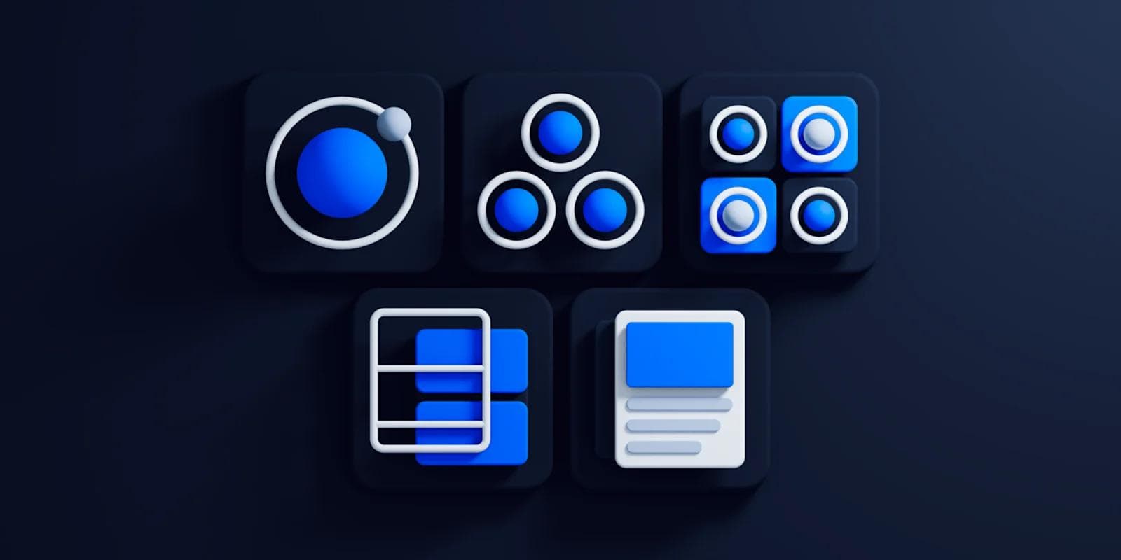
Atomic Design Methodology for Building Web Design Systems

Designing for the web isn’t as simple as it used to be. Interfaces need to work across different screen sizes, devices, and environments and that shift has changed how designers approach their work.
Atomic design offers a way to handle that complexity. It’s a system for building user interfaces from the ground up, using a structured approach to web development.
The idea comes from science: atoms are the smallest building blocks of matter. When they combine, they form molecules, and eventually, complete structures.
In a similar way, the atomic design methodology with the most basic UI elements (buttons, input fields, labels) and gradually combines them into more complex components, templates, and full pages.
What is Atomic Design?
Atomic design is a methodology that structures the development of visual systems in an organized way using atoms, molecules, organisms, templates, and pages.
This approach is particularly beneficial in web development for creating cohesive and scalable design systems.
For example, a search icon and an input box are two separate atoms. Put them together to form a search box, and you've got yourself a molecule. Add block content place-holders below the search box, and you just created a template. Fill the template with content text and images and you have a complete page.
The atomic methodology was introduced by designer Brad Frost to help designers craft reusable UI systems.
His book, "Atomic Design," introduces the methodology for creating and maintaining visual identity systems.
What Are the Five Atomic Design Phases?
An atomic design system improves the efficiency of web development projects.
Like in science, atomic design starts from the smallest instance of any website page:
1. Atoms
Atoms are the smallest building blocks of a website page. In atomic design, atoms refer to basic HTML elements that provide the smallest units of a web page, such as buttons, labels, and input fields. Fonts, color palettes, and animations are also considered atoms.

2. Molecules
Atoms are bonded together to create molecules, representing the second smallest groups of a website page. An example of a molecule is a blog subscription box made up of a field label, an input field, and a button.

3. Organisms
Organisms are groups of molecules that are joined together to form more complex beings. In interface terms, the organism is any design sequence that appears on website pages.
The header and footer of a website page consist of two or more molecules, making them both organisms. The search bar is an example of a molecule used to build a header component.

4. Templates
Website pages start to take shape in the fourth phase of the atomic approach. Templates are groups of organisms combined to form the structure of a page.
If we look at a homepage, the header and footer organisms we started with are found in the homepage template. These organisms join others to make up the homepage template, as shown in the image above.
Templates are effective because they ensure components of a visual identity system are crafted to look and function together. Atomic design templates can be viewed as a skeleton of a page.
5. Pages
After the first four phases, designers have all the elements they need to build out pages for the UI of a website.
If the previous four steps were done correctly, then the final step gives designers the freedom to drop in images, text, and all that good stuff to give them an idea of what the UI will look like.
The final appearance of the pages dictates whether the site is ready to launch, or whether the developer needs to loop back and make changes to earlier design elements.
How to Apply Atomic Design to Build Visual Identity Systems
Atomic design methodology helps build a cohesive brand identity in the most shareable and efficient manner.
Yes–it is possible to build a visual identity system using other approaches. However, the atomic approach does not creates significantly less work for other internal teams who would be using the system.
What Is a Visual Identity System?
A visual identity system, also referred to as a design system, is a comprehensive framework of visual elements, such as logos, color schemes, typography, and imagery, which consistently and coherently represent an organization's brand and values across various mediums. It serves to create a recognizable and memorable brand image, ensuring that all visual communications are aligned and effective in conveying the brand's message to its audience.
It provides designers and engineers with a single point of access to visual style guides, typography systems, color systems, tokens, templates, component libraries of documented and coded elements to be reused, design patterns, voice and tone guides, and much more.
The design system that emerges from the atomic way of doing things contains all of the components in use, as well as their corresponding codes. This can be a useful tool for both designers and developers.
The most important aspect of a design system is its documentation, which includes instructions on how to use each component. Well-designed systems can aid in the development of a stronger relationship between the user and the brand, as well as the maintenance of consistency across multiple digital products.
How do you build design components for your visual identity system?
Components are functional elements of design. Think of them as building blocks of your design system. Combined, the design components form libraries that designers refer to and use when they create products.
A component can be anything – a drop-down menu, icon, button, or something more complex. The most important thing is that it combines elements that solve a particular problem in your digital experience.
When you create a new component, begin by building its default state. Find the most essential aspects of the component and write a generalized, default version of it. Each component should be usable in this state. For example, a given Button component will require a minimum of:
- a label (such as text, or an icon)
- some form of color, size, visual pizzaz
- an action to perform when triggered
The default configuration of these characteristics will inform the base usage.
Next, modify the component to include other states. For Button, this may include handling errors, allowing for an icon to display alongside the text, and building a loading state. In most cases, these states should work independently of each other to maintain a separation of concerns.
Why Atomic Design?
Breaking down big projects into templates, organisms, and molecules is efficient in itself.
Atomic design will not only let the designer focus on small details but allows them to see the bigger picture—the web application’s user interface. Doing so allows designers to avoid creating a component more than once, saving designers time and promoting a culture of reusability.
Mix and Match Design Components
By breaking down components into basic atoms, it's easy to see what parts of a website can be reused and how they can be mixed and matched to form other molecules and even organisms.
Above, you’ll notice there are three different pages: a homepage, a blog page, and an article page. Each is using the same components created from the atomic design process. This allows designers to build pages faster all while remaining consistent.
Website Code is More Consistent
For developers, the atomic approach gives them the guardrails they need to take existing components and implement them properly.
Because design components follow an approach like atomic design, developers have an established language and structure that is universal.
Atomic design is also great for any developer that is assigned to a new project. Since all design components are organized and should match any mockups for new website pages, development teams can easily differentiate from component to component.
Fewer Design Components to Manage and Organize
The issue many teams run into before implementing a visual identity system that follows the atomic methodology is the creation of duplicate components.
It’s easy for designers to fall into the habit of creating net new components when a similar one already exists. This is because:
- The designer forgets about existing components.
- There is no documentation tracking existing components.
By using the atomic approach, designers keep track of every single atom they begin with and document each instance that each is used to create a larger being or organism.
Faster Speed-to-Market
Visual identity systems make cross-browser/device, performance, and accessibility testing easier; vastly speeding up production time and allowing teams to launch higher-quality work faster.
This is because all teams are speaking the same visual language. The common workflow for building new website pages looks something like this:
- Marketing teams suggest a new page using the components found in the atomic design system.
- Designers take the request and build the mockup using the same components.
- Developers take the design mockup and launch the page.
In addition, baking things like accessibility into a living visual identity system scales those best practices, allowing your interfaces to reach more users and maintaining brand consistency across all digital channels.
How to Implement Atomic Design in Your Workflow
For B2B startups and enterprise teams, atomic design is a practical way to scale your product without losing control over consistency or speed.
Start with what you already have. Audit your product’s UI. You’ll likely find overlapping components: five slightly different buttons, inconsistent form styles, mismatched spacing. This kind of UI debt slows down teams and creates confusion. Atomic design gives you a framework to clean it up.
Build a shared language. In fast-moving teams, designers, developers, and product managers often talk past each other. Atomic design encourages a common vocabulary: atoms, molecules, organisms, templates, and pages. This makes handoffs smoother and reduces back-and-forth over things like “which version of the dropdown are we using?”
Prioritize reuse over reinvention. When you're scaling across multiple products or features, it's tempting to rebuild components to suit each use case. With an atomic design system in place, teams can pull from a centralized library of tested, documented components.
Integrate it into your tooling. Atomic design works best when it’s not siloed. Use tools like Storybook or Figma libraries to reflect your atomic system directly in your workflows. Connect it with your codebase so devs can actually use what's being designed.
Think long-term. For enterprise environments with complex approval processes and multiple stakeholders, atomic design can reduce risk. A change to a core atom (say, a button style) can cascade predictably through the entire product. That makes governance and QA far easier over time.
Atomic Thinking is Best Applied in Design
The atomic design methodology makes visual identity systems scalable, understandable, and efficient. At the end of the day, having a source of truth for all the creative work for new website pages promotes a culture of consistency that many websites today are missing.
Your website is your biggest growth lever—are you getting the most out of it? Schedule a strategy call with Webstacks to uncover conversion roadblocks, explore high-impact improvements, and see how our team can help you accelerate growth.


