9 Innovative B2B Website Features in Tech

9 B2B Website Features that We Admire
We have assembled a list of B2B website features we feel knocked it out of the park - Let's dive in!
1. Contentful’s “To select, begin typing” Company Field
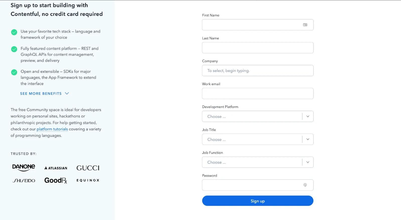
When you sign-up for an account on Contentful, you are redirected to a form model that contains many input fields. While names and email addresses are quite easy for users to work around, they are often confused by other categories.
For this reason, Contentful accommodates user needs by displaying a default value of “To select, begin typing” in the company input field. This field automatically displays a list of companies according to the alphabet you have entered in the field.
All of this is done with the help of optimized queries that provide a list of companies that match the letters typed by the user.
2. ServiceTitan’s “Bad-fit” Thank You Page
ServiceTitan is a service-based software giant that provides resources like customer service, marketing, sales, payment, payroll, and scheduling to companies. It has helped grow several well-known companies like Battery Ventures, Broadly, Gold medal, etc.
Like any other organization, companies must fit ServiceTitan's ideal customer profile. These company characteristics may include annual revenue, company size, or the country from which the company is operating.
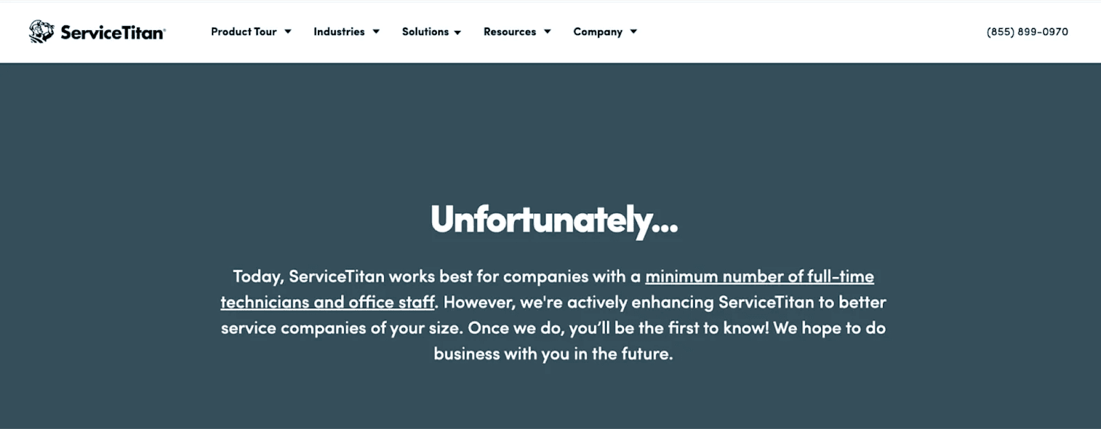
For companies that don't meet ServiceTitan's customer profile, they are redirected to a page that displays a message explaining why your company might not qualify for using its services.
3. Arengu’s “Table of contents” on their blog
Arengu is an online form creator that helps users build and share different kinds of forms for capturing user analytics and data, forms for conditional logic, or simple registration forms.
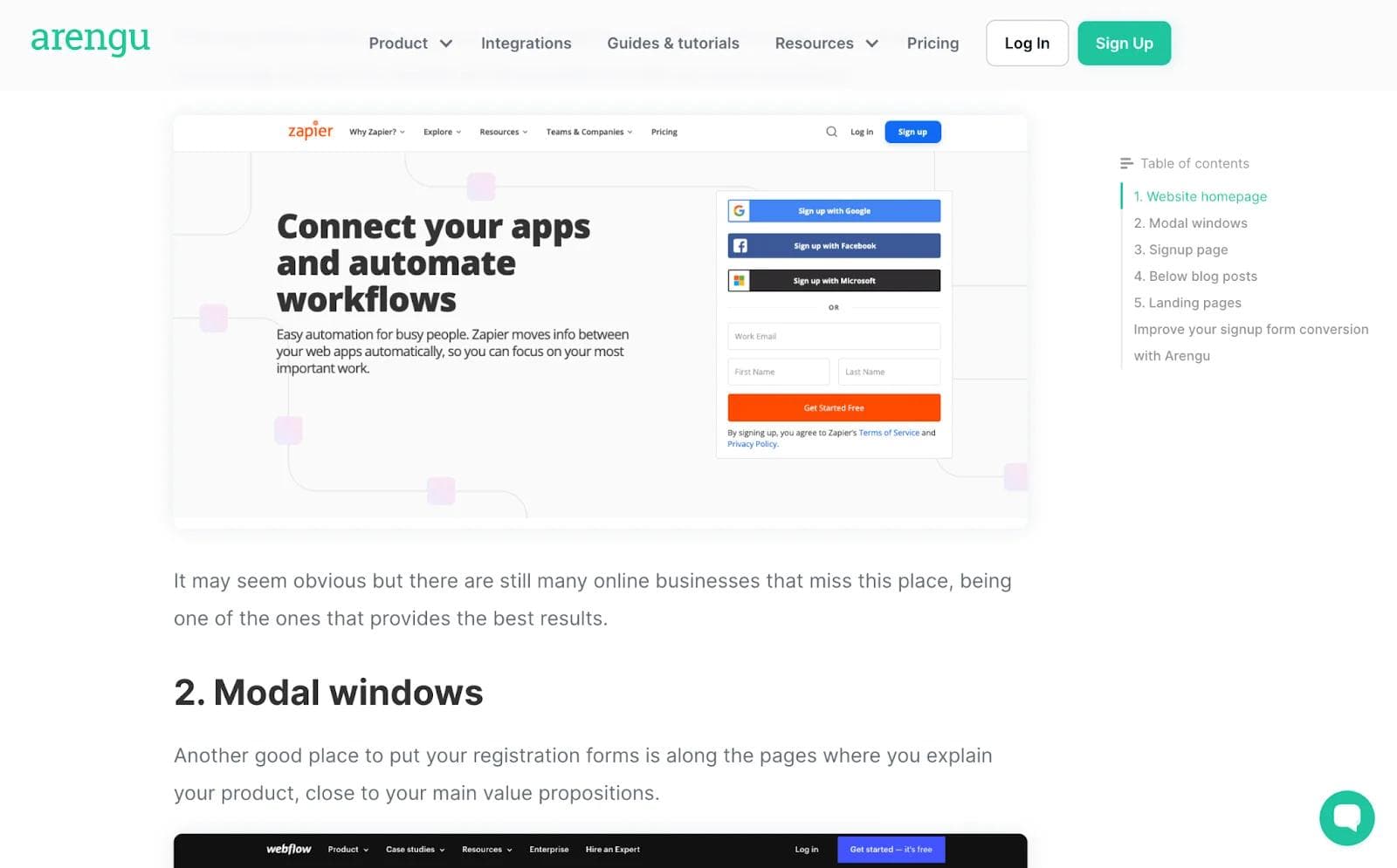
Arengu's notable website feature doesn't have to do with its product. However, it's a feature on their blog article pages: a scrolling table of contents.
Users aren't required to scroll to the top of the page after reaching 50% scroll ability. Instead, the user can easily bounce from section to section by accessing the scrolling table of contents.
The placement of the table of contents is another reason that makes it great. As users, we are accustomed to reading from left to right. Positioning it on the right makes it easier for readers to spot it and engage with it.
4. Zenefits’ “Number of downloads” Counter
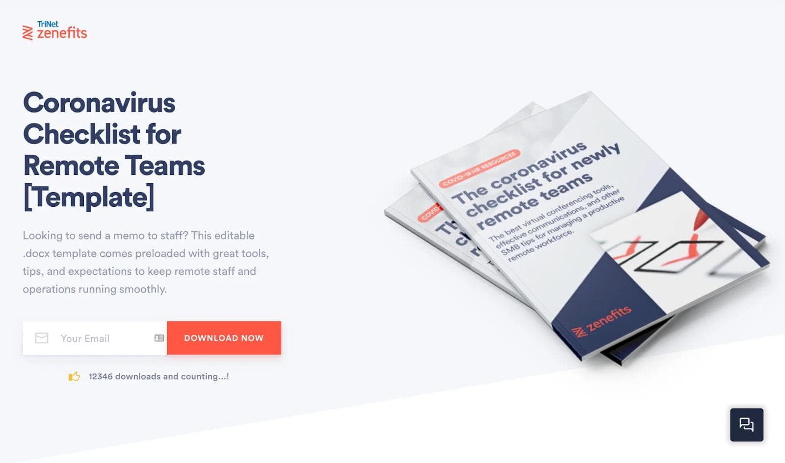
Zenefits is a SaaS company that provides HR services like payroll, compliance, health insurance, and paid time off for other B2B businesses.
After launching the “Coronavirus Checklist for Remote Teams” guide, the Zenefits team decided to add a download counter to the hosting landing page. The download counter is a real-time feature that tells new visitors how many people have downloaded the guide.
Not only does the feature peak interest of newcomers, but it also offers credibility and social proof to the asset that they would be downloading.
We also added a download counter to our headless CMS implementation checklist landing page to give visitors the real-time download counter.
5. Stripe’s “Parallax image capture” Visualization
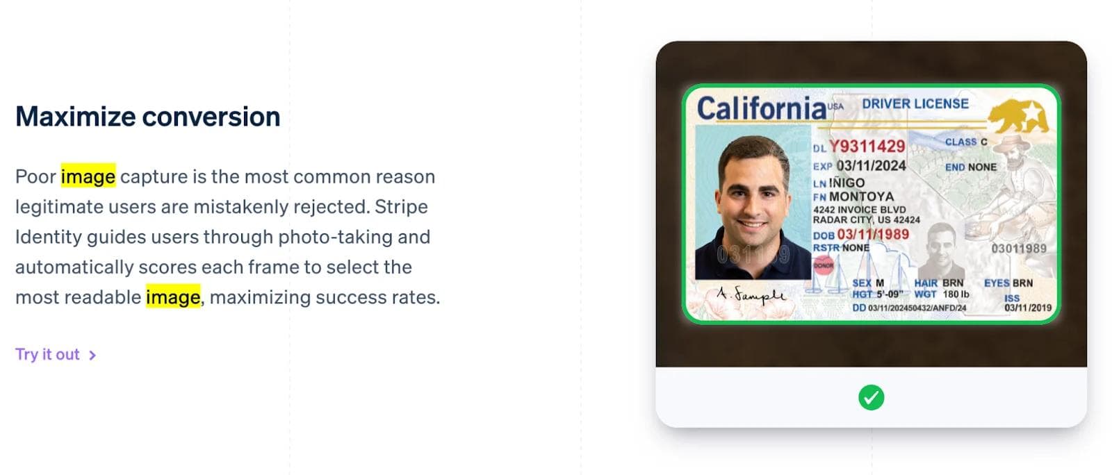
Stripe is a payment service provider platform that businesses use to accept transactions and pay their vendors through different payment modes.
Since Stripe is a PCI service provider, it needs to verify the identities of its users that are registered on the platform to either pay or receive money. Several documents are needed to be scanned for the accounts to get verified.
Stripe has come forward with a maximized image resolution solution for its users that converts the documents into readable images to get the maximum success rate.
This ultimately results in letting legitimate users create an account and disposing of applications that might have been detected as risks.
6. HubSpot’s “Hear from our team” Video Cards
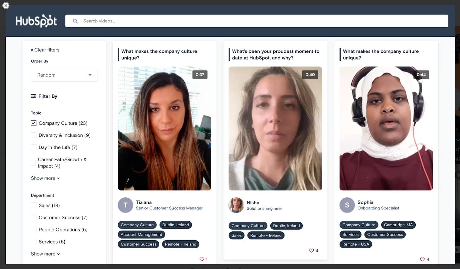
HubSpot is a customer relationship management platform that aids companies in attracting customers by bringing together marketing and sales teams to manage their operations all in one place.
The CRM giant recently added an awesome feature to their careers page: video testimonials from HubSpot workers.
These pre-recorded videos give applicants an inside look at company culture, day in the life of a variety of positions, and insights on career paths. Some videos also walk applicants through the onboarding process and give a better insight into the application process.
This feature is perfect for applicants who are on the fence or wish to learn more about HubSpot and the people who make the workplace great.
7. ClickUp’s “Replaces” Competitor Callout
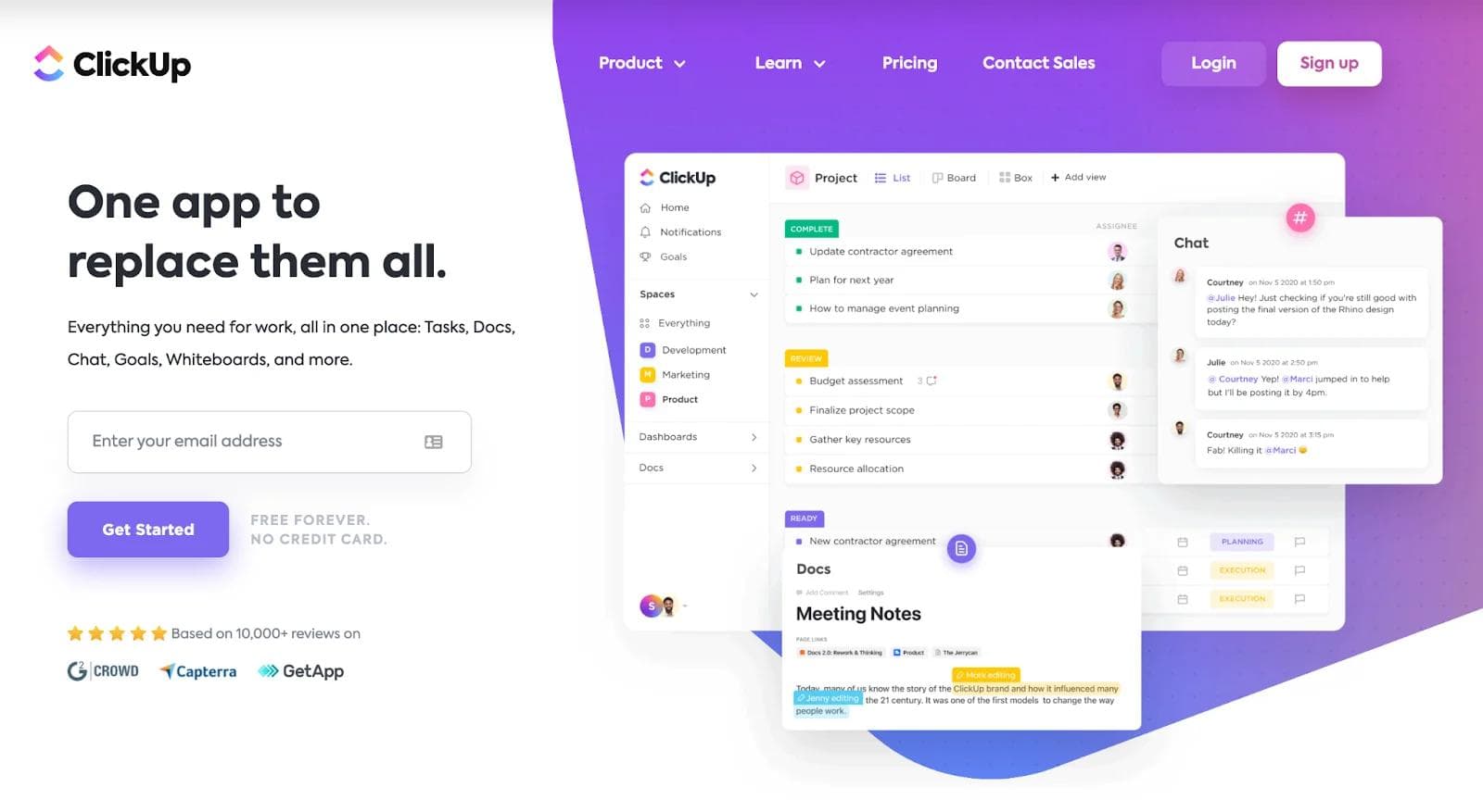
ClickUp is an all-in-one solution that brings all your work to one place. It can help teams from all departments like project management, engineering, marketing, and sales to collaborate on a single platform.
ClickUp’s landing page declares itself as a replacement for all other competitors in the market by demonstrating its use cases in every niche of the business. This landing page by Clickup helps in customer acquisition by stemming confidence in them with proper animations all over the page.
Right now, ClickUp is used by teams working at companies like Google, Nike, Airbnb, Netflix, and Ubisoft.
8. Shopmonkey’s “Watch the video” Popup
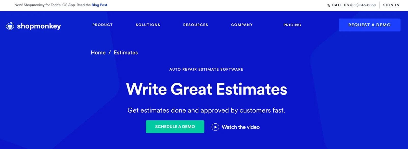
Shopmonkey is a software-based auto repair platform that accommodates businesses in the automotive industry by managing their invoices, inventory, scheduling, and other processes.
Upon visiting their website, a user has the option to schedule a demo or watch a video explaining how Shopmokey's software works. Given that a first-touch visitor is not ready for a demo, they are likely to watch the video instead.
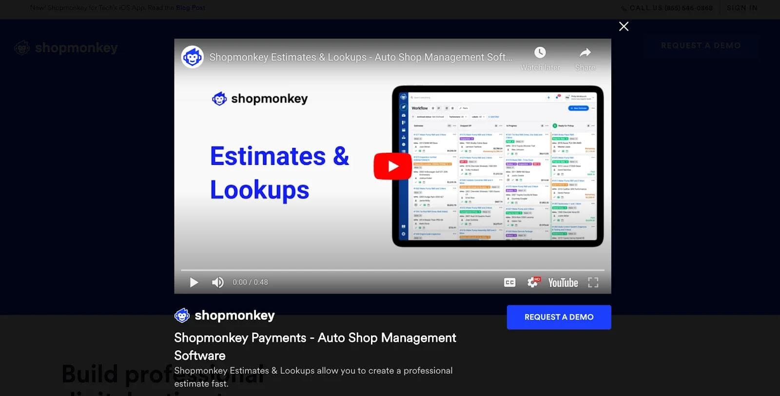
The popup feature is great in this case because visitors receive a concise walkthrough of how Shopmonkey works through an engaging piece of dynamic content. The visitors then have the option to schedule a demo if they are convinced after watching the popup video.
9. GitHub’s “Community-powered workflows” Sliding Cards
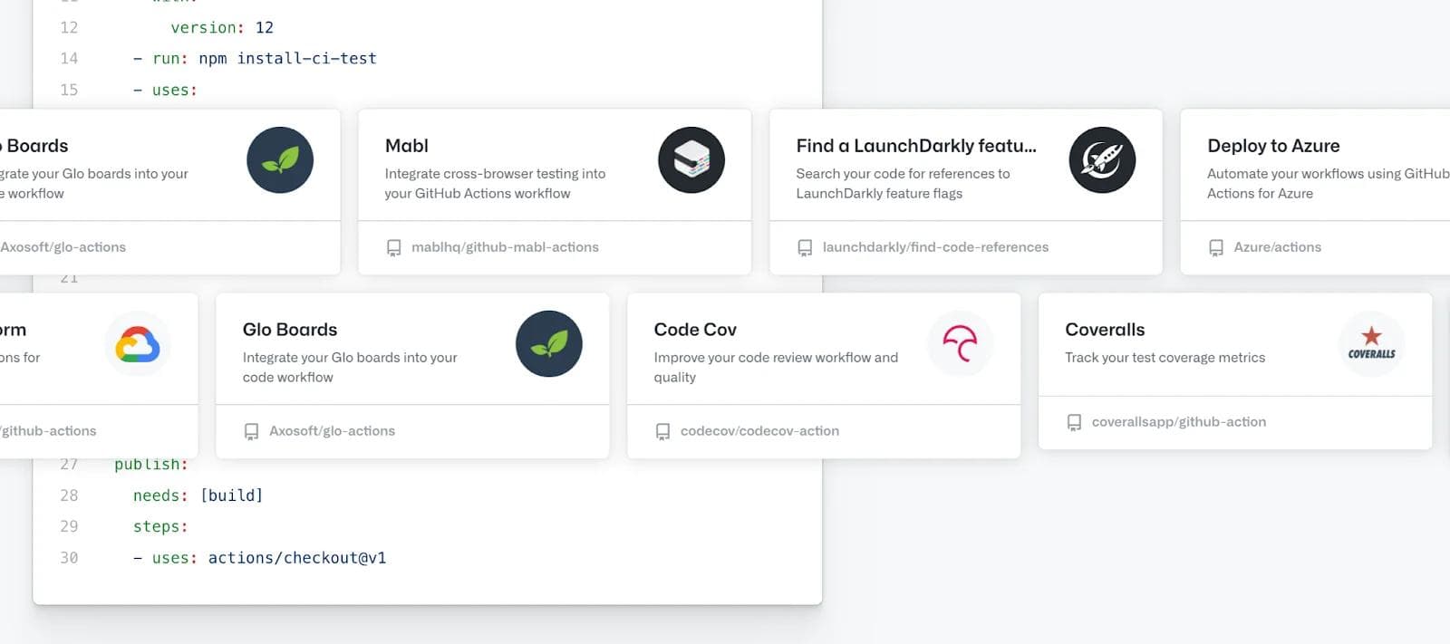
GitHub is a code hosting platform that provides services like version control and collaboration between development teams. GitHub has introduced actions as part of its services that allow users to automate the workflow without having to worry about complex pipelines.
If you scroll down the actions page on GitHub, you will see a moving carousel that displays GitHub actions that can be easily integrated into GitHub projects.
The actions displayed are integrations from third-party software to improve code reviews, automate specific actions, and improve other intricate development tasks. The sliding carousel captures user attention, convincing them to take action like in the name of the GitHub product launch.
Parting Thoughts
Features like a download counter and field values to page layouts and a table of contents can help B2B businesses create a memorable website experience.
We've adopted a few B2B ideas ourselves because they're innovative and we strive to offer a seamless website experience to everyone. So should your website team!

I drive our marketing initiatives and help maintain the company website. I work closely with our design teams to keep branding consistent across every channel.


