AI Website Examples: Design Trends & Best Practices
AI marketing leaders are currently facing a fierce and complex landscape. Thousands of startups are fighting to gain market share in the tech industry, with AI-related companies capturing nearly 50% of all global venture funding in 2025. Moreover, we've observed a swath of established SaaS companies pivoting to embrace a more AI-centric brand identity.
In this crowded landscape, marketing teams must work hard to differentiate, attract attention, build trust, and generate pipeline. As we've continuously preached, the marketing website is one of (if not the most) powerful ways to present and grow your brand.
Much like the Web3 space, artificial intelligence has carved out its own style when it comes to marketing website designs. And as usual, when it comes to emerging web design trends, Webstacks is here to give our two cents.
In this article, we'll discuss the winning tactics we're seeing AI marketing teams deploy to make their websites stand out amongst the competition, foster meaningful user experiences, and effectively drive business outcomes.
We will also highlight Webstacks' favorite examples across the entire industry. Read on to learn what it takes to create an industry-leading website in AI/ML, and draw inspiration from those already at the top.
AI Website Trends
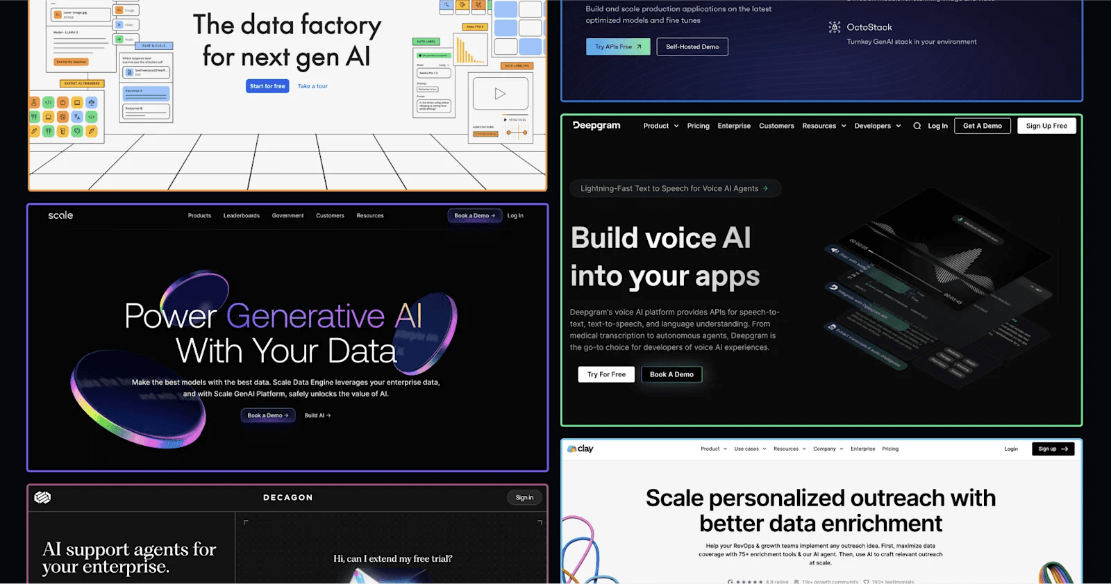
After reviewing hundreds of sites from AI companies, there are a few themes we noticed across design, development, and content.
Dark Mode and Colorful Backgrounds: Designers are straying away from your typical white backdrops and electing for more colorful options to promote brand colors.
Product Illustrations: AI companies are letting their products shine on the website. Visitors can get an inside look at the product UI, some with static illustrations and some animations. Some even include interactive experiences, which are as close to a demo as you can get.
Trust Signals: Many included prominent displays of reputable brands that are customers, as well as testimonials from founders, executives, and leaders. There is a clear effort to establish oneself as a trusted partner by showcasing achievements with other successful names across SaaS and AI.
Consistent Use of the Buzzword (AI): It's highly likely you will find "AI" mentioned above the fold on the homepage. The majority use it in a bold, snappy heading.
CMS Selection: Apart from design, we were curious about what infrastructure AI websites were utilizing. We found that many AI startups with relatively simple websites were on Webflow, while content-heavy websites and more established organizations were on headless platforms such as Contentful and DatoCMS.
Developer Resources: Lots of AI websites prioritize dev-related content, including resource hubs with documentation, tutorials, integration marketplaces, and communities.
Best AI Website Design Examples in 2026
Now, let's review the top website designs in AI/ML.
Sidenote: In addition to design, we may also call out other impressive aspects of each site, such as innovative content ideas, SEO/CRO strategies, technologies leveraged, etc.
1. Deepgram
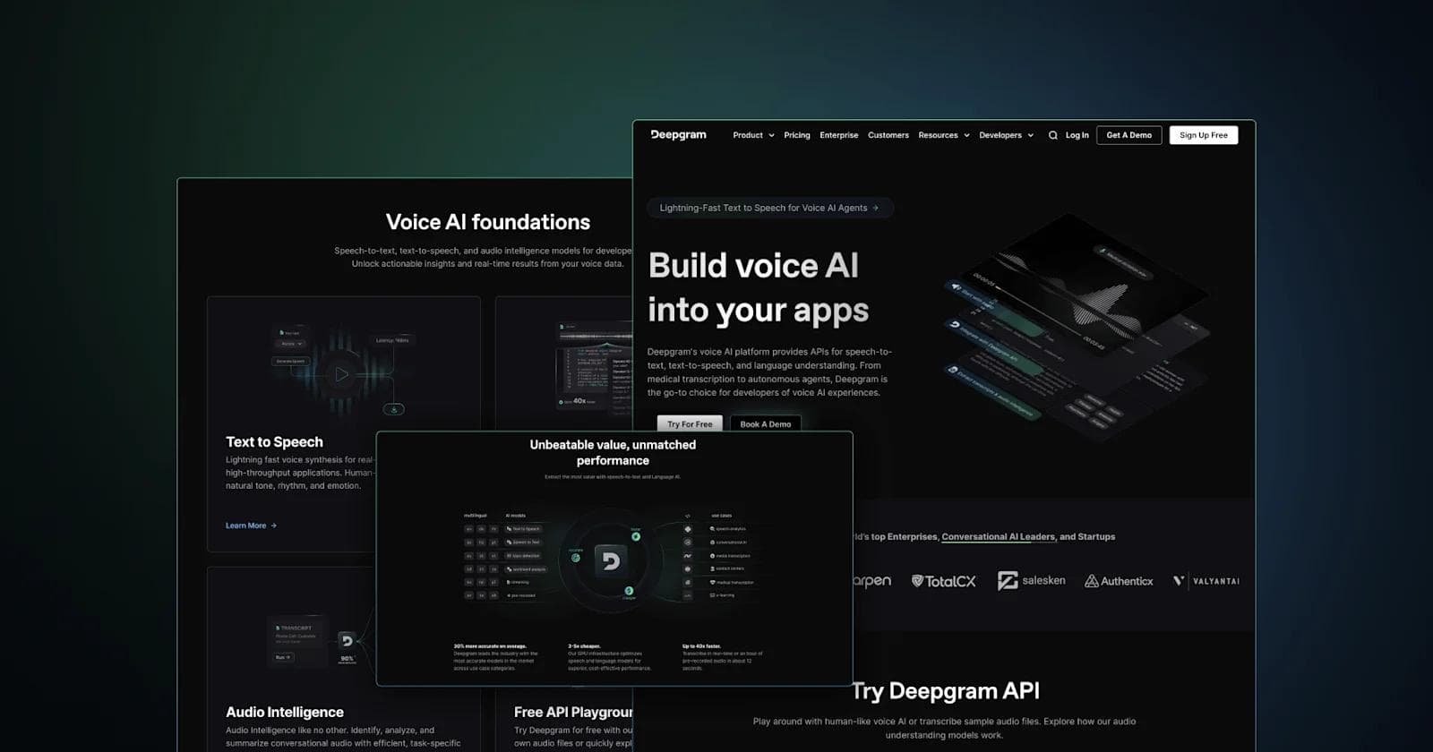
We have to begin by showcasing our very own creation, Deepgram. If you are not familiar, Deepgram is a platform that's changing the way apps can leverage voice AI.
Deepgram brought Webstacks in to design and develop a modern, industry-leading AI website that would establish an unmistakable brand, showcase the capabilities of its products, and foster a loyal community of AI developers.
Overall, the website is extremely product-focused. There are captivating animated product demonstrations everywhere you look. Additionally, users can try out each of Deepgram's voice models, Text to Speech, Speech to Text, and Audio Intelligence, without even converting.
Best of Deepgram's Website
- Product-led web design
- Motion design and microinteractions
- Dark mode, bold fonts, and colorful gradients
- The AI App Catalog's SEO
2. Cohere
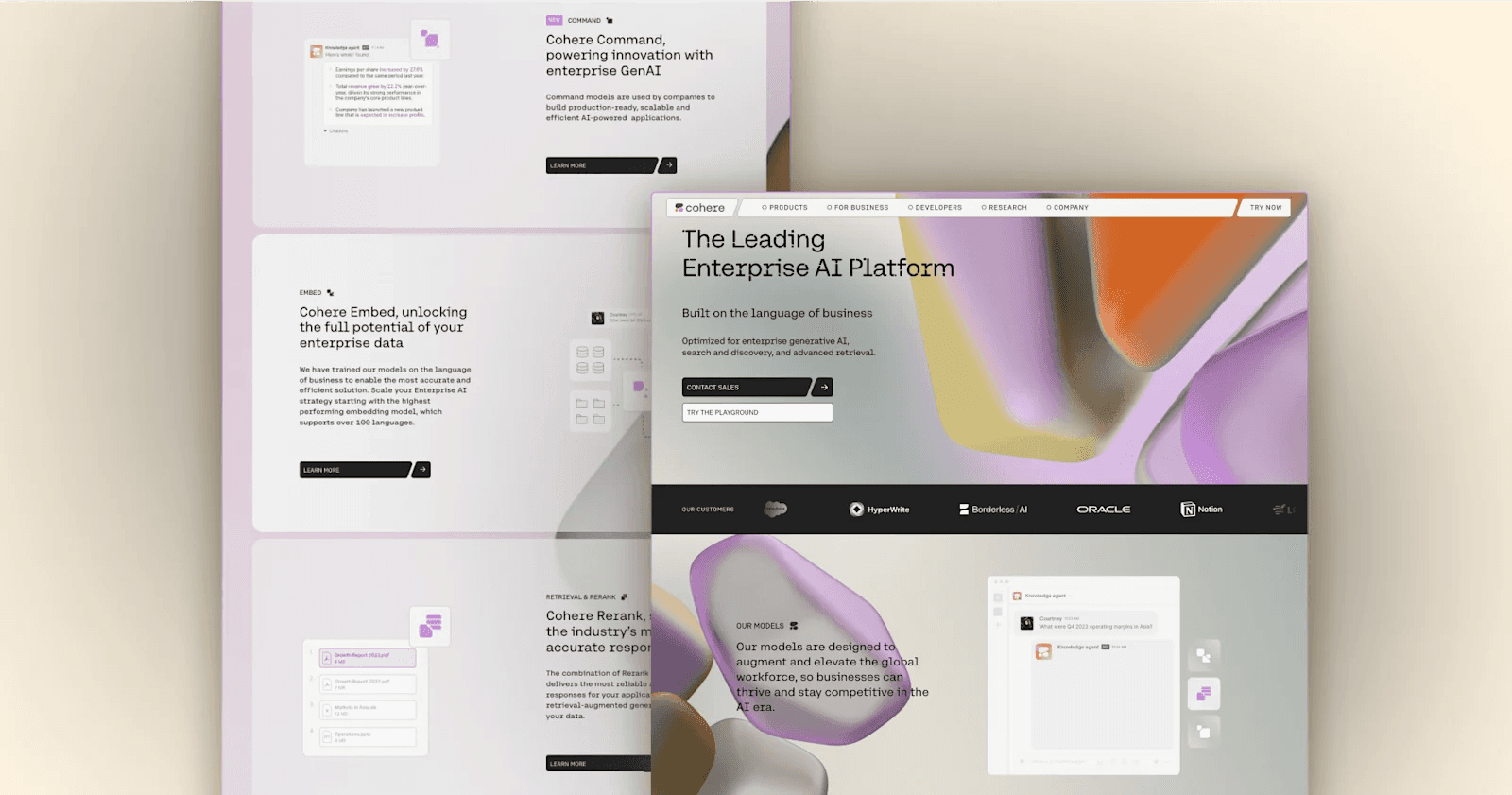
Cohere has one of the cleanest layouts we have seen in AI. There's so much to compliment here from their colorful backgrounds, neat typography, and subtle animations. We also appreciate the consistency in shapes across buttons, images, and form fields. If you're AI company is looking for brave inspiration that stands out from your traditional enterprise design, you have to do a deep dive into Cohere.
Best of Cohere's Website
- Motion background
- Unique navigation bar design
- Techy typography that works in AI
- Enterprise-grade headless CMS (Sanity)
3. OpenAI
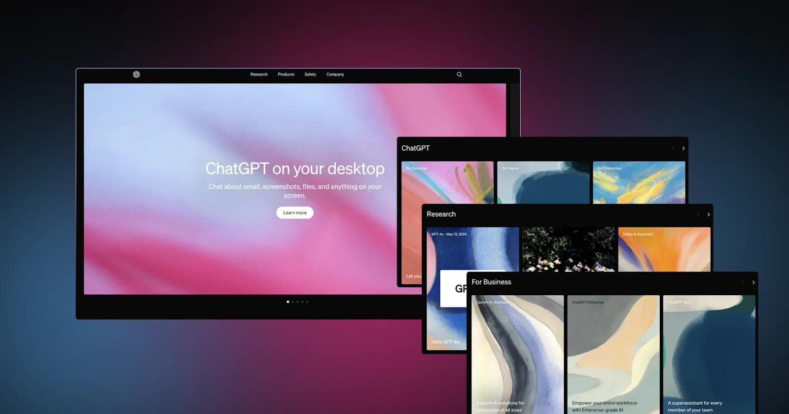
You've probably spent plenty of time in the ChatGPT UI, but have you ever checked out OpenAI's marketing website?
The leading AI company takes an unconventional approach with its homepage, making OpenAI seem more like an art gallery than an app. However, all the visuals you see were likely created by AI, which is a neat way to combine your product with marketing. All in all, it's quite fascinating what OpenAI's models are capable of, and they do a great job of showcasing the things ChatGPT, Sora, and DALL-E can produce.
Best of OpenAI's Website
- AI-generated pastel artwork
- Card deck slider components
- Compelling product pages
4. Clay
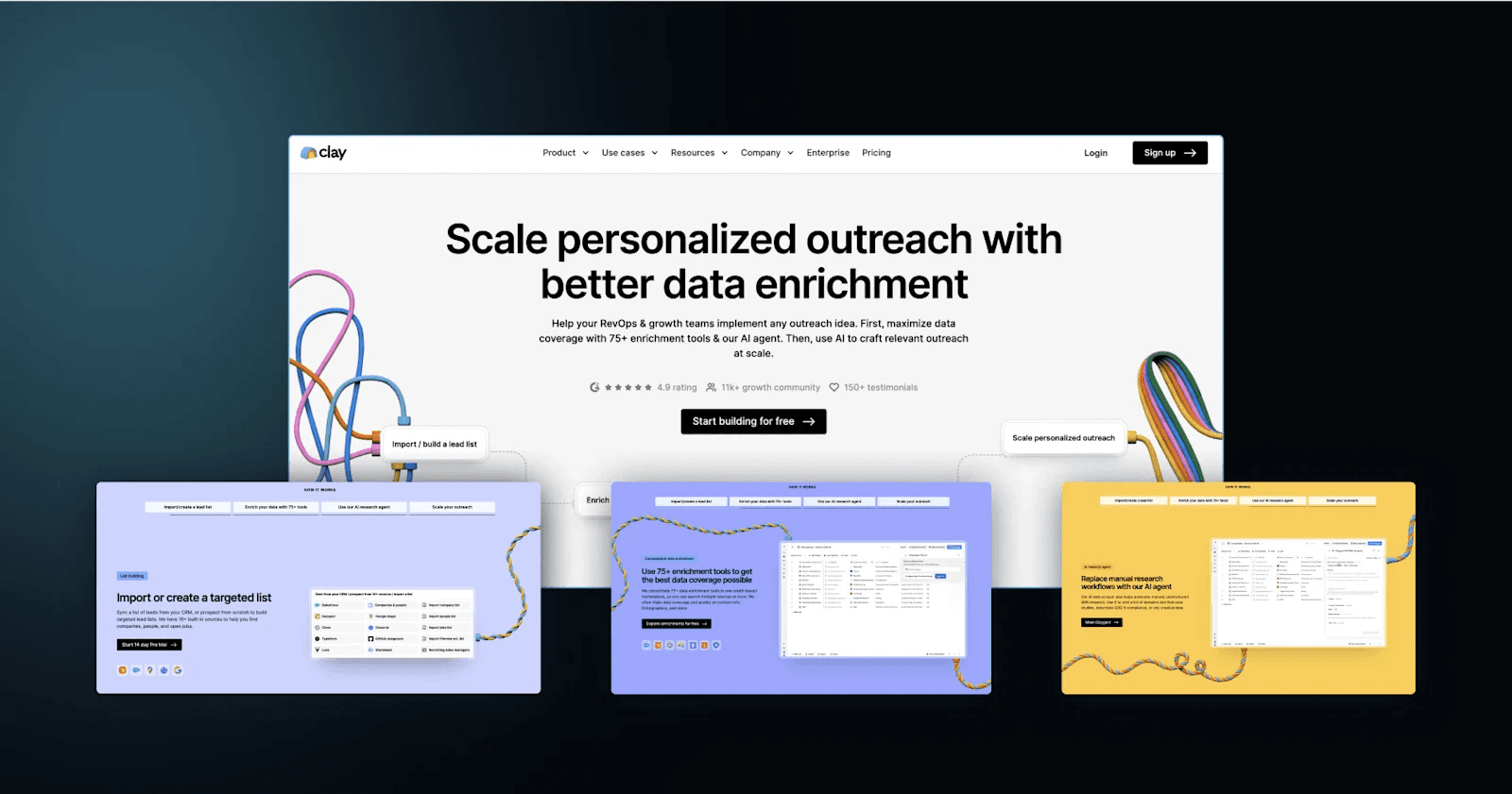
Clay is the data enrichment and outbound automation solution that supercharges sales teams with AI. It appears that Clay took inspiration from some of the best PLG company websites like Calendly, Notion, and Airtable.
There are large product UIs on almost every page, and all CTAs are geared towards their free signup. The AI company also leans into its vibrant branding with colorful illustrations that feature the inherent creativity in clay art (definitely check out their blog images).
Best of Clay's Website
- Mega menu nomenclature, iconography, and copywriting
- Captivating imagery and intriguing product illustrations
- Trust signals (client logos, testimonials, G2 rating, security standards)
- Product feature comparison table on the pricing page
5. Labelbox
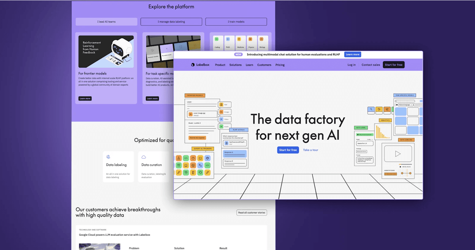
Next up is Labelbox, AKA "The data factory for next gen AI". They have one of the most content-heavy websites we've seen, with use cases, industries, product tours, guides, and even a "Customer Academy". From its content strategy to its copywriting, this website is obsessed with educating the end user. Labelbox exhausts all the different types of information a prospective customer could be looking for and delivers that content in the best format possible. It's all complimentary and creates a comprehensive web experience, which many AI companies fall short of.
Best of Labelbox's Website
- Interactive product demos
- Lighting-fast loading speeds
- High-quality illustrations and icons
- Diverse content ecosystem
6. OctoAI
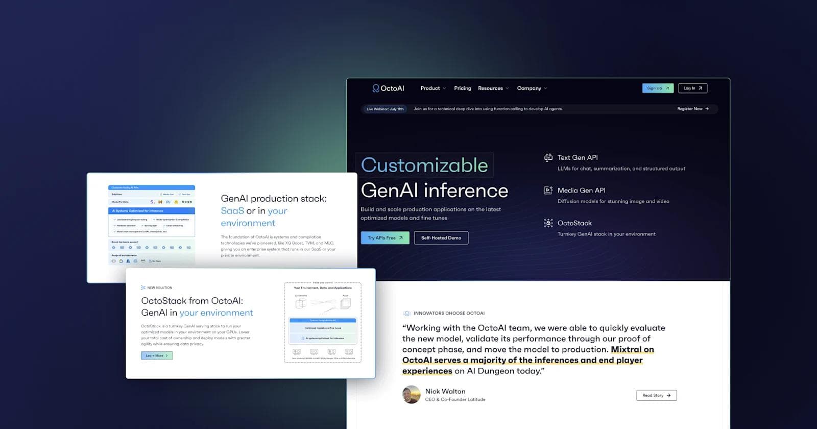
Another AI startup Webstacks has worked with is OctoAI (now part of NVIDIA) to design and develop a modern AI website focused on modularity.
From the onset, we helped OctoAI construct and implement a new design system that was focused on modularity. Content modeling, which used to be a significant constraint for their marketing team, is now a seamless process that increased the creativity and agility of their website.
Some things OctoAI wanted to translate through were trust and experience. The best way to do this was to design a best-in-class testimonial components, which included bold quotes, large logos, headshots, job titles, and CTAs that linked to case studies.
Read more about our success with OctoAI here!
Best of OctoAI's Website
- Design that establishes experience and expertise
- Clean and simple UIs
- Copy that focuses on outcomes
- Futuristic gradients
7. Scale
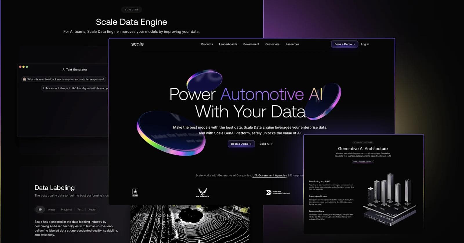
Scale has a top-notch AI website, and it's also a staple of our Best B2B SaaS Websites.
One of the most impressive aspects of the Scale website is its motion design. A prime example of this is the animation on the Defense Industry page, which portrays fighter jets taking off and landing on an aircraft carrier. The attention to detail and significant investment that has gone into this website is clear, and makes it a clear standout in its industry.
Best of Scale's Website
- High-production customer story videos
- Distinct purple gradients
- Descriptive and compelling copy
- Seamless user journeys to BOFU content
8. Fetch AI
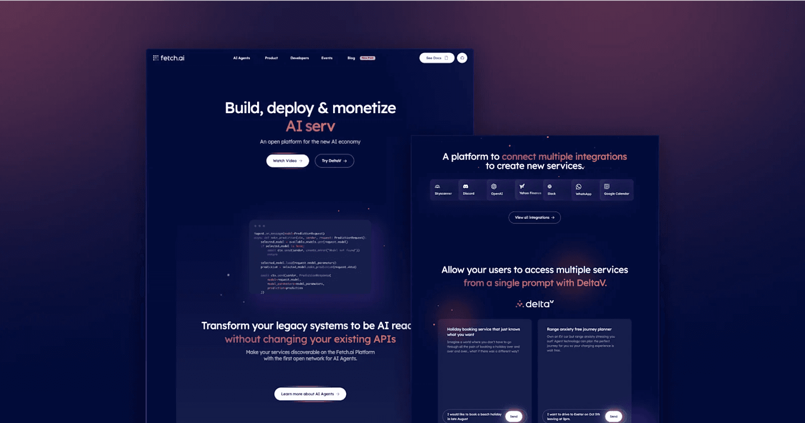
A member of the Artificial Superintelligence Alliance (ASI), Fetch.ai is a blockchain-based project that helps developers build decentralized AI applications.
A prime example of web design in the crypto industry, Fetch.ai is a simple yet beautiful website. Even with just a dozen pages, it has all the design elements and technical performance you would expect from an enterprise-level website.
Best of Fetch.ai's Website
- Unique color palette
- Animated demos
- Conversational tone
9. HeyGen
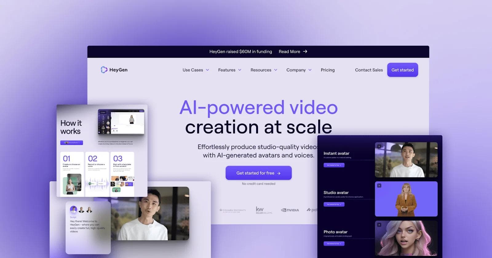
HeyGen is a platform that allows businesses to produce studio-quality, AI videos for product overviews, sales outreach, and L&D. HeyGen is another product-led website. Their site does an excellent job of showcasing the realism and versatility of their AI-generated videos. Additionally, their messaging is very persuasive, stating the simplicity of creating AI video content. Their design certainly helps reach the skeptics who have preconceived notions about AI voice and video quality.
Best of HeyGen's Website
- Letting the product shine
- Constant motion that keeps users engaged
- CTA strategy
- Gradient blur backgrounds
10. Baseten
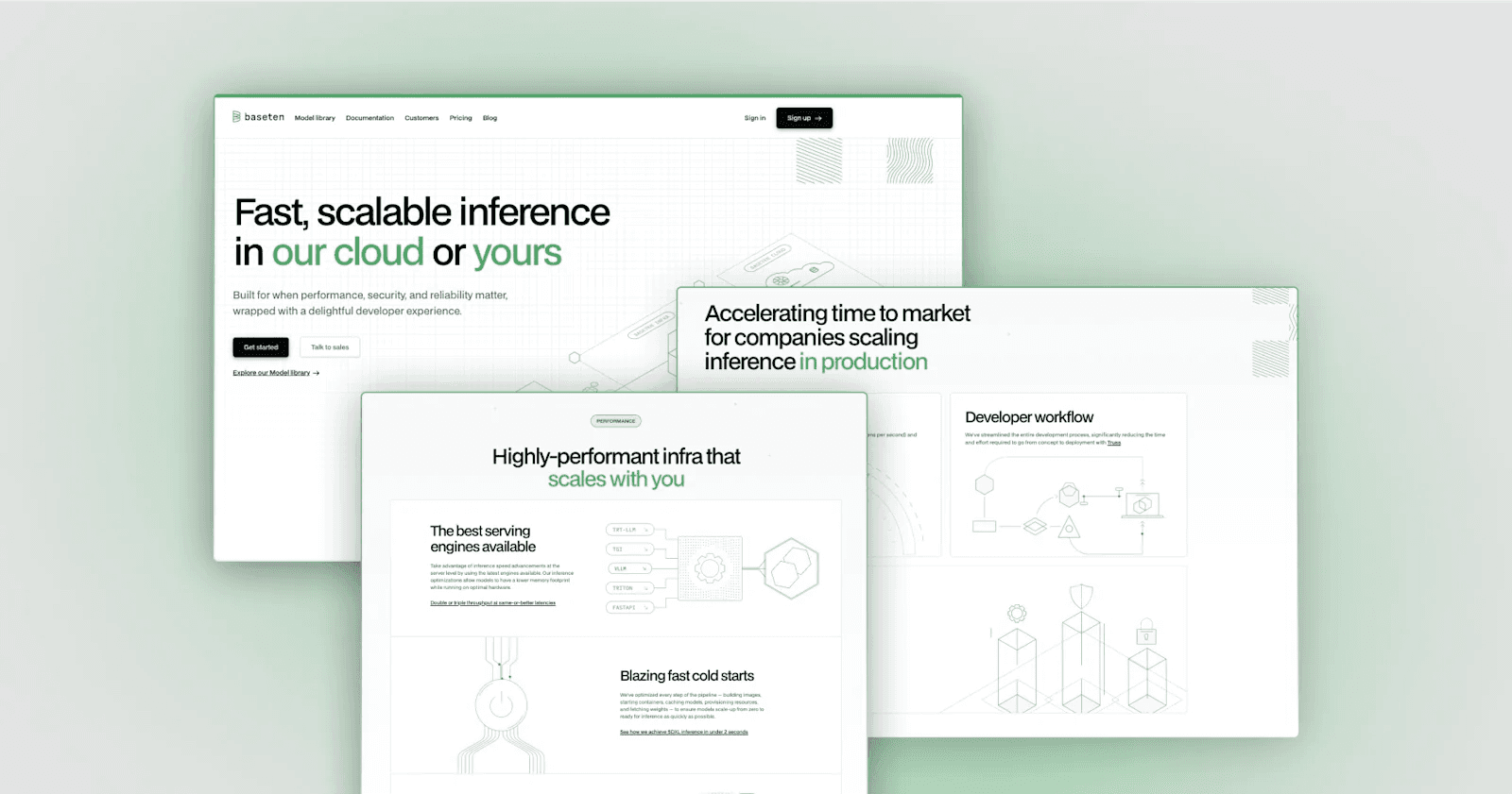
Baseten is a machine learning software that integrates AI into business operations, production, and processes.
Baseten brings simple illustrations to life with subtle animations, which substantially elevates the website from a static experience to an immersive one.
A majority of its core pages fall under the Model Library, which is designed as a directory or marketplace. Rather than having bland and indistinguishable cards, each model features a detailed futuristic image to make them unique and capture users' attention.
Best of Baseten's Website
- Illustrations that elevate copy
- Information architecture
- Color in headings
- Unmatched technical performance (DatoCMS + Next.js)
11. Jasper
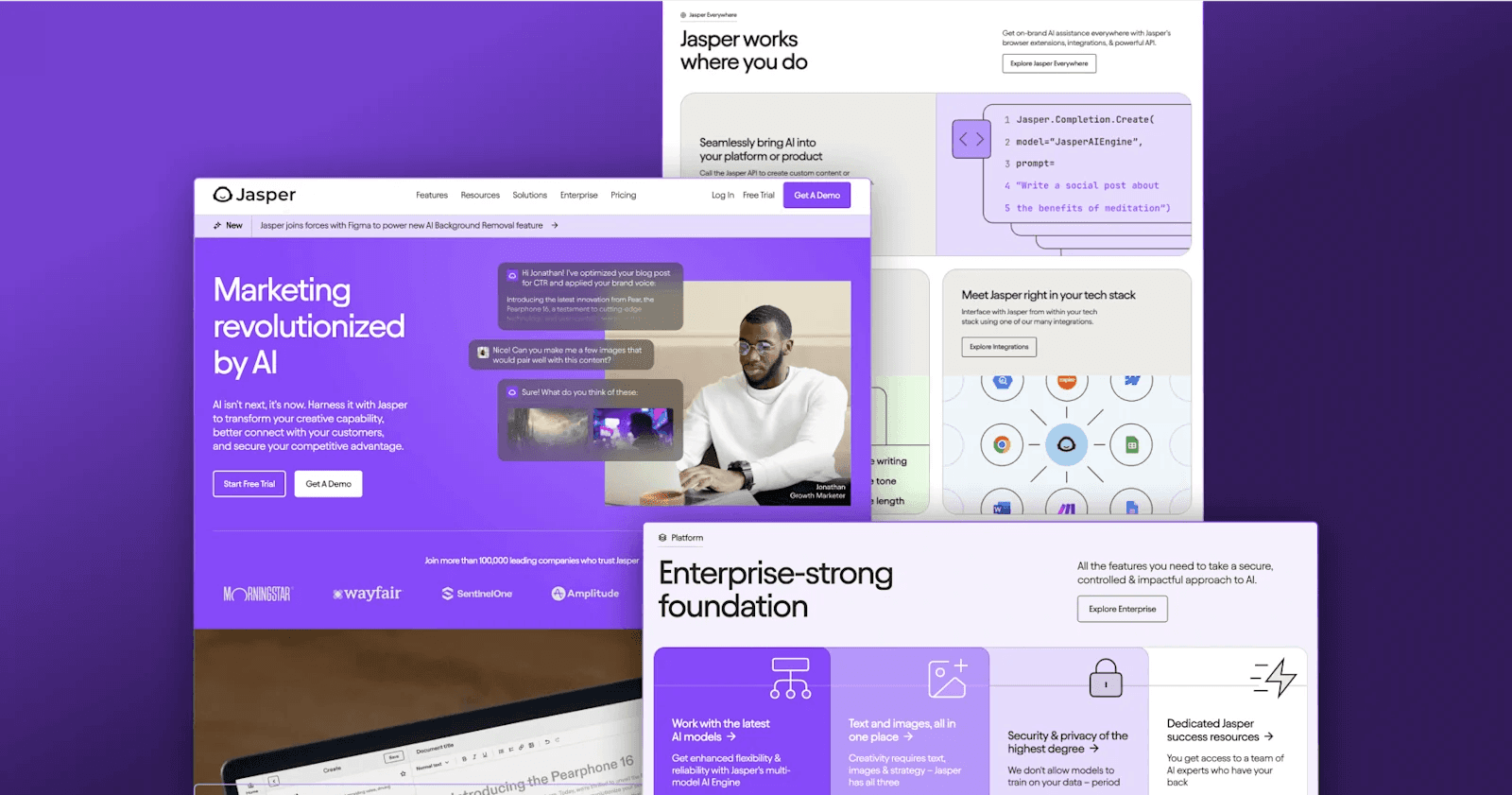
Jasper easily makes our list because of its strong brand identity and content marketing excellence. Through modern web design principles and highly tactical strategy, the Jasper website is a lead-generation machine.
Jasper has plenty of valuable content that empowers people to write better and faster. For example, their "Free AI Writing Tools & Generators" shows users how to leverage Jasper's AI tools for more than 30 different use cases from ad copy to YouTube video titles.
These are all designed perfectly with CTAs to drive signups from individuals, as well as demos for businesses.
Best of Jasper's Website
- Intuitive navigation menu
- Personality-rich, relatable copywriting
- Genius content strategy
- Quantitative results from clients
12. Arthur
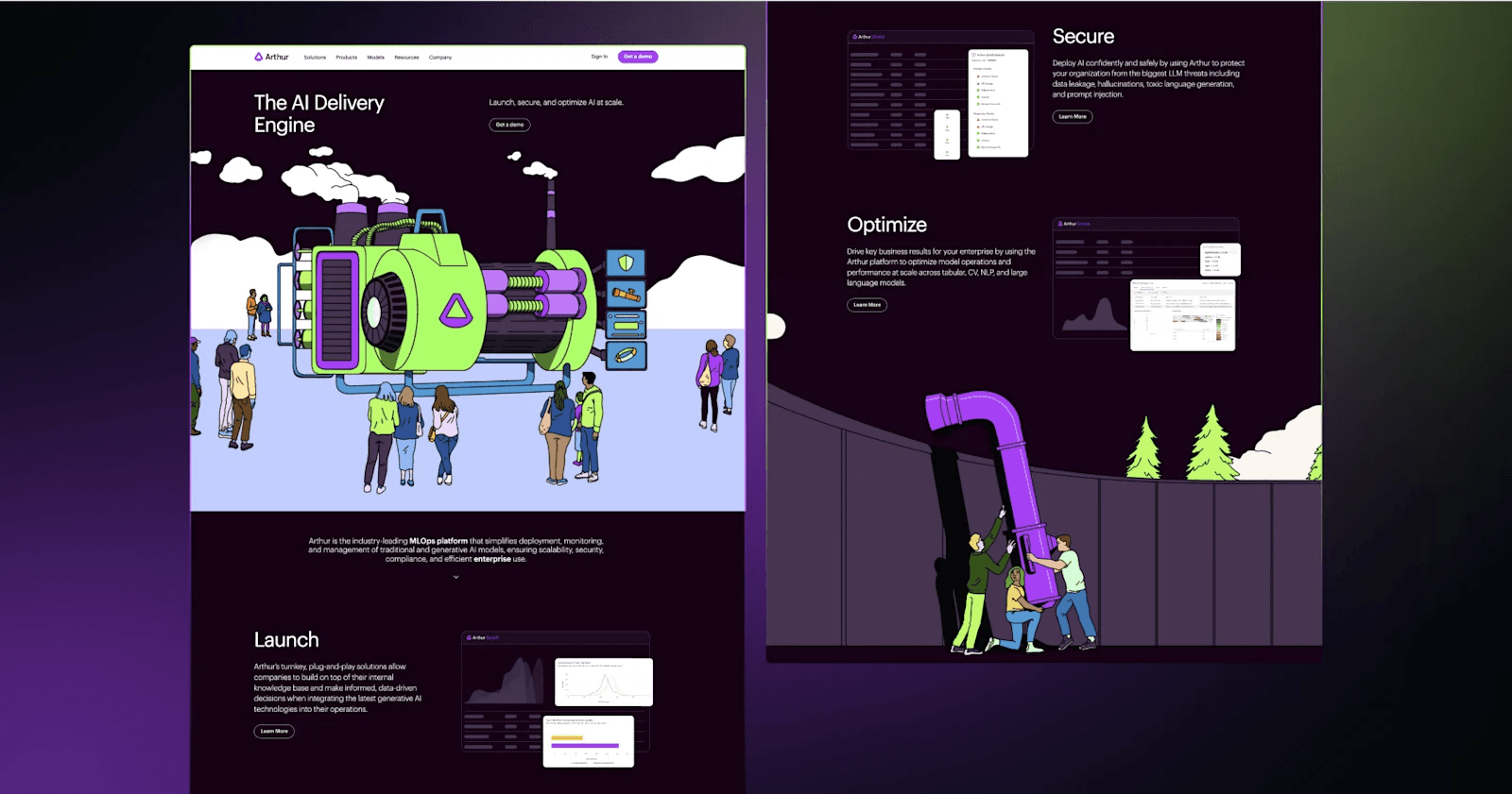
The AI delivery engine, Arthur, takes a cartoonish illustrative design approach that simplifies their innovative solutions. Their hero sections for each of the solutions and product pages are works of art that instantly grab your attention. Down each page, Arthur utilizes bold headings, dynamic product UIs, and relevant calls to action that extend the user journey.
Best of Arthur's Website
- Alluring drawings that integrate humans and futuristic tech
- Dark mode and neon colors
- Icons for visual cues
- Animated illustrations
13. Otter AI
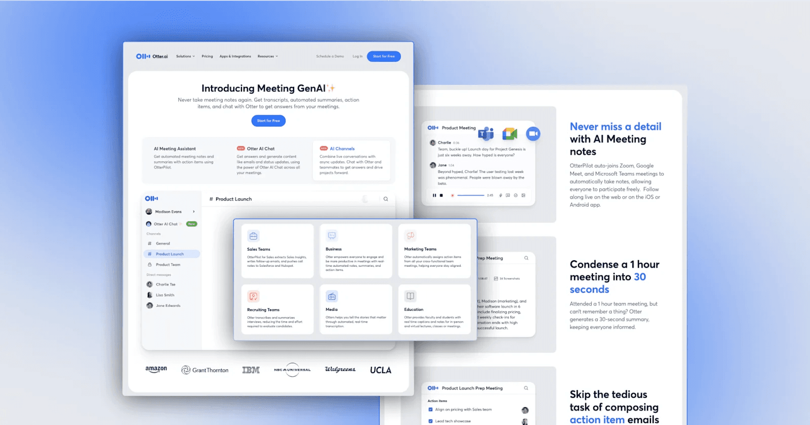
Otter.ai is a model for a not-so-flashy yet effective AI website. With insightful imagery and thoughtful copywriting, Otter.ai quickly establishes its value proposition of increasing meeting and collaboration efficiency with AI.
Best of Otter.ai's Website
- Intuitive SaaS pricing page design
- Meeting cost calculator
- Separate demo scheduling pages for each audience
- Client and press logos
14. LangChain
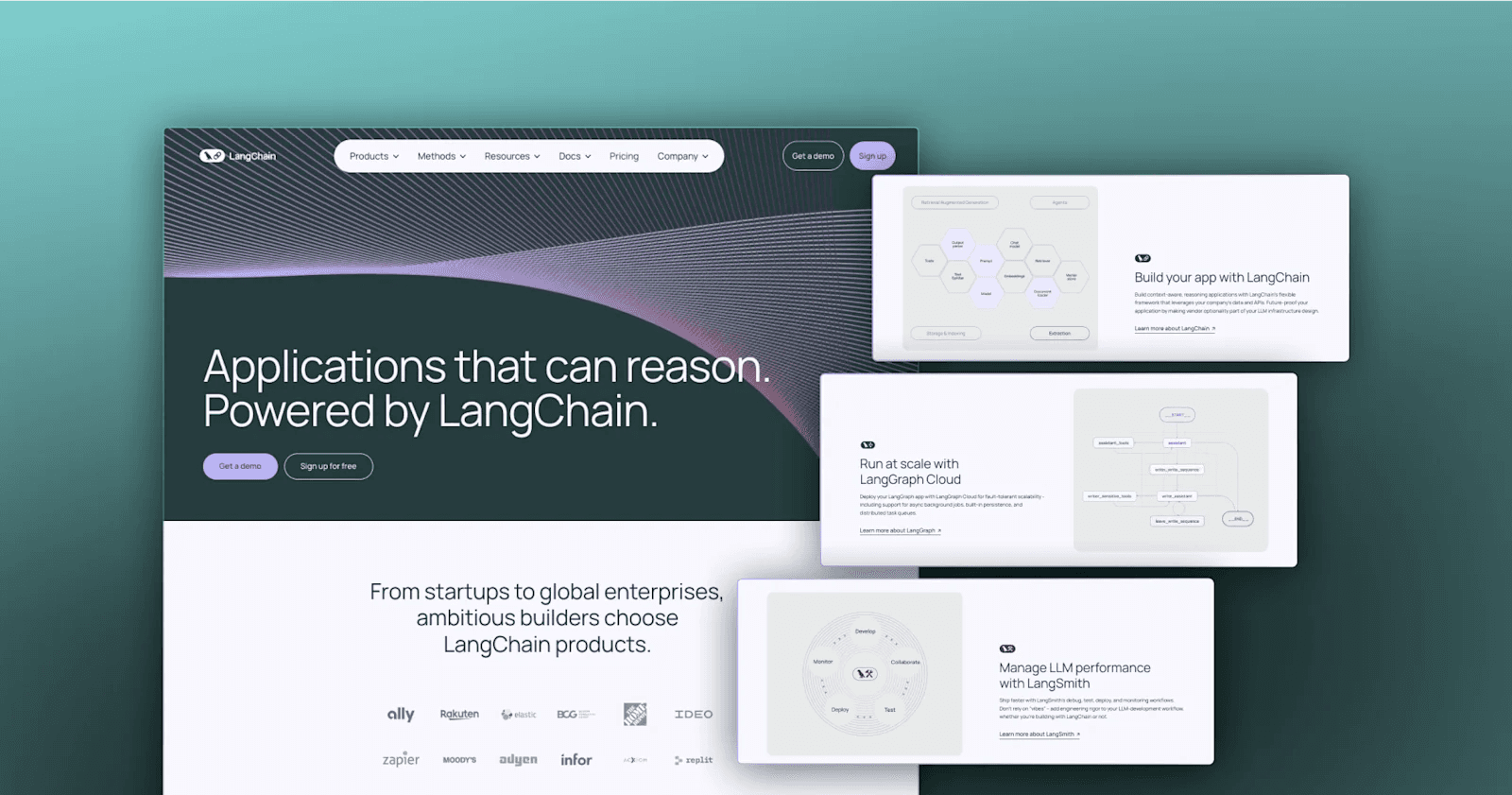
For those unfamiliar with LangChain, it is an open-source framework that helps developers build applications using large language models (LLMs). Abstract patterns, soft pastels, and ample use of white space are all common themes for LangChain's web design. Large, bold headings and concise text highlight essential information, making it easy for users to quickly understand the platform's benefits and features.
Best of Langchain's Website
- Designs that give pages dimensionality
- Prominent CTAs
- Hover states for buttons, linked text, and cards
15. Pika
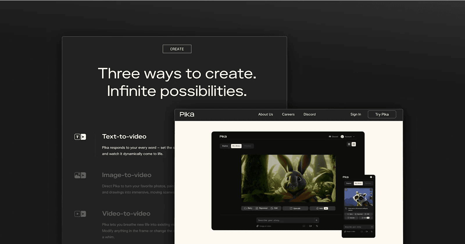
Pika is an AI startup that transforms your text and image prompts into short videos. Right from the homepage, Pika puts their product's endless imagination on display for users to admire. There are all kinds of videos from cartoon films to realistic videos. The copywriting is also very inspirational, aiming to intrigue even more. All in all, Pika effectively sells its platform by triggering fascination and creativity in its website visitors.
Best of Pika's Website
- Immersive scrolling effects
- Witty and comical copywriting
- Community video creations
16. Salt
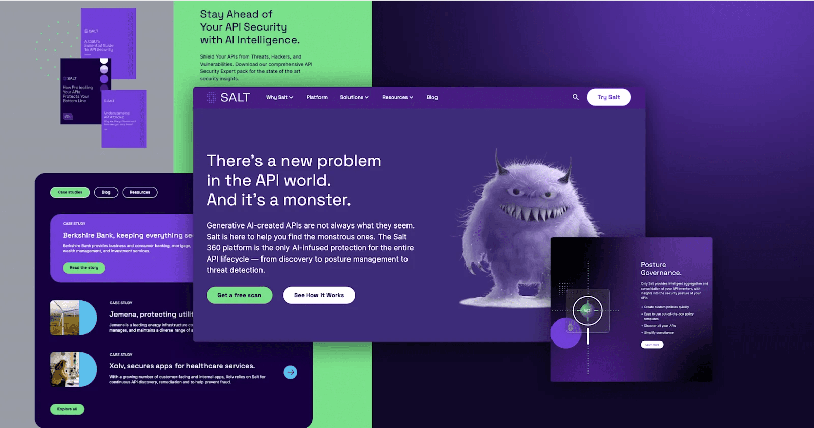
Here we have Salt and its API security monster. Salt is on a mission to detect and prevent API attacks, and the marketing site is an important platform for educating people on the threats their infrastructures currently face. Their website design has a sleek, contemporary look with a balanced color palette that combines professional tones with vibrant accents. Right from the homepage headline, Salt states the problem it solves but delivers it in a rather unconventional but compelling manner. When you are a prospective buyer dealing with these types of issues, this tone can be very enticing.
Best of Salt's Website
- Compelling "Why Us" page
- Memorable mascot
- Straightforward calls to action
Wrap-Up
There you have it – 16 of our favorite websites across the AI industry! We hope that you were able to get some inspiration for your web operations. AI/ML marketing teams looking for a partner to level up their online presence like Deepgram, OctoAI, and HeyGen should check out Webstacks – the premier web design and development agency for high-growth AI companies.
We build high-performance websites that help AI brands convert, compete, and grow.

I create SEO-driven content for B2B SaaS companies, from blog posts to case studies. I focus on research-backed writing that ranks on the first page and drives meaningful organic traffic.


