B2B SaaS Marketing Mistakes That Decrease Conversion Rates
The B2B SaaS marketing industry is undergoing changes but the pursuit of increasing conversion rates will remain a constant priority. By implementing CRO (conversion rate optimization) best practices, B2B SaaS marketers can optimize their marketing efforts to increase the likelihood of turning website visitors into paying customers.
Unfortunately, many B2B SaaS companies make several avoidable mistakes by not following CRO best practices, thus decreasing conversions instead of increasing conversions. In order to develop a solution, it's crucial to have a thorough understanding of the problem at hand.
For a seasoned conversion rate optimization professional, identifying best practices is a breeze, but for many B2B SaaS companies that lack CRO agency support, several mistakes occur.
Let's look at three common conversion rate optimization mistakes that don't follow best practices and how to avoid them to increase conversion rates with your B2B SaaS marketing efforts.
Mistake # 1 - Creating Cognitive Load On Users
Have you ever heard of hicks law? Hicks law is a principle that states the following:
"The more options available to a person, the longer it will take for a person to make a decision."
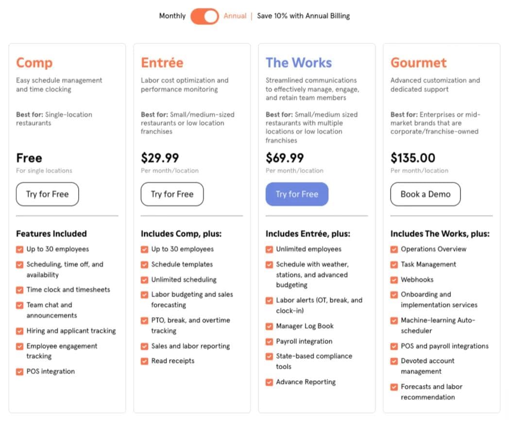
Looking at 7shifts pricing page, users may experience a cognitive overload when deciding which specific plan is best for their particular needs.
How B2B SaaS Companies Design Pricing Pages
Most B2B companies place too many details on the pricing page, making a complex purchase decision even more complicated due to all the package options provided.
Instead of offering all the immediate options available for each package, allow users to explore the specific details that pertain to their needs.
How to simplify pricing page options
If the user already has the price details, business fit (small, medium enterprise), and top-level overview of an offering, provide an option to expand product details as needed.
Don't assume that they need everything upfront. Users can only process so many things at once. For instance, compare the original pricing page with a mock design we created that features an accordion drop-down under each option:
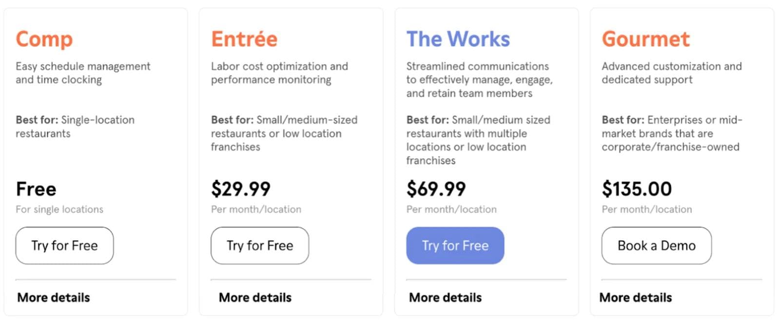
Users would click "More details " to gather more information about the service offering that pertains to them, simplifying the decision-making process vs. displaying every detail about each option.
Mistake # 2 No micro-conversion actions to retarget users
Defining micro-events to retarget users is often underutilized in B2B SaaS marketing which is unfortunate since retargeted visitors are 70% more likely to convert on a website compared to those who aren't targeted for the second time.
How to increase B2B SaaS leads
Retargeting users based on click events can increase B2B SaaS conversion rates. When users perform specific actions, audiences can be created based on the particular action performed to re-engage users to convert.
For example, when a user clicks on the "More details " CTA in the experience presented in the mock design shown above, an audience can be triggered to retarget users based on the specific service offering they have expressed learning more details about.
If you have one visitor who clicks the 'More details' CTA for the Comp package, and another who clicks the same CTA for the Entree package, you could retarget each of those visitors with messaging specific to the pricing package they engaged with.
How to set up retargeting & personalization for B2B SaaS marketing
When it comes to retargeting and personalization there are several effective strategies that could be deployed. Each tech stack will be different. Additionally, each specific goal will be different.
For example purposes we will walk you through the steps we use to set up retargeting and personalization. We use four platforms which are:
- GTM (Google Tag Manager)
- GA4
- Google Ads
- Mutiny
Here are the steps we take to set up personalization:
- Setup the GTM remarketing tag on the site experience.
- Define click events within GTM that will import data into GA4.
- Define audiences in GA4 based on the events set up in GTM.
- Connect Google Ads to GA4 to import data into Google Ads to define campaign ad groups.
- Lastly, we use Mutiny for audience personalization on key pages based on defined events.
While the process I have described may seem straightforward, developing a strategy that utilizes data to maximize the potential of every user visiting critical pages takes considerable time, expertise, and a significant amount of creativity.
If your B2B SaaS company needs help, call Webstacks. We can discover opportunities and create profitable personalization campaigns to aid your B2B SaaS marketing efforts.
Mistake # 3- Ignoring Sinistrodextral eye movement
Did you know web users spend 80% of their time viewing the left half of a web page and 20% viewing the right half?
So, when considering the layout of a web page, you have to understand that most users will view content from left to right.
What is Sinistrodextral eye movement?
Sinistrodextral eye movement is the principle that states the vast majority of people will view information from left to right.
Take a look at the Top Hat homepage. Where does your eye go first? The copy near the navigation? Perhaps the CTA’s positioned to the right corner? Perhaps immediately on the video that is centered in front of you.

Since the text, videos, and CTAs are centered, your eyes do not have a central focal point to digest information from left to right.
How to use CTAs and left alignment to increase B2B leads
Top Hat is an education company mentioning learning and try speaks to two different segments. Top Hat targets two primary segments: educators and students.
Educators would more than likely want to learn more before they try since they are making a purchase decision for several students. Therefore, they would want to look at all the options available for students hence “learning more”.
Students will more likely want to try before they learn more because they want a first-hand experience of what they will use to complete coursework.
B2B SaaS marketing that uses verbiage that speaks directly to segmented target prospects tend to convert twice as many users.
For Top Hat, the homepage could greatly benefit from an A/B split test that shifts the layout to a left alignment design and uses " Learn more " as a CTA prompt for educators and Try Top Hat for students.
Additionally, elevating the trust element component that is below the fold would be advantageous to solidifying trust. For instance, at Webstacks we would test the following layout against the control for the educator segment:
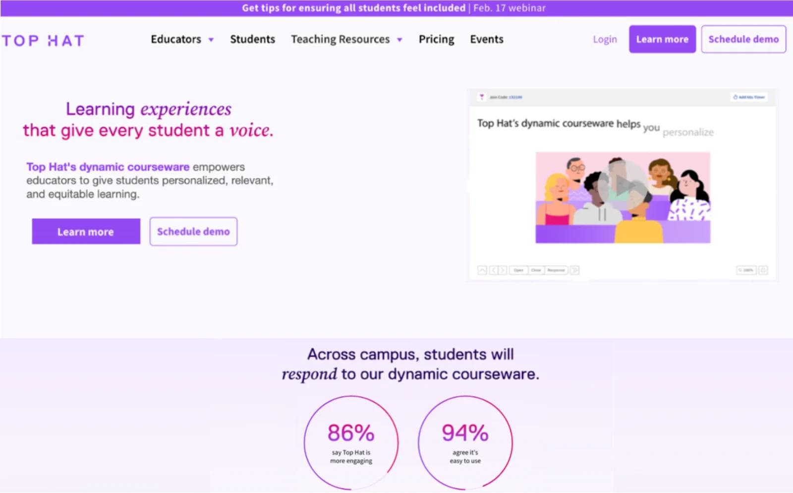
Do you see the difference between where your eye travels first with this experience?
In conclusion
Before immediately assuming that your B2B SaaS pages are optimized for conversions, always think about first impressions.
- Are you presenting too much upfront?
- Are you taking into consideration how a person will process information?
- Are you providing immediate value upon first impression?
If this sounds like you are establishing a relationship, it's because you are. Think about how you would like to be perceived, just like meeting someone for the first time because, in most cases, new user traffic is one-to-one to meeting a person for the first time. Leave a good impression and watch how your relationship evolves.

I lead our insights and optimization practice, specializing in conversion rate optimization and A/B testing. I've spent over a decade helping companies turn website traffic into measurable revenue.
