16 Best Demo Page Design Examples + Best Practices

Demo pages are essential for showcasing your product's features to potential customers. We'll explore their importance, effective structuring, top examples, and the role of A/B testing in optimizing performance.
In addition, we’ll analyze the design choices of 16 demo page examples from some of the best B2B tech websites.
Gated vs Ungated Demos
First, let's discuss the difference between gated and ungated demos. Choosing between these two approaches is crucial when designing demo pages for SaaS, as each has unique advantages and drawbacks. Understanding these differences will help you select the right strategy for your business.
Gated Demo
A gated demo requires users to provide some information or take a specific action before accessing it, typically by filling out a form with details such as name, email address, and company name.
Gated demos serve as lead-generation tools. By collecting user information, the company can follow up with potential customers, nurture leads, and tailor marketing efforts based on the provided details.
One significant advantage of gated demos is building a list of potential leads for targeted marketing and personalized follow-ups, which can improve conversion rates. However, requiring information upfront can deter some users and reduce immediate interactions, as the extra step of filling out a form may discourage engagement.
Ungated Demo
An ungated demo allows users to freely access and explore the demo without registration. This frictionless approach focuses on immediate user engagement and showcasing the product's capabilities, leading to higher overall engagement and a better understanding of the product.
However, it limits lead generation opportunities since no user information is collected upfront, requiring alternative strategies for follow-ups. If lead generation is a priority, a gated demo might be better. For maximizing engagement and providing a seamless experience, an ungated demo is preferable.
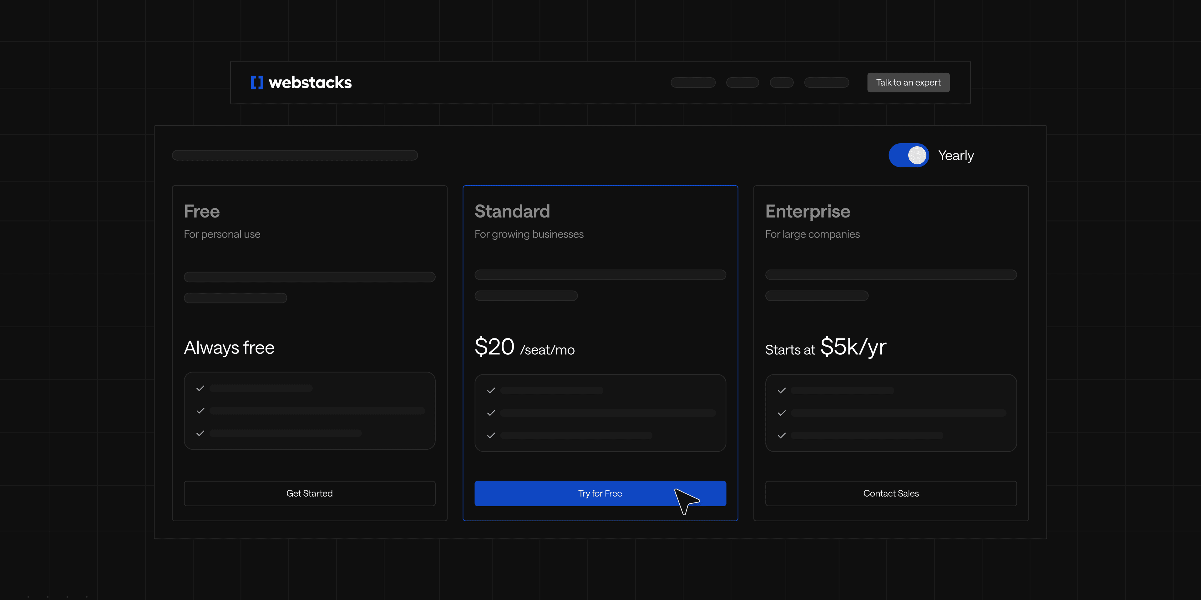
Webstacks websites don’t just look good—they scale with you and drive real results.

Choosing Between Gated and Ungated Demos:
The decision to use a gated or ungated demo depends on your SaaS company's marketing and sales strategy. Key considerations include:
- Lead Generation Goals: If building a lead database is crucial, a gated demo effectively captures user information for personalized follow-ups and nurturing leads.
- User Experience Focus: For a seamless, user-friendly experience that maximizes demo usage, an ungated demo allows users to explore the product without barriers.
- Sales Funnel Strategy: Positioning the demo in the sales funnel can dictate the approach. Ungated demos work well at the top of the funnel for initial engagement, while gated demos may be better suited for lead qualification.
- Target Audience Preferences: Consider whether your audience prefers the convenience of ungated access or is willing to provide information for additional benefits.
Align the choice with your overall marketing and business objectives, balancing lead generation with user experience. Some companies may offer both options to meet diverse user preferences.
3 Key Elements to Craft a Demo Page
Creating an effective demo page is essential for showcasing your SaaS product and converting visitors into customers. Here are three key elements to design a compelling demo page:
- Showcase Your Product’s Capabilities
Like your product pages, showcase your offering’s core features using screenshots, videos, and interactive elements. Demonstrate how your product solves problems or improves workflows, helping users navigate and explore without feeling overwhelmed. - Intrigue Potential Customers
Capture interest with a strong headline and engaging content. Use storytelling to highlight unique selling points and incorporate social proof. Ensure the design is visually appealing with a clean layout and high-quality graphics. - Drive Conversions
Guide users to take action with clear, compelling CTAs. Simplify the sign-up or contact process and offer incentives like free trials or special offers to encourage conversions.
By showcasing capabilities, intriguing potential customers, and driving conversions, your demo request pages can effectively turn visitors into loyal customers. Now, let’s dive into some examples.
See what’s working for industry-leading websites and find inspiration to improve yours.

Demo Page Examples
Today, we'll explore several different SaaS product demo page designs, each with unique approaches to showcasing a product. These examples highlight the diversity in design and strategy that SaaS companies use to engage potential customers and demonstrate their product's value. By diving into these get a demo page examples, you can gain inspiration and insights for creating or improving your own!
ClickUp

We’re starting this list strong with this compelling demo page design by ClickUp, one of today’s leading productivity platforms.
This demo page design excels in drawing the user in with inviting copywriting and a demo explainer video right above the fold. If you’re still unsure that their workflow solution is for you, ClickUp cleverly provides informative use cases on the same page. Now, site visitors can quickly see how ClickUp helps managers, teams, and executives, which can increase the likelihood they click on eh free product demo.
Key demo page elements we love from ClickUp:
- Straightforward headline paired with a compelling subheading that emphasizes the free offering
- A concise explainer video above the fold
- Informative use cases for how Clickup’s product makes the workday better.
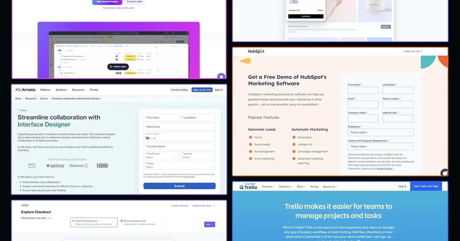
Trello

Let’s get into Trello and its demo page design that exceptionally demonstrates their project management software.
We admire Trello’s clean demo page design, which includes only essential elements like an explainer video and prominent CTAs to encourage sign-ups. Further down the page, interactive benefit sections communicate the value of Trello’s workflow solutions. Users have ample opportunities to convert, thanks to numerous CTAs that encourage them to learn more about each solution. Extra kudos go to the playful, on-brand product illustrations that capture the attention of potential customers.
Amazing demo page aspects we admire from Trello:
- Sleek hero section with an explainer video and prominent CTA buttons.
- Colorful product illustrations that excite and engage users
- Company testimonials that show proven success from Trello’s products
Stripe

If you’re looking for a more unique SaaS demo page design, look no further than Stripe’s checkout page product demo design.
Instead of a traditional demo page, Stripe offers an interactive walkthrough for their payment checkout page demo. Users begin by selecting their use case and then customize their checkout page based on their business needs. This personalized approach helps users see how Stripe’s payment solutions can be tailored to their specific requirements, making it easier to understand the product’s value.
Standout demo page features from Stripe:
- An interactive demo experience that engages users with hands-on features
- Main CTAs to create an account and explore the docs are always visible at the top
- Sleek product illustrations that show Stripe’s user-friendly checkout page solutions
Retool

Here’s another standout SaaS demo design example from Retool and their “Try Retool” demo page.
Retool’s page excels with motion illustrations that animate key features, making the demo dynamic and informative. Multiple CTAs guide users through solutions, pricing, and integrations, ensuring easy exploration of all product aspects. Additionally, the captivating trust bar showcasing renowned Retool customers adds credibility, highlighting that industry leaders trust the product. These elements combine to create a user-friendly experience, making Retool's demo page a must-see.
Key aspects from Retool’s demo page:
- Engaging motion illustrations
- Multiple CTAs to learn about solutions, pricing, and integrations
- Captivating trust bar featuring renowned Retool customers
Monday.com

We’re featuring Monday.com for its innovative approach: using its high-traffic blog as a demo format. The blog article title clearly reflects its content, presenting a demo in a blog format—such a unique idea!
The main heading includes a CTA button for signing up, targeting the broad audience of the Monday blog rather than a specific persona. This approach offers multiple conversion opportunities throughout the article, increasing the chances for readers to engage and convert.
What we like from this experience:
- Using the blog as a medium for conversions
- Multiple conversion points throughout the details page
- Engaging videos and illustrations displaying the product
Square

Square is an integrated system and device offering small and medium-sized businesses a way to accept credit and debit card payments, manage appointments, and more. The demo page we’re featuring is for Square’s POS (point of sale) software that enables users to sell anywhere at any time.
Advertised as a new system for current and future Square customers, users can see the software in action on the switcher component featuring – from checkout to adding customers to handling and managing transfers. Users can toggle between use cases and view the dynamic content showcasing how POS works.
In addition to this interactive component, the demo page includes an additional resources section, FAQs, and transparent pricing cards with CTAs for users interested in learning more.
What we like about Square’s demo page:
- Interactive switcher component paired with dynamic content
- Multiple conversion points for the demo and other marketing materials
- Transparent pricing and FAQs
Mutiny

Mutiny put together a tailored product tour experience for prospects looking to increase website conversions. The demo page experience is powered by Navattic, which allows website visitors to get a full product tour without exiting the page.
Mutiny’s demo page is a simple, direct demo experience that doesn’t hide anything. The visitor gets the product tour and can easily get started in seconds.
What we appreciate about Mutiny’s demo page:
- Branded demo page containing Mutiny branding elements
- Interactive product demo powered by Navattic.
- Simple page, with multiple conversion points to drive the action.
BONUS NOTE: Webstacks helped Mutiny with the design of the product experience – read about our engagement.
See what’s working for industry-leading websites and find inspiration to improve yours.
Demo Form Landing Page Examples
These types of demo pages are primarily geared towards lead generation through demo request form submissions. As you’ll see through these unique demo form landing pages, different SaaS brands use distinct formatting and additional content to boost conversion rates. By examining these approaches, you can uncover effective demo page form strategies used by SaaS brands to capture user information and convert prospects into qualified leads.
Toast

Toast, a leading provider of POS solutions, offers a compelling demo request form for their SaaS product. The page effectively captures potential customers' interest by clearly outlining the benefits of their POS system.
Key features such as inventory management, online ordering, and integrated payment processing are highlighted, making it easy for visitors to understand the value proposition. The form is straightforward, requiring only essential information, which reduces friction and encourages completion.
What we like about Toast's demo landing page:
- Clear, concise messaging
- Highlight of key features
- Simple, user-friendly form
- Incentive with a promotional discount
Osano

Osano’s demo request page is a standout example of an effective SaaS landing page, designed to captivate and convert potential customers seamlessly. By placing a clear and prominent "Request a Demo" button front and center, Osano ensures that users can easily take action.
The page effectively communicates the company’s core benefits, including comprehensive data privacy solutions and streamlined compliance management, through concise and engaging supporting text. This text highlights key features such as automated privacy management and risk assessment tools, which are crucial for businesses aiming to stay compliant with data regulations.
The user-friendly design further enhances the experience, guiding visitors through the demo request process with ease and maintaining focus on their needs.
What We Like About Osano’s Demo Landing Page:
- Messaging has a compelling value proposition without overwhelming visitors with too much information.
- Intuitive design ensures that users can quickly find and complete the demo request form.
- Clean, professional look aligns well with Osano’s brand and builds trust with potential customers.
UpKeep

UpKeep’s demo request landing page is designed to attract and convert potential customers with ease. The page is well-structured, featuring a clear and inviting call-to-action button that encourages visitors to "Request a Demo."
UpKeep effectively communicates its value proposition by highlighting key features, such as real-time asset management, streamlined maintenance workflows, and user-friendly mobile access. The supporting text showcases how UpKeep’s solutions can help organizations enhance operational efficiency and reduce downtime, making it clear why their platform is a valuable tool for asset management.
What We Like About UpKeep’s Demo Landing Page:
- UpKeep introduction video is a great example of supporting content.
- Communicates the benefits of UpKeep’s platform, emphasizing features like real-time management and mobile access.
- Social proof slider features real testimonials from UpKeep customers.
Jasper

Jasper’s landing page example is designed to capture and convert potential leads efficiently. The page features a prominent "Request a Demo" button, making it easy for visitors to take the next step. Jasper effectively communicates its core value proposition through engaging supporting text that highlights its AI-driven content generation capabilities.
Key features such as customizable templates, advanced AI writing tools, and integrations with popular platforms are showcased, illustrating how Jasper can streamline content creation and boost productivity for users.
The design is clean and visually appealing, guiding users smoothly through the demo request process.
What We Like About Jasper’s Demo Landing Page:
- "Request a Demo" button is strategically placed for easy access, encouraging immediate action.
- Value prop clearly outlines Jasper’s benefits, emphasizing its AI-driven features and productivity enhancements.
- Clean and modern layout ensures a seamless user experience, making it easy to request a demo.
Airtable

Airtable’s demo request page excels with its strategic design and clear messaging. The prominent "Request a Demo" button encourages immediate action. The page highlights Airtable’s value proposition by showcasing its intuitive Interface Designer and customizable permissions for enhanced team collaboration and project management.
Overall, the page combines compelling messaging with a user-friendly design, featuring a well-organized categories section that aids navigation and helps users discover how Airtable meets their needs.
What We Like About Airtable’s Demo Landing Page:
- Social proof is established on the left-hand side of the page.
- The value proposition clearly communicates the features and benefits.
- Engaging categories section allowing visitors to quickly navigate and find relevant information.
ServiceTitan

Did someone say free gift card? ServiceTitan’s demo request is a perfect example of an incentivized demo landing page. The experience exemplifies user-centric design with thoughtful features. The form uses progressive disclosure to present relevant fields based on user input, preventing overwhelm – and the user knows what they will get in return after attending the meeting.
Its clean layout and ample white space keep users focused, while real-time validation helps correct errors, reducing frustration. The form collects contextual details like role and company size to tailor the demo to specific needs. Additionally, customer testimonial snippets and client logos near the form build credibility and trust.
Standout features from ServiceTitan’s demo landing page:
- Reduces user overwhelm by only displaying relevant fields.
- Enhances focus and usability with ample white space and a visually appealing design.
- Helps users correct errors on-the-go, ensuring accurate submissions.
- Allows for personalized demos by asking for role and company size.
- Builds trust with testimonial snippets and client logos near the form.
HubSpot

HubSpot’s demo request page showcases an effective SaaS landing page with its streamlined and engaging design. The prominent "Get a Free Demo" button captures attention and encourages action.
The user-friendly form collects essential information without overwhelming users and includes a brief description of what to expect, setting clear expectations and boosting conversion likelihood. The clean, modern layout with clear headings and ample white space guides users smoothly through the form.
Additionally, social proof, including customer testimonials and trusted company logos, adds credibility and reassures potential customers about the demo’s value.
Things we like about HubSpot’s demo page:
- CTA button is easily noticeable and encourages immediate action.
- Form experience asks for essential information only, reducing user overwhelm.
- Provides a brief description of the demo, setting clear expectations.
- Utilizes clear headings and ample white space for an easy navigation experience.
- Includes customer testimonials and trusted logos to build credibility and trust.
Quickbooks

QuickBooks’ product tour request page is an effective SaaS landing page with its user-friendly and engaging design. The prominent "Request a Product Tour" button immediately draws attention and encourages action.
The simple, concise form collects essential information, making the request process straightforward. A brief overview of the tour sets clear expectations, increasing engagement. The clean, modern layout with clear headings and organized sections guides users smoothly through the form while highlighting QuickBooks Enterprise’s key features for managing finances and enhancing operational efficiency.
Why Quickbooks made our list:
- CTA button is prominently displayed, encouraging immediate user engagement.
- Form experience asks for essential information, keeping the process straightforward and user-friendly.
- Video overview of what users will experience during the product tour.
Goldcast

Goldcast’s demo request page features an engaging, user-centric design with an interactive switcher at the bottom, capturing visitor interest effectively.
The prominent "Request a Demo" button encourages action, and the concise form collects only necessary information, with a brief description setting clear expectations. The clean, modern layout with clear headings guides users smoothly through the form. The interactive switcher enhances engagement by allowing users to explore different product aspects dynamically.
What we like about Goldcast’s page:
- Summary description of the demo to set clear expectations.
- Utilizes clear headings and a clean design for smooth navigation.
- Enhances engagement by allowing users to explore different product features interactively.
Iterating and Testing Your Demo Page
A/B testing is a key practice for maximizing conversions on demo pages. By testing different elements, you can identify what works best for engaging visitors and driving them to take action. This iterative process helps you refine your demo page, ensuring it effectively showcases your product and converts visitors into leads and customers.
Key Elements to A/B Test on a Demo Page
Here’s a list of important elements to A/B test on a demo page.
📞 Call-to-Action (CTA) Buttons:
It’s best to test the color of your CTA buttons (contrasting vs. complementary) and different text variations ("Start Free Trial" vs. "Get Started") to see what attracts more clicks. Additionally, experiment with the size and placement of your CTA buttons to maximize effectiveness.
📝 Form Fields (for Gated Demos):
To balance information collection and user friction, make sure to test the number of form fields for gated demos. Experiment with placeholder text, labels, and form submission button styling to enhance user experience and encourage form completion.
📰 Headlines and Subheadings:
Testing different headline variations can significantly impact conversions by ensuring your message is clear and compelling. Experiment with subheading content and placement to improve user engagement and guide visitors through your demo page effectively.
📹 Hero Image or Video:
Different visuals resonate with different audiences, so it’s best to test your images or videos in your hero section to see which resonates best. Also, compare static images versus video backgrounds to determine what captures attention and conveys your product's value most effectively.
🧭 Navigation and Page Layout:
It’s vital to test different page layouts and structures to find the most intuitive and engaging format for your demo content. A great place to start is experimenting with navigation element placement and styles.
✏️ Content-Length and Depth:
Explore how variations in content length—whether more concise or longer and more detailed—impact user engagement. Find the optimal balance that provides sufficient information while keeping users interested without overwhelming them.
🤝 Trust Indicators:
Evaluate how different placements and designs of trust elements, such as trust bars and customer testimonials, affect user trust. Consider incorporating industry certifications or partner logos to enhance credibility and drive conversions.
🎨 Color Scheme:
Experiment with various color schemes to identify the most visually appealing and effective combinations. Examine how different colors impact CTAs, headlines, and background sections to ensure a cohesive and attractive design.
🔡 Typography:
Test a range of fonts, sizes, and line spacing to improve readability and visual appeal. Assess different font styles for headers, body text, and CTA buttons to optimize the user experience.
⬜️ Whitespace and Padding:
Assess how varying amounts of whitespace around key elements affect page clutter and readability. Experiment with different padding and margin settings to enhance the layout and focus of your demo page.
👉 Interactive Elements:
Investigate the impact of incorporating interactive features like sliders and accordions on user engagement. Test various timing and triggers for pop-ups or tooltips to present additional information effectively and maintain user interest.
❌ Exit Intent Pop-ups:
A/B test exit intent pop-ups to see which designs and content keep users on the page longer. Experiment with different offers or incentives to reduce bounce rates and increase conversions.
Webstacks websites don’t just look good—they scale with you and drive real results.
Rethinking Your Demo Page Design and Strategy
Investing in and rethinking your demo page design is crucial for maximizing conversions and revenue. A well-crafted demo page can significantly boost conversions and support your sales team by effectively engaging prospects.
By applying best practices, conducting A/B tests, and continuously optimizing, you create a compelling experience that showcases your product effectively. This strategic investment leads to higher engagement, improved lead quality, and stronger sales performance.
See what’s working for industry-leading websites and find inspiration to improve yours.