How To Future Proof Your Website in 2025

Technology is in a constant state of evolution, and businesses cannot afford to be complacent when it comes to their online presence.
A website that once served you well can quickly become outdated, impacting both your credibility and efficiency. So, how can you create a website that not only meets your current needs but also adapts to future challenges?
This article explores essential strategies for future-proofing your website, ensuring it remains effective and relevant for years to come. By taking a proactive approach, you can safeguard your online presence and keep up with the competition.
Key Takeaways
- Understand the importance of future-proofing your website for long-term success
- Explore scalable and flexible technologies to ensure your website can adapt to changes
- Optimize your website for performance and speed to provide a seamless user experience
- Embrace SEO best practices to maintain visibility and relevance in search engines
Importance of Future Proofing a Website
A website's success depends on its ability to adapt to new technologies and changing user behaviors. If a website doesn't evolve, it can quickly become outdated, harming a business's credibility and efficiency.
Future-proofing a website is essential because it helps businesses keep up with digital changes. A website must not only meet current user expectations but also anticipate future needs. For example, in Q1 2017 which was the first time mobile traffic surpassed traffic from desktop computers. By doing this, businesses can provide a better user experience, which leads to higher customer satisfaction and loyalty.
Additionally, it’s important to regularly check the tools and platforms used on the website to ensure they remain secure, functional, and visible in search engines.
Through future-proofing a website, businesses can enjoy a range of benefits, including:
- Increased website longevity and adaptation to new technologies
- Improved business credibility and operational efficiency
- Enhanced competitiveness through a superior user experience
- Maintained security, functionality, and search engine visibility
Investing in the future-proofing of a website is a strategic decision that can pay dividends in the long run, ensuring the continued relevance and success of a business.
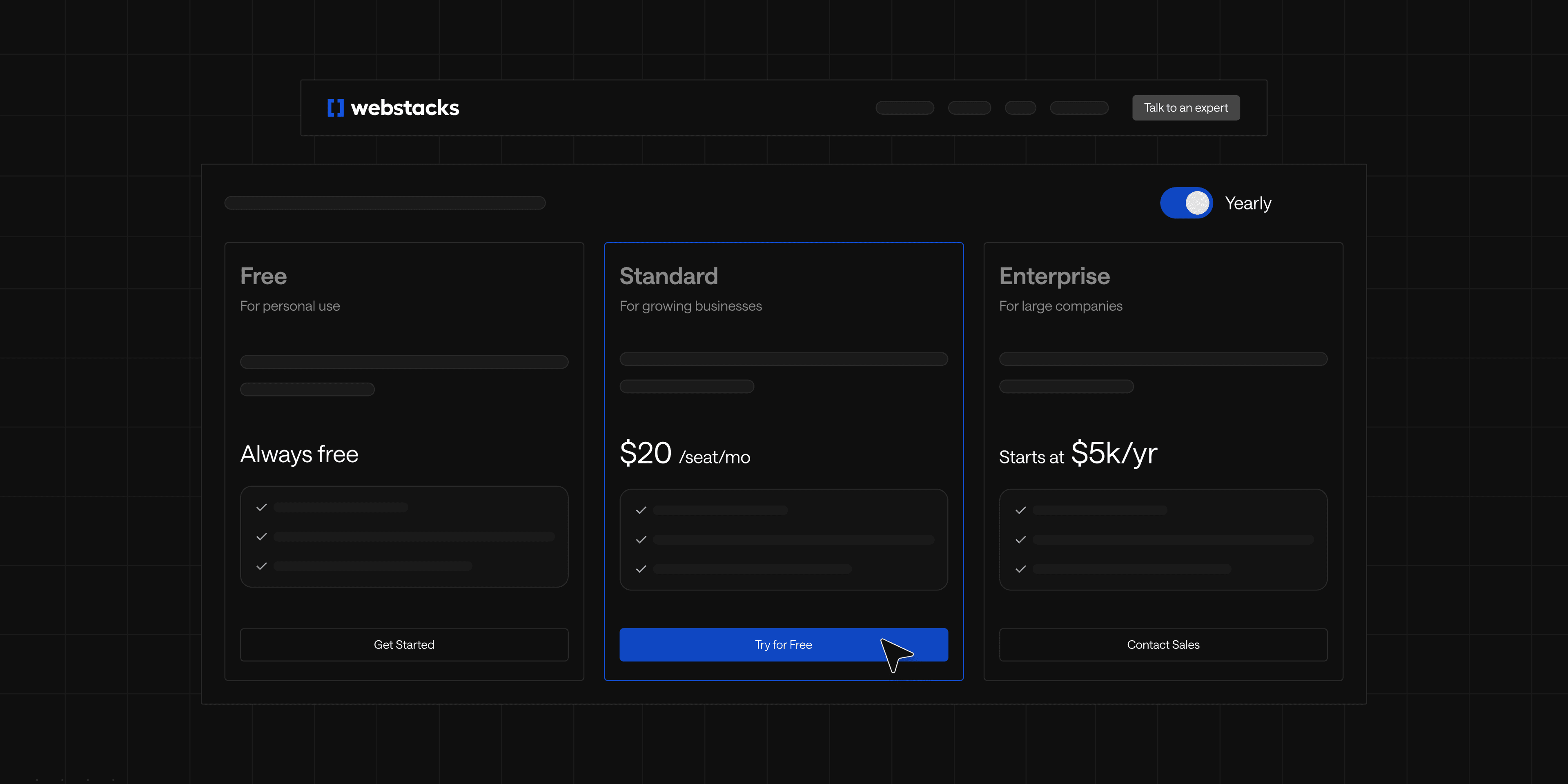
Choosing Scalable Technology
To future-proof your website, selecting the right tech stack is crucial. This begins with choosing a flexible Content Management System (CMS) that can grow with your business.
Selecting a Flexible CMS
When choosing a CMS, look for one that offers:
- Modular and Scalable Technology: A CMS that supports a modular architecture allows you to easily add or remove features as your business needs change. This ensures your website remains agile and responsive to evolving user demands.
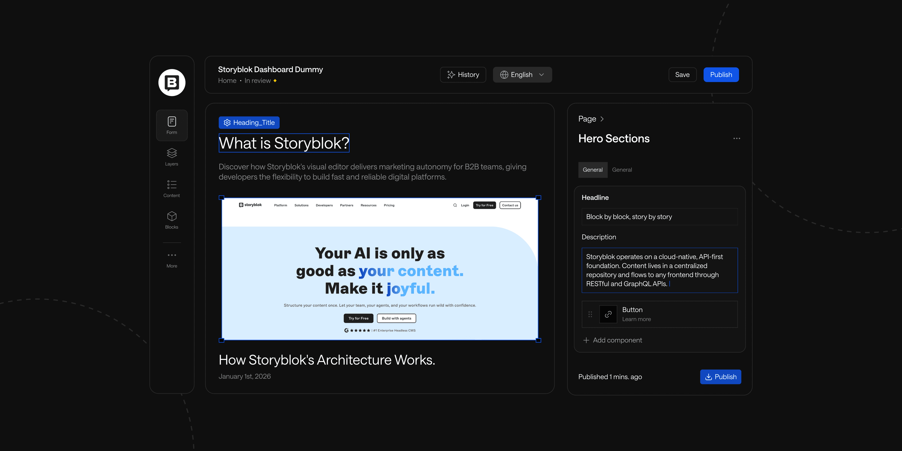
- Integration Capabilities: Strong integration with third-party tools and services is essential. A headless CMS, for example, decouples the front-end presentation layer from the back-end content management, allowing for seamless integration with various platforms and technologies. This flexibility enables you to deliver content across multiple channels, such as websites, mobile apps, and IoT devices, without being tied to a specific front-end framework.
- Active Developer Community: A CMS with a thriving community can provide support, resources, and plugins that enhance functionality. Regular updates and security patches are vital for maintaining the integrity of your website.
Avoid costly mistakes and last-minute surprises by preparing with our actionable checklist.

Using Modular Design Principles
Adopting modular design principles can significantly enhance the flexibility and scalability of your website. By breaking your site down into reusable components, you can easily adapt and rearrange content and functionality as needed. This approach, known as atomic design, includes:
- Atoms: Basic elements like buttons and input fields.
- Molecules: Simple groups of UI elements that work together.
- Organisms: More complex components made from molecules and atoms.
- Templates and Pages: Structured layouts that organize these components into cohesive designs.
80% of web developers believe that modular website design is the best approach for creating a successful website. This modular approach allows you to keep pace with industry trends and user preferences while ensuring a consistent design across your website.
Ensuring Responsive and Adaptive Design
With users accessing websites on various devices, responsive and adaptive design is essential. This involves:
- Flexible Layouts: Use grid systems that adjust to different screen sizes.
- Media Queries: Apply different styles based on device characteristics.
- Mobile-First Approach: Design for mobile users first, ensuring a seamless experience across all devices.
Regular Security Audits
Maintaining your website's integrity and performance requires ongoing vigilance. Conduct regular security audits of your technology stack and third-party services to identify and address vulnerabilities. Key practices include:
- Automated Vulnerability Scans: Use tools to regularly check for security issues.
- Software Updates: Keep your CMS and plugins up to date to protect against threats.
- Backup Solutions: Regularly back up your website to safeguard against data loss.
By focusing on these areas and incorporating a headless CMS where appropriate, you can build a website that is not only ready for the future but also adaptable to the changing needs of your business and its users. This strategic approach ensures your online presence remains effective and competitive for years to come.
Optimizing for Performance and Speed
A future-proof website must prioritize performance and speed to provide users with a seamless and engaging experience. Through optimizing for website performance and speed, you can future-proof your online presence and ensure it remains accessible and responsive, even as internet connectivity and device capabilities continue to advance.
Leveraging Content Delivery Networks (CDNs)
One of the most effective ways to improve website load times is by utilizing Content Delivery Networks (CDNs). CDNs cache your website's content, such as images, CSS, and JavaScript, on servers located around the world.
When a user accesses your website, the content is served from the nearest server, reducing latency and delivering a faster loading experience, regardless of the user's location.
Image Optimization Techniques
Images are a crucial component of most websites, but they can also be a significant contributor to slow loading times.
Implementing image optimization techniques, such as compression and lazy loading can reduce the file size of your images without compromising their quality.
This is crucial as 47% of consumers expected a website to load in 2 seconds or less. Image optimization not only enhances website performance but also ensures your website remains visually appealing and engaging for users.
Minimizing and Compressing Code
Optimizing your website's code, including HTML, CSS, and JavaScript, can also play a vital role in improving its performance and speed.
Minimizing the amount of code, removing unnecessary elements, and compressing the remaining code, can significantly reduce the overall file size and the time it takes for the website to load, contributing to a more responsive and future-proof online presence.
Embracing SEO Best Practices
Keeping your website future-proof means staying ahead of the curve when it comes to search engine optimization (SEO) best practices.
Adapting your strategy to align with the latest trends and algorithms is crucial for maintaining a strong online presence.
Mobile-First Indexing
Over 60% of website traffic comes from mobile devices. As a result, with the rise of mobile-first indexing, ensuring your website is optimized for mobile devices is no longer a nice-to-have, but a necessity.
This means optimizing your website's navigation, layout, content, and user experience to provide a seamless experience for users accessing your site on the go.
Structured Data and Schema Markup
Implementing structured data and schema markup can significantly enhance the way your content is understood and displayed by search engines. Providing detailed information about your web pages, you can increase the likelihood of your content appearing in search results, ultimately improving visibility and click-through rates.
Regular Content Updates and Audits
Maintaining a future-proof website also involves regularly updating and auditing your content to keep it fresh, relevant, and aligned with user search intent. Continuously evaluating your content strategy and making necessary adjustments can ensure your website remains a valuable resource for your target audience and continues to rank well in search results.
Embracing SEO best practices, staying on top of the latest trends, and adapting your strategy accordingly can future-proof your website's online presence and drive sustainable growth in the years to come.
Enhancing User Experience (UX)
To future-proof your website, prioritizing user experience (UX) for conversions is paramount.
By adopting a user-centric design approach, you can ensure your online presence remains engaging and relevant over time. Simplicity and intuitive interactions should be the guiding principles as you strive to create a seamless user journey.
User-Centric Design
Placing the user at the heart of your website's design is crucial for long-term success. UX design is proven to have great ROI with every dollar spent developers see a return of $100.
Focus on understanding your target audience's needs, preferences, and pain points. Implement a minimalist design philosophy that eliminates clutter and emphasizes clarity.
To implement user-centric design:
- Conduct user research to understand your audience's needs, preferences, and pain points
- Create user personas to guide design decisions
- Implement a minimalist design philosophy to reduce clutter and emphasize clarity
- Use heatmaps and user session recordings to identify areas for improvement
- Regularly collect and act on user feedback
Accessibility Compliance
Making your website accessible to users with disabilities broadens your audience and future-proofs your online presence. In 2023, 2,281 website accessibility lawsuits were filed, highlighting the importance of this aspect. Key accessibility features include:
- Alt text for images
- Keyboard-navigable menus
- Clear contrast ratios
- Proper heading structure
- Closed captions for video content
- ARIA labels for dynamic content
Adhere to Web Content Accessibility Guidelines (WCAG) and aim for at least AA compliance.
Intuitive Navigation and Layout
An intuitive website structure is crucial for a future-proof user experience. To achieve this:
- Organize content and functionalities logically
- Use clear, consistent labeling for navigation menus
- Implement a search function with autocomplete features
- Use breadcrumbs to help users understand their location within the site
- Limit the number of main navigation items (aim for 5-7)
- Ensure the site adapts smoothly across devices using responsive design principles
Using Analytics and Data
Making use of website analytics and data-driven insights is crucial for future-proofing your online presence. Implementing strong tracking and analytics tools, you can gain a deeper understanding of your users' behavior, content performance, and overall website effectiveness.
Implementing Tracking and Analytics Tools
Integrating advanced analytics platforms, such as Google Analytics or Adobe Analytics, can provide you with a wealth of data about your website's traffic, user engagement, and conversion rates.
These tools offer a comprehensive view of your website's performance, empowering you to make informed, data-driven decisions.
Data-Driven Decision Making
Adopting a data-first approach to managing your website allows you to prioritize the needs and preferences of your users. Closely analyzing website analytics can identify pain points, optimize content, and refine your marketing technology strategy to ensure your website remains adaptable and responsive.
A/B Testing and User Feedback
- Regular A/B testing enables you to experiment with different website elements, such as design, content, or functionality, and determine which variations resonate best with your audience. It has been found that A/B testing can help improve customer retention rates by up to 54%.
- Gathering user feedback through surveys, interviews, or website analytics can provide valuable insights into your users' needs and pain points, informing future website improvements.
Embracing a data-driven approach to website management can future-proof your online presence, making informed decisions that meet the evolving expectations of your users and stay ahead of the competition.
Conclusion
Building a future-proof website is essential for maintaining a competitive edge and ensuring long-term business success. By implementing strategies that address design and user experience, technology and scalability, SEO best practices, and data-driven decision-making, you can future-proof your website and keep it relevant, functional, and engaging for years to come.
See what’s working for industry-leading websites and find inspiration to improve yours.