How to Design an Effective Landing Page in 7 Steps
Want to learn how to design a landing page that attracts your target audience and increases conversions? Our guide will walk you through seven steps, including modern techniques like AI personalization, to help you create effective landing pages that stand out online.
What is a Landing Page?
A landing page is a standalone web page created for a specific marketing or advertising campaign, focusing on a single call-to-action (CTA) to drive conversions.
A landing page prompts visitors to take a specific action, such as:
- Signing up for a newsletter
- Making a purchase
- Downloading content
By eliminating distractions and focusing on a single objective, landing pages increase the likelihood of converting visitors into leads or customers.
Importance of an Effective Landing Page
An effective landing page helps you get more from your marketing campaigns by matching your audience's needs and directing them toward your desired action. This improves engagement, increases conversion rates, makes your marketing more efficient, and helps your business grow.
Step 1: Define Your Goal
Before designing your landing page, establish a clear goal to guide every aspect of your page, from layout to content.
Determine the specific action you want visitors to take. Common objectives include:
- Generating leads
- Driving sales
- Encouraging sign-ups
- Promoting downloads
A specific, measurable goal helps you tailor the design and content effectively.
Make sure your landing page's goal matches your overall business goals. By crafting effective landing pages, you can ensure your marketing efforts directly support your strategy, and you can measure success using key performance indicators (KPIs).
Step 2: Know Your Audience
Understand who you're designing for to tailor your content and design to their specific needs.
Understanding your audience allows you to create a more personalized experience that resonates with visitors.
Analyze your audience's needs and pain points. Focus on:
- Motivations
- Challenges
- Solutions your offer provides
Craft messaging that resonates and drives action. Implementing website personalization can enhance user experience by addressing individual preferences.
Gather data on your audience's demographics, such as age, location, and interests, to inform design decisions. For instance, ensure mobile responsiveness if your audience primarily uses mobile devices.
Step 3: Craft a Compelling Headline
Your headline is the first thing visitors see, so make it strong. Pairing it with engaging design elements can capture attention and draw visitors in.
An effective headline should:
- Be clear and concise
- Focus on benefits
- Evoke emotions
- Create urgency or curiosity
- Use action-oriented language
Step 4: Design a Clear Call to Action (CTA)
A clear CTA is essential for converting visitors into leads or customers.
A strong CTA:
- Directs visitor attention
- Encourages action
- Enhances conversion rates
To create an impactful CTA:
- Use action-oriented language
- Make it visually prominent
- Position it strategically
- Simplify the choice
- Guide the eye
- Remove distractions
Improve your CTA through:
- A/B testing different elements
- Analyzing performance with analytics tools
- Iterating based on data insights
Step 5: Use Persuasive and Relevant Content
Engage visitors with persuasive copy and relevant multimedia.
Create concise, benefit-driven copy with clear headings, subheadings, and bullet points. Write straightforwardly to speak directly to your audience.
Use high-quality images, videos, or interactive elements like multi-step forms to support your message. Authentic photos build trust and engagement, while engaging visuals can boost conversions.
Step 6: Optimize for Mobile and SEO
Maximize effectiveness and focus on improving conversion rates by ensuring your landing page is mobile-responsive and optimized for SEO.
With significant mobile traffic, ensure your page:
- Uses responsive design
- Maintains content consistency
- Optimizes load times
- Implements user-friendly mobile navigation
Boost visibility by implementing SEO best practices, such as incorporating keywords into titles, headings, and meta descriptions. Don't overlook technical SEO aspects like quick load times and schema markup.
Step 7: Test, Analyze, and Improve
Evaluate performance and make data-driven enhancements after launching your landing page by focusing on conversion rate optimization.
Compare two versions to find the best-performing elements, focusing on headlines, images, and CTAs.
Use analytics tools to:
- Monitor engagement
- Track conversions
- Identify drop-off points
Evaluating performance helps you improve website ROI. Regular testing and analysis allow for informed adjustments that boost performance and help you achieve your goals.
Step 8: Simplify Navigation and Reduce Distractions
Keep the page focused on your primary goal. Remove unnecessary links and elements that might divert attention from your call to action.
An organized and intuitive layout makes it easy for visitors to navigate your landing page. Keep the design clean with plenty of white space, ensuring key information and CTAs are prominently placed and accessible.
Step 9: Focus on Fast Loading Times
A quick-loading page improves user experience and reduces bounce rates. Optimize images and minimize code to ensure your landing page loads swiftly.
Visitors are likely to abandon a page that takes too long to load. Faster loading improves user experience and search engine rankings.
Key Elements of a High-Converting Landing Page
Creating a landing page that turns visitors into customers involves focusing on key elements that drive engagement and action.
Compelling Headline
Your headline is the first thing visitors see. It should be clear, concise, and grab attention immediately. A strong headline communicates the main benefit of your offer or product to your audience.
Clear and Engaging Call-to-Action (CTA)
A call-to-action guides visitors toward the desired action. It should stand out on the page, use action-oriented language, and be easy to find. Ensure the CTA tells visitors exactly what to do next, such as "Sign Up Now" or "Get Your Free Trial."
Trust Signals: Testimonials or Reviews
Including testimonials or reviews adds credibility to your landing page. Real feedback from satisfied customers can reassure visitors and reduce hesitation, encouraging conversions.
High-Quality Visuals
Visual elements like images, videos, or graphics enhance the appeal of your landing page. Use high-quality visuals relevant to your message to illustrate the benefits of your offer without distracting from the content.
User-Friendly Layout
An organized and intuitive layout makes it easy for visitors to navigate your landing page. Keep the design clean with plenty of white space, ensuring key information and CTAs are prominently placed and accessible.
Common Mistakes to Avoid in Landing Page Design
Creating an effective landing page is crucial for converting visitors into customers. However, certain common mistakes can hinder its performance. As web design experts at Webstacks, we've identified key pitfalls to avoid.
Cluttered Designs with Too Much Text
A landing page overloaded with text and visuals can overwhelm visitors. Focus on a clear, concise message and use whitespace strategically to guide the user's eye to key elements.
Unclear or Weak CTAs
The call-to-action is one of the most important elements on a landing page. Ensure your CTA is prominently displayed, with action-oriented language that clearly tells users what to do.
Slow Load Times
Visitors are likely to abandon a page that takes too long to load. Optimize images and minimize code to enhance page speed. Faster loading improves user experience and search engine rankings.
Lack of Mobile Optimization
With many users accessing the web on mobile devices, a landing page that's not mobile-friendly can lead to lost conversions. Design your page to be responsive, ensuring it looks and functions well on all screen sizes.
Inconsistent Messaging
Align your landing page content with the messaging used in your ads. Consistent messaging reinforces your value proposition and reduces confusion for visitors arriving from advertisements.
5 Examples of Great Landing Pages
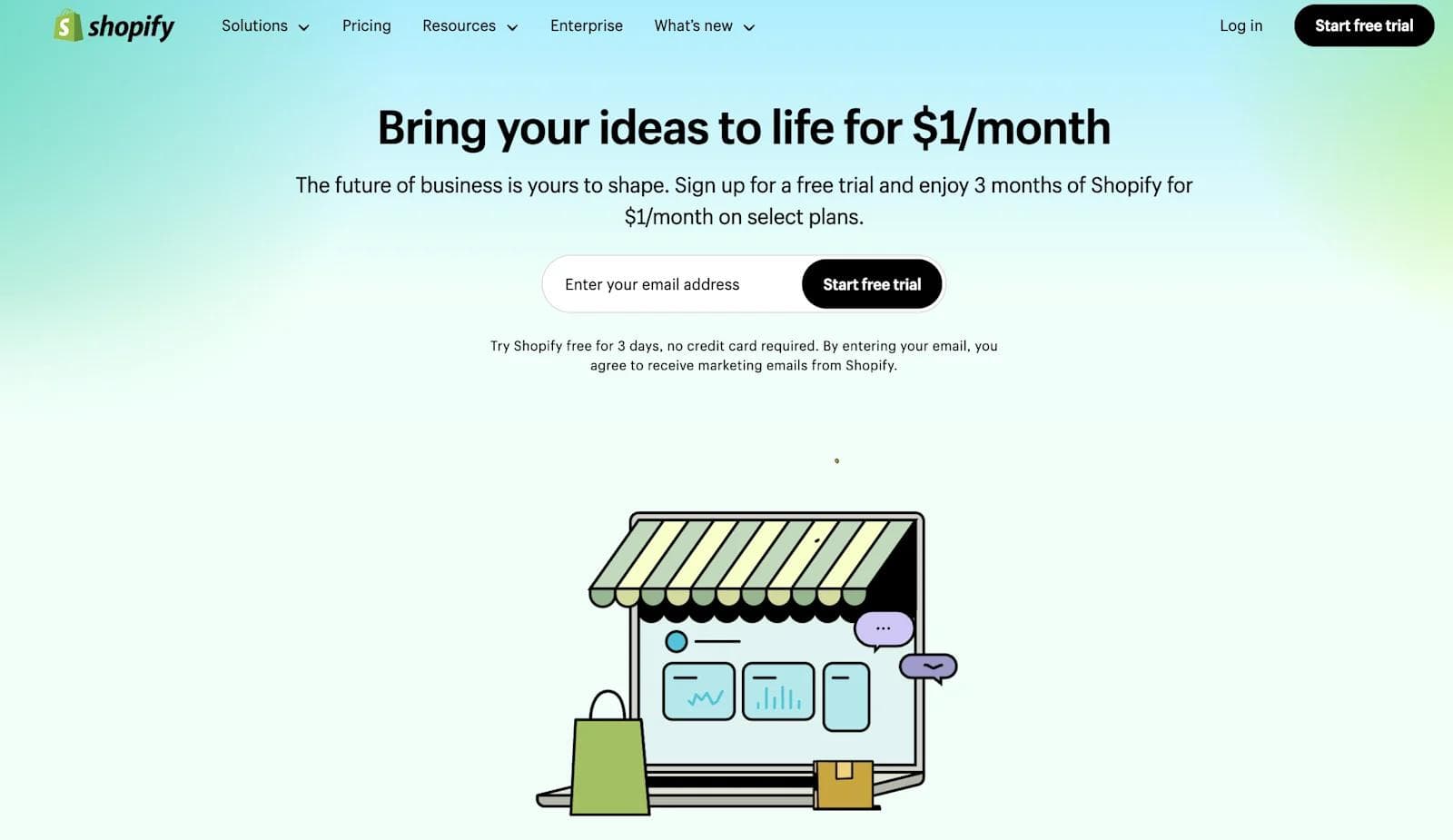
Shopify's landing page for its free trial is an example of simplicity and clarity in landing pages. It features a concise headline, a brief description of benefits, and a prominent call-to-action (CTA) button that invites users to start their free trial. The minimalistic design ensures visitors are not overwhelmed.
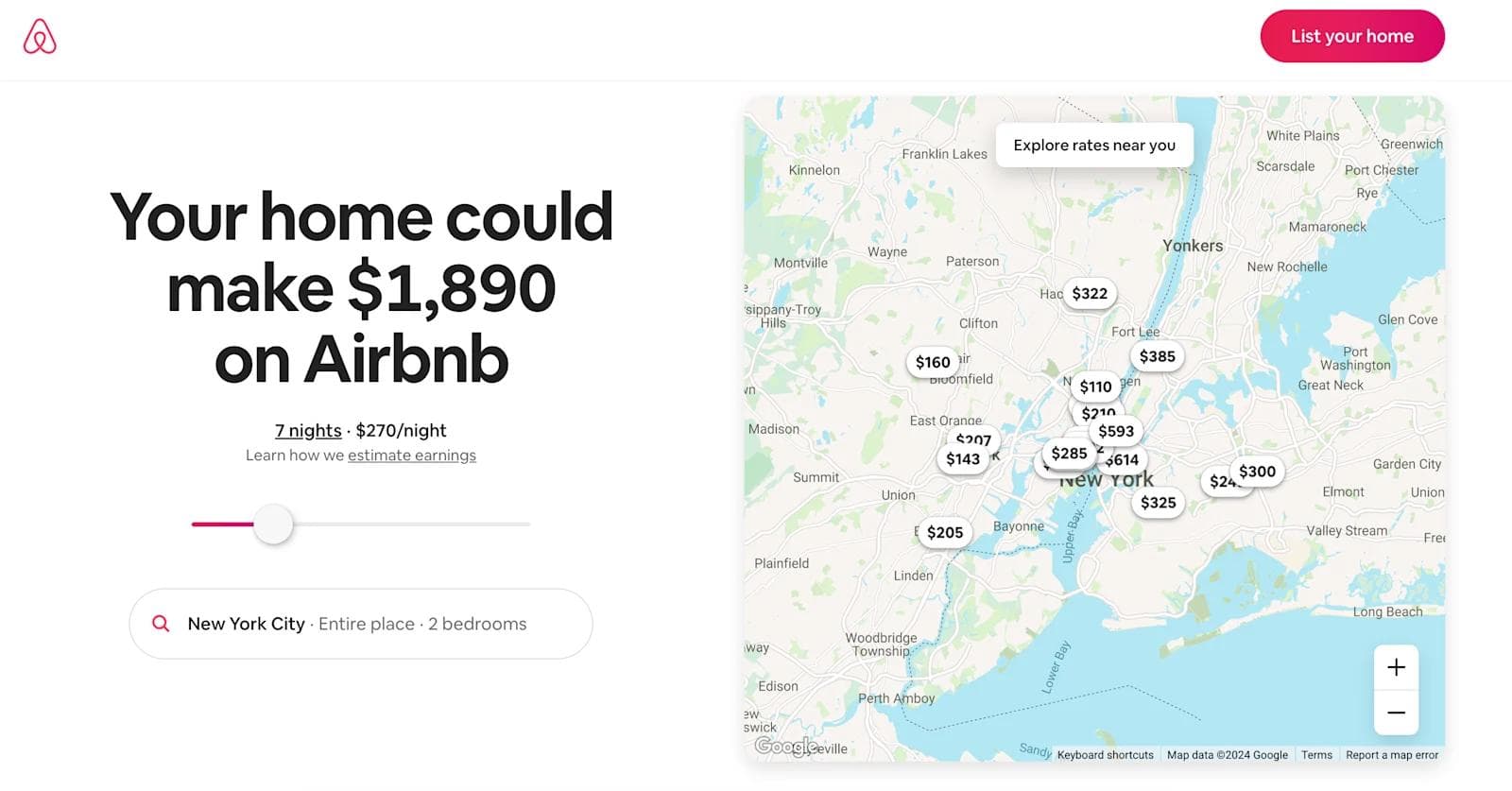
Airbnb's landing page for hosts effectively communicates the benefits of listing a property. It includes a compelling headline, supportive imagery, and a clear CTA that encourages users to "Get Started." The page also provides estimated earnings based on location.
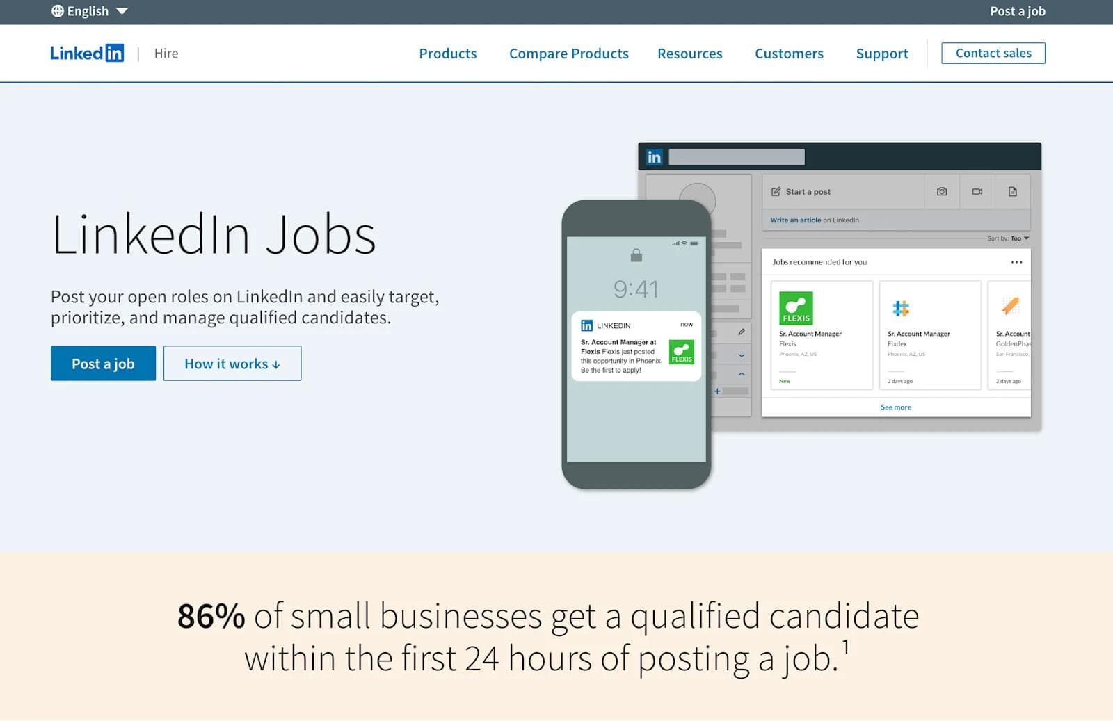
LinkedIn's landing page for its job posting service is clean and professional. It highlights key benefits, such as reaching a vast network of professionals, and includes trust signals like user testimonials and data-backed statistics.
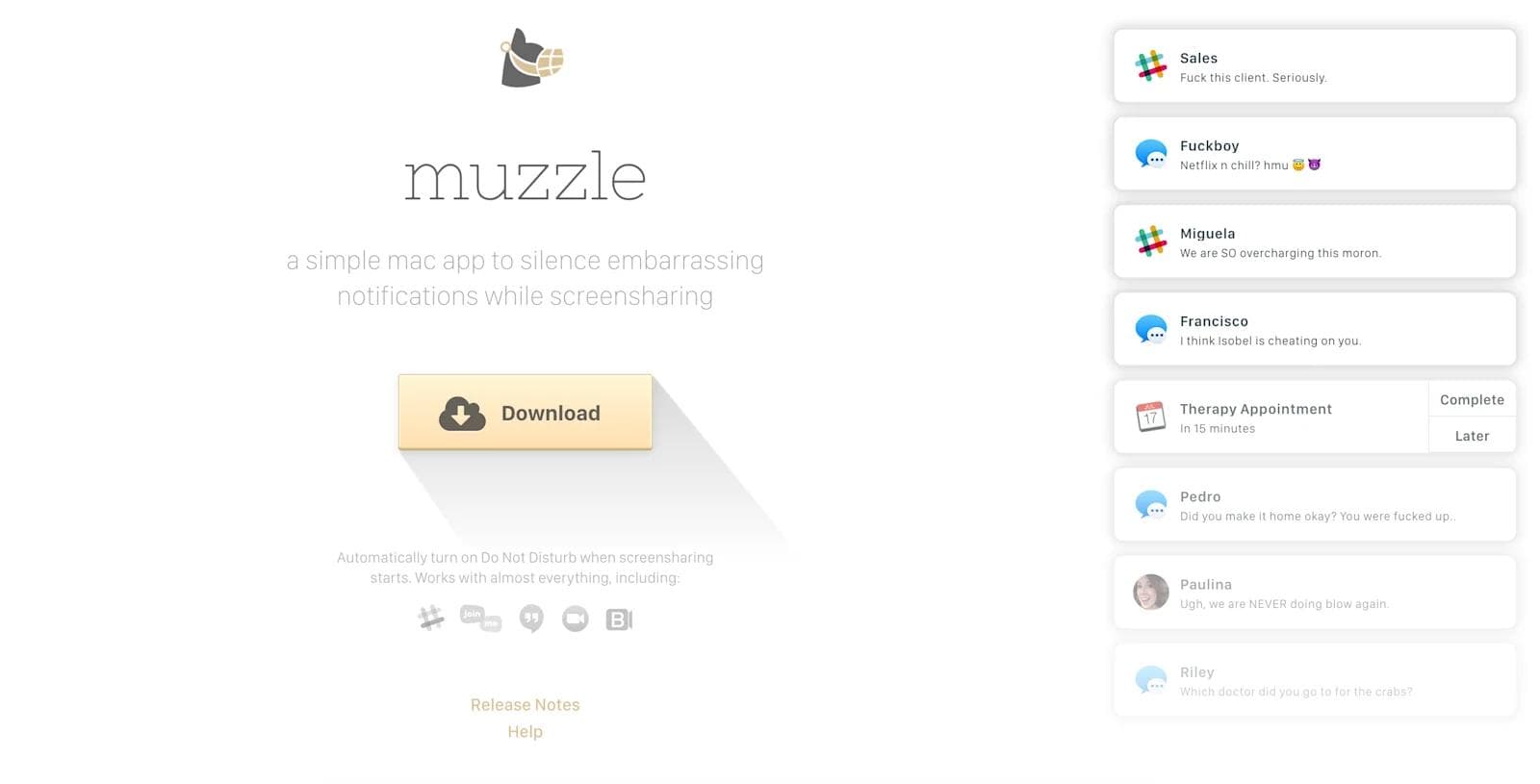
Muzzle, a Mac app that silences on-screen notifications, uses a unique and engaging approach on its landing page. The page features a live demo showcasing the app's functionality in a humorous way which captures the visitor's attention and demonstrates the product's value.
ExpressVPN's landing page emphasizes security and simplicity. It has a straightforward headline, a brief overview of features, and a prominent CTA to "Get ExpressVPN." The use of trust badges and customer testimonials enhances credibility.

Conclusion
By consistently applying these strategies and following SaaS best practices, you'll design landing pages that engage your audience and increase conversions. Stay focused on your goals, consider leveraging SEO services, and you'll see your business grow.
Here at Webstacks, we help many companies level up their online presence through next-gen solutions for web design.
If you want to learn more about web design and designing landing pages, feel free to reach out to us!

I create SEO-driven content for B2B SaaS companies, from blog posts to case studies. I focus on research-backed writing that ranks on the first page and drives meaningful organic traffic.

