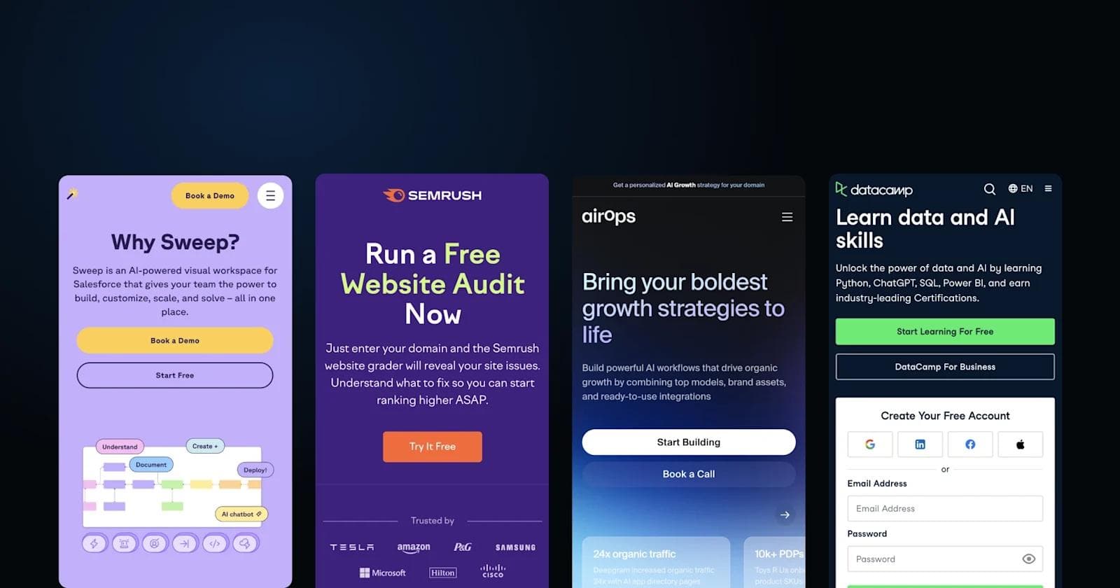
Mega Menu Examples: 7 B2B SaaS Sites with Best-in-Class Navigation Design
For B2B SaaS companies managing extensive product catalogs, feature sets, and content libraries, navigation architecture directly impacts conversion rates and user engagement. Mega menus solve a specific problem: how to surface dozens or hundreds of pages without burying critical conversion paths or overwhelming visitors.
This article examines seven B2B SaaS companies that have implemented mega menus effectively, analyzes why their design choices work for their specific business contexts, and distills the principles you can apply to your own navigation strategy.
Find out what the industry's best websites are doing to stay relevant and effective. If you need web strategy inspiration, this is the resource for you.

What is a Mega Menu? Definition and Key Characteristics
A mega menu is an expanded navigation panel, typically triggered by hover or click, that displays multiple categories, subcategories, and content types in a structured, two-dimensional layout. Unlike traditional dropdown menus that list items vertically in a single column, mega menus use horizontal and vertical space to organize content into scannable sections with visual hierarchy.
Mega menus work best for specific scenarios:
- SaaS platforms with multiple product lines that need to differentiate features without creating separate sites
- Enterprise software companies serving different buyer personas (IT, marketing, finance) who enter with distinct needs
- Content-heavy sites (50+ primary pages) where traditional navigation creates excessive menu depth
- Multi-solution providers that need to cross-promote related offerings without cluttering the user's path
For sites with focused product offerings or straightforward user journeys, simpler navigation patterns often perform better. Mega menus introduce complexity that only pays off when content volume and user diversity demand it.
What Are the Benefits of a Mega Menu?
Mega menus deliver measurable advantages when implemented in the right context. Understanding these benefits helps you evaluate whether the added complexity of mega menu design is justified for your specific site and audience.
Reduces Path-to-Conversion Friction
Mega menus decrease the clicks required to reach specific content, directly supporting the three-click rule for optimal user experience. For B2B buyers conducting research across multiple features or use cases, this efficiency can be the difference between exploring your product and bouncing to a competitor.
Improves Content Discoverability
The two-dimensional layout allows users to scan multiple content categories simultaneously rather than navigating linearly through nested menus. This is particularly valuable for B2B SaaS companies where buyers may not know your product taxonomy. They're searching for solutions to problems, not navigating through your internal product structure.
Showcases Strategic Content in High-Visibility Real Estate
Mega menus provide premium space to highlight new features, popular resources, customer stories, or conversion-focused content. This positioning is especially effective for promoting underutilized features or guiding users toward high-intent pages like pricing or demo requests.
Best Practices in Mega Menu Design
These principles emerge consistently across successful B2B mega menu implementations. Applying them ensures your navigation serves both user needs and business goals while remaining scalable as your content grows.
Logical Categorization and Clear Information Hierarchy
Group navigation items by how users think about their problems, not how your organization is structured internally. For example, categorize by use case ("Marketing Teams," "Sales Teams") rather than internal department names. Establish clear visual hierarchy through sizing, weight, and spacing so users can quickly distinguish primary categories from secondary options.
Mobile-First Design Strategy
Design mega menus for small screens first, typically using accordion-style interfaces or hamburger menus that expand into full-screen navigation. Desktop mega menus should feel like enhancements, not completely different experiences. For mobile-specific navigation patterns, see our guide to mobile menu design.
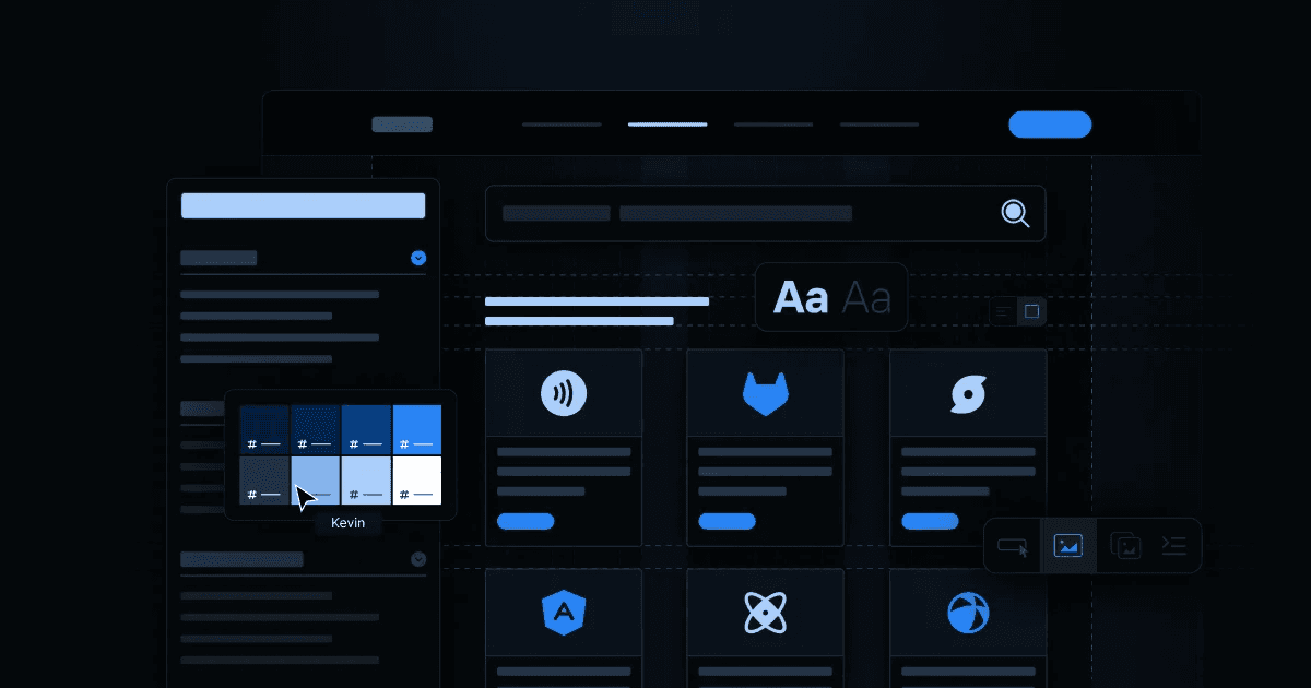
Consistency with Brand Design System
Mega menus must adhere to your brand's typography, color palette, spacing system, and component patterns. Inconsistent navigation creates cognitive friction that undermines trust. At Webstacks, we build mega menus within structured design systems that ensure visual consistency across all components and allow rapid iteration as content needs evolve.
Strategic Use of Icons and Visual Cues
Icons enhance recognition and scanability when they reinforce category meaning. Avoid decorative icons that add visual noise without aiding comprehension. Use icons consistently (every category gets one, or none do) and ensure they're recognizable across cultural contexts if serving international audiences.
Clear Interactive States
Define distinct visual states for hover, active, and selected navigation items. Subtle animations or color changes signal interactivity and guide users through the menu structure. These micro-interactions should feel responsive without becoming distracting.
Scalable Architecture for Future Growth
Design mega menus to accommodate new content without requiring complete restructuring. Use flexible grid systems and establish maximum item counts per category (typically 7-9 items before cognitive load becomes an issue). Map your site architecture in tools like Miro or Slickplan before building to ensure the structure can grow logically.
Avoid Information Overload
More options don't automatically improve navigation. They increase decision paralysis. Prioritize ruthlessly. If everything is prominent, nothing is. Limit top-level categories to 5-7 options and use mega menu space to provide clarity around those core pathways, not to expose your entire sitemap.
See what’s working for industry leading websites—and find inspiration to improve yours.

7 Mega Menu Examples from B2B SaaS Leaders
The following companies demonstrate effective mega menu implementation across different business contexts and navigation challenges. Each example highlights specific design decisions that align with their product complexity and buyer journey.
1. Segment: Technical Differentiation Through Visual Design

Segment, a customer data platform that collects and routes event data to analytics and marketing tools, faces a specific navigation challenge: their product enables hundreds of integrations and technical workflows that easily blur together without clear differentiation.
Segment's mega menu uses color-coded iconography to distinguish product areas: data collection (purple), data transformation (blue), and data activation (green). This visual system helps technical buyers (data engineers, product managers, and marketers) quickly locate their area of interest without reading every menu item.
The "Use Cases" and "Products" categories are separated cleanly, recognizing that some visitors enter knowing their problem (improving email marketing) while others know the solution type they need (a reverse ETL tool). This dual structure accommodates different buyer entry points.
Key design elements:
- Color-coded icons create immediate visual differentiation for complex technical products
- Hover micro-interactions provide progressive disclosure without cluttering the initial view
- Gray section dividers establish clear visual boundaries between navigation groups
Why this works for Segment: Their CDP platform is technically complex with overlapping capabilities. The visual design system prevents feature blur and helps diverse personas (engineers vs. marketers) navigate confidently.
2. Qualtrics: Use Case-Based Navigation for Multiple Personas

Qualtrics, an experience management platform serving everyone from HR teams to product managers, organized their mega menu around the critical question their buyers ask first: "Is this for someone like me?"
Their navigation switcher allows users to filter the entire menu by use case: customer experience, employee experience, product experience, or brand experience. This approach acknowledges that a product manager researching feature prioritization tools and an HR director evaluating employee survey platforms have completely different needs. Showing them the same navigation would create unnecessary friction.
Within each view, Qualtrics uses bold iconography and concise descriptions to differentiate their solutions. The bottom CTA section remains consistent across views, offering clear next steps regardless of which use case brought the visitor in.
Key design elements:
- Use case categorization reduces cognitive load by showing only relevant content
- Vibrant icons and clear two-line descriptions aid quick scanning
- Persistent CTAs (free account, demo, platform exploration) maintain conversion focus across all menu states
Why this works for Qualtrics: As a horizontal platform serving distinctly different buyers, showing everyone the same comprehensive menu would overwhelm. The filterable approach respects that different personas have different priorities.
3. Plaid: Minimalist Structure for Technical Clarity

Plaid, a financial data network connecting apps to users' bank accounts, uses a minimalist mega menu that prioritizes clarity over visual flourish—a design choice that aligns with their technical, developer-focused audience.
The left-side navigation panel displays main categories while the right side reveals specific pages within each category. This two-panel structure creates clear spatial separation and allows users to switch between major sections without closing and reopening the menu. The color-change micro-interactions (links highlight on hover) provide immediate visual feedback without animated distractions.
For a fintech platform where trust and security are paramount, this restrained design reinforces professionalism. The straightforward labeling ("Use Cases," "Products," "Developers") uses terminology that matches how their technical buyers think about financial infrastructure.
Key design elements:
- Two-panel layout (category selection left, detail right) creates intuitive navigation flow
- Minimal visual design emphasizes content hierarchy over decorative elements
- Color-change hover states provide feedback without animation that could feel unprofessional
Why this works for Plaid: Developer and fintech audiences value efficiency and clarity. The restrained design signals technical competence and makes navigation predictable, which is critical for building trust in financial infrastructure.
4. Toast: Highlighting Popular Paths in Multi-Product Navigation

Toast, a restaurant management platform offering POS systems, payroll, online ordering, and more, faces the challenge of cross-selling related products to different restaurant types (quick service vs. full service vs. bars).
Their mega menu uses left-hand highlighted sections to surface the most popular solutions: "Toast POS" and "Toast for Quick Service" receive visual emphasis through background shading. This design acknowledges that most visitors are entering to evaluate core POS functionality. The highlighting reduces decision time for the majority while still making specialized offerings accessible.
The menu also categorizes by restaurant type, recognizing that a coffee shop owner and a fine dining restaurant manager need different feature sets despite both needing POS systems. This structure allows Toast to present targeted information without creating separate sites for each vertical.
Key design elements:
- Visual highlighting (background shading) draws attention to high-traffic, high-conversion pages
- Restaurant type categorization allows for audience-specific navigation paths
- Hover micro-interactions (highlights and underlines) create subtle wayfinding cues
Why this works for Toast: Their multi-product platform risks overwhelming restaurant owners who primarily need a POS system. The highlighted sections guide the majority efficiently while making specialized offerings discoverable for those who need them.
5. Monday.com: Multi-Perspective Navigation for Diverse Teams

Monday.com, a work operating system adaptable to project management, CRM, dev workflows, and more, implemented a mega menu that acknowledges their platform serves radically different use cases and team types.
The navigation structure allows filtering by product (Work Management, Sales CRM, Dev), by team (Marketing, PMO, Operations), and by platform capabilities. This tri-modal approach recognizes that some visitors know exactly what product they need, others are exploring based on their team role, and still others are evaluating based on specific capabilities like automation or integrations.
Each mega menu tab includes multiple CTAs strategically positioned: featured customer stories provide social proof, template galleries offer hands-on exploration, and getting started CTAs maintain conversion focus. This multi-CTA approach creates multiple pathways to engagement based on buyer readiness.
Key design elements:
- Three-way categorization (product, team, platform) accommodates different buyer entry points
- Colorful on-brand icons create visual consistency and aid pattern recognition
- Multiple CTAs per menu tab provide options for different engagement levels
Why this works for Monday.com: As a horizontal work platform, Monday.com serves teams with vastly different priorities. The multi-perspective navigation allows each visitor type to quickly filter to relevant content rather than wading through everything.
6. Asana: Scrollable Design for Comprehensive Feature Sets

Asana, a work management platform with dozens of features and use cases, made an unconventional choice: their mega menu is scrollable.
Rather than constraining content to fit within viewport height (which would require aggressive editing or smaller text), Asana's scrollable mega menu allows them to showcase their full capability set without compromising readability. The clear visual hierarchy (icon + bold heading + description) maintains scanability even within a longer menu.
The right-hand featured section remains fixed while the left side scrolls, keeping high-priority content (new templates, popular blog posts) visible regardless of scroll position. This design balances comprehensiveness with strategic highlighting.
Key design elements:
- Scrollable layout accommodates extensive product features without cluttering or reducing font size
- Fixed featured section (right side) maintains visibility of strategic content during scroll
- Clear icon + heading + description pattern aids scanning even in longer lists
Why this works for Asana: Their platform includes numerous features (timeline view, portfolios, goals, workflows) that all deserve visibility. The scrollable approach respects that some buyers need to browse comprehensively rather than jump directly to known features.
7. Jasper: Dynamic Featured Content for Product Education

Jasper, an AI content generation platform, uses mega menu space strategically to educate visitors about their rapidly evolving product capabilities.
The Resources tab includes dynamic components that surface recent blog posts, customer success stories, and review highlights. This content changes frequently as Jasper adds features and publishes new material. This approach treats the mega menu as an active content channel, not just static navigation.
The highlighted section promoting "Jasper AI Copilot" demonstrates strategic use of mega menu real estate to drive adoption of newer features. For a fast-moving AI product where capabilities expand monthly, this flexible mega menu structure allows Jasper to shift emphasis without redesigning navigation structure.
Key design elements:
- Animated preview components draw attention to fresh, time-sensitive content
- Strategic highlighting promotes underutilized features or new product launches
- Contextual icons and micro-interactions create polished, premium feel
Why this works for Jasper: In the fast-evolving AI content space, static navigation would quickly become outdated. The dynamic mega menu keeps feature promotion current and educates visitors on capabilities they might not know exist.
Common Patterns Across Effective Mega Menus
Analyzing these seven implementations reveals consistent principles that separate effective mega menus from cluttered, confusing ones. These patterns apply regardless of industry or specific product complexity.
- Visual Hierarchy Trumps Comprehensiveness: Every example prioritizes scanability over showing everything. They use size, weight, color, and spacing to guide attention rather than presenting flat lists.
- Context-Appropriate Complexity: Companies with horizontal platforms (Monday.com, Qualtrics) use more complex, filterable navigation. Companies with clearer product hierarchies (Plaid, Toast) use simpler structures. Match navigation complexity to your actual product and buyer diversity.
- Strategic Highlighting Drives Conversion: Each example uses visual emphasis (background shading, featured sections, CTAs) to guide visitors toward high-value pages. Mega menus aren't democratic. They're strategic tools for shaping user journeys.
- Mobile Considerations Shape Desktop Design: While we focused on desktop implementations here, these companies all simplified their desktop mega menus to ensure mobile navigation remained usable. Overly complex desktop menus rarely translate well to small screens.
Applying these patterns requires evaluating your own site against specific criteria to determine whether mega menu complexity is justified.
Implementing Effective Mega Menu Navigation
If you're considering mega menus for your B2B SaaS site, start by auditing your current navigation against these questions. These criteria will help you determine whether mega menu complexity is justified for your specific situation.
- Do you have 50+ pages that need primary or secondary visibility?
- Do you serve multiple distinct personas who enter with different priorities?
- Is your current navigation forcing more than three clicks to reach conversion pages?
- Are users bouncing from your homepage without exploring deeper content?
If you answered yes to most of these, mega menus may solve real friction in your buyer journey. The examples above demonstrate that effective mega menu design requires aligning navigation structure with your specific product complexity and buyer behavior, not copying what works for others.
At Webstacks, we approach navigation architecture as a strategic system, not a cosmetic layer. We build navigation within structured design systems that allow rapid iteration as your product and content strategy evolve.
If your current navigation is limiting growth or if you're planning a site redesign that includes navigation restructuring, talk to Webstacks about building navigation architecture that scales with your business.
Your website is your biggest growth lever—are you getting the most out of it? Schedule a strategy call with Webstacks to uncover conversion roadblocks, explore high-impact improvements, and see how our team can help you accelerate growth.

I research and write about B2B web design trends, content strategy, and UX best practices. I focus on helping teams understand how great website design drives business growth.