10 Best Mobile Landing Page Design Examples
- Mobile landing pages drive conversions by minimizing distractions and focusing on a clear call-to-action for users.
- Successful designs prioritize speed, responsiveness, and engaging visuals to enhance user experience on mobile devices.
- Best practices include simplifying navigation, incorporating social proof, and ensuring prominent calls-to-action throug
Today, most online interactions happen on mobile devices.
This shift in user behavior means businesses need to not only optimize their online presence for mobile but also create compelling experiences that drive immediate action.
A well-crafted mobile landing page design can be the difference between a casual visitor and a committed customer. It's your chance to make a strong first impression, deliver a clear message, and guide your audience toward a desired action with minimal distractions.
In this article, we'll dive into mobile landing page examples from B2C and B2B websites, and showcase best practices to ensure they turn visitors into loyal customers.
In brief:
- Mobile landing pages are specially crafted webpages for mobile devices that lead visitors toward specific actions and drive conversions with minimal distractions.
- Effective mobile landing pages focus on simplicity, fast loading times, clear calls-to-action (CTAs), and a seamless user experience optimized for touch interfaces and smaller screens.
- Best practices include optimizing for responsiveness and speed, simplifying design and navigation, engaging users with strong visuals and clear CTAs, and incorporating social proof to build credibility.
- Successful examples from companies like Outreach, Semrush, and YotPo show how well-designed mobile landing pages enhance user engagement and conversion rates.
See what’s working for industry-leading websites and find inspiration to improve yours.

What is a Mobile Landing Page?
A mobile landing page is a specially crafted webpage designed for people using mobile devices like smartphones and tablets. The main goal of a mobile landing page is to drive conversions by leading visitors toward specific actions such as signing up for a newsletter, making a purchase, or downloading an app.
Mobile landing pages often highlight a single, clear call-to-action (CTA) to minimize distractions and streamline user engagement. These CTAs need to be easily visible and compelling, drawing users toward the desired action.
Mobile Landing Page Use Cases
Here are some practical ways a mobile landing page can be especially effective:
- E-commerce Sales Promotions: Mobile landing pages shine in supporting e-commerce campaigns by providing a streamlined and focused experience for users. When someone clicks on an ad for a sale, they're directed to a mobile landing page showcasing special offers and discounts that are directly relevant to their interests. This reduces decision-making time and increases the likelihood of a conversion.
- Event Registration: For businesses or organizations hosting events, a mobile landing page simplifies the event registration process. Offering a straightforward form on a mobile-friendly landing page allows potential attendees to register quickly and easily.
- App Promotion and Downloads: For companies aiming to increase app installations, mobile landing pages are particularly effective. When users encounter ads or promotions for an app, directing them to a dedicated mobile landing page can highlight the app's key features and benefits succinctly. Implementing PPC campaign strategies can also drive targeted traffic to these landing pages.
Mobile Landing Page Design Best Practices
Designing an effective mobile landing page requires attention to detail and following a few key principles to maximize user engagement and conversions.
Here are some best practices to consider for your mobile landing page:
- Optimize for Mobile Responsiveness and Speed: Make sure your mobile landing page is fully responsive and adapts to various screen sizes. Use a responsive design checklist to make sure your page performs well across devices.
- Simplify Design and Navigation: A clean, uncluttered design—like a minimalist landing page—helps users focus on the primary call-to-action Minimal navigation options and ample whitespace guide the user toward completing the desired action.
- Engage with Strong Visuals and Clear Call-to-Actions (CTA): Use high-quality, relevant images or videos to draw attention, incorporating interactive landing page features for more engagement. Ensure your CTA stands out with contrasting colors and strategic placement to encourage interaction.
- Incorporate Social Proof: Display customer testimonials, reviews, and trust badges on your mobile landing page to build credibility and reassure visitors of your product's or service's quality.
Best Mobile Landing Page Examples
Here are some of the best mobile landing page examples to inspire your design.
Outreach

Outreach’s comparison landing page takes a direct, competitive approach by positioning itself against Outreach in a structured side-by-side feature comparison. The page has a clean, scroll-friendly design that makes it easy for mobile users to compare capabilities quickly.
It starts with a bold headline and CTA button prompting users to “Request a Demo.” Below, a visual comparison table highlights where Outreach outperforms Gong.
Further down, the page includes social proof elements, such as industry rankings and customer success stories, before leading into a demo request form.
Standout Elements:
- Direct feature comparison – A side-by-side checklist highlights Outreach’s advantages over Gong.
- Impact-driven stats – Performance metrics like 3x productivity gains and 28% higher conversions reinforce credibility.
- Conversational testimonial – A real customer quote calls out Gong’s weaknesses while endorsing Outreach.
- Engaging video CTA – An embedded video and demo request form boost interaction and conversions.
See what’s working for industry-leading websites and find inspiration to improve yours.
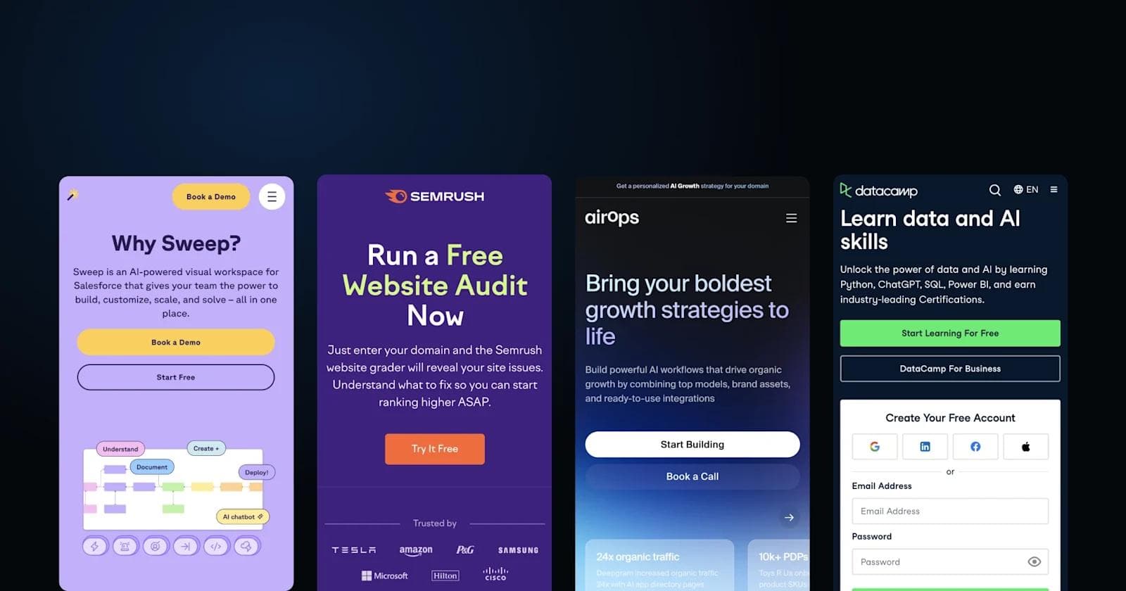
Semrush

Semrush’s mobile landing page is optimized for conversions, leading with a bold CTA encouraging users to run a free website audit.
The three-step process for improving site health is clearly outlined, making it easy for visitors to understand the tool's value. The page also features trust badges, visual breakdowns of SEO issues, and interactive charts to reinforce credibility and user engagement.
The design is clean and scroll-friendly, with contrasting color blocks (purple, green, and orange) that guide users' attention to key sections. Call-to-action buttons are frequent and strategically placed to encourage conversions.
Standout Elements:
- Instant value offer – The page leads with a free website audit, making it an easy entry point for new users.
- Visual-driven SEO insights – Screenshots, interactive graphs, and audit scores make complex data easy to digest.
- Iterative CTAs – Multiple “Try It Free” buttons ensure users have plenty of conversion opportunities throughout their scroll.
- Trust-building elements – Features logos of major brands and awards badges to reinforce SEMrush’s industry authority.
Yotpo

Yotpo’s mobile landing page is a clean, content-driven lead magnet designed to capture email and SMS marketing professionals. The page centers around an ebook download offer, using a simple form with minimal friction to encourage sign-ups.
The design is minimalist and elegant, with soft background tones that contrast with bold blue CTAs for clear visual hierarchy. Below the form, the page provides sneak peeks into the ebook's content, touching on AI, campaign strategies, and personalization.
A strong closing CTA encourages visitors to book a demo of Yotpo’s marketing solutions.
Standout Elements:
- Lead magnet-driven approach – Instead of a product pitch, Yotpo offers valuable content first to attract and nurture leads.
- Soft, editorial-style design – The light beige background and minimalist layout make the content feel premium and approachable.
- AI vs. authenticity theme – The page directly addresses AI in marketing, positioning Yotpo as a thought leader in humanized automation.
- Newsletter integration at the bottom – A secondary email capture allows users who don’t download the ebook to still engage with Yotpo’s content.
Airtable

Airtable’s mobile landing page is a structured, lead-generation-focused design built around an insights report for product teams. The page features a multi-field form for capturing user details, ensuring that Airtable collects valuable lead data before granting access to the report.
The design is clean and modern, using a soft pastel color palette that aligns with Airtable’s branding. Below the form, the page offers a preview of key takeaways from the report, emphasizing actionable insights on AI, strategy, and cross-functional collaboration.
Standout Elements:
- Multi-step form with segmentation – The form captures team function, job level, and country, allowing Airtable to better qualify and segment leads.
- Content discovery section – The “Explore Categories” grid promotes additional resources like webinars, eBooks, and events, keeping users engaged.
- AI-focused industry insights – The page highlights how top product teams use AI, reinforcing Airtable’s positioning as a forward-thinking workflow tool.
Sweep

Sweep’s mobile landing page is sleek, modern, and optimized for Salesforce users looking for an AI-powered visual workspace. The design is playful yet professional, using a soft purple color scheme and dynamic visuals to highlight Sweep’s intuitive, drag-and-drop interface for Salesforce automation.
The page follows a benefits-driven structure, breaking down how different teams—Salesforce Admins, GTM teams, and RevOps leaders—can use Sweep to simplify CRM management.
Instead of relying on lengthy text, interactive UI previews and clear CTA buttons drive engagement, making it easy for users to explore the product and book a demo.
Standout Elements:
- Playful yet functional design – The combination of soft purples, minimalist illustrations, and a friendly font makes the page feel approachable while maintaining a professional SaaS tone.
- Dynamic UI previews – Instead of static screenshots, the page features animated or interactive UI components to showcase Sweep’s drag-and-drop functionality.
- Industry-specific messaging – Unlike generic CRM pages, Sweep speaks directly to Salesforce Admins and GTM teams, addressing their specific pain points with tailored sections.
- Trust signals from leading brands – The page features logos from companies like Wix, Deputy, and Exiger, reinforcing credibility and adoption across revenue teams.
Customer.io

Customer.io’s mobile landing page is sleek, content-driven, and designed to position the company as a thought leader in messaging automation. The page centers around "The State of Messaging Report," offering an in-depth analysis of messaging trends in exchange for an email sign-up.
The design embraces a dark, sophisticated color palette, giving it a premium feel while maintaining readability. Below the report download, the page includes related content recommendations, featuring guides, expert insights, and data-driven studies to keep visitors engaged.
The bottom section is rich with platform resources, ensuring easy navigation to product-related pages.
Standout Elements:
- Content-first lead generation – Instead of pushing a product demo, the page leads with a high-value industry report, making it more appealing to marketing professionals.
- Dark, elegant design for premium feel – The deep green color scheme and high-quality visuals make the page stand out compared to typical SaaS landing pages.
- Seamless content discovery experience – Related guides, insights, and featured blog posts are incorporated naturally, encouraging visitors to keep exploring.
- Comprehensive footer with platform details – The footer goes beyond standard navigation, offering API documentation, competitor comparisons, and customer success resources.
Sanity

Sanity’s mobile landing page is sleek, modern, and designed to reinforce its position as the #1 headless CMS. The page is structured for quick engagement, leading with a bold ranking badge, strong call-to-actions, and a credibility-building testimonial from Puma.
The design follows a high-contrast black-and-white theme, making the text and visuals pop while maintaining a futuristic, premium feel. Scrolling through, the page features customer success stories, a demo video, and enterprise logos to validate its impact.
The final CTA reinforces Sanity’s value as a competitive advantage for businesses looking to scale content efficiently.
Standout Elements:
- Third-party validation with rankings – Featuring a market leadership quadrant at the top immediately establishes credibility.
- Engaging product video – Instead of just describing features, the page includes a Sanity Content Operating System video, making it easier to grasp the platform’s value.
- Emphasis on "composable businesses" – The page strongly positions Sanity as the go-to CMS for modular, scalable architectures, appealing to tech-savvy enterprises.
AirOps

AirOps’ mobile landing page is sleek, futuristic, and heavily focused on AI-driven growth strategies. The page features a dark, gradient-heavy design that gives it a high-tech feel, while bold call-to-actions make it clear how users can get started.
The structure follows a logical flow, starting with an engaging hero section, moving into real-world customer testimonials, and finally guiding users to pre-built templates and educational content.
The emphasis on scalability and AI-powered automation positions AirOps as an essential tool for companies looking to streamline content and marketing execution.
Standout Elements:
- AI-driven branding and futuristic UI – The dark gradient design and floating glass-like elements create a modern, high-tech aesthetic that reinforces AirOps’ AI focus.
- Expert-driven testimonials – The page includes endorsements from growth experts and marketers, making it feel more like a trusted industry tool than just another AI platform.
- AirOps Academy integration – Unlike many SaaS pages, this one promotes a built-in learning hub, making it easy for users to level up their AI expertise.
- Pre-built strategy templates – The page doesn’t just pitch a tool; it provides plug-and-play content strategy templates, ensuring users can get immediate value from AirOps.
Spotify

Spotify’s mobile hiring page is vibrant, dynamic, and built to reflect the brand’s creative and inclusive culture. The page embraces bold colors, immersive images, and playful copy, making job hunting feel more like an experience than a corporate process.
The layout is designed to engage and inspire, with a music-inspired "Join the band" theme that positions job seekers as part of something bigger. The use of global city names, employee spotlights, and curated content reinforces Spotify’s commitment to diversity and innovation.
Standout Elements:
- Music-inspired branding – The entire hiring page follows a musical theme, making it feel unique and connected to Spotify’s identity.
- Global hiring emphasis – Instead of listing locations traditionally, the page creatively integrates city names and cultural imagery, reinforcing its worldwide presence.
- Authentic employee storytelling – Personal spotlights and real-life employee experiences add a human touch, helping candidates envision their future at Spotify.
- Interactive job discovery – Instead of a static search bar, job roles are visually categorized, making it easy to browse by passion, expertise, or interest area.
Datacamp

DataCamp’s mobile landing page is structured to make learning data skills feel accessible, engaging, and career-boosting. The design uses contrasting colors, interactive elements, and social proof to highlight its platform’s impact.
The page balances practicality and motivation, featuring a course search tool upfront, testimonials from industry leaders, and real employment outcomes for learners. Key statistics about user base, career transitions, and employer partnerships further reinforce DataCamp’s credibility.
Standout Elements:
- Instant course search tool – Instead of making users browse manually, the page offers a quick "Find Your Course" feature, streamlining discovery.
- Industry expert endorsements – The page includes quotes from leading data professionals, reinforcing the platform’s relevance in the job market.
- Career outcome statistics – Data-backed proof of job placements, skill adoption, and employer demand makes DataCamp’s value clear.
See what’s working for industry-leading websites and find inspiration to improve yours.
Ready to Design a Mobile Landing Page?
A mobile landing page redesign is a big step toward boosting engagement and improving your conversion funnel.
Integrating dynamic elements like videos and attention-grabbing headlines can keep user interest, while A/B testing allows for continual optimization based on user behavior.
By embracing these strategies and continuously improving your mobile landing page, you can turn it into an effective tool for achieving your marketing objectives.
Ready to take your B2B website to the next level? Download Webstacks' Best B2B SaaS Websites eBook to discover more inspiring examples and actionable insights that can transform your digital presence.
Your website is your biggest growth lever—are you getting the most out of it? Schedule a strategy call with Webstacks to uncover conversion roadblocks, explore high-impact improvements, and see how our team can help you accelerate growth.

I lead growth at Webstacks, connecting strategy, design, and engineering to build websites that drive results. I specialize in website strategy, CMS implementation, and helping B2B teams scale their web presence.