In SaaS, product pages are the digital storefront for your software. They are one of the first encounters many will have with your brand, and your best chance to make a lasting impression.
But in order to be effective, SaaS product pages must perform these 3 key functions; educate, entice, and convert.
- They educate by coherently and succinctly explaining your product's capabilities
- They entice by deeply resonating with a problem their audience has.
- They convert by crafting strategic user journeys and prominently displaying relevant call to actions.
Based on our work with all kinds of SaaS websites, we've put together this article to share what design elements will make your product stand out the most. We also include a list of 15 excellent product page examples for you to check out and take inspiration from!
Key Components of a High-Converting SaaS Product Page
Diving into the anatomy of a high-converting SaaS product page, it's clear that certain elements consistently play a pivotal role in guiding visitors from curiosity to conversion. These components, when executed with precision and creativity, form a powerful narrative that speaks directly to the needs and aspirations of potential customers.
Let's unpack these critical aspects and explore how they contribute to creating engaging and effective product marketing.
Strong Copywriting
- Product Positioning - It is critical for you to coherently and succinctly describe your SaaS product to your prospects. In most cases, this takes a substantial amount of research and planning done by the product marketing team to hone in on the organization’s messaging.
- Compelling Headlines - The opening act of your product page sets the tone for the entire user experience. A magnetic headline paired with insightful subheadings captures attention and communicates the core benefits of your offering.
- Persuasive Copy - Beyond the initial hook, the copy must continue to engage, educate, and convince. Mention the capabilities of the product, and highlight the outcomes. Be descriptive and quantify wherever possible.
Visual Elements
- Product UI - A picture is worth a thousand words, and in the case of SaaS, a glimpse into your product's user interface can communicate usability, functionality, and aesthetic appeal faster than any description.
- Illustrations and Animations - SaaS illustrations and animations add a layer of uniqueness and personality to your product page, making complex ideas more accessible and memorable.
- Explainer Videos - Videos serve as a versatile tool, capable of demonstrating your product in action, highlighting key features, and conveying your value proposition in an engaging and digestible format.
User-Friendly Design
- Intuitive Layout - The architecture of your product page should lead visitors to a seamless experience, with each section logically flowing into the next. This not only enhances the user experience but also encourages deeper exploration of your site.
- Consistent Branding - Uniformity in design and messaging reinforces your brand identity and builds trust with your audience, making your SaaS product stand out in a crowded market.
Social Proof and Trust Signals
- Trust Bars - Trust bars belong across the entire website, but product pages are certainly one place they should be displayed. It is simply the quickest and most straightforward way to associate your brand and products with other reputable organizations.
- Certification Badges - Displaying trust signals such as SSL certificates, privacy badges, and industry accreditations instantly boosts credibility and reassures visitors of your site's security and legitimacy.
- Testimonials and Customer Reviews - Authentic testimonials and glowing reviews serve as powerful endorsements, showcasing the positive experiences of your current users.
- Case Studies and Success Stories - Don’t be afraid to boast and showcase how your product has generated standout results for your clients. This concrete evidence is some of the most compelling content you can include on your website.
User Journeys
So, you got someone to your product page. Now what? How do you get that website visitor to stay on the website and eventually convert? This involves having a deep understanding of what your audience cares about, and what content is going to generate the most engagement.
You need to figure out what supporting content (and CTAs) are most appealing to your prospective buyers. Create multiple stepping stones, each resonating with different audience segments. If a lot of developers are coming to inspect your products, perhaps you include a CTA in the hero linking to your product's documentation. Maybe there is another audience of executives who care more about outcomes. Therefore, you should include a section that previews a case study sharing the outstanding results your product got for a large, well-respected enterprise.
The point here is do not make all your CTAs the same desired action. Research and invest in content that will keep users venturing deeper down the rabbit hole that is your website.
SaaS Product Pages Examples
Next, we’ll share 15 SaaS product page designs that are sure to entice, engage, and convert website visitors. Use these as inspiration to improve your product pages!
Scale

Scale’s “Data Engine” product page showcases a sophisticated and modern design that aligns with the high-tech nature of their organization. A compelling value proposition is immediately visible at the top, emphasizing the platform's capabilities in enhancing data management for AI solutions. Visual elements such as high-quality images, interactive icons, and a sleek UI preview invite engagement, while the clear, concise copy is tailored to inform a knowledgeable audience without unnecessary jargon. Trust is built through customer logos and testimonial teasers, and the varied CTAs throughout offer clear pathways to learn more, driving user action
Top Callouts:
- 🌑 Dark mode and futuristic colors that align with AI
- ✏️ Captivating illustrations and animations
- 🔗 Links to additional relevant content (blogs, guides, case studies)
Braze

Designed by Webstacks
A client of ours here at Webstacks, Braze features a colorful and sleek design that stands at the forefront of modern, composable SaaS web design. The playful mix of pastels and dynamic smartphone mockups illustrate the platform's capabilities in real-time communication. Clear, benefit-driven content is interspersed with actionable buttons, inviting immediate interaction. Case studies with significant metrics are prominently featured, affirming the platform’s results-driven approach and establishing credibility through proven success.
Top Callouts:
- 👁 Eye-catching brand coloring
- 📱 Immersive product illustrations
- ✍️ Simple yet powerful copywriting
Stripe
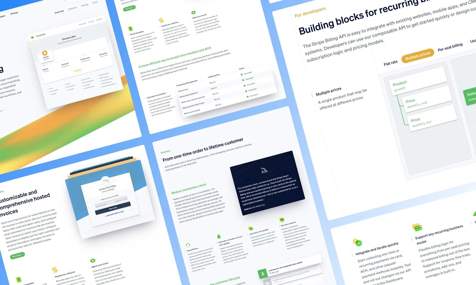
This SaaS product page from Stripe presents a bright and inviting design with a clear, concise layout that conveys ease of use—a critical factor for any billing platform. The use of vibrant, yet not overwhelming, colors contributes to the visual hierarchy, guiding the viewer's eye through the features and benefits with a sense of enthusiasm.
Informative sections are punctuated with crisp screenshots and playful icons, making the complex world of billing seem simple. Moreover, integration points are smartly showcased, promoting a sense of robustness and flexibility in the product, while customer logos and a preview of pricing plans demonstrate transparency and trust from the outset.
Top Callouts:
- 🌈 Popping colors and branding
- 📱 Product UI imagery
- 👉 Microinteractions (buttons, sliders, hover states)
Semgrep
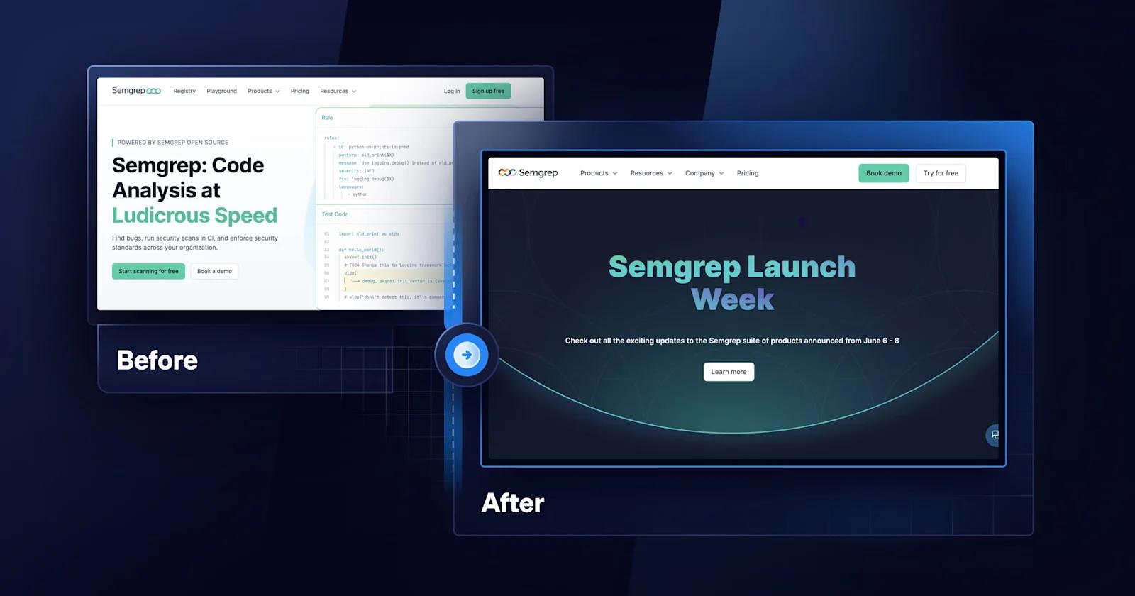
Designed by Webstacks
One of the highlights from Semgrep is the page’s activity, including the animation in the hero, the scrolling trust bar, and the buttons that alter the content. Also noteworthy is the strategic use of infographics and flowcharts that break down complex data processes into digestible visuals, facilitating comprehension at a glance.
Top Callouts:
- 🎥 Lively hero animation
- 🔠 Variation in font sizes and colors
- ™️ Integration and customer logos
ClickUp
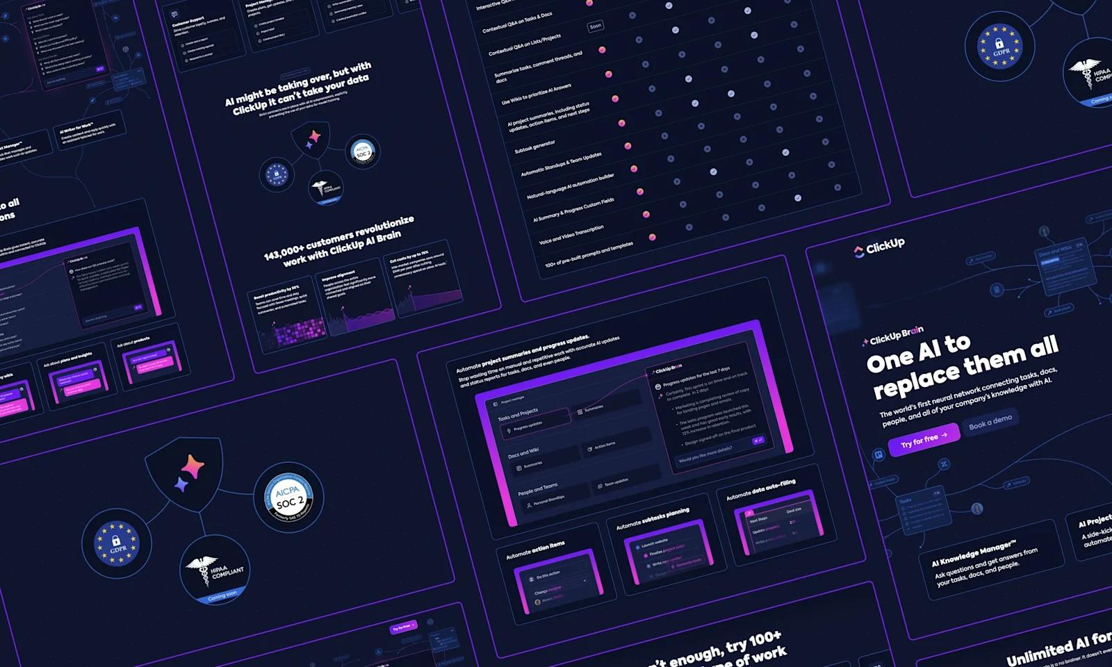
This special product page for ClickUp Brain is a vibrant display of their AI-driven platform, boasting a deep blue backdrop that gives way to pops of contrasting pink. The design reflects a forward-thinking approach, mirroring the innovative nature of their AI offerings.
Screenshots and icons pepper the page, offering a sneak peek into the platform's interface. Their message is underpinned by impressive statistics and straightforward pricing, communicating value and transparency. With customer trust at its core, the page also highlights privacy commitments, an essential assurance for any savvy user in the digital age.
Top Callouts:
- 🧊 Dimensionality
- 🟪 Complimentary gradients
- 📰 Bold headings
Lokalise

This example from Lokalise is a testament to clarity and focus, promising to streamline the path to global market presence through AI-powered translations. The page balances informative content with visual demonstrations, effectively showing how their AI works in real-time to deliver speed and precision. It highlights key selling points like one-click translations and maintaining brand tone, reassuring potential clients of both efficiency and quality.
Top Callouts:
- 💲 Interactive pricing tool
- 📣 Clear, enticing CTAs
- ❓ FAQ accordion section
Equals

Perhaps the most unique SaaS product page in our list is from Equals, a modern Excel alternative. The entire website takes on a retro-inspired design and pairs it with modern product UIs and functionalities. Furthermore, it puts the product front and center with interactive elements that simulate the ease of integrating queries into spreadsheets.
Top Callouts:
- 💾 Unconventional design
- ▶️ Product demos
- 🧠 Witty and compelling copy

Notion

Another standout comes from Notion. Key features like task prioritization and team collaboration are highlighted with clear, informative descriptions, accompanied by uncluttered screenshots. The inclusion of third-party integrations signifies a commitment to seamless workflow, reinforcing Notion’s positioning as a hub for productivity.
Top Callouts:
- 🧱 Creative formatting of page sections
- 📱 Showcasing Product UIs
- 🐱 Playful illustrations
Freshworks

Designed by Webstacks
Freshworks’ product page presents a clear and engaging narrative, emphasizing the tool's ability to revolutionize customer engagement. The clean interface with plenty of white space invites focus on key information and the vibrant call-to-action buttons are well-positioned to nudge visitors towards a trial. Demonstrations of the chat interface convey functionality with real-world applications, while endorsements from prominent client testimonials underscore credibility. Freshchat positions itself not just as a product but as a game-changer in customer communication.
Top Callouts:
- 📹 Explainer video
- 📱 Product UI screenshots
- ↔️ Scrolling trust bar
GitHub

A leading developer platform, GitHub, takes a distinct approach to each product page design. Here, we’ll focus on our favorite one, GitHub Copilot. It is spacey, futuristic, and outright captivating. No matter your coding expertise, the design will capture anyone’s attention.
Top Callouts:
- ✨ Vibrant gradients
- 🖊 Bold headings and CTAs
- 💰 Beautiful and intuitive pricing table
Monday

The use of vibrant colors and interactive graphics captures the energy and dynamism of the tool. It presents a myriad of workflow possibilities, appealing to a broad audience with diverse needs, from simple task management to complex project planning. The page communicates the transformative effect of their software on productivity and collaboration, backing up claims with testimonials and statistics for a comprehensive narrative.
Top Callouts:
- 📸 Personable design with high-quality images of real people
- 📱 Colorful product interface illustrations
- 💼 Case study video embeds
UpKeep
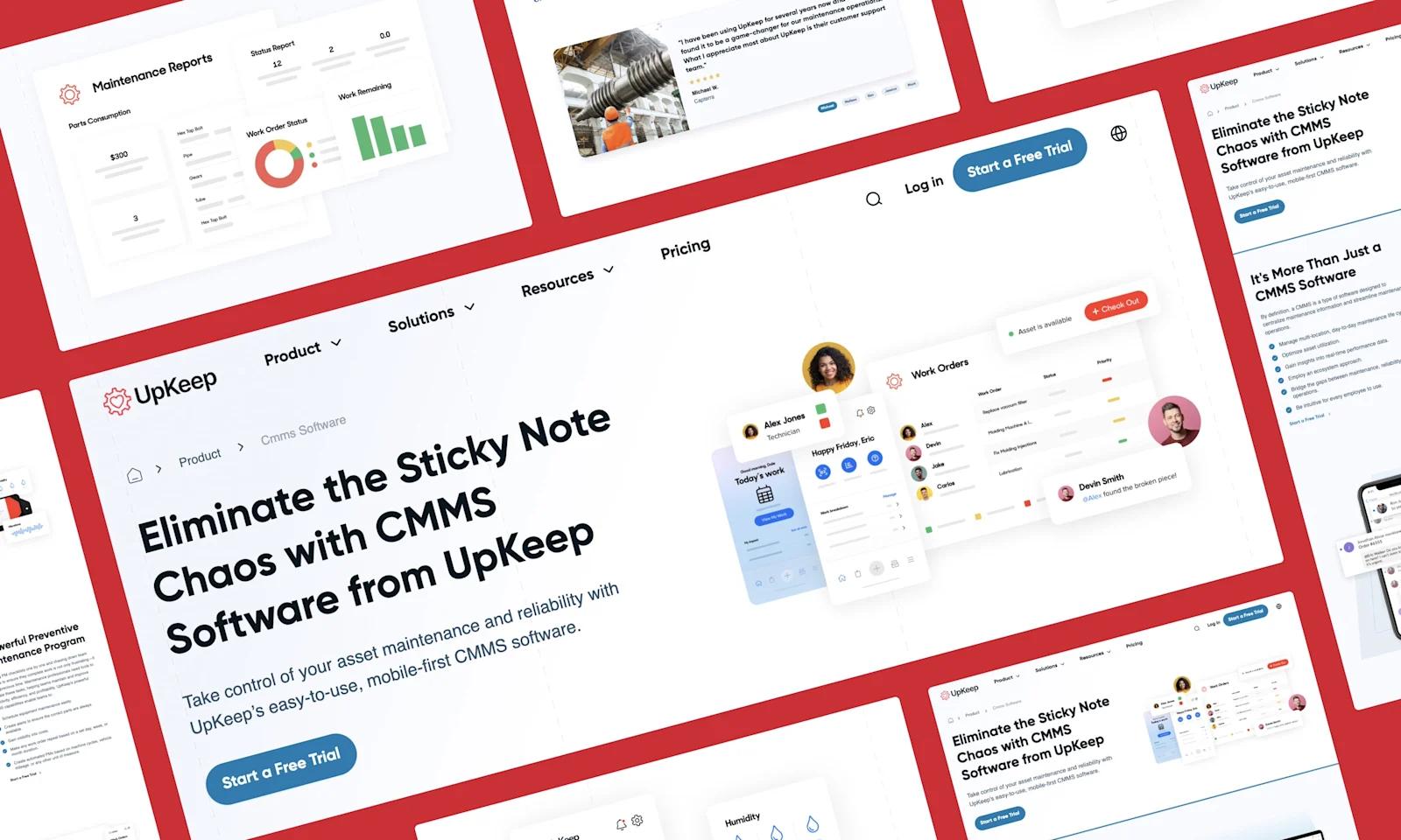
Designed by Webstacks
Also a standout for SaaS solutions pages, UpKeep has effective product pages to communicate the benefits of its CMMS software. The layout is business-like with a clear, straightforward presentation of features, emphasizing mobile accessibility and enterprise asset management.
Each section is punctuated with clean visuals and concise bullet points, making complex information easily digestible. Finally, the page is rounded out with customer testimonials and additional resources, providing depth and reinforcing trust in UpKeep's platform as a comprehensive maintenance solution.
Top Callouts:
- 🔗 Links to additional relevant content
- 🚶 Explainer video
- 🏅 Award and client logo trust signals
Rippling

Rippling presents a product page that exudes sophistication, with a color palette that speaks to a refined user experience. The clear delineation of platform capabilities, paired with crisp interface snapshots, promises a comprehensive and seamless human resource solution. It's a page that communicates a promise of transformation—turning HR tasks from necessary chores into strategic advantages. The design invites HR professionals to explore how every feature, from onboarding to performance analytics, integrates to create a harmonious workflow.
Top Callouts:
- 📧 Simple email capture CTA
- 💟 Creative contextual iconography
- 💨 Motion design
Deepgram
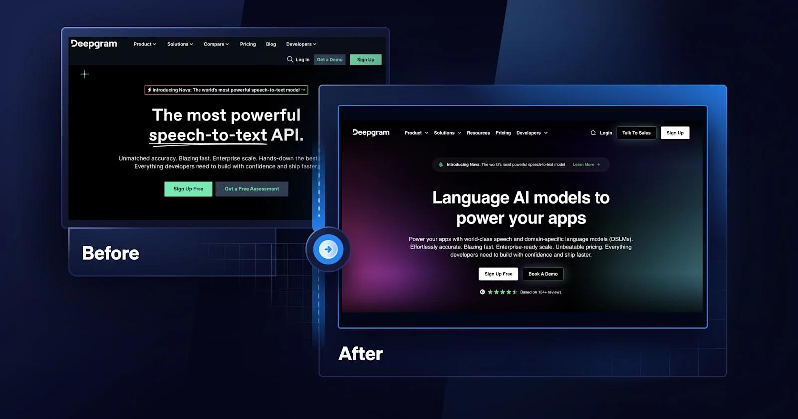
Designed by Webstacks
Deepgram’s product page is the epitome of cutting-edge design, tailored to highlight their advanced text-to-speech technology for conversational AI. It gives off a sleek, tech-savvy vibe, inviting visitors to experience the precision and human-like quality of their audio output.
The page is efficiently organized, showcasing the speed, scalability, and versatility of their solutions, and is dotted with trust signals from reputable enterprise clients, reinforcing Deepgram's market position. Engaging visuals and interactive demos work together to demystify the technology, making it approachable for potential customers across various industries.
Top Callouts:
- 🧑💻️ Embedded interactive product demo
- 🤔 Specific use case examples
- 💬 Compelling testimonial design
Bonus: Framer (Features Page)

Ultimately, we know that not all SaaS websites are structured the same - especially when it comes to product pages. Your organization may have one product, which can affect how you organize and present product-related content on the website. In place of true product pages, you may showcase other aspects such as features, solutions, or use cases.
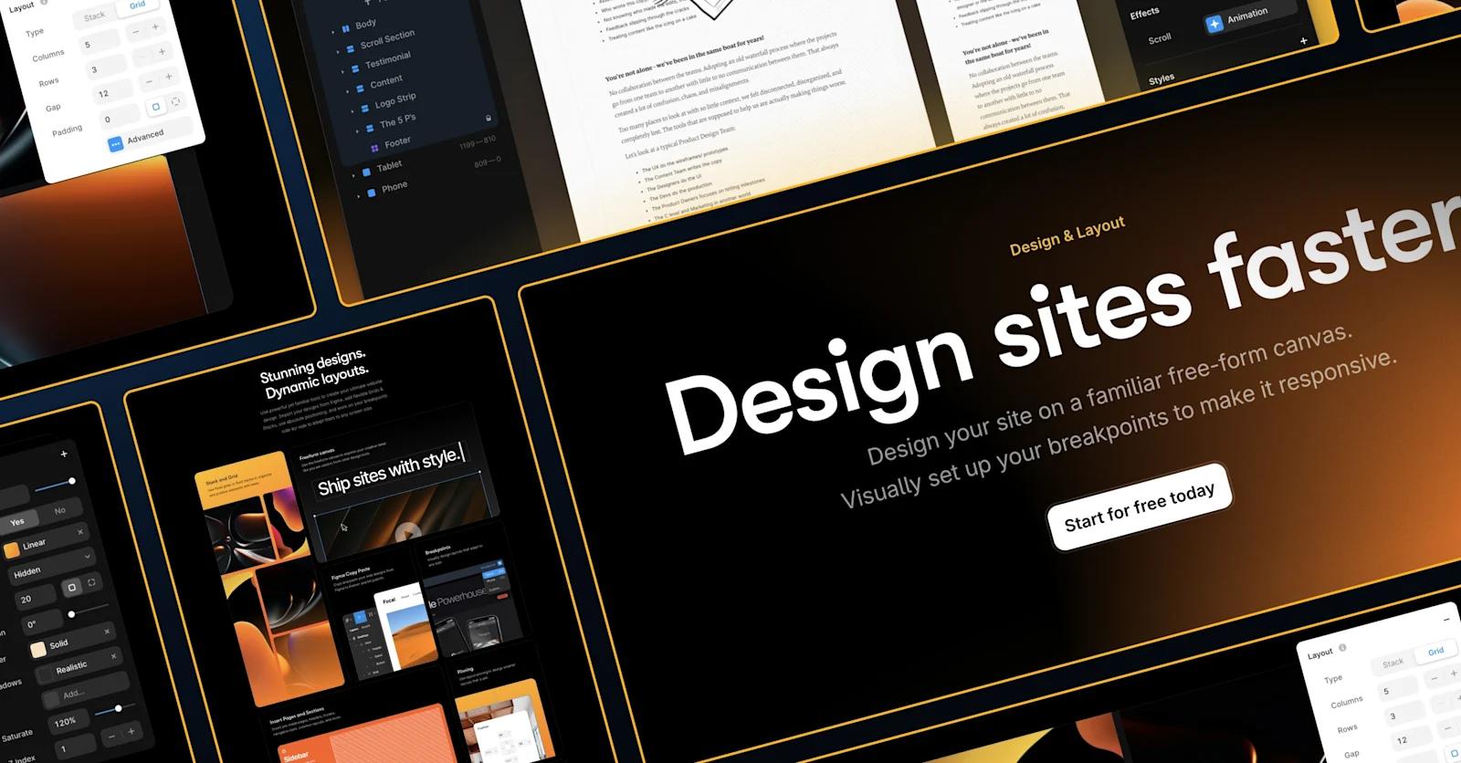
An example of this would be Framer, which is a website builder software. In place of “products”, they utilize several “features” pages to describe their platform.
If you’re searching for a true immersive web experience, look no further than Framer. Dark mode, constant movement, scannable text - this page has much to admire. It ditches many of the traditional SaaS design elements in favor of a style that is sure to wow every visitor.
Top Callouts:
- 😱 Captivating page layout
- 🌀 Lively animations
- 🎨 Unique color schemes for each product page
