SaaS Website Best Practices: A Page-by-Page Guide to Design That Converts
Most SaaS website advice reads like a checklist: add social proof, clarify your value proposition, speed up your load times. None of that is wrong, but it treats a homepage and a pricing page as if they solve the same problem.
They do not. A visitor lands on a homepage to figure out what a product does and who it is for. The same visitor reaches a pricing page days later, ready to weigh cost against value. Each page type answers a different question at a different stage of the buyer's evaluation, and design decisions that ignore that distinction produce a site that looks polished but converts inconsistently.
This guide breaks down SaaS website best practices by page type: homepage, product page, solutions page, pricing page and blog. It covers the navigation and UX foundation those pages sit on, the illustration and SEO layers that support them and real examples from companies that get each page type right.
What Makes a SaaS Website Effective
Before any single page can convert, the site around it needs a foundation that helps visitors move with intent instead of guessing where to click next.
Build Navigation Around Buyer Questions, Not Org Charts
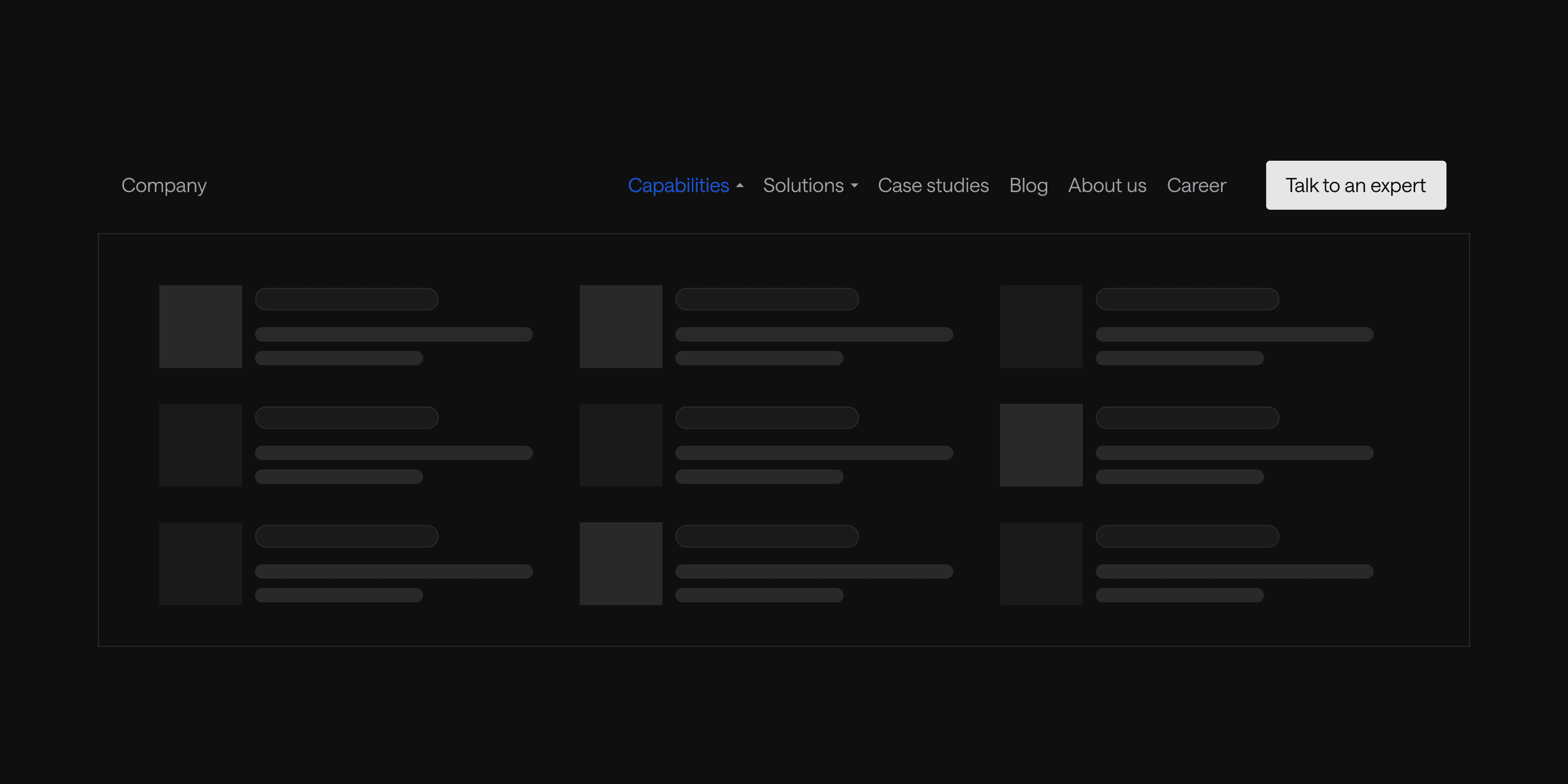
Navigation is usually the first element a visitor interacts with, and it shapes their initial impression of the entire product. The most common mistake is cramming every stakeholder's pet page into the menu. When navigation becomes a repository for internal priorities instead of a decision-making tool, visitors face decision paralysis instead of a clear path forward.
Most SaaS navigation menus should center on a handful of core items that map to buyer questions: Products, Solutions or Use Cases, Pricing, Resources, About, Contact, Demo and Log In. Secondary items like Why, Developers, Enterprise, Integrations and Partners earn a place only when a specific audience segment needs a dedicated path.
Three practices make that structure work in execution:
- Use labels people actually understand. Internal naming conventions and clever branded terms do not translate to a first-time visitor. Straightforward labels like "Pricing" or "Use Cases" match how buyers already search.
- Use mega menus for large site architectures. Two-dimensional layouts let visitors compare options side by side instead of scanning a long vertical list, and usability research from the Nielsen Norman Group has found this pattern consistently outperforms standard dropdowns on sites with many navigation options.
- Design for mobile first, not as an afterthought. A responsive hamburger menu with clear primary CTAs like "Get Demo" keeps conversion paths visible even on the smallest screens.
Four Elements of a Strong SaaS UX
SaaS UI/UX design is the practice of building interfaces that are easy to use and visually coherent. Companies that invest in it consistently see the payoff in conversion, retention and support-cost reduction. Four elements consistently separate strong SaaS experiences from weak ones.
- A user-centric approach. Start with research into what visitors are trying to accomplish, not assumptions about it.
- Intuitive navigation. Organize information architecture around how buyers think, not how the org chart is structured.
- Responsive design. Make sure the experience holds up across devices, since inconsistent behavior between desktop and mobile erodes trust fast.
- Onboarding and user education. Use guided tours, tooltips and contextual help to reduce the learning curve for new users once they convert.
Common UX Pitfalls to Avoid
The same few mistakes show up across weak SaaS experiences, and each one compounds the others.
- Feature overload. Cramming in every capability at once overwhelms visitors before they understand the core value.
- Inconsistent design patterns. Buttons, menus and forms that behave differently from page to page force users to relearn the interface.
- Onboarding that overwhelms rather than guides. Front-loading information instead of pacing it out increases drop-off.
- Mobile experiences treated as secondary. Designing for desktop first and patching mobile afterward creates friction for a growing share of visitors.
Design Best Practices by Page Type
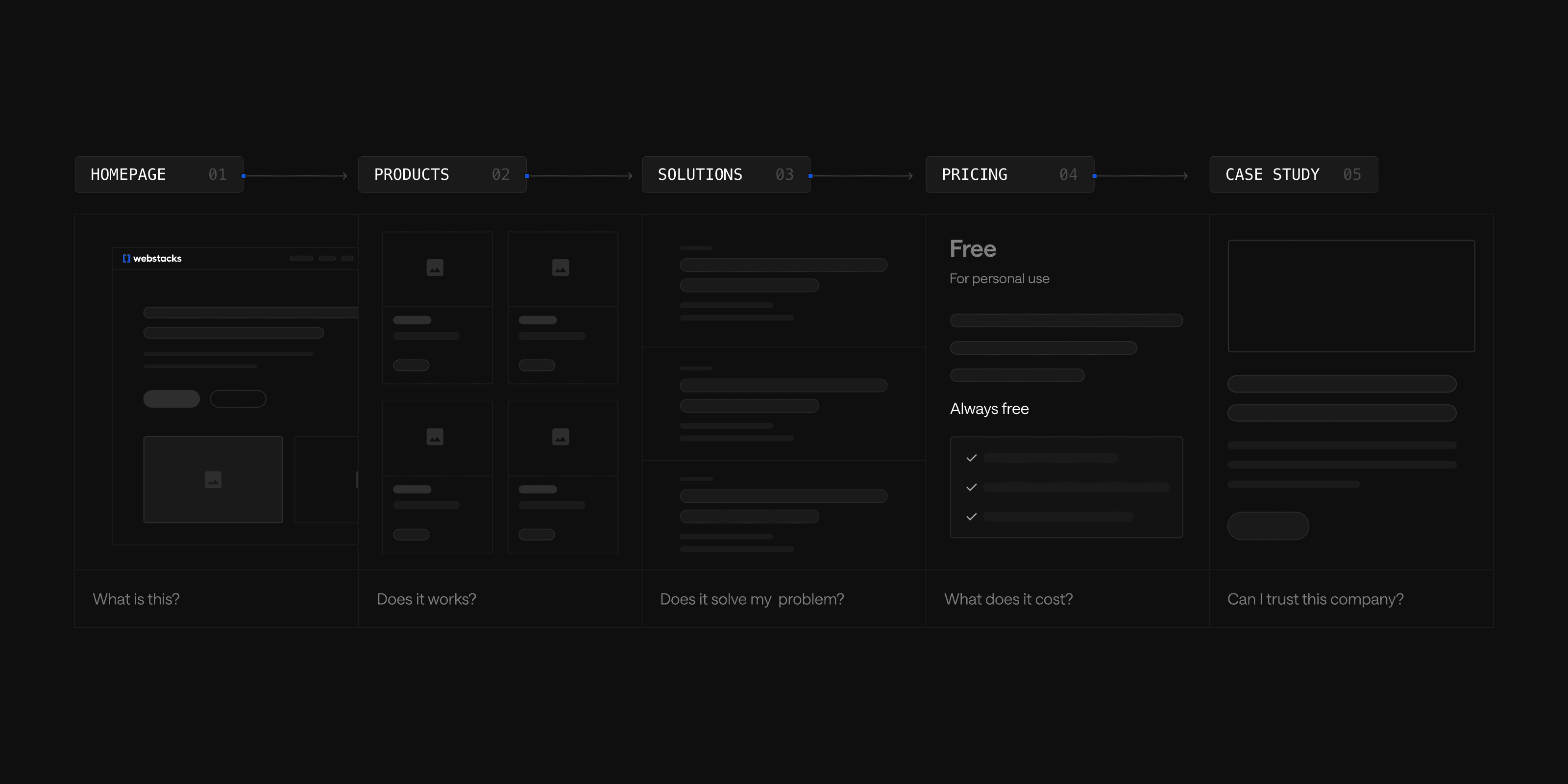
Every SaaS website is built from a handful of recurring page types, and each one has to do a different job. The order below follows how a buyer actually moves through evaluation: understand the product, see it in depth, connect it to a specific need, weigh the cost and keep learning after they convert.
Homepage: Communicate Value in Seconds
A homepage has one job in the first few seconds: tell a visitor what the product does, who it is for and why it is worth their time. The strongest examples do this without flashy visuals, relying instead on clean layout, clear copy and smart structure.
Notion's homepage opens with a single-line headline and lets real product UI, not mockups, carry the rest of the page. Stripe balances developer and enterprise use cases side by side, so neither audience has to dig for relevance. Linear strips away filler entirely, using a fully dark interface and dense grid system to signal speed and control to the engineering teams it targets.
A few patterns repeat across strong homepages:
- Sharp CTA hierarchy that prioritizes one primary action instead of competing for attention.
- Product UI embedded throughout the scroll, rather than isolated in a single hero image.
- Modular sections that let visitors digest one benefit at a time instead of one long wall of copy.
Product Pages: Educate, Entice, Convert
A product page has to perform three functions at once. It has to educate by explaining the product's capabilities clearly, entice by resonating with a specific problem the audience has and convert by guiding visitors toward a clear next step.
Four components consistently support those functions:
- Strong copywriting. Establish product positioning and lead with outcomes, not just features.
- Visual elements. Real product UI, illustrations and short explainer videos communicate usability faster than description alone.
- Trust signals. Certification badges, testimonials and case study previews reduce hesitation at the exact moment a visitor is deciding whether to act.
- Deliberate user journeys. Route different audience segments, such as developers versus executives, toward the content and CTA that matches their concern.
Scale's Data Engine page pairs a dark, technical aesthetic with clear customer proof, aligning tone to a sophisticated buyer. Braze uses a colorful, benefit-driven layout with case study metrics woven directly into the scroll. Deepgram embeds an interactive demo alongside specific use case examples, letting technical buyers validate the product's claims themselves rather than taking them on faith.
Solutions Pages: Sell the Outcome, Not the Feature List
A solutions page and a product page are frequently confused, but they answer different questions. A product page answers what the product does. A solutions page answers how the product solves a specific problem for that visitor. It is outcome-focused, often organized by role, industry or use case and frequently anchored by client stories that demonstrate results.
Solutions pages are worth the investment for reasons beyond conversion. Because they map directly to how buyers search, whether by role, industry or specific use case, they tend to rank for long-tail, high-intent keywords that a generic product page cannot target. A visitor searching one of those specific terms has already moved past broad research and is evaluating fit for their exact situation, which makes a solutions page one of the most efficient pages on a site for turning organic traffic into pipeline.
Structure matters as much as content. Categorize solutions clearly, whether by role, department, industry or use case, so visitors self-select quickly. Decide deliberately where solutions live in the navigation: a mega menu suits a large number of solutions, while a dedicated top-level tab with a parent hub page works better for a smaller, well-defined set. Calendly's solutions hub does the latter well, combining bold headings with an interactive feature comparison table and clear testimonials.
Pricing Pages: Make the Investment Easy to Justify
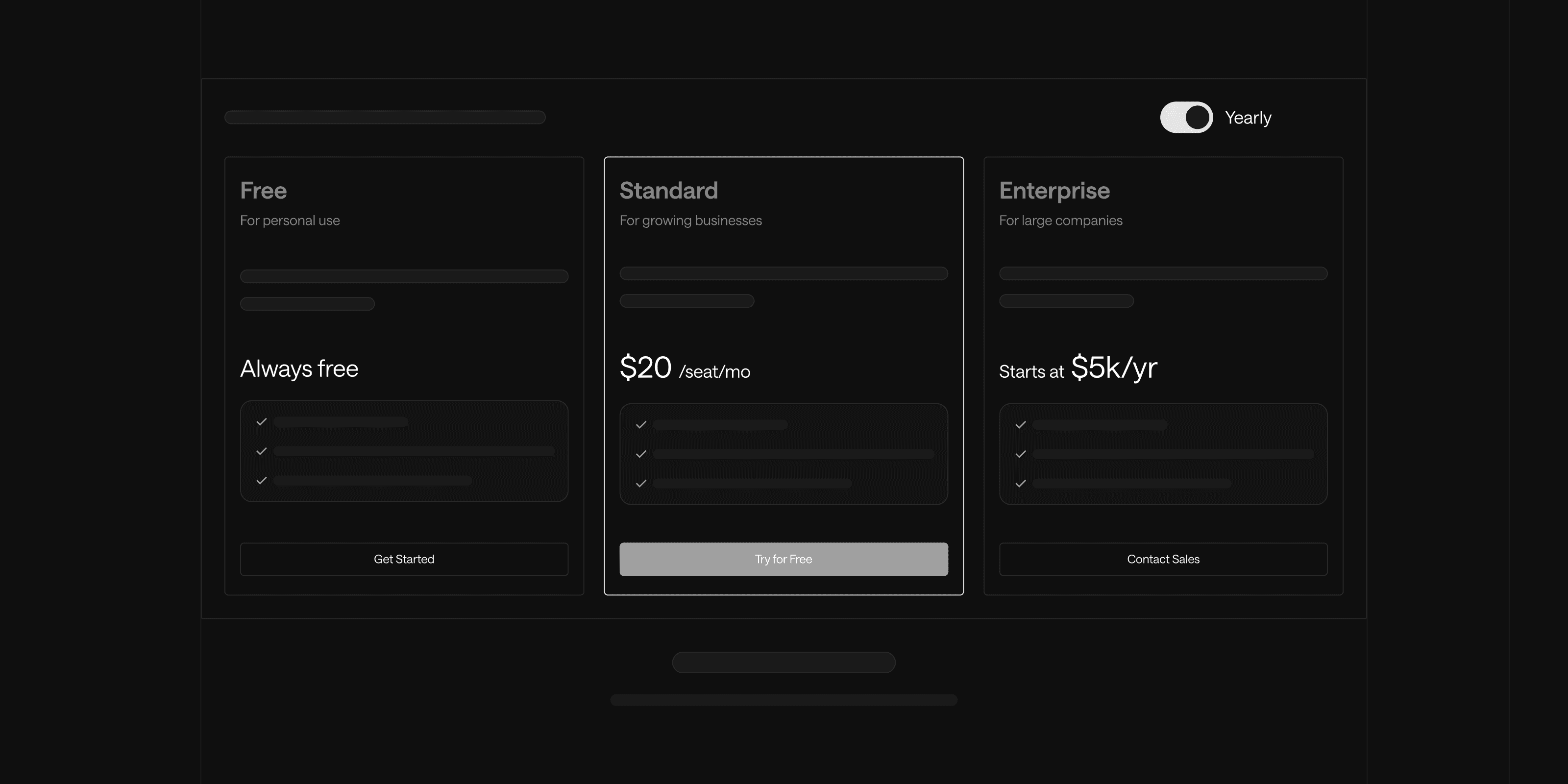
The pricing page is where evaluation turns into a decision, and buyers arrive expecting transparency. A well-built pricing page removes the friction that causes prospects to leave without converting or without reaching out to sales at all.
A strong pricing page includes four elements:
- Clearly defined plan tiers that state who each plan is for, not just what it includes, so a prospect can self-identify quickly.
- Comparison tables that let visitors see feature differences across tiers without leaving the page.
- Interactive calculators, worth building for usage-based pricing models where the sticker price alone tells a visitor little about what they will actually pay.
- FAQs that address the concerns that stall a purchase decision: contract terms, billing cycles and upgrade paths.
Psychological pricing tactics can influence which plan a visitor chooses without being manipulative. Placing a preferred plan between a higher and lower option makes it the natural middle choice, and highlighting annual billing discounts nudges toward longer commitments. For higher-priced products, buyers need to understand value, not just cost, so ROI estimates, customer testimonials and case studies placed near the pricing table help justify the number a visitor is about to commit to.
Blog and Resource Pages: Turn Content Into a Conversion Engine
A SaaS blog earns a large share of organic traffic for most B2B websites, and the blog listing page is the gateway that determines whether that traffic converts into anything more.
Layout and findability come first on the listing page itself:
- Organize posts so a standout piece draws attention, rather than presenting every post with equal visual weight.
- Add categorization and filtering so visitors can narrow by topic.
- Include search functionality for visitors looking for something specific.
- Show article thumbnails, author information, publish dates and read-time estimates to set expectations before a visitor commits to reading.
From there, conversion points matter as much as content quality. Newsletter CTAs, downloadable assets and clear paths to a product demo turn a casual reader into a lead.
Hotjar structures its blog by use case, customer story and industry insight, which keeps a broad content library navigable. ClickUp uses color-coded tags across a vibrant layout to help readers self-sort quickly. Both examples support the same principle: a blog is a lead-generation asset only if its structure gets out of the way of the content.
Use Illustration and Visual Design to Build Trust
Illustration is frequently treated as decoration, but on a SaaS website it does real work: humanizing digital interactions, communicating personality and making abstract or technical concepts easier to grasp at a glance.
The strongest illustration systems share a few traits. Consistency in color palette and style, as seen across Calendly's and Mailchimp's illustration systems, reinforces brand identity every time a visitor encounters a new page. Product UI embedded directly into illustrations, a pattern monday.com uses throughout its solutions pages, builds credibility by showing rather than describing. Real people, combined thoughtfully with icons and interface elements as Clickatell does, humanize what would otherwise be an abstract software interaction.
Building a reusable illustration system, rather than commissioning one-off graphics per page, pays off at scale. It lets a design or marketing team repurpose the same visual language across the website, social media and paid campaigns without starting from scratch each time.
Structure Content and Code for SEO
SaaS SEO requires more than keyword targeting, given how competitive the software category is across search. A handful of structural decisions determine whether the rest of this guide's design work actually gets found.
| SEO Practice | What it does |
|---|---|
| Target problem-focused and purchase-intent keywords | Comparison queries and solution-based searches signal a buyer closer to a decision |
| Build topic clusters | A broad pillar page links out to related subpages, strengthening authority around competitive terms |
| Apply schema markup for software products | Helps search engines understand the offering and improves eligibility for rich results |
| Use canonical tags | Prevents duplicate content issues across similar product or solution pages |
| Add hreflang tags | Ensures visitors in different regions land on the correct localized content |
Proof: How Leading SaaS Companies Put This Into Practice
The best evidence for any of these practices is a website that already applies them under real constraints. Webstacks has designed and built product and solutions pages for several SaaS and B2B companies, including Braze, Freshworks, UpKeep, Deepgram and Semgrep, and each reflects the principles above in a different context.
UpKeep's product and solutions pages lead with a business-like layout that emphasizes mobile accessibility and enterprise asset management, closing each section with customer testimonials that reinforce trust in its CMMS platform. Freshworks pairs a clean, high-white-space layout with a scrolling trust bar and clear CTA hierarchy, giving customer engagement software room to breathe without losing conversion focus. Semgrep uses hero animation and a scrolling trust bar to hold attention on a technical product page, backed by infographics that break dense security data into something scannable.
Beyond individual pages, Webstacks' broader case study work shows what these practices produce at the site level. ServiceTitan migrated its marketing website to Gatsby and Contentful, shipping the full redesign in under 100 days. Circle rebuilt its marketing site on HubSpot and, after the new website launched, saw a 500 percent increase in product demos, a 21 percent lift in organic traffic and zero loss of existing organic traffic during the migration. Webstacks' work with Calendly and Snowflake covers similar full-site redesigns and CMS migrations, illustrating how the page-level practices in this guide fit into a larger site strategy.
Track Performance and Keep Testing
Website design is not a one-time project, and the best SaaS teams treat their site as a product that gets measured and iterated continuously.
Metrics That Matter Most
- Visitor-to-trial conversion rate, measuring how effectively the site turns visitors into trial users.
- Trial-to-paid conversion rate, tracking how many trial users become paying customers.
- Customer acquisition cost by traffic source, showing which channels bring in cost-effective leads.
- Feature usage during trial periods, identifying which features drive engagement and conversion.
Tools like Google Analytics, Mixpanel and Amplitude surface the behavioral data behind those numbers.
Test One Variable at a Time
Structured testing beats assumption-driven changes. Prioritize high-traffic, high-impact pages first, and isolate a single variable per test:
- Value proposition language on landing pages.
- CTA placement, design and wording.
- Pricing page layout and feature presentation.
- Signup flow length and required information.
Where to Focus First
Not every team has the resources to overhaul every page type at once. The table below maps common starting points to the page type most likely to move the needle, based on the practices covered above.
| Decision priority | Best-fit page or practice | Why |
|---|---|---|
| Visitors bounce before understanding the product | Homepage | A homepage that fails to communicate value in seconds loses visitors before any other page gets a chance |
| High-quality traffic but low demo requests | Product and solutions page | These pages carry the burden of proof; weak trust signals or unclear outcomes stall consideration-stage buyers |
| Prospects stall before contacting sales | Pricing page | Missing transparency or ROI context is a common reason buyers disengage before a sales conversation starts |
| Strong organic traffic, low content-to-lead conversion | Blog and resource pages | Traffic without conversion points or categorization leaves a lead-generation asset underused |
| Site feels generic compared to competitors | Illustration and visual design | A cohesive illustration system differentiates brand perception faster than a page-by-page copy rewrite |
| Rankings plateaued or declining | SEO structure | Topic clustering, schema and canonical cleanup often produce gains before a content rewrite is needed |
A website redesign does not have to start everywhere at once. Matching the practice to the actual point of friction in the buyer journey makes the investment measurable from the first sprint.
Ready to treat your website like a growth product? Talk to Webstacks.

I create SEO-driven content for B2B SaaS companies, from blog posts to case studies. I focus on research-backed writing that ranks on the first page and drives meaningful organic traffic.