High-Converting Startup Landing Pages


A startup's landing page is often the first impression potential customers have of your product. It's where visitors decide whether to take the next step, whether that's to sign up, request a demo, or make a purchase. A strong landing page should look good and lead visitors through a clear journey that highlights your value and makes it easy to take action.
Many startup websites struggle to get this right. Some overwhelm visitors with too much information, while others leave out important details that could build trust. Some use vague calls to action (CTAs), while others make the signup process so complicated that visitors drop off.
This article breaks down the five elements every high-converting startup landing page needs, common mistakes to avoid, and additional strategies for B2B startups looking to drive more leads.
In brief:
- Great startup landing pages convert visitors into leads and improve the sales process for B2B startups.
- Key elements include a compelling hero section, clear call-to-action, social proof, feature highlights, and optimized design.
- Common mistakes like content imbalance, weak CTAs, complex design, and neglecting mobile optimization can reduce conversions.
See what’s working for industry-leading websites and find inspiration to improve yours.

What Every High-Converting Landing Page Needs
A high-converting landing page doesn't happen by accident. It's built with intention—every section, headline, and CTA serves a purpose. Visitors should immediately understand what your product does, why it matters, and how they can take the next step.
Here are the five elements that make a landing page effective.
1. Clear and Compelling Hero Section
The hero section is the first thing visitors see when they land on your page. It needs to grab attention and communicate your value in just a few seconds. A strong hero section includes three key elements:
- A clear headline that states what your product does and who it's for.
- A supporting subheadline that explains the main benefit or problem it solves.
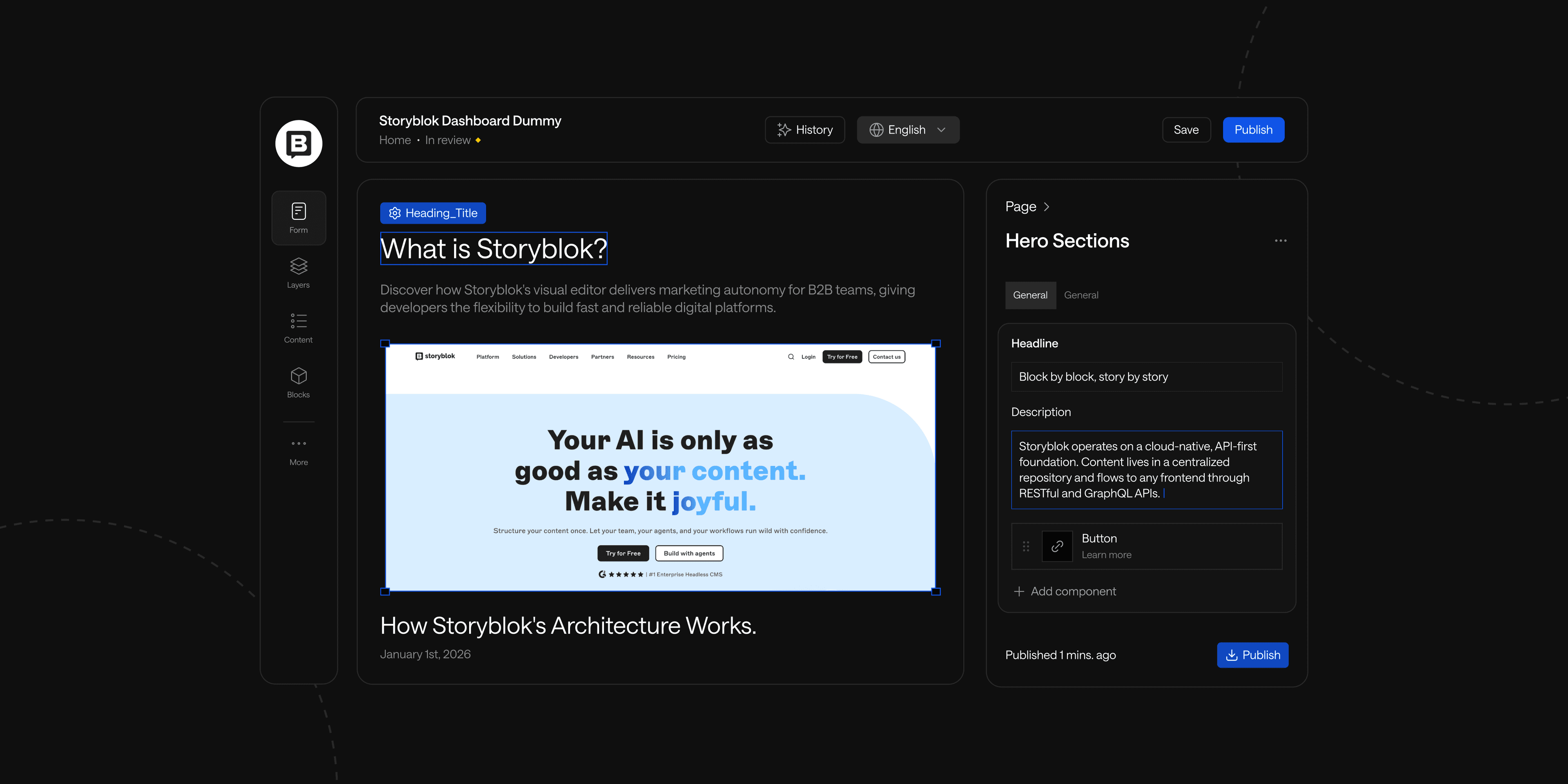
- A visual element (screenshot, video, illustration) that reinforces your message.
For example, instead of saying:"Revolutionizing Business Efficiency with AI-Powered Solutions"
Try something more direct and benefit-driven:"Save 10+ Hours a Week with AI-Powered Marketing Automation"
The goal is to be clear, not clever. Visitors should immediately understand what they're getting. If they have to think too hard, they'll leave.
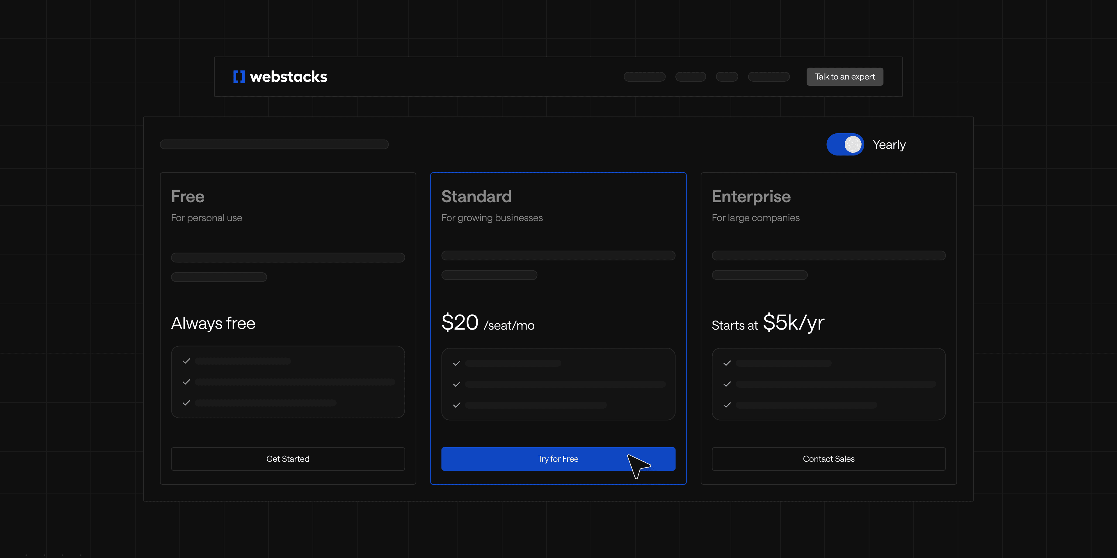
2. Strong CTA and Lead Capture Form
Once visitors know what your product does, they need an obvious next step. That's where a CTA comes in.
It should be:
- Action-oriented: "Start Free Trial" works better than "Learn More."
- Visually distinct: Use a contrasting color that makes the button stand out.
- Positioned prominently: Place it above the fold and repeat it throughout the page.
Your lead capture form should be as frictionless as possible. Long forms with unnecessary fields discourage signups. If you don't absolutely need a phone number or job title, leave it out. Some startups offer a "Continue with Google" option to simplify the process further.
3. Social Proof and Credibility Indicators
People trust other people more than they trust companies. Adding social proof reassures visitors that they're making the right choice.
This could include:
- Customer testimonials with real names, photos, and specific results.
- Logos of recognizable clients that show industry credibility.
- Third-party endorsements (G2 ratings, Trustpilot reviews, media mentions).
Numbers help too. If thousands of businesses use your product, say so: "Trusted by 10,000+ companies worldwide."
4. Feature Highlights Tied to Pain Points
Startups often make the mistake of listing features without context. Instead, connect each feature to a specific pain point or benefit.
For example, instead of:"Our CRM integrates with 50+ tools."
Try:"Connect your favorite tools in seconds—sync HubSpot, Slack, and more without writing a single line of code."
Break features into short sections with icons or visuals. Keep text scannable, since long paragraphs slow visitors down.
5. Fast-Loading, Mobile-Optimized Design
A slow or clunky landing page kills conversions. If your page takes more than a few seconds to load, people will leave before they even see your offer.
Optimize images, reduce unnecessary scripts, and use a content delivery network (CDN) to speed things up. Don't forget about mobile responsiveness, either. Many startups test on desktop but forget to check how the page looks on a phone.
If forms or buttons are hard to click on mobile, conversions will suffer.
See what’s working for industry-leading websites and find inspiration to improve yours.
Common Landing Page Mistakes Startups Make
Even with all the right elements in place, simple mistakes can hold back your landing page's success. Many startups fall into these traps without realizing how much they impact conversions.
Too Much or Too Little Content
Finding the right balance is tricky. Some landing pages overwhelm visitors with endless text, while others provide so little information that potential customers don't understand the product.
If your page has huge blocks of text, break them up. Use bullet points, subheadings, and short paragraphs. Every sentence should help move visitors toward the CTA.
If your page is too vague, add just enough detail to address common objections. A simple FAQ section at the bottom can help answer lingering questions without cluttering the main sections.
Weak CTAs or Friction in the Signup Flow
A weak CTA makes visitors hesitate. A complicated signup flow makes them leave. And both hurt conversions.
Make sure your CTA is direct and benefit-focused. Instead of "Get Started," try "Start Your Free Trial Now." Instead of "Request Info," try "See a Live Demo in 30 Seconds."
Friction in the signup flow, such as requiring unnecessary details or forcing visitors to create an account before they can see pricing, adds extra steps that push people away.
How B2B Startups Can Optimize Their Landing Pages
B2B landing pages have different challenges than B2C. Buyers often need more information before making a decision, and there are usually multiple stakeholders involved.
- **Use industry-specific messaging: **Generic messaging doesn't work as well in B2B. If your product serves different industries, tailor your messaging accordingly or create multiple industry pages. Some startups use IP-based personalization tools to adjust headlines and case studies based on the visitor's industry.
- **Incorporate lead nurturing elements: **Not every visitor will convert immediately. A secondary CTA, such as a downloadable guide or webinar invite, keeps them engaged until they're ready. Retargeting ads can also bring back visitors who left without signing up.
- **Highlight integrations and scalability: **B2B buyers care about how a product fits into their existing tech stack. Make integration capabilities clear. A section that highlights API support, third-party integrations, and scalability features can address these concerns.
Turn Your Landing Page into a Conversion Machine
A startup landing page that focuses on clear messaging, credibility, and mobile performance will increase conversions and generate more leads.
But landing pages are never done. Testing different headlines, CTAs, and layouts can uncover what resonates best with your audience. Small tweaks often lead to big improvements.
If your startup is scaling and needs a more flexible website solution, moving to a headless CMS can help. Download our headless CMS implementation checklist to get step-by-step guidance to support you during this process.
Avoid costly mistakes and last-minute surprises by preparing with our actionable checklist.