Top SaaS Website Design Trends

It takes just 0.05 seconds for users to form an opinion about your website's visual appeal. In a business of SaaS, this can make or break a lead or a conversion.
This is why this article explores the fundamentals of good SaaS website design.
In brief:
- SaaS website design is not just about aesthetics—it directly impacts user retention, conversion rates, and brand perception.
- Trends like bold typography, personalized experiences, and microinteractions are reshaping how SaaS companies engage users and simplify their offerings.
- SaaS design should balance innovative layouts with seamless and familiar functionality to ensure both aesthetic appeal and practical usability.
What is SaaS Web Design?
SaaS web design focuses on creating websites for Software as a Service (SaaS) companies. These websites need to be user-friendly, visually appealing, and functional. Effective SaaS web design helps businesses attract and retain customers by providing an intuitive and engaging user experience.
Key elements include clear navigation, compelling calls-to-action, and responsive design. These components ensure that users can easily understand the product, navigate the site, and take desired actions, such as signing up for a trial or making a purchase.
We partner with high-growth tech brands to design, build, and scale websites that marketers and end-users love.

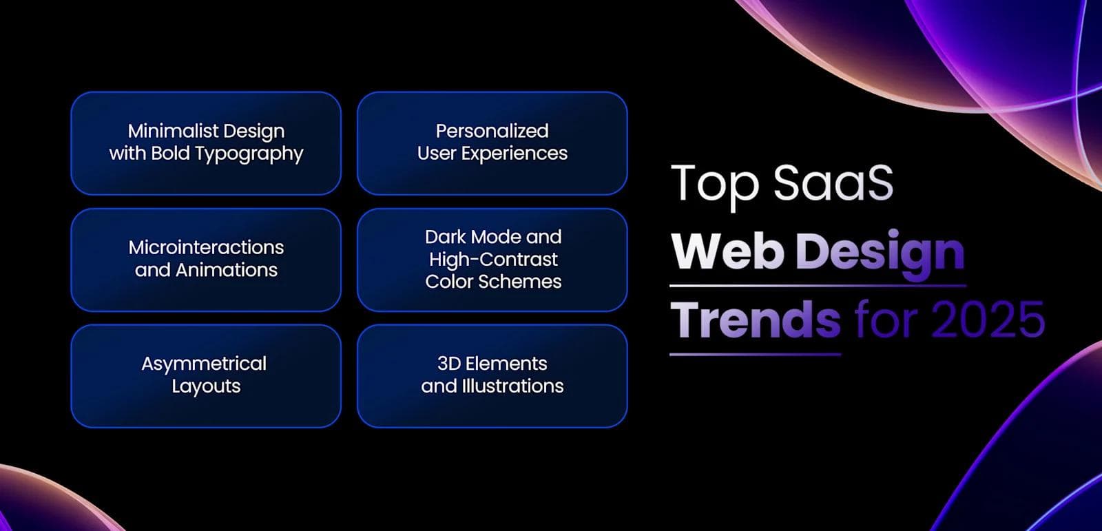
Top 6 SaaS Web Design Trends for 2024
You might be wondering which trends will actually make a difference in your website’s performance. Let's go through some of the top trends that could give you the edge you’re looking for.
Discover key indicators that you’re in need of a SaaS website redesign and explore 10+ B2B SaaS redesign examples.
1. Minimalist Design with Bold Typography
Minimalist design continues to dominate SaaS web design in 2024. This approach focuses on clean, simple layouts that eliminate unnecessary elements. Bold typography becomes a focal point, drawing attention to key messages and calls-to-action.
This combination ensures that users can easily navigate the site and find the information they need without distractions. The use of ample white space enhances readability and creates a modern, professional look.
2. Personalized User Experiences
Personalization plays a significant role in SaaS web design. Tailoring the user experience based on individual preferences and behaviors increases engagement and satisfaction. This can include personalized content recommendations, dynamic landing pages, and user-specific dashboards.
By leveraging data analytics, you can create a more relevant and engaging experience for each visitor, making them feel valued and understood.
3. Microinteractions and Animations
Microinteractions and animations add a layer of interactivity to SaaS websites. These small, subtle animations guide users through the site and provide feedback on their actions. For example, a button might change color when hovered over, or a form field might shake if filled out incorrectly.
These elements enhance the user experience by making the site feel more responsive and intuitive.
4. Dark Mode and High-Contrast Color Schemes
Dark mode and high-contrast color schemes are gaining popularity. Dark mode reduces eye strain and can save battery life on mobile devices. High-contrast color schemes improve readability and accessibility, making it easier for users with visual impairments to navigate the site.
Offering a dark mode option allows users to choose their preferred viewing experience, enhancing overall satisfaction.
5. Asymmetrical Layouts
Asymmetrical layouts break away from traditional grid-based designs, creating a more dynamic and visually interesting experience. These layouts use irregular shapes, overlapping elements, and varied spacing to draw attention to specific areas of the page. Asymmetry can make a SaaS website stand out, giving it a unique and modern feel.
6. 3D Elements and Illustrations
3D elements and illustrations bring depth and realism to SaaS web design. These visuals can make a site more engaging and memorable. For example, 3D product models allow users to explore features in detail, while custom illustrations can convey complex ideas in an easily digestible format.
Incorporating these elements adds a layer of sophistication and creativity to your site, making it more appealing to users.

Key Principles of Effective SaaS Web Design
You might be wondering what foundational principles you should focus on to ensure your website is effective. Here are some key elements to consider.
Intuitive Navigation and User Flow
Intuitive navigation ensures users can find what they need quickly and easily. A well-structured menu and clear labels guide users through the site without confusion. Logical user flow means each page leads naturally to the next, helping users complete tasks efficiently.
Breadcrumbs, search bars, and clear headings enhance navigation, making the user experience smooth and enjoyable.
Clear Value Proposition and Messaging
Your value proposition should be immediately apparent. Users need to understand what your SaaS product offers and why it’s beneficial. Use concise, compelling language to communicate your unique selling points.
Highlight key features and benefits prominently. Effective messaging builds trust and encourages users to explore further, increasing the likelihood of conversion.
Responsive Design for Mobile Devices
Responsive design adapts your website to various screen sizes and devices. Mobile users should have the same seamless experience as desktop users. Ensure buttons are easy to tap, text is readable without zooming, and images load correctly.
A mobile-friendly design improves user satisfaction and keeps visitors engaged, regardless of how they access your site.
Fast Loading Speed and Performance
Fast loading speeds are non-negotiable. Users expect pages to load quickly, and delays can lead to high bounce rates. Optimize images, leverage browser caching, and minimize JavaScript and CSS files to enhance performance.
A fast website not only improves user experience but also positively impacts search engine rankings, driving more organic traffic to your site.
Accessible Design for All Users
Accessibility ensures everyone, including those with disabilities, can use your website. Use readable fonts, high-contrast color schemes, and descriptive alt text for images. Implement keyboard navigation and screen reader compatibility. Accessible design broadens your audience and demonstrates a commitment to inclusivity, enhancing your brand’s reputation.
Common Mistakes to Avoid in SaaS Web Design
Avoiding common pitfalls can save you a lot of headaches and ensure your website performs at its best. Here are some mistakes to watch out for.
Cluttered and Confusing Layouts
Cluttered layouts overwhelm users and make it difficult to find information. Stick to a clean, organized design. Use ample white space to separate elements and guide the user's eye. Avoid overloading pages with too many images, buttons, or text blocks. A straightforward layout helps users navigate your site effortlessly, improving their overall experience.
Lack of Clear Calls-to-Action (CTAs)
CTAs drive user actions, such as signing up for a trial or purchasing a subscription. Without clear CTAs, users may leave your site without taking action. Place CTAs prominently and use compelling language. Ensure they stand out visually by using contrasting colors and strategic placement. Clear CTAs guide users toward desired actions, increasing conversion rates.
Poor Mobile Optimization
Many users access websites on mobile devices. A site that isn't optimized for mobile can frustrate users and lead to high bounce rates. Ensure your design is responsive, adapting seamlessly to various screen sizes. Test your site on different devices to confirm that text is readable, buttons are tappable, and navigation is intuitive. Mobile optimization enhances user satisfaction and keeps visitors engaged.
Slow Loading Times
Slow loading times can drive users away. Optimize your site to load quickly by compressing images, minimizing code, and leveraging browser caching. Users expect fast, smooth experiences; delays can lead to frustration and abandonment. A fast-loading site not only improves user experience but also boosts search engine rankings, attracting more organic traffic.
Neglecting Accessibility Guidelines
Accessibility ensures everyone can use your site, including those with disabilities. Follow accessibility guidelines to make your site inclusive. Use readable fonts, high-contrast colors, and descriptive alt text for images.
Implement keyboard navigation and screen reader compatibility. Ignoring accessibility can alienate potential users and harm your brand's reputation. An accessible site broadens your audience and demonstrates a commitment to inclusivity.
Our Take on SaaS Website Design
Effective website design is important in SaaS industry for user engagement and retention. A minimalist approach, emphasizing clarity and ease of navigation, reduces cognitive load and enhances user experience.
In our view, incorporating interactive elements, such as microinteractions, can provide immediate feedback and make the interface more intuitive. Responsive design, on the other hand, ensures accessibility across various devices, which caters to a diverse user base. Prioritizing these aspects in design not only meets user expectations but also fosters trust and encourages continued use of the service.
Find out how Webstacks achieved a 900% increase in organic traffic for Snowflake through the power of good website design and website structure.
See the Webstacks difference: Schedule a brief discovery call today. At Webstacks, we specialize in designing and building scalable, cutting-edge websites tailored to your unique needs. Let us help you generate more value from your website with our hassle-free design and development processes. Schedule a call now.
We partner with high-growth tech brands to design, build, and scale websites that marketers and end-users love.


I drive our marketing initiatives and help maintain the company website. I work closely with our design teams to keep branding consistent across every channel.


