There’s a good chance you’ve stumbled upon a microsite without even recognizing it. Today’s fastest-growing companies leverage branded microsites to boost their content marketing initiatives – from new product launches and building event hype to sharing hyper-focused content with specific audiences.
We’ll look at how microsites help leading B2B and B2C companies convey unique messages to draw in niche audiences. In this article, we are showcasing awe-inspiring microsite examples and the innovative design elements that drive their success.
What is a Microsite
A microsite is a website dedicated to a specific product, campaign, or event. While a company’s main website speaks to a broad audience, microsites allow brands to create tailored experiences for select audiences.
Microsites have emerged as a valuable ABM tool for teams to continue personalized messaging post-sale. When you enable visitors to navigate information that directly resonates with their needs, they’re more likely to convert and become loyal customers.
Let’s make one thing clear: microsites are not landing pages. Microsites typically contain multiple web pages with in-depth information, and landing pages are single pages focused on a specific call to action.
For creating immersive experiences and hyper-targeted content, microsites are the way to go. Landing pages are more suited for lead generation and boosting conversions.
Microsites can be simple and showcase content on a smaller scale, but that doesn’t mean they can’t make a substantial impression. Let’s explore some astonishing microsite examples that keep users exploring and provide mind-blowing interactive experiences!
Types of Microsites
Microsites come in various flavors, each tailored to different marketing needs. Understanding these types can help you choose the right approach for your brand's objectives.
Campaign-Specific Microsites
These are the go-to for short-term marketing goals. Think of them as your digital billboard, designed to capture attention and drive immediate action. Whether it's a seasonal sale or a limited-time offer, campaign-specific microsites create urgency and focus.
Product-Focused Microsites
When you have a product that deserves the spotlight, a product-focused microsite can make it shine. These sites delve into the details, offering in-depth information, user testimonials, and interactive features that encourage users to explore and engage.
Event-Driven Microsites
Planning a virtual or in-person event? Event-driven microsites serve as the hub for all event-related activities. From registration to agenda details, these sites make it easy for attendees to get the information they need while building excitement and anticipation.

8 B2B/B2C Best Microsite Examples
Snowflake University
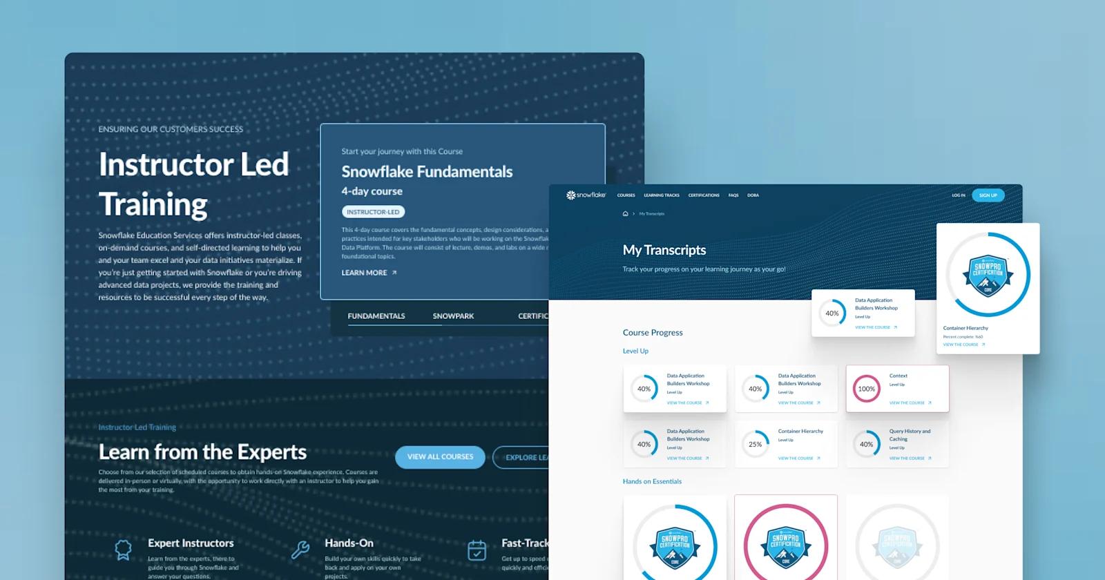
One fantastic microsite example is Snowflake’s intuitive educational microsite, Snowflake University. It’s a common use case for microsites to serve as a learning hub to provide laser-focused content to individuals looking to expand their knowledge and skills in areas related to your products or solutions.
For Snowflake, this educational hub engages both data management novices and experts looking to start with Snowflake or advance their data projects.
How Snowflake University offers an effortless learning experience

The #1 reason behind why Snowflake University is a top microsite example? Their intuitive, user-friendly design. This educational center allows users to easily navigate courses and certifications that help individuals and organizations effectively use Snowflake's cloud-based data platform.
Snowflake University microsite design is top-notch

Old, unclear cards were replaced with new cards that include thumbnails and context for easier course navigation without leaving the homepage. You can also filter by topic and cost to narrow down results, as well as use a table of contents to select courses based on effort level.

Everyone can benefit from a little motivation on their learning journey, and Snowflake University makes sure each user is encouraged to make it across the finish line! When users view their transcripts, they can track their progress with progress bars, which create an interactive aspect for the website, along with providing tangible feedback to learners.
Ultimately, Snowflake University excels in providing engaging learning experiences and encouraging their target market to get hands-on experience with a company’s product. A 10/10 educational microsite in our books!
Key features from Snowflake University:
✔️ Color palettes matching Snowflake’s corporate branding
✔️ Interactive progress bars to track course progress
✔️ Revamped navigation bar for better accessibility
✔️ Clean card decks with thumbnails and context for each course
Learn more about how Webstacks revamped Snowflake University’s microsite. >
HubSpot Website Grader
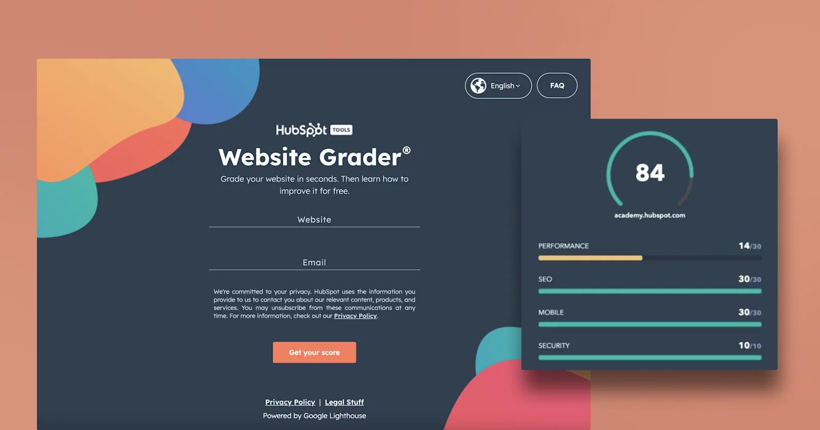
Does your website make the grade? See if your website checks off all the boxes with HubSpot’s website grader!
The purpose of HubSpot’s microsite is to help businesses analyze their website’s current performance and make improvements. In turn, HubSpot uses this microsite to gain contact information to boost future lead-gen initiatives. It also encourages marketers to use Hubspot Academy as a valuable resource for refining their website.
How HubSpot grades your website
Websites are graded based on four criteria: performance, security, SEO, and mobile experience.

After a website is graded, users are provided with a breakdown of their website’s rating and suggestions for improvement. But the experience does not stop there!
Use Case: Promote more resources and boost conversions
To ensure users get all the guidance they need, Website Grader directs users to a HubSpot Academy course related to an area of improvement. Now, businesses are equipped with the resources needed to increase their website grade, and HubSpot receives contact information that can be used for future lead-generation efforts.
Key features from HubSpot’s microsite:
✔️ Colorful, on-brand design elements on the homepage
✔️ Meter bars that reflect users’ scores for the four criteria
✔️ Personable copy that guides users to implement suggestions
✔️ Helpful FAQ’s conveniently on the homepage
Adobe Creative Types

Curious about what your creative persona is? Not only does Adobe set the standard for visual design tools, but they continue to raise the bar when it comes to aligning themselves with their customers.
Introducing Adobe “Creative Types,” a microsite that targets creatives to discover their creative personality with an immersive questionnaire. The main goal: raise brand awareness by giving creatives added value associated with their brand, aka their creative personality. This in turn demonstrates to creative artists that Adobe understands their needs and is the ideal software to fulfill any creative demands.

How Adobe uncovers your creative personality
This microsite embodies the core values of Adobe: innovation, creativity, and inspiration. Each question assesses an individual’s habits and outlook on life. Users are asked self-reflective questions like “Are you a dreamer or a doer?” and “Are you more intellect or emotion dominant?” which builds excitement for their creative identity discovery.

It wouldn’t be an Adobe-designed microsite without some fun and flair. After each question, users experience animated transitions and different eye-catching gradients that all make for an enjoyable user experience.

Raise brand awareness & loyalty like Adobe
In the end, users are given one of eight creative types, as well as a breakdown of their motivations, strengths, and advice for pursuing creative goals. Each type is depicted by animated, playful characters that add an interactive element to the site. We appreciate how users are encouraged to take one final step: download their type and share on social media. This drives home their goal of increasing brand awareness and solidifying Adobe as a creative software industry leader.
Kudos to Adobe for its ingenious microsite, engaging millions of creatives with this unique user experience!
Key features from Adobe’s microsite:
✔️ Whimsical, fun character designs representing each persona
✔️ Use of bold, colorful gradients that match Adobe’s branding
✔️ Dynamic transitions between each question
✔️ A download feature for users to share their type on social media
BetterUp (Uplift)

If you’re looking for an outstanding event microsite example, check out BetterUp’s “Uplift” microsite! For their two-day summit centered around courageous leadership practices, BetterUp designed this informational hub to share event details and encourage senior executives to register.

How Betterup’s Uplift microsite builds event hype
You can’t help but feel uplifted after landing on this homepage. Users immediately feel welcomed with exciting video snippets of last year’s event, fun shapes, and a dynamic trust bar that features renowned brands who are attending. We love how BetterUp includes a CTA to “relive last year’s Uplift” to allow users to preview what’s to come and build hype for this year’s summit.

Get the answers to all event-related questions
This microsite answers all potential attendee questions in an easy-to-navigate layout. Who are the guest speakers? Scroll through a neat card deck for each presenter.
What’s on the agenda? Here’s a detailed bulleted itinerary.
How can I get there? Check out the location page for information on the closest airports and hotels.
Hats off to BetterUp for executing a memorable event microsite that successfully builds interest and drives registrations!
Key features from BetterUp’s Uplift microsite:
✔️ Use of eye-catching shapes and bold, on-brand color palettes
✔️ High-quality images of guest speakers and past BetterUp summits
✔️ An animated trust bar and event testimonials
✔️ A custom pink cursor for users to seamlessly scroll through the page
Mural (Persona)

Are you looking to uncover which “meeting” type you are during team meetings? Mural - a visual collaboration tool for all teams - launched a microsite to help users determine which “meeting persona” they are.
Users who complete the microsite experience uncover the value, which is learning more about their meeting styles.
But for Mural, it’s an opportunity to learn more about the user and find targeted ways to promote their product to this core group of “meeting persona” seekers.
Mural’s purpose and who they target
The value a user will take away from the microsite experience is stated in the copy:

Mural targets people who are in creative or strategy roles, consistently attending team meetings. The goal of Mural’s persona test is to help this group of people be more effective with the tips they offer.
And present their solution/software to help them improve as a collaborator.
How Mural does it

Mural asks questions about agenda organization, the types of meetings we enjoy, and even hypothetical situations like not paying attention and how we’d react. The microsite is an enjoyable experience for users to understand what they’re like as meeting participants.
But how do they get their results?
Mural gives value after they receive value

Mural does a great job crafting an enjoyable microsite experience by highlighting the benefit of taking the persona test and what the user will walk away with after taking the test.
The tailored questions are creative and entice users to continue through the questionnaire without wanting to bounce midway through. Mural’s team also does a great job adding visual elements across the page experience with the theme of team collaboration and meeting.
The final conversion point is frictionless and only asks for basic information from the user, with a clear call to action. The purpose of Mural’s microsite is clear: increase conversions to learn more about the meeting styles of users.
Key features from Mural’s microsite:
✔️ Clear action and value statement
✔️ Seamless UI/UX page experience from page to page
✔️ Survey questions that directly correlate with the offer
✔️ Creative visuals that match the offer
✔️ Frictionless submission experience
Blueheart Patagonia

DAM, what a beautiful experience. Patagonia launched a microsite with one clear objective - rally their outdoor enthusiasts and environment supporters to sign a petition to save Europe’s last wild rivers.
The microsite experience is breathtaking and attempts to trigger the emotions of its audience by featuring beautifully captured images of the European river.
Judging by the homepage, they know who their target audience is and present visitors with multiple conversion points to learn more about the cause.
How Patagonia gets it right with microsite design

Patagonia does a great job of featuring screenshots of the European rivers and mountain ranges across the microsite. Composed of only three pages, each is designed to help raise awareness for how hydropower is impacting life across the Balkans.

Patagonia’s team incorporates bold headlines intended to trigger the emotions of website visitors. Paired with the headlines are eye-catching experiences - in the example above, visitors can see the areas impacted by hydropower.

To give visitors a closer look at the effects of hydropower, Patagonia incorporates more images of different regions and what life is currently like. By doing so, Patagonia targets its audience while presenting an interactive yet informative web experience.
Patagonia’s microsite has clear conversion paths

It’s more than likely that Patagonia would want to learn more about the cause before taking action. Patagonia presents different conversion points - website visitors can learn more, explore the affected regions, and take action immediately.
Patagonia’s experience is heartfelt and wholeheartedly fulfills the purpose of the microsite - well done, Patagonia.
Key features from Patagonia’s microsite:
✔️ A microsite experience for people who love the outdoors and the environment
✔️ Clear messaging evoking the importance of taking care of the environment
✔️ Copywriting that evokes distress
✔️ An interactive experience allowing users to explore for themselves
✔️ Clear conversion paths
Spotify Canvas

Spotify, one of the most popular music streaming platforms, launched a new creative feature called Canvas - for artists and anyone a part of their team.
The microsite is a flashy, artistic experience showcasing how current artists use these looping visuals to create visionary album artwork for their listeners.
Spotify’s loop hero component experience

Spotify’s microsite welcomes artists and their teams with a bold headline highlighting the benefit of using the Canvas feature - to show fans something new.
Paired with the headline is a hero illustration showcasing five album artwork examples of artists using the feature. Website visitors see the likes of Flume, Harry Styles, and Billie Eilish.
A neat scrolling experience

Our favorite part of Spotify’s microsite is the scrolling experience. The website component pictured above is a fun interactive experience allowing users to hover over each example to see the Canvas feature in action.
Users can drag their cursor from left to right to scroll through the different types of artistic work - from 3D graphics to 2D graphics to video.
Bonus: Spotify’s microsite is on-brand

Spotify’s creative team did an outstanding job by primarily using their native color palette. Like Spotify’s website and product user interface, the Canvas is dominantly black - also known as dark mode.

The only difference is the use of this bright orange instead of the flashy green we’re all used to seeing. However, Spotify isn’t breaking any rules since they still use the same fonts, design styles, and iconography.
Spotify’s microsite is a 12/10 - built for artists and artists only.
Key features from Spotify’s microsite:
✔️ Value-driven headline paired with the featured product
✔️ Interactive scrolling component showcasing the product
✔️ Design styles and iconography remain on brand
IKEA (Live at Home)

IKEA raised awareness for living a better everyday life through one slogan - A better everyday life starts at home. IKEA’s microsite to promote their 2022 Life at Home Report, highlighting what life at home means to people worldwide for…
IKEA to make it better.
IKEA adds a hamburger menu for better usability

IKEA’s microsite experience is a bit denser than our previous examples. Adding a way to navigate the page will provide users with the following benefits:
- Users can see at a glance what the site will include.
- Users can click on the sections they find most interesting.
- Users get transparency before hopping into the scrolling experience.
The hamburger menu - often used for mobile experiences - is a perfect solution for IKEA’s microsite. The menu only takes up half of the screen and does not interfere with the microsite experience.
Use case: IKEA’s microsite is the report

What’s super cool about IKEA’s microsite is that it’s quite literally the report. Time and time again, users must submit information to receive a report of this stature in return. In this case, IKEA provides the report as ungated content.

After a user clicks on a chapter, they have the entire report at their fingertips. Users can explore the entire report without having to submit information or click a download button.

The rest of the IKEA microsite includes additional resources that someone already on the microsite might find interesting. IKEA promotes its Life at Home Magazine and also includes previous yearly editions of the Life at Home report.
Key features from IKEA’s microsite:
✔️ Hamburger menu for a seamless navigation experience
✔️ The microsite is unique and promotes an ungated asset
✔️ Additional resources section for users

Benefits of Microsites
Microsites aren't just a trendy marketing tool; they're a strategic asset that can elevate your brand's digital presence. Here's why they matter.
Enhanced User Engagement
Microsites provide an immersive experience that traditional websites often can't match. By eliminating distractions and focusing on a single message, they encourage users to interact, explore, and engage with your content more deeply.
Targeted Marketing Opportunities
With microsites, you can tailor your message to specific audiences, increasing the relevance and impact of your campaigns. This ability to target niche markets can lead to higher conversion rates and better ROI.
Simplified Content Management
Managing a microsite is often more straightforward than handling a full-scale website. With fewer pages and a focused scope, updates and changes become manageable, allowing for quick pivots and real-time adjustments.
Improved SEO Performance
Microsites can boost your search engine visibility by targeting niche keywords and providing content that's highly relevant to specific search queries. This focused approach can result in better rankings and more organic traffic.
How to Launch a Successful Microsite
Launching a microsite might sound like a massive undertaking, but with the right steps, you can create a powerful digital asset that drives results. Here's how to do it effectively.
Define Clear Objectives
Before diving in, pinpoint exactly what you want your microsite to achieve. Is it to boost sign-ups for a webinar? Promote a new product? Having clear, specific goals will guide every decision you make, ensuring your microsite aligns with your broader marketing strategy.
Choose the Right Technology
Tech can make or break your microsite. It's crucial to select a tech stack that supports your goals and offers room for growth. Consider platforms that offer flexibility and scalability, like those recommended by Webstacks, which provide a composable architecture that integrates seamlessly with your existing systems.
Design with User Experience in Mind
A great microsite isn't just about aesthetics—it's about usability. Prioritize user-friendly interfaces that enhance the journey through your content. Incorporate visual storytelling to captivate your audience and keep them engaged. Remember, a well-designed microsite can significantly impact user interaction and conversion rates.
Plan for SEO and Analytics
Don't overlook the importance of search engine optimization and performance tracking. Optimize your microsite for relevant keywords to boost its visibility. Implement analytics tools to monitor user behavior and measure success. This data will help you refine your strategies and maximize the microsite's impact.
Conclusion
As we’ve seen through these amazing microsite examples, microsites are a powerful marketing tool to captivate and connect with certain audiences. With a well-designed microsite, businesses can go beyond the conventional company website experience, experiment with unique content, and create genuine value for their target audience.


