Friday, July 26, 2024
Enterprise Website Design: Best Practices + 10 Examples

Enterprise website design has a big job to do. It needs to tell your story, earn trust, and make it easy for buyers, users, and job candidates to take action.
But most large companies end up with sites that are bloated, confusing, and slow to update.
Why?
Because as teams grow, the website turns into a dumping ground for disconnected content and priorities. What started as a strategic asset becomes a bottleneck.
Great enterprise website design also accounts for speed, flexibility, and making sure your site can grow with your business. It should help every team do their jobs better.
By the end of this article, you'll learn how to create an enterprise-grade website and see some of our favorite enterprise website examples to use as inspiration.
What is Enterprise Web Design?
Enterprise website design is the process of building and managing websites for large companies with complex needs.
You’re dealing with more content, more stakeholders, and more technical requirements than a typical site. That means more templates, tighter brand control, deeper integrations, and a faster pace of publishing.
Specifically, it involves:
- Lots of content types, increasing the number of components and page templates.
- More functionality and dynamic content, increasing the amount of development support.
- There is a heightened level of brand equity, which requires more attention to detail regarding branding, brand consistency, and visual identity.
- More CRO, A/B testing, and personalization.
- Higher content velocity.
Overall, managing an enterprise's web design often requires significantly more strategy, time, and resources than that of a startup or mid-market business.
Another important but separate aspect of enterprise web development focuses on the strategy and implementation of technology that powers the website. Many of the development processes and tools will have a significant impact on the design of the website.
Here’s What Matters for Enterprise Website Design
In our extensive experience designing enterprise websites, we have a pretty good idea of what makes or breaks. When we start a new website project for large, well-established companies, here are several factors that guide our process right from the start.
👤 User Experience: Ensuring Intuitive, Meaningful Engagements
We have to begin by discussing UX as a whole. As a trustworthy enterprise and leader in your industry, you must be able to create meaningful digital experiences that intrigue, educate, and ultimately sell.
The difference between a mediocre and exceptional engagement with your website could be the difference between your most highly valuable prospects converting and not. Therefore, your website must follow the basic principles:
- Quick page loading times: Prolonged waiting times can disrupt a user’s session, negatively impacting their opinion of you and leading to them bouncing sooner.
- Strategic user journeys: The layout of each page should keep users scrolling and advancing to more bottom-of-the-funnel pages. This means having organized information architecture as well as strategic CTA placement.
- Intuitive navigation: Utilize mega menus to neatly organize all of your pages. For enterprises with content-heavy websites, it's so important to avoid the clutter that can lead to users being confused or overwhelmed and subsequently bouncing.
- Easily digestible copywriting: Too often (especially in the enterprise world), copy goes overlooked. While you shouldn’t stray from your brand voice, you must craft compelling messages that resonate with your target audience.
🎨 Design System: Scaling Your Visual Language
A design system is a collection of reusable design elements like buttons, layouts, typography rules, and interactive components that guide how your website looks.
It helps large teams keep the website consistent, even as you add new features or pages.
Instead of starting from scratch every time, designers and developers can pull from existing, approved components.
For enterprise organizations, a good design system also protects your brand. It makes sure everything matches visually and provides clarity for anyone working on the site, so your website stays polished no matter how many people touch it.
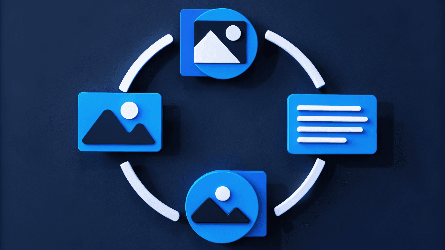
🧱 Modular Design: Designing for Scalability and Flexibility
The days of hard-coded, uneditable web pages are over. Modular web design is the way to scale websites and dramatically increase your speed to market.
In its simplest form, you can think of a modular website as if you are working with LEGOs. You can break your website down into sections (or blocks) such as your navigation, hero, trust bar, or conversion panel. This way, you can easily build pages, rearrange, and swap blocks over time.
With this approach, you eliminate the frustrations that arise with rigid page templates. When you reach the scale of enterprise websites, you need this flexibility to efficiently make changes and continuously test and improve.
In short:
- It allows for the ability to swiftly interchange elements within a page.
- The same blocks can be reused across many different pages.
- Content editors can build and edit pages without developer intervention.
- It speeds up the development time of new components and templates.
🧑🎨️ Branding: Having a Consistent and Professional Visual Identity
Your brand appears at thousands of different touchpoints, from billboards and commercials to social media and, of course, the website. Whether your site is first or last in a brand refresh, it must be consistent with the visuals across every other marketing channel.
Another key point is that your entire website’s design is a direct reflection of your brand. From the way it looks and operates, it should be held to the highest of standards.
This doesn’t mean that creativity should go out the window! In our most honest opinion, we think that enterprises are traditionally too conservative and lack the style and innovation that actually makes a website in today’s age “professional”. Certainly, we hold different benchmarks between new startups and seasoned corporations. However, there are many modern design trends enterprises lack that inspire trust and foster more intimate experiences.
📱 Responsive Design: Adapting to Different Screen Sizes
Responsive design is a huge part of user experience. When you have millions of web visitors, think of all the different devices they could access your website from. Each device will display your website differently, so your designs must be flexible and account for these variations.
In practical terms, this means utilizing fluid grids that can adjust to various screen sizes and orientations, adjusting images to fit containers, and applying media queries that alter web designs based on a user’s device.
🌐 Accessibility: Building User-Friendly Websites for All Abilities
Crafting websites that cater to all abilities ensures that every user, regardless of their physical or cognitive challenges, can navigate and interact with your site effortlessly. Prioritizing accessibility broadens your audience and embodies an elevated brand ethos of empathy and modernity.
Here’s a brief of the 4 pillars of the Web Content Accessibility Guidelines (WCAG):
- #1. Perceivable: All users must be able to perceive the information on your website. This means providing text alternatives for images, using adaptable content formats, and offering clear audiovisual options, such as adjustable contrast and text size.
- #2: Operable: Users should be able to navigate and interact with your site effortlessly. This involves making sure that everything is accessible via keyboard, giving users enough time to read and engage with content, and avoiding elements that might trigger seizures.
- #3: Understandable: Content and functionality need to be easy to understand. Achieve this by using clear and readable text, ensuring predictable navigation and behavior, and offering assistance for input tasks when necessary.
- #4. Robust: Your content should be compatible with various user agents, including assistive technologies. This requires using clean, consistent code so that both current and future technologies can interpret the content accurately.
🔍 SEO: Optimizing for Organic Traffic
Enterprise SEO goes beyond keywords and content. Your site's design directly influences how well your pages rank and how many people actually click through.
Google prioritizes user experience, not just text on a page. So your website’s design should focus on factors like:
- Mobile responsiveness: Your site needs to look great and function well on any device. Google heavily favors mobile-friendly websites.
- Fast load times: Slow sites lose visitors and rank lower in search results. Improving load speeds helps both SEO and user experience.
- Clear, intuitive structure: Make it easy for search engines (and users) to find and understand your content. Good navigation and clean URL structures help your pages get indexed.
- Proper HTML headings: Clear and descriptive headings (H1, H2, H3, etc.) help search engines quickly understand what your content is about.
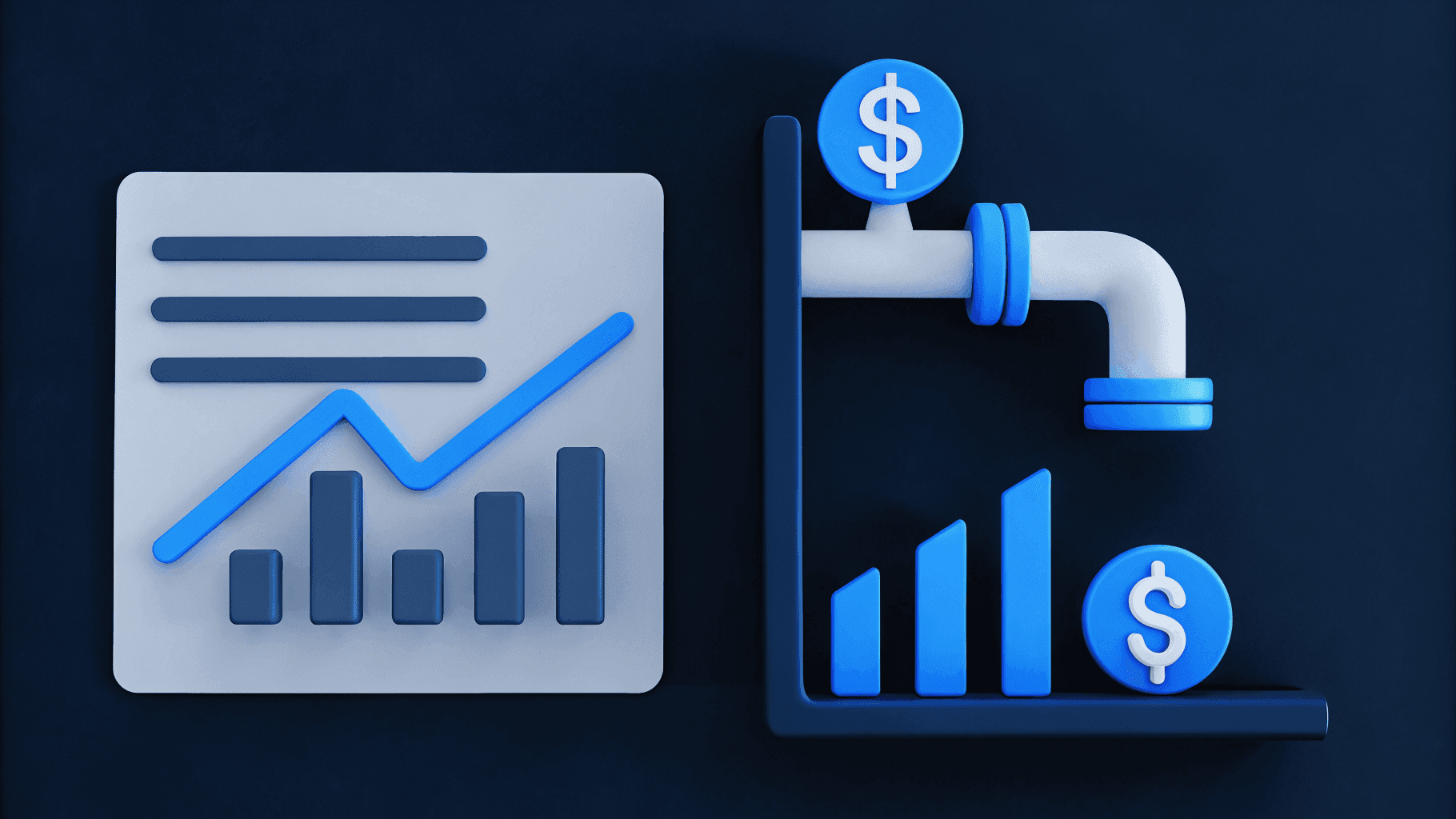
🔄 CRO: Maximizing Your Conversions
Lastly, your website needs to be driving towards business outcomes, whatever they may be (leads, demos, sales, etc).
As an enterprise, your web operations are not cheap. You need to ensure that the website is ROI positive, and that means turning visitors into paying customers.
Remember, websites are not set and forget. They are never-ending experiments that constantly learn, adapt, and improve. Therefore, modern CRO is most effective with modular web design, which allows you to seamlessly test different buttons, layouts, copy, and many other elements to find the combinations that convert the best.
Webstacks websites don’t just look good—they scale with you and drive real results.

Best Enterprise Website Design Examples
Now that we’ve discussed what makes an enterprise-level website, let’s check out some of our favorite examples.
Stripe

It’s pretty conclusive that Stripe is the gold standard for websites in B2B tech. They are an exceptional example of an enterprise with an exciting and compelling brand. Everything is spot on – their navigation, page layouts, color palette, animations, product illustrations, and typography – combined to create an unmatched user experience.
This one is definitely worth digging through if you haven’t done so already.
Braze

Webstacks recently had the pleasure of working with Braze, a leading customer engagement platform, to design a new website that embraced their rebranding. From the start, we adopted an entirely new color scheme that gave Braze a much more distinguishable visual identity. While the layout of many core pages remained relatively unchanged, many elements within got a major upgrade – most notably the illustrations. The fresh illustrations are bright and dimensional, bringing to life how customers experience the product. We also elevated the CTA strategy by increasing the number of user journeys across high-value pages.
Webstacks couldn’t be more ecstatic about how this project turned out!
Shopify

No matter if you’re in e-commerce or SaaS, B2B or B2C, you can draw inspiration from Shopify’s marketing website. As one of the most recognizable PLG companies, Shopify has a flawless synchrony between its website and its product. Their website is completely product-centric - showcasing its capabilities and the stories behind its most successful users. Each page is crafted around its core CTA of getting visitors into a free trial.
As far as visuals go, Shopify’s website is a masterpiece. It effectively uses bold headings, eye-catching gradients, lively illustrations, vibrant imagery, and unique layouts. With so much going on, it makes you want to keep scrolling and engage with the page even more.
Atlassian

The creators of Jira, Atlassian, have a new website design hot off the press – and we’re huge fans. From a high level, the updated website architecture is very effective at addressing all the different use cases for their project management software. They cover all their bases with pages that speak directly to personas, industries, company sizes, and specific solutions.
They are also another example of an enterprise letting the product shine. Large, animated product illustrations are utilized across the entire site. Moreover, Atlassian’s trust signals are some of the best designs we’ve seen in SaaS, especially their testimonial slider component.
In the competitive landscape of project management tooling, your website has a major impact on how prospects evaluate you against alternatives on the market. Continuous improvements like this are necessary to stay at the forefront of B2B website design.
Tesla

Now, we turn to the automotive industry and take a look at Tesla. It’s a minimalistic yet stunning website that lets the high-resolution imagery do most of the selling. The website is fully responsive, ensuring that it looks and functions well on all devices, from desktops to smartphones. This is crucial for providing a seamless user experience across different platforms.
From a CRO perspective, it’s extremely effective at tailoring to both the users who are ready to order now, and those who want to schedule a demo drive. Additionally, the navigation is b
GitHub

Let’s check out an enterprise that truly breaks that mold of traditional enterprise web design: GitHub. The popular developer platform has a very innovative website and mimics a lot of the trends seen in Web3 design - most notably dark mode, neon colors, and futuristic visuals.
One reason this works so well for GitHub is that they understand their audience of web-obsessed developers. While not every enterprise can take this approach, GitHub captured the opportunity to express their creativity and create a remarkable design.
Freshworks

Next up we have Freshworks, an enterprise cloud-based provider of CRM, IT, and sales tools.
Another client of Webstacks, Freshworks, was aiming to create a more professional, enterprise-grade website. This involved upgrading their web tech stack, modernizing their online identity, and revamping the user experience.
We switched it up from a fairly flat standard color scheme to a contemporary, gradient-style aesthetic. Another focus was incorporating more powerful social proof, which resulted in the addition of trust bars, human-centric illustrations, and brand-new testimonial components.
Check out our client story on how we overhauled Freshworks' website to an enterprise-grade foundation.
Okta

Okta is the leading independent provider of employee and customer identity solutions for organizations.
As a global enterprise, Okta’s existence in the security industry creates extra responsibility to present itself as an experienced and trustworthy brand. A large component of this identity comes from having a fast, intuitive, and bug-free marketing website.
Okta offers an engaging, feature-heavy experience that is designed to instill trust.
HashiCorp

Hashicorp is renowned for its worldwide multi-cloud infrastructure automation solutions. It also has a top-tier marketing website among publicly traded companies. Powered by a composable tech stack, the Hashicorp website provides a speedy, user-friendly experience that reflects the reliability and integrity of its products.
In terms of presentation, the website does a great job of blending startup-y design trends with the professionalism required of enterprises.
Justworks
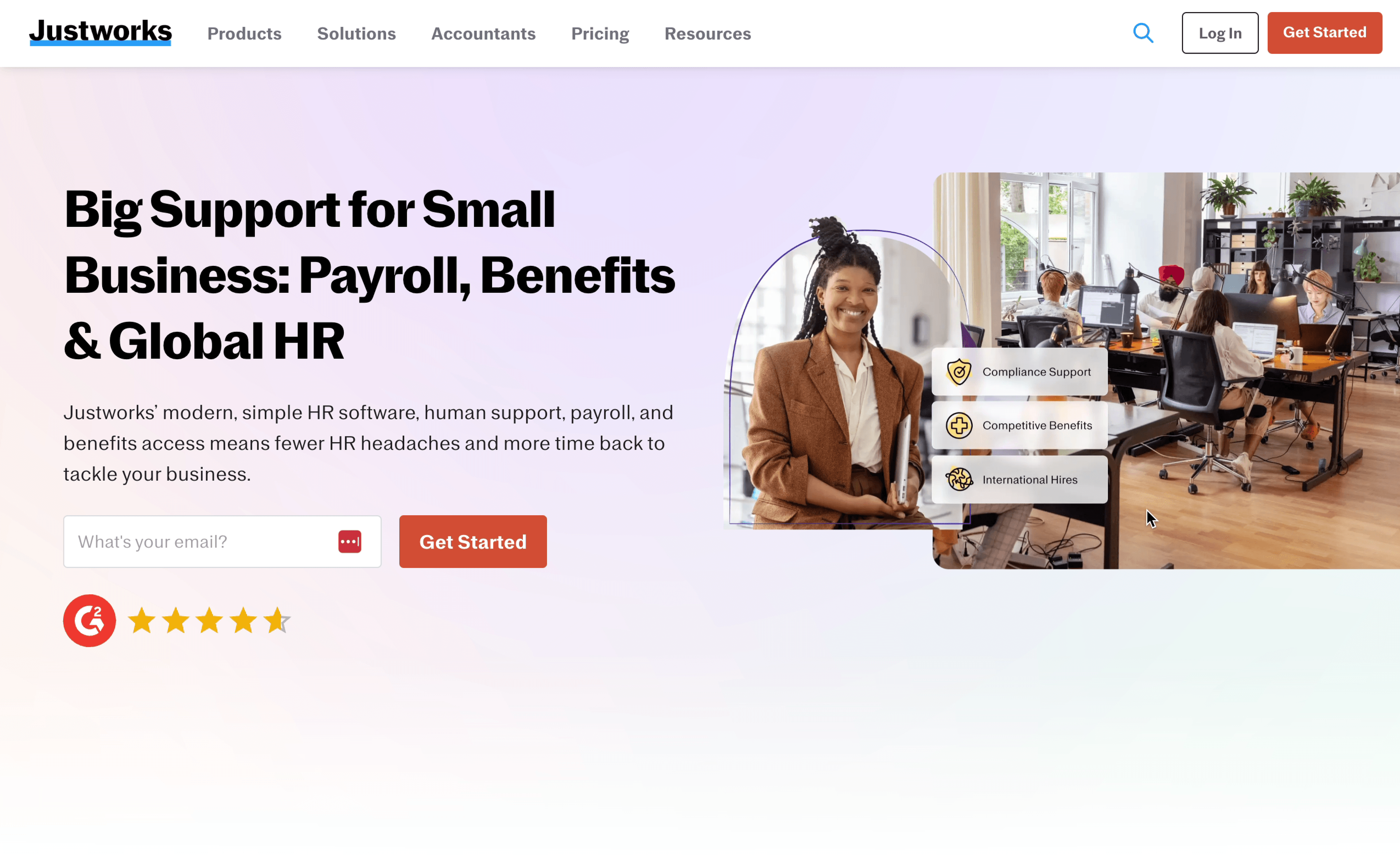
Justworks operates in a crowded HR tech space, but their website cuts through that noise with clarity and restraint. The visual design is crisp and minimal, but far from generic. It reflects a brand that’s designed to feel supportive, straightforward, and human.
Their homepage immediately segments visitors by intent: businesses looking to manage payroll and benefits, and those exploring PEO services. It’s a subtle but smart move for conversion. The product sections rely on clean illustrations rather than feature overload, which keeps the focus on outcomes instead of specs.
What’s especially effective is their copy. It’s plainspoken without dumbing things down, which matches their value prop: taking complexity off your plate. Paired with a thoughtful mobile experience and clear CTAs, the Justworks site is a great example of enterprise design that puts clarity above all else.
Docusign
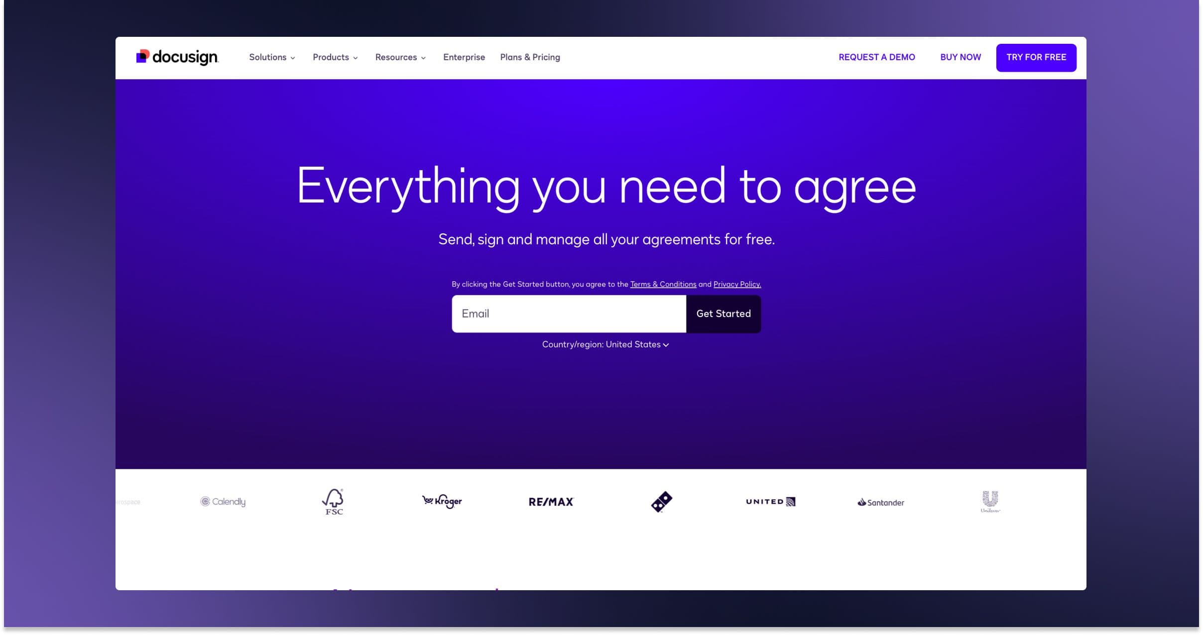
DocuSign’s website reflects a company that has moved from a product category leader to a trusted infrastructure layer for global business. The site design supports this positioning by leaning heavily into trust, scale, and ecosystem.
Navigation is broken into two primary user paths: solutions and products, reinforcing DocuSign’s relevance across verticals and use cases. Rather than just listing features, the site shows how agreements flow through an entire business—HR, sales, legal, procurement—which supports the broader “Agreement Cloud” narrative.
Visually, the site stays clean and corporate, but not dated. DocuSign keeps the interface light, with structured grids and subdued colors that allow product screens and trust signals (logos, certifications, awards) to take center stage.
HubSpot
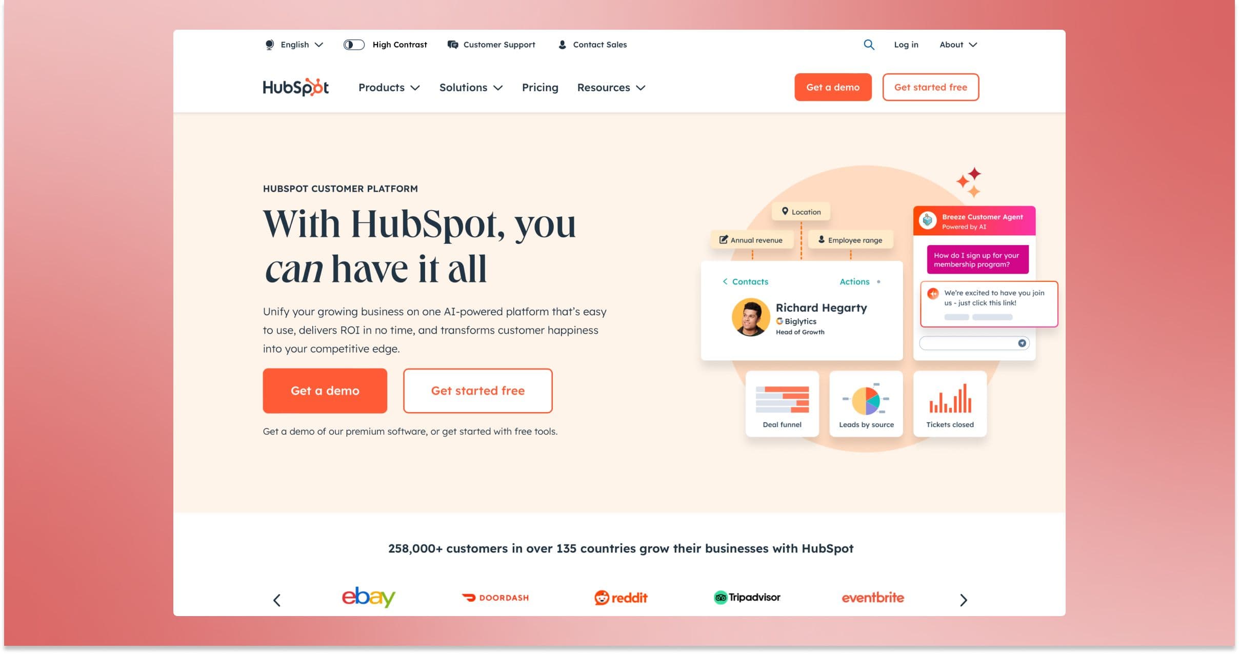
HubSpot’s enterprise web design signals the scale and maturity of a brand that has grown from a single-product company into a full CRM platform. The design is modular and systematic, which aligns with how HubSpot structures its product ecosystem. You can clearly see how the website has been built to serve multiple audiences, from startups to enterprises, across marketing, sales, service, and ops.
The homepage introduces the platform with concise copy and minimal animation. There’s a noticeable focus on credibility—partner logos, awards, and customer stories appear early and often, helping establish trust without relying on longform storytelling. CTA hierarchy is clear, with immediate paths to “get a demo” or “start free,” and the sticky nav keeps users anchored throughout the experience.
Product pages do a good job of balancing information density with visual hierarchy. Tabs, accordions, and scroll-based interactions allow HubSpot to show depth without overwhelming the user. The visual design is clean, but the real strength lies in how well it scales across a wide content surface area.
Datadog
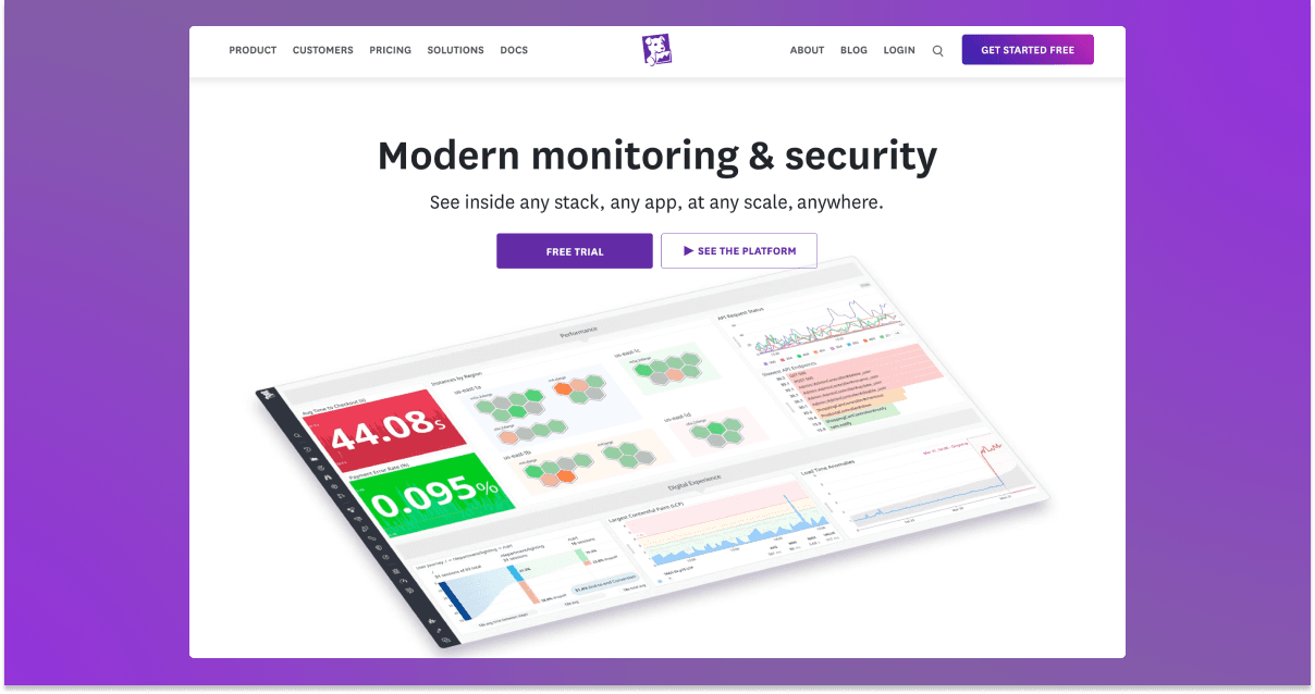
Datadog makes it clear from the homepage that this is a company built for technical buyers. From the homepage down to the product pages, the site prioritizes depth, documentation, and integration flexibility. The UI feels engineered, not overly branded, which reinforces credibility with its core user base: developers, SREs, and enterprise IT teams.
There is an emphasis on showing rather than telling. Real product screenshots appear across nearly every section, paired with high-contrast callouts that summarize key metrics or platform benefits. The messaging leans technical without losing clarity. Phrases like “unified observability” and “real-time monitoring” are backed up by visuals that help users understand what those terms mean in practice.
Zendesk
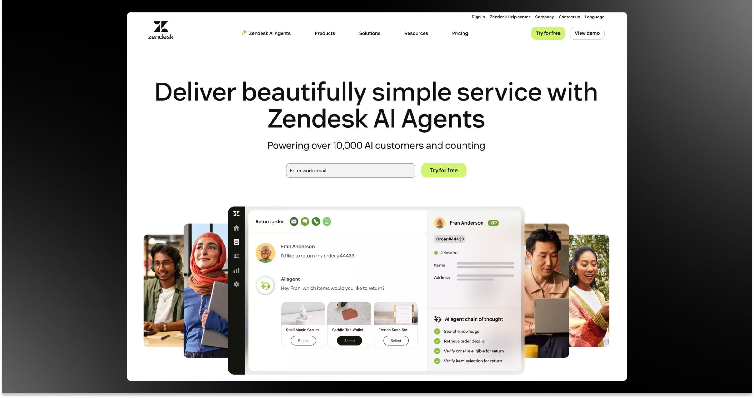
Zendesk’s site balances enterprise professionalism with just enough personality. The design is confident and polished, but still accessible—reflecting a company that serves both fast-growing startups and large-scale support teams.
The homepage leads with use cases rather than features. It’s structured to help visitors see how Zendesk fits into their organization, whether they’re managing a customer service team or implementing AI-driven support tools. Navigation is intuitive and segmented by industry, role, and product, which makes it easy for enterprise buyers to find their entry point.
Aspire Software

We round out our examples with one more client of Webstacks, Aspire. The field service management software company serves over 50,000 users across 1,100 locations, performing roughly $4 billion in annualized transactions.
Our engagement with their marketing team stemmed from our longstanding relationship with ServiceTitan, Aspire’s parent company. We helped transform their entire website from its backend to the design. With a scalable modular website, Aspire could now scale its content on top of a visually and technically sound foundation.
See what’s working for industry leading websites—and find inspiration to improve yours.

Ready to Level Up Your Enterprise Website?
There you have it—some best practices and prime examples to inspire you to improve your enterprise web design.
Here are just a few key takeaways to remember before you dive into your next website project:
- Don’t be afraid to go against the grain. Enterprise websites don’t have to be boring. Given their influence, they should actually be some of the most aesthetically pleasing and innovative websites in the business world.
- Start with a solid foundation. Given their complexity, enterprise websites must employ scalable and flexible technologies, as well as a modular design approach.
- Find the right partner. If you plan on partnering with an external agency, choose one that has ample enterprise experience and knows how to build and manage modern tech stacks (since you’re already here, check out Webstacks’ design and development capabilities).