23 Best Fintech Website Design Examples in 2026

Trust decides every conversion in fintech. A visitor lands on a payments platform, a banking app, or a compliance tool and forms a judgment about reliability within seconds, long before a sales conversation begins. The website carries that judgment.
Most fintech marketing teams treat design, content, SEO and technical architecture as separate workstreams handled by separate people on separate timelines. That separation is the problem. A fintech website earns trust through the combination of clear design patterns, credible content, discoverable structure and an architecture that can evolve without a full rebuild every time the product line changes.
This guide covers what that combination looks like in practice:
- The design trends and UX principles shaping fintech sites today
- 23 real examples across eight fintech categories
- How to build brand consistency and a content strategy that supports both
- How to decide whether a redesign, a migration or a localization project is the right next step
Why Trust Drives Fintech Web Design
A checkout page, a loan application or an account dashboard asks users to hand over financial data and act on financial advice. That is a higher-stakes request than most SaaS categories make, and design either earns the confidence needed to complete it or costs the conversion.
Two forces make this harder than it used to be:
- Users now expect the same visual polish from a banking app that they get from any well-funded consumer product, so a dated interface reads as a risk signal rather than a personality quirk.
- Financial services carry compliance and security obligations that consumer apps do not, which means the same page has to look approachable and prove it is safe at the same time.
The rest of this guide breaks that challenge into its component parts: the UX principles that build trust at the interaction level, the design trends currently doing that work well, and the content, SEO and architecture decisions that keep a fintech site credible as it grows.
Core UX Principles for Fintech Websites
Financial products handle sensitive data and multi-step processes, which makes UX design a compliance question as much as an aesthetic one. Four principles recur across the fintech sites that convert best.
Security and Trust
Visitors need to see that data is protected, not just be told it is. Trust signals need to be visible and specific, not just implied by professional design, and three practices do the most work to prove it:
- Encryption, multi-factor authentication and biometric login reduce actual risk
- Plain-language privacy policies and clear terms of service make protections easy to find
- Security features belong in view, not buried in a footer link
Simplicity and Clarity
Financial tasks are often multi-step by nature, and the job of the interface is to make that complexity feel manageable. Reducing that complexity to fewer, clearer steps keeps first-time users from abandoning a process midway through, and three practices matter most for making that real:
- Break processes like fund transfers into fewer, clearer steps
- Use plain language instead of financial jargon
- Build consistent navigation patterns that lower the cognitive load a user carries while managing money
Personalization
Generic financial experiences underserve users with different goals, risk tolerances and account histories. Design that treats every visitor the same misses the differences that actually drive engagement, and the following approaches tailor the experience without adding friction:
- Tailored dashboards reflect a user's actual accounts and goals
- Relevant product recommendations replace generic upsells
- Adjustable settings turn a fintech site from a static tool into something that adapts to the person using it
Accessibility
Financial services need to reach users regardless of ability, and this is now a legal requirement as much as a design best practice. The European Accessibility Act became enforceable across the EU in mid-2025 and applies directly to banks, payment providers and e-money institutions serving retail customers, with EN 301 549 (which incorporates WCAG 2.1 Level AA) as the compliance standard.
- Keyboard navigation and screen reader support are baseline requirements, not enhancements
- Sufficient text contrast keeps content legible for low-vision users
- These standards widen the reachable audience in every market, not just the EU
Design Trends Shaping Fintech Websites Today
A short list of design patterns is currently doing the most work to build trust and hold attention on fintech websites. Each one shows up repeatedly across the sites reviewed for this guide, though not every site uses all of them at once. Here is what each trend does and why it matters:
| Trend | What it does |
|---|---|
| Animations and microinteractions | Subtle motion and feedback moments (hover states, loading indicators, button presses) make an interface feel responsive and considered |
| Data visualization | Charts, graphs and infographics turn numbers like users, assets under management or dollars saved into something a visitor can grasp at a glance |
| Mobile-first design | Q1 2026 data from Statista and StatCounter puts mobile at 52 percent of global web traffic, so the interface needs to be legible and intuitive on a small screen first |
| Personalization | Behavioral and financial data shape web experiences around a visitor's specific needs rather than a generic average |
| Dark mode | A dark color scheme offers a modern, lower-strain viewing option and makes data visualizations stand out |
| Product illustrations | Screenshots or illustrations of the actual product give visitors a preview of what they are signing up for |
| Accessibility and compliance | Now a legal requirement across the EU (see above) and a usability win everywhere else |
AI agents and agentic interfaces
The newest shift in fintech design is structural rather than visual. A site-by-site review of the 23 companies featured in this guide found that roughly a third have rebuilt part of their homepage around a second audience: AI agents acting on a user's behalf, not the human reading the page.
On the enablement side:
- Stripe previewed stablecoin settlement for agent-to-agent transactions and now ships an Agentic Commerce Protocol
- Circle rebuilt its homepage around the line "the tech stack for the agentic economy," with a dedicated Agent Stack and Agent Wallets
- Meow relaunched around agent-initiated account opening through an MCP endpoint
On the detection and governance side:
- SEON now brands itself an AI Command Center with dedicated agent-detection signals
- Sardine rebuilt its platform around nine named AI agents working alongside human risk analysts
Expect more fintech sites to add agent-facing documentation, machine-readable descriptions and explicit guardrail messaging over the next year, since homepages increasingly need to speak to two readers at once.
Fintech Website Examples
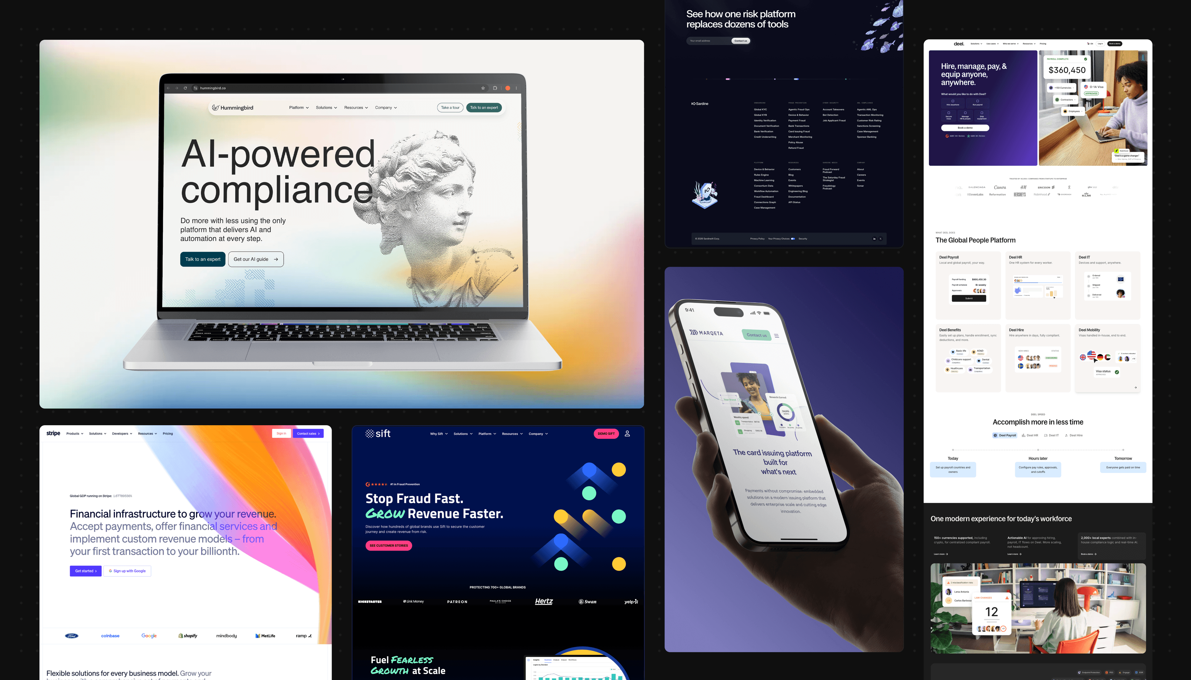
Here are the best fintech website designs, spanning several niches within fintech, including payments, banking, payroll, wealthtech, fraud prevention, insurtech, regtech and blockchain.
Payments Website Design Examples
There are plenty of payment processing companies out there, but a handful stand out for remarkable web design. If you need inspiration, take notes from these payment website staples.
Stripe
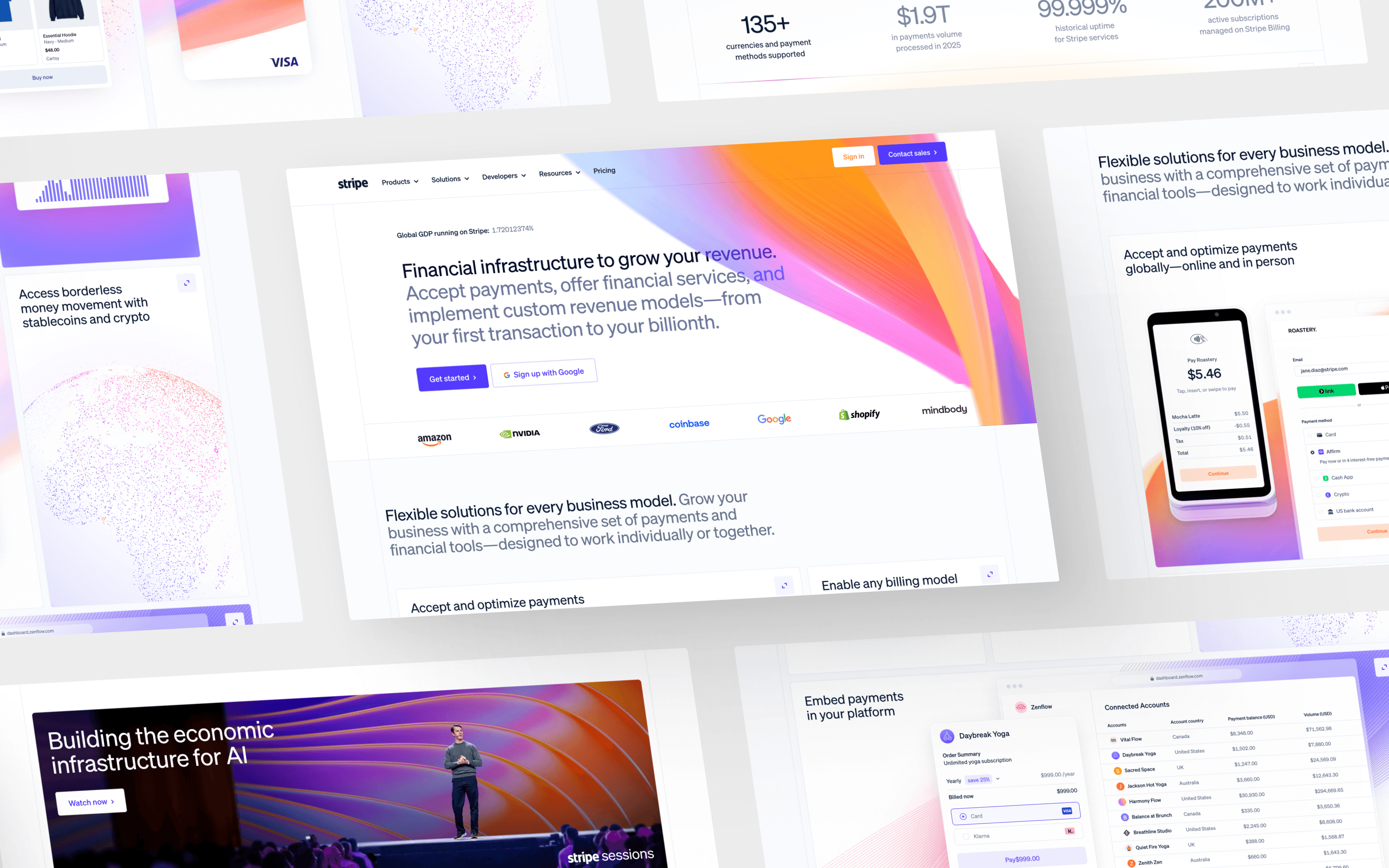
First up is Stripe, a top payment processing platform whose website ranks high on this list of inspiring fintech designs.
The homepage grabs attention with vibrant mesh gradients set against sleek layouts. Dynamic motion graphics showcase Stripe's payment products and experiences throughout the site. Stripe's homepage story now extends well beyond card payments: the site leads with agentic commerce, stablecoin settlement and an AI use case sitting alongside the core payments pitch.
More standout design elements:
- Bright, eye-catching geometric icons that reinforce the brand's playful visual identity
- An organized dropdown mega menu that keeps a broad product line easy to navigate
- Engaging microinteractions, including hover states, that add polish without slowing the page down
- Clear showcasing of the platform's UI throughout product and use-case pages
CashApp
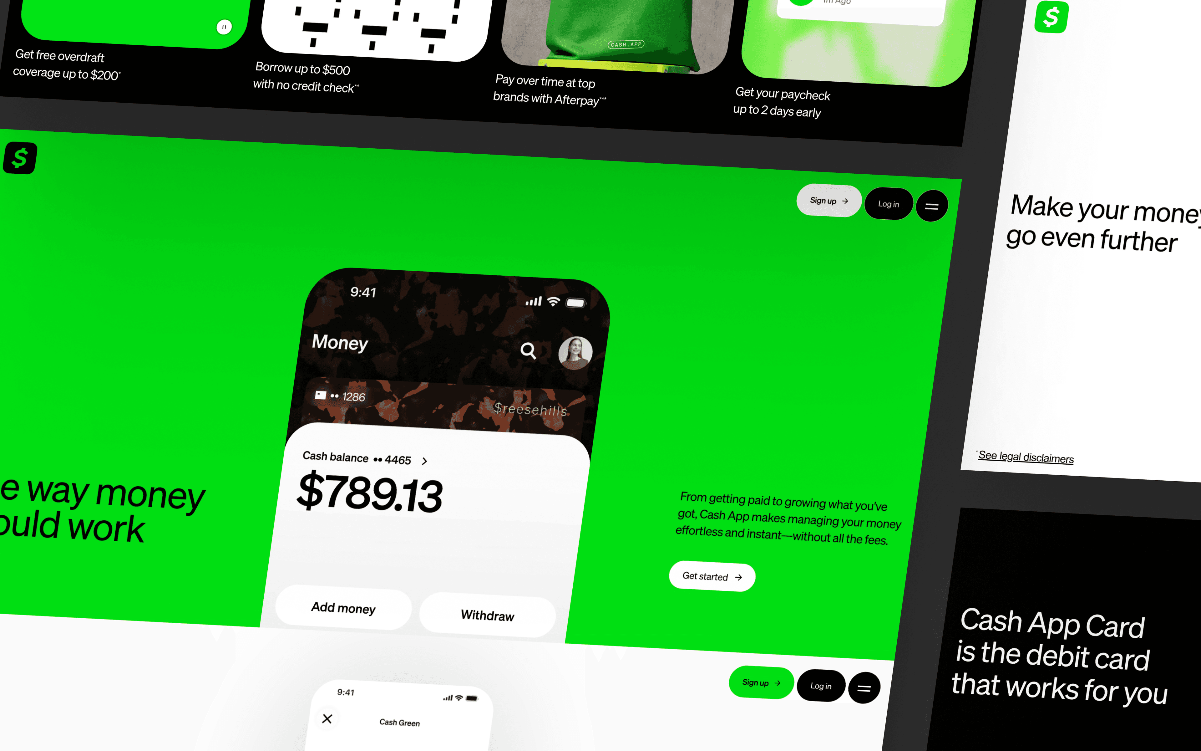
Next up is CashApp, a personal finance app that consistently raises the bar in fintech website design.
CashApp takes a distinct approach with a fluorescent color scheme and striking animations. 3D holographic elements and illustrations give the site a futuristic aesthetic while conveying the security users associate with sending money.
Best aspects of CashApp's design:
- A fluorescent color scheme and bold visual choices that give the brand real wow factor
- Bold typography paired with witty, conversational copy
- Animations across landing pages that reinforce the futuristic, 3D aesthetic
- An informative, collapsible FAQ section that keeps a busy page scannable
Marqeta
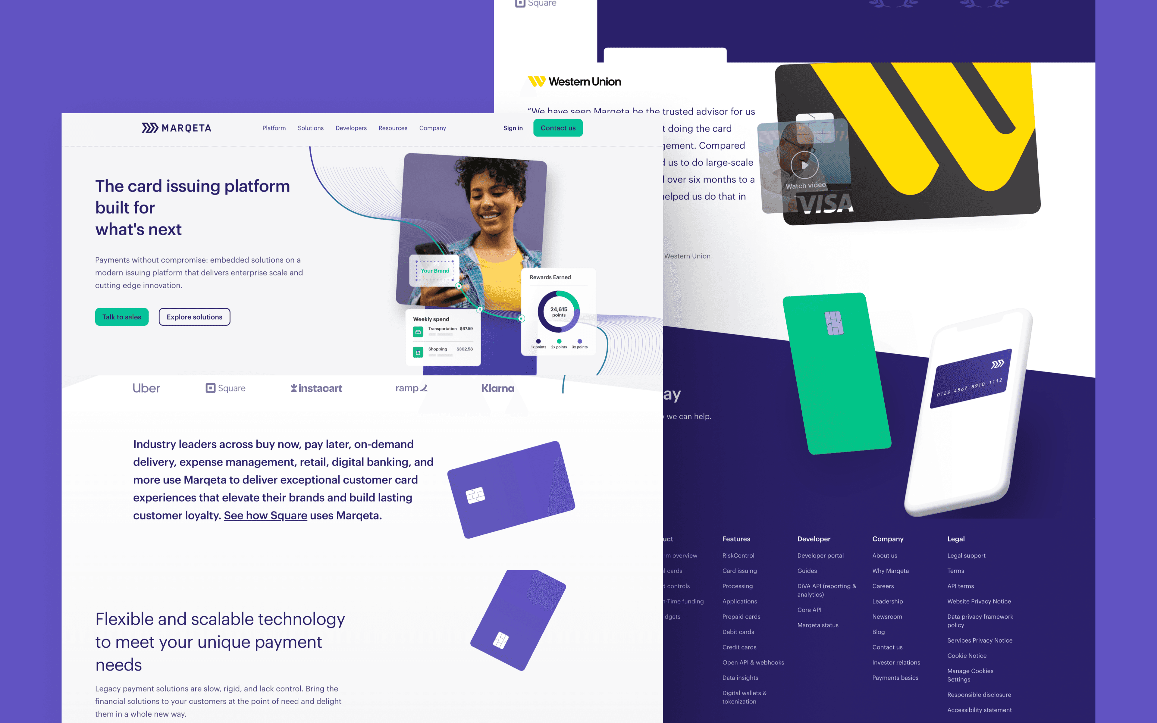
Concluding this payments lineup is Marqeta, a card issuing platform and a strong reference point for modern fintech website design.
The credit card animation that follows the user down Marqeta's homepage adds an engaging, memorable touch and entices visitors to learn more about its payment card programs. Marqeta's blog listing page also shows a clean, orderly card layout that helps readers navigate content.
Further strong design elements from Marqeta:
- Striking isometric product illustrations that make card issuing feel tangible
- An intuitively designed navigation menu with supporting icons throughout
- Search functionality and filters that make its resource hub easy to browse
Banking Website Design Examples
Now let's look at a few banking website design examples that exhibit innovative features while providing intuitive interfaces for customers.
Traditional financial institutions have historically kept things bland when it comes to website design. You could describe your own bank's website as conventional, uneventful, or frustrating.
The next generation of banks takes a different approach to its online presence, especially its marketing website.
The following bank websites go above and beyond to create a memorable brand and a meaningful story. Expect no wonky UX, cookie-cutter templates, or boring copy here.
SoFi
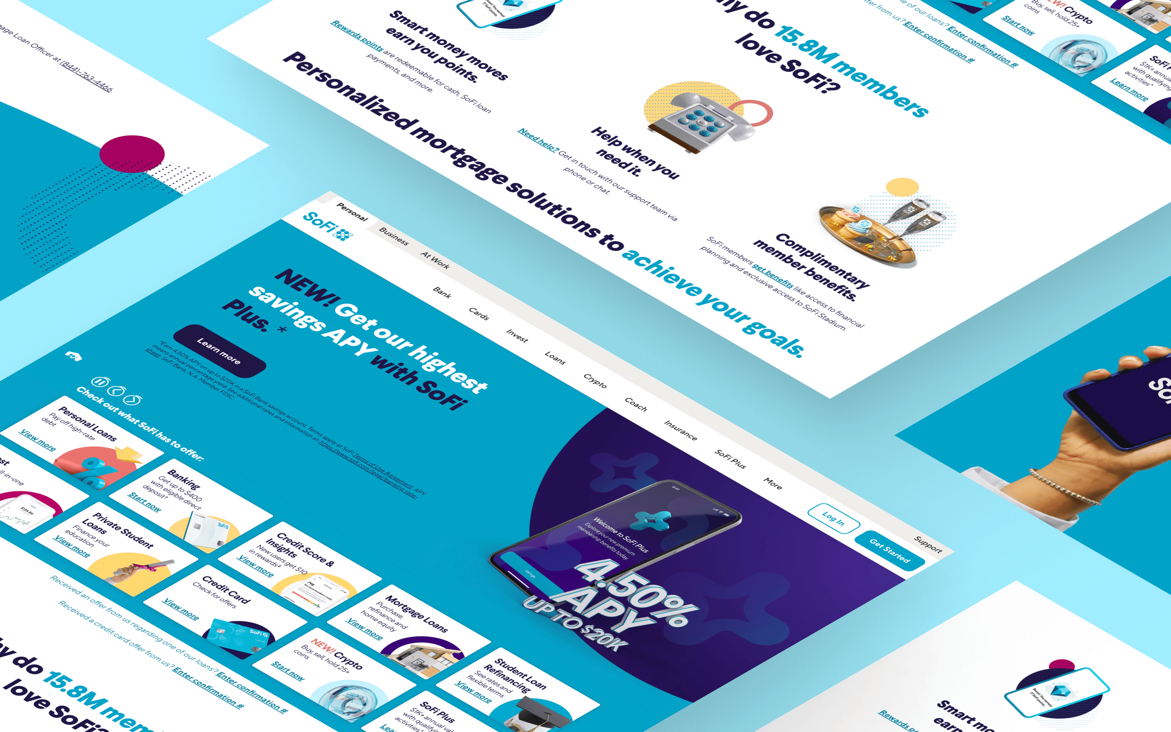
First among the banking examples is SoFi, an online banking and personal finance company with numerous products and strong website design elements.
SoFi's site reflects a fusion of modernity and professionalism. A dynamic hero section scrolls through SoFi's featured banking programs, paired with soothing blues and greens and copy that builds the trust fintech visitors look for.
Key design features:
- Playful shapes and 3D product illustrations that soften a traditionally buttoned-up category
- Organized pricing comparison tables that make plan differences easy to scan
- A search bar and card component that make its resources page easy to browse
Revolut
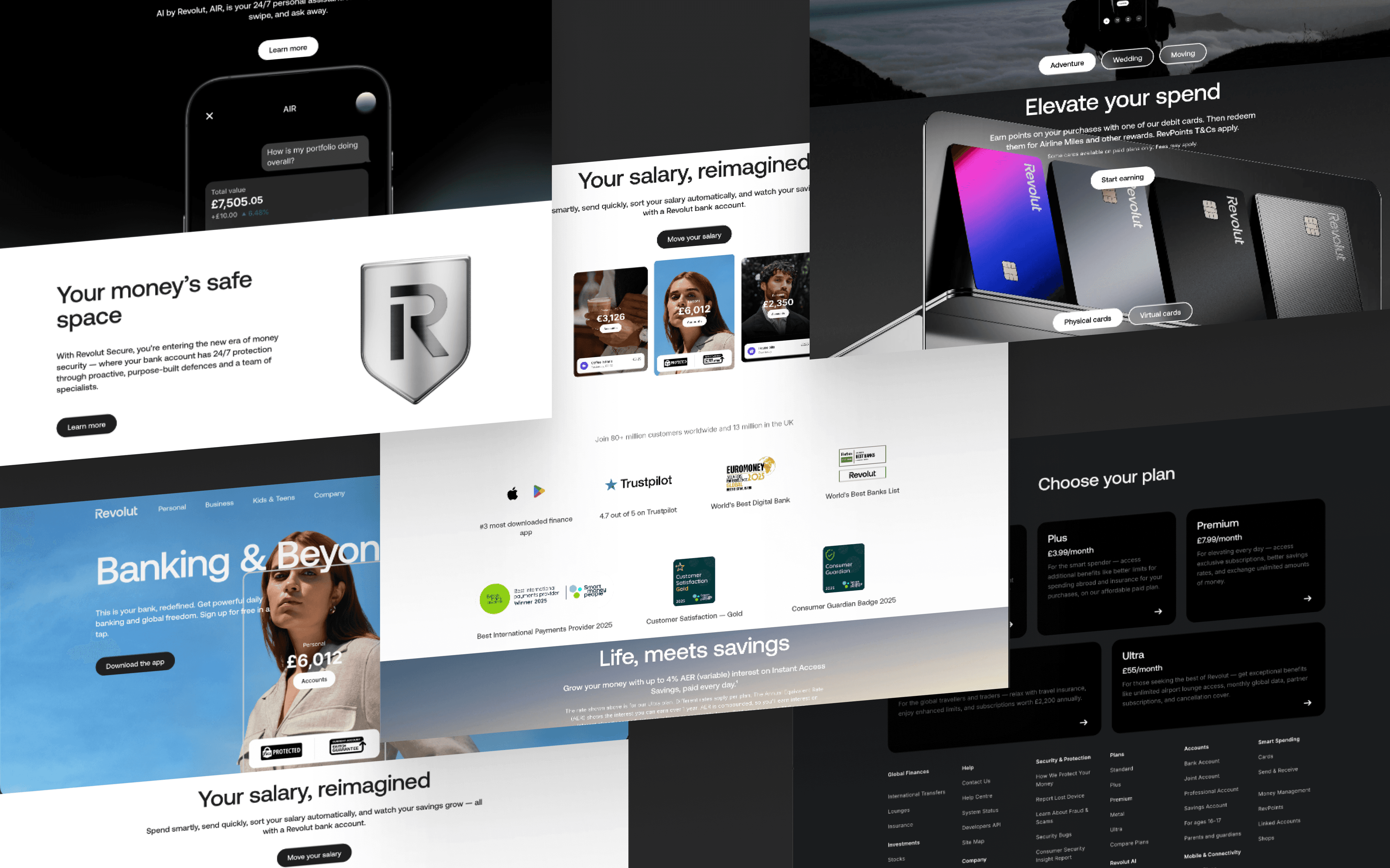
Next is Revolut, a personal finance app with an incredible modern website design.
Trust and safety are central to attracting new financial customers, something Revolut reinforces with well-designed ebooks that educate visitors. Revolut also places customer testimonials on each product feature page. Each testimonial expands into a larger component with the full review, without pulling the user away from the page. The homepage also gives a hero-level callout to AIR, a 24/7 in-app AI assistant ("Ask, and AIR makes it happen").
More elements worth noting from Revolut:
- Bold, playful colors set against neutral backgrounds for contrast
- Microinteractions on buttons, cards and drop-down arrows that add polish throughout
- Dark mode with text that stays legible and pops against the background
Meow
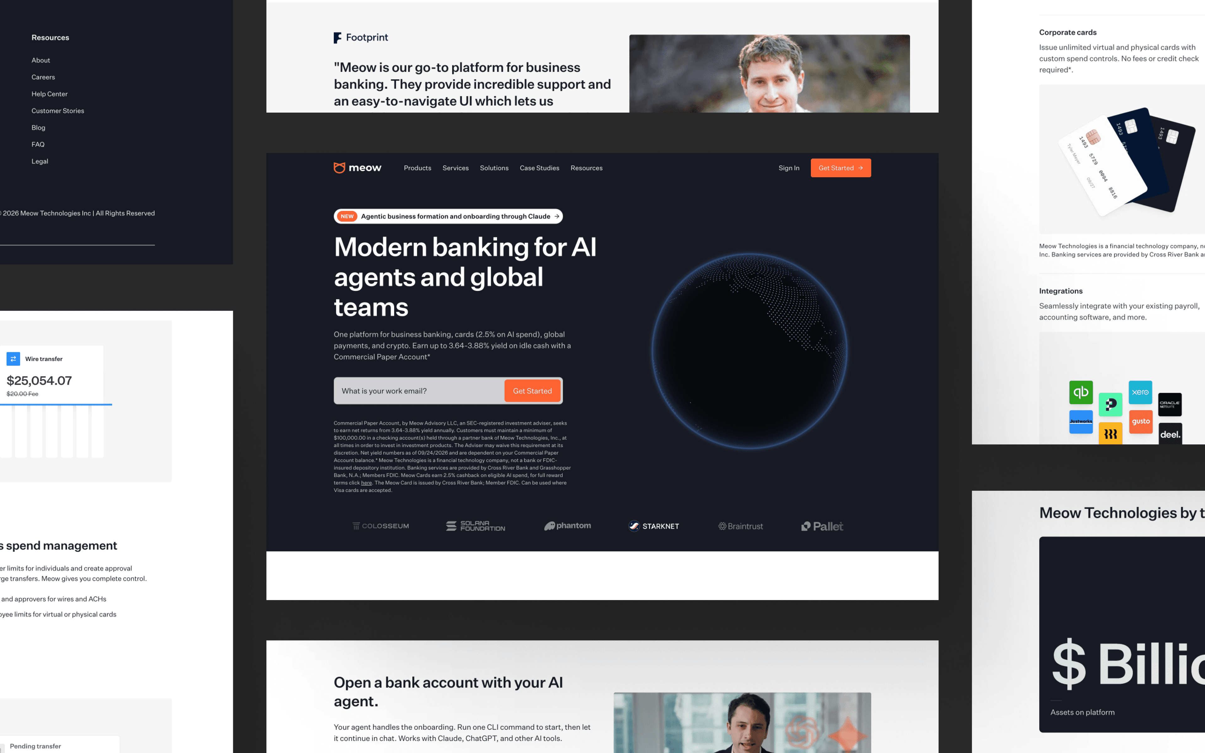
Closing out banking is Meow, a business banking platform that has undergone a second, more significant redesign.
Meow started with a homepage built around high-quality product illustrations, pastel gradients and a dynamic trust bar. In April 2026, Meow rebuilt that homepage again around a new audience: AI agents. The current site leads with "Modern banking for AI agents and global teams," adds a dedicated AI Agents navigation item and MCP integration page and walks a visitor through a single flow where an agent, not a human, completes account setup, card issuance and payments end to end.
What Meow's redesign gets right:
- A headline built for two readers, human and AI agent, without confusing either one
- A clear guardrails FAQ that answers the trust question this new category raises right away
- A product UI walkthrough video placed above the fold that shows, not just tells, how agent-initiated banking works
Payroll / HR Website Design Examples
Payroll and HR platforms carry some of the least glamorous subject matter in fintech: compliance, benefits enrollment, tax withholding. The websites that win in this category make that complexity feel manageable rather than burying it, using clear product paths and visible trust signals to reassure buyers who are choosing a system their whole company will depend on.
Justworks
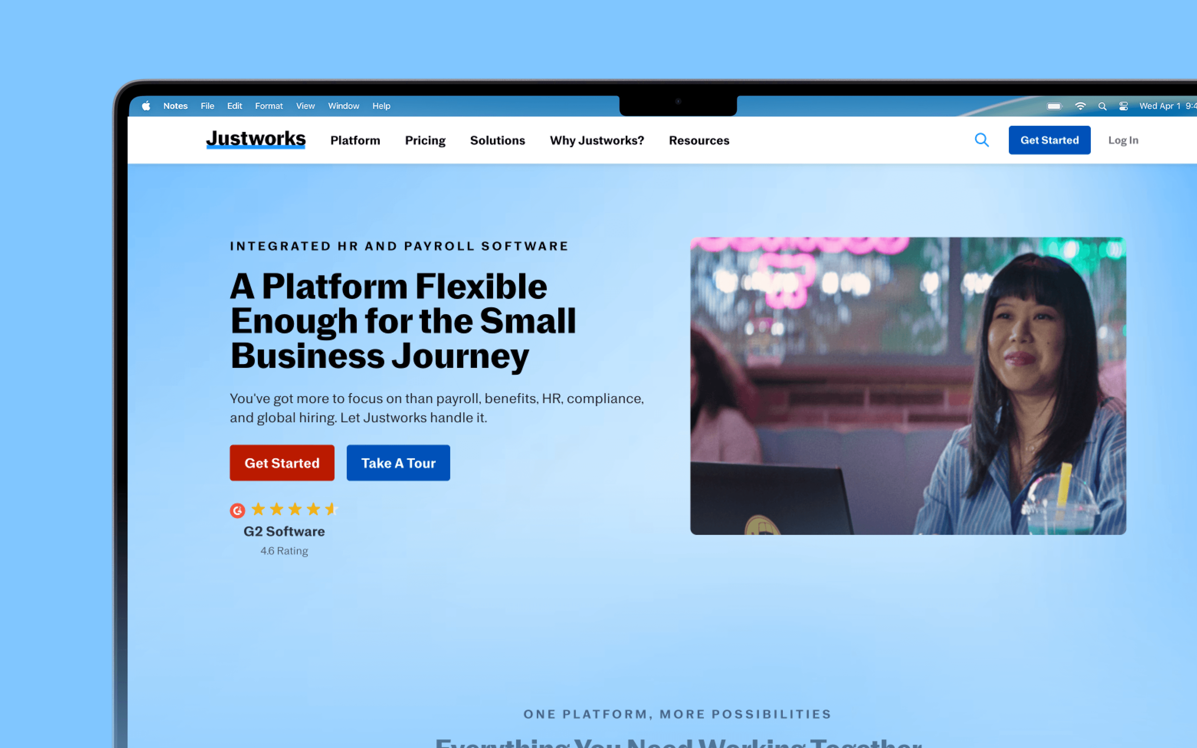
Next is Justworks, a payroll processing platform for small and medium-sized businesses. As a Webstacks client, Justworks adopted a modular design system to increase the customizability of its website. The refreshed version excels at building trust and rapport, a core part of any fintech brand.
Justworks builds credibility with visitors from the moment they land on the homepage. G2 reviews, a loaded trust bar, quotes and testimonials make the brand easy to see as a reliable partner. The copy is written to make payroll processing easy to understand at a glance, which shortens the path from visitor to informed lead.
Reasons to like Justworks:
- Strong color contrast that keeps key information easy to read at a glance
- Iconography that supports quick visual scanning across the homepage
- Strategic CTA placement throughout the payroll and benefits pages
Gusto
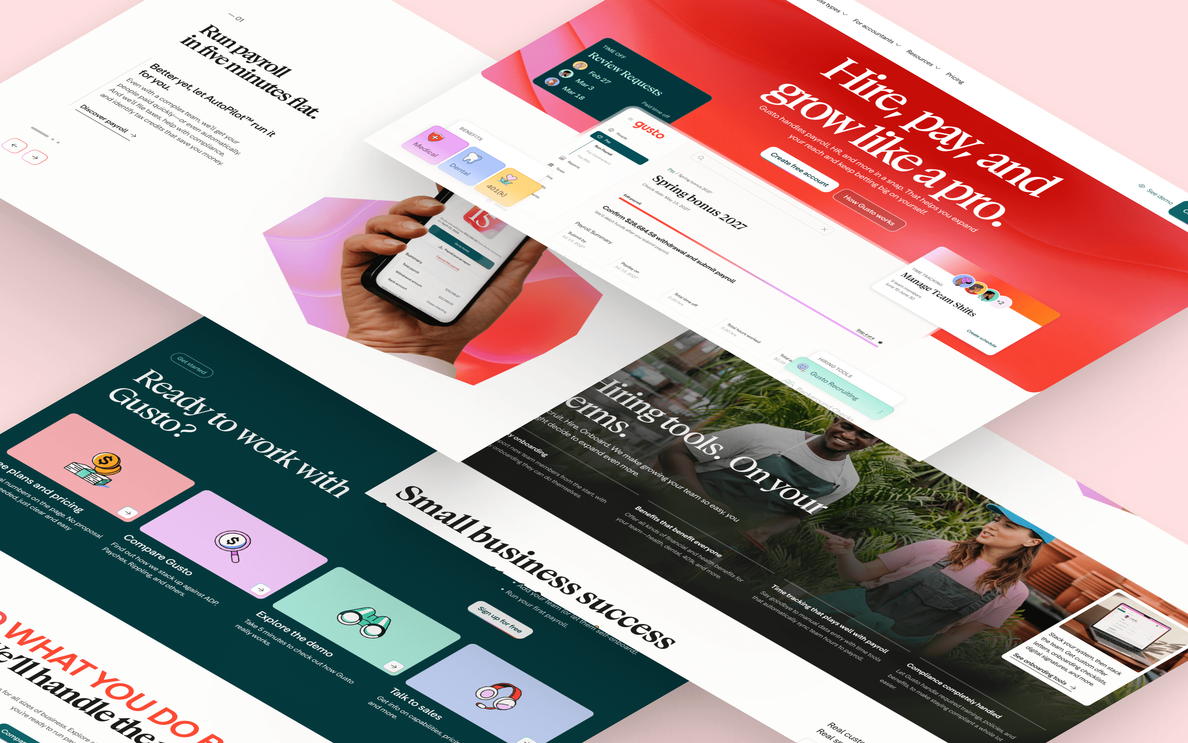
Gusto is a leading cloud-based payroll, benefits and HR management platform in the United States.
Beyond exceptional design, its content is rich and detailed. Readers can start and continue a meaningful journey on the site with little friction, which is how Gusto turns anonymous visitors into leads and eventually paying customers.
Gusto also appears in Best SaaS Pricing Page Examples.
What to love about Gusto:
- Playful illustrations that soften a traditionally dense payroll and HR subject
- Clean, intuitive navigation that keeps a broad product line easy to browse
- High-quality images of real employees and customers in place of stock photography
- An instant, interactive demo that lets visitors try the product before booking a call
Deel
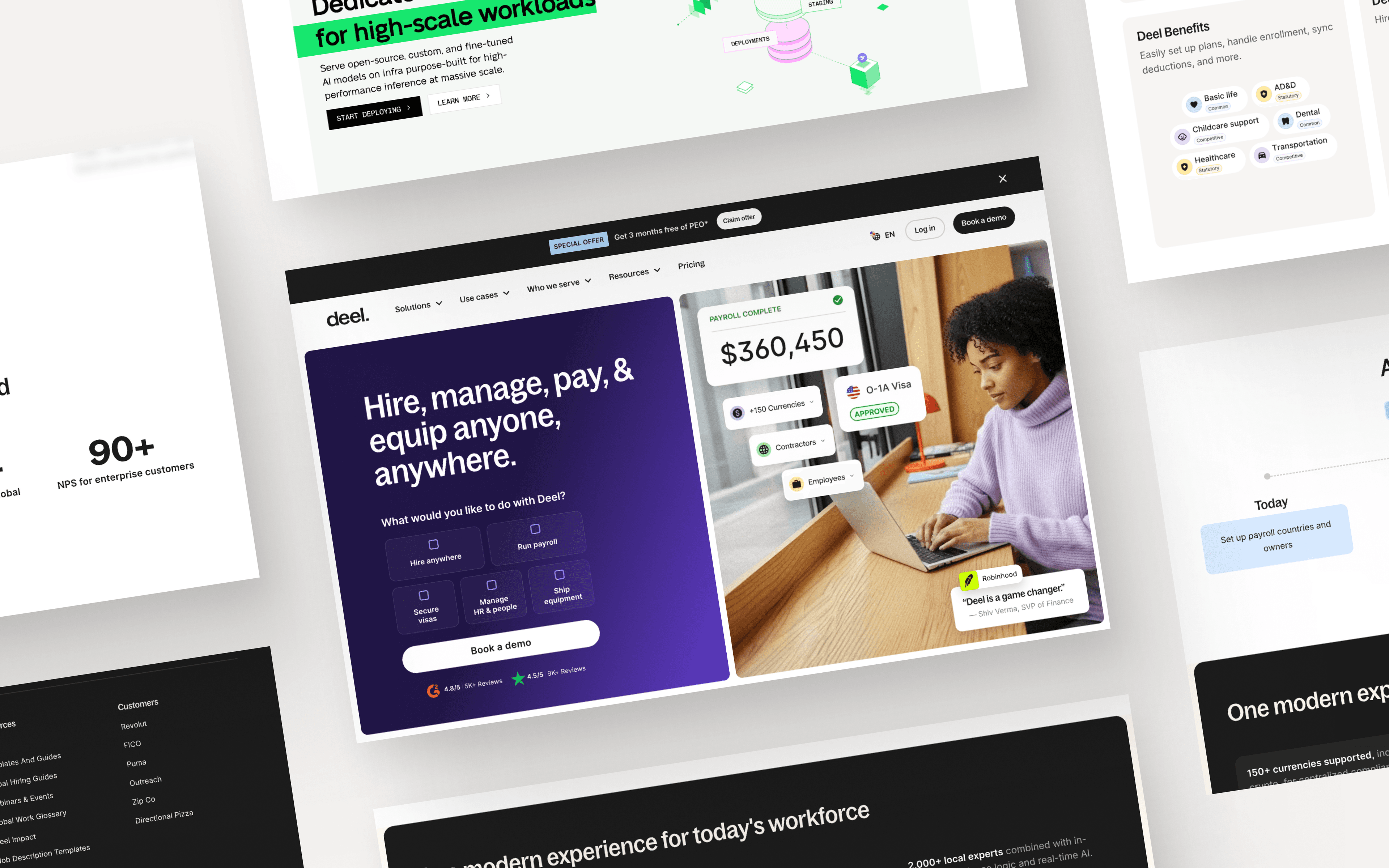
Rounding out payroll and HR is Deel, which has broadened from a payments-for-international-teams tool into what it now calls "the Global People Platform," adding named HR, IT, benefits, mobility and AI products alongside payroll.
Deel's website has design creativity that gives it a distinct personality. Bold headings, colorful illustrations and product examples draw the eye as visitors browse.
From a content strategy standpoint, Deel's blog and glossary are highly effective at attracting organic traffic. Its content ranks for relevant search queries such as "contract labor," "benefits of independent contractor," "w2 employee," and "virtual employees."
Highlights from Deel:
- A clear, consistent value proposition carried across a broad, multi-product homepage
- Interactivity through video, animation and microinteractions throughout the site
- Ample CTAs for demos and pricing placed at natural decision points
Wealthtech Website Design Examples
Wealthtech describes companies that use AI and data to improve traditional wealth management services. These examples take a distinctive approach to investment product marketing.
Betterment
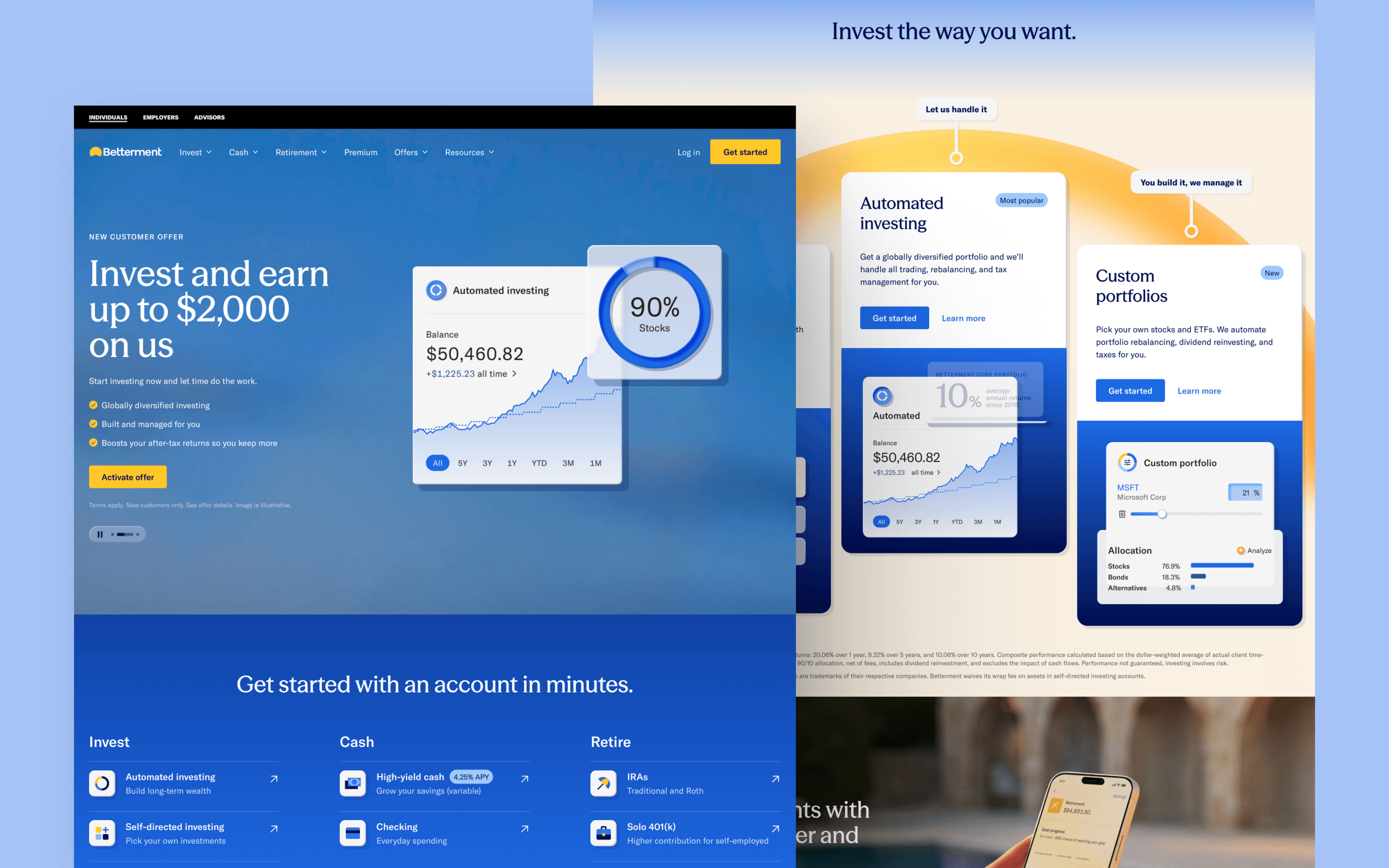
Betterment is a financial advisory company offering digital investment, retirement and cash management services.
A fintech website not purposefully designed for mobile and tablet view will show shortcomings in SEO, CRO and other analytics. Limited screen real estate makes it harder to recreate the same experience for non-desktop users.
Betterment accounts for small screen sizes well. Nothing is cut off, the font is easy to read, and the page is built for continuous scrolling.
- Flush, proportionate design that holds up cleanly on smaller screens
- A hamburger navigation menu with clean, simple drop-downs
- A sticky "Get started" CTA button that stays visible while scrolling
- Color, icons and illustrations used with intent rather than as decoration
Wealthfront
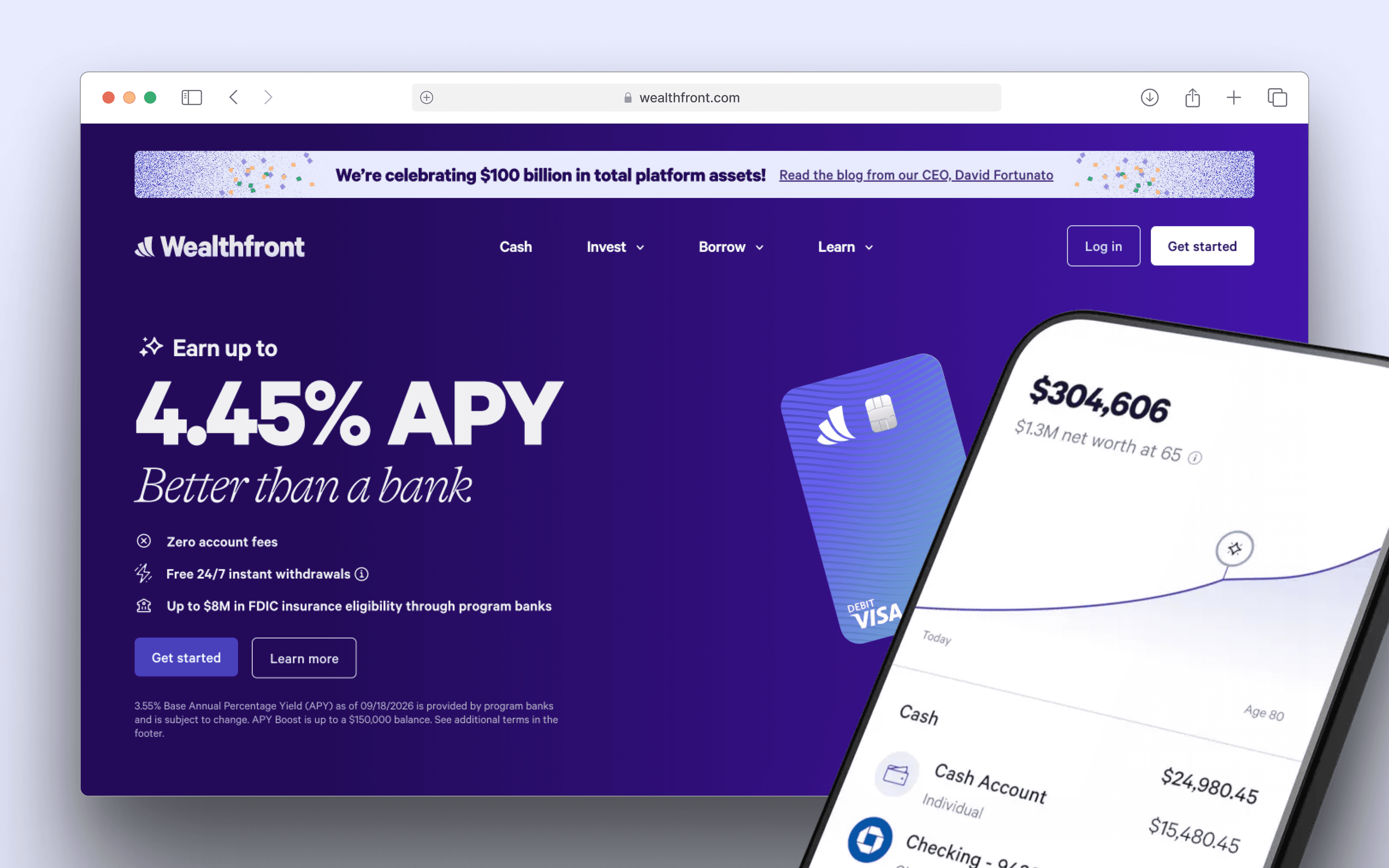
Wealthfront is an automated investing platform offering ETFs, index funds, crypto trusts and more. The company went public on the Nasdaq under the ticker WLTH in December 2025, and the homepage now features a home lending product alongside its original investing and cash management lineup.
Wealthfront's website feels full of life, with animation at nearly every scroll. Fancy typography, vibrant gradients and detailed illustrations combine into a site that stands apart from its competitors.
Watch for the hidden easter eggs across the site, including a jetpack sloth.
Favorite elements from Wealthfront:
- Stunning visuals built from vibrant gradients and detailed illustrations
- Neat, distinctive typography that carries the brand's personality
- Product UI woven directly into the page instead of shown separately
- Animations and microinteractions that appear at nearly every scroll point
Agicap
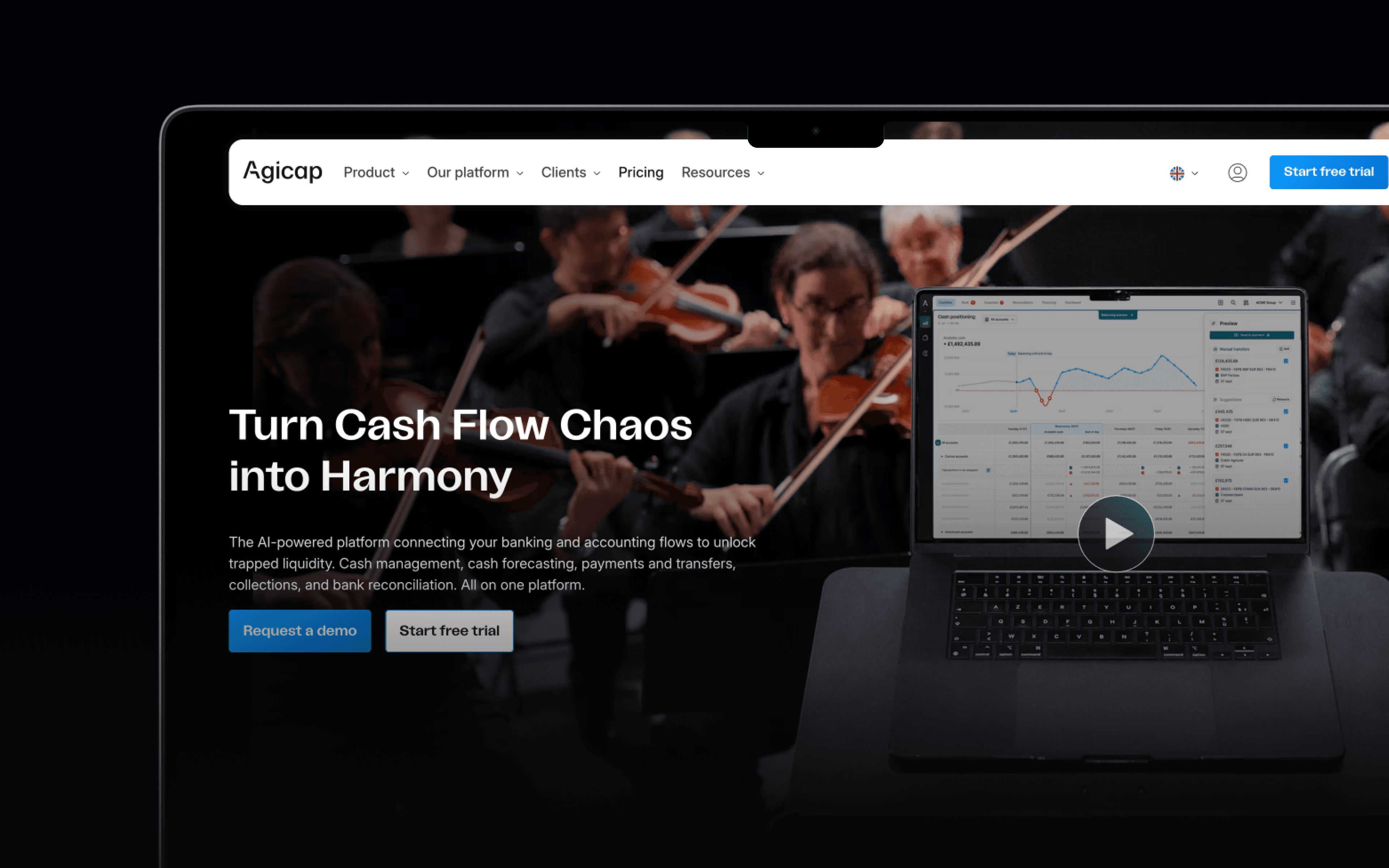
Cashflow management software Agicap rounds out this wealthtech section.
Turning anonymous website interest into an attributable lead is a constant challenge in fintech marketing. One reliable answer is building confidence that the product looks and feels like the solution a visitor needs, which raises the odds they request a demo or talk to sales.
Agicap does this by showing its product's interface and functionality through video, screenshots and detailed copy that explains what the platform does and how it works. That approach can help increase session duration and conversion rate.
Things to admire about Agicap:
- The product and its surrounding ecosystem shown clearly through video and screenshots
- Excellent use of white space that keeps dense financial data readable
- Testimonials from different target personas that speak to varied buyer needs
Fraud Prevention and Detection Website Design Examples
Fraud prevention platforms sell a hard thing to market: a product whose success is invisible when it works. These websites have to make deeply technical risk-scoring and detection systems legible to a buyer who needs to trust the platform before ever seeing it stop an attack.
SEON
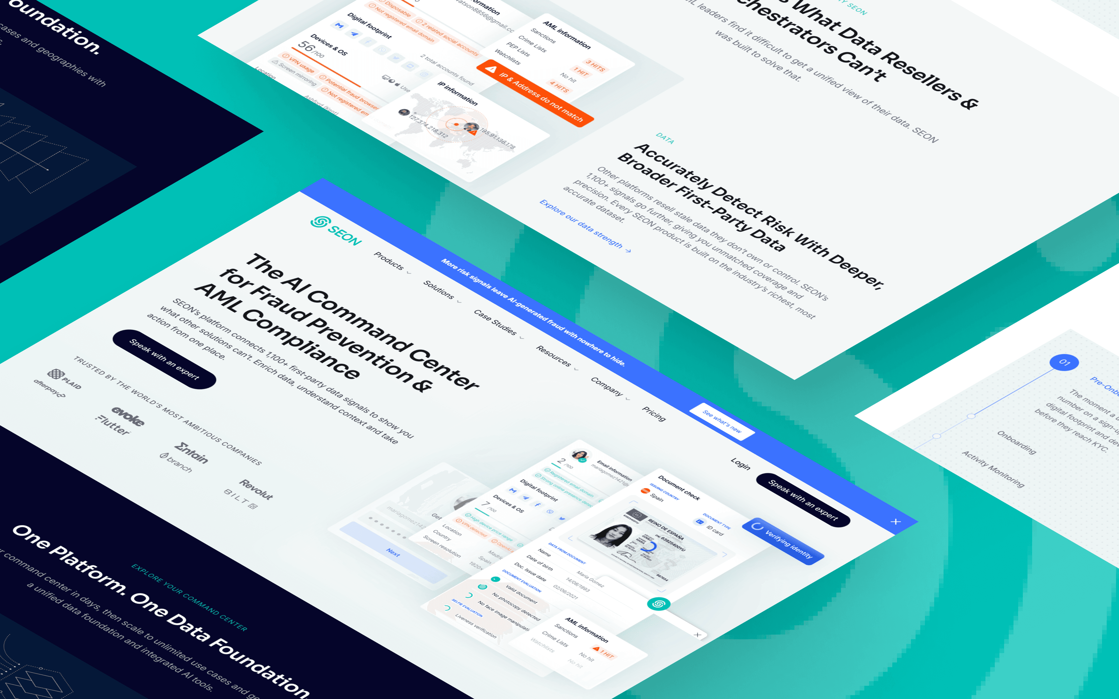
SEON's website highlights its fraud prevention platform with a clean, professional aesthetic. Soft greens and whites create a calming, trustworthy ambiance, while interactive elements emphasize the platform's data-driven approach. The homepage now leads with "The AI Command Center for Fraud Prevention & AML Compliance," backed by a dedicated AI agent-detection signal alongside its existing device and digital-footprint checks.
SEON leans on user data and device details, using clean, easy-to-understand cards and graphs to present complex information. The result feels both accessible and technical, matching the needs of businesses fighting fraud.
Best aspects of SEON's design:
- A user-friendly dashboard with clear data visualizations that make fraud signals easy to parse
- Intuitive card design that breaks fraud detection insights into scannable pieces
- A sleek, professional color scheme that fosters trust from the first screen
Sardine
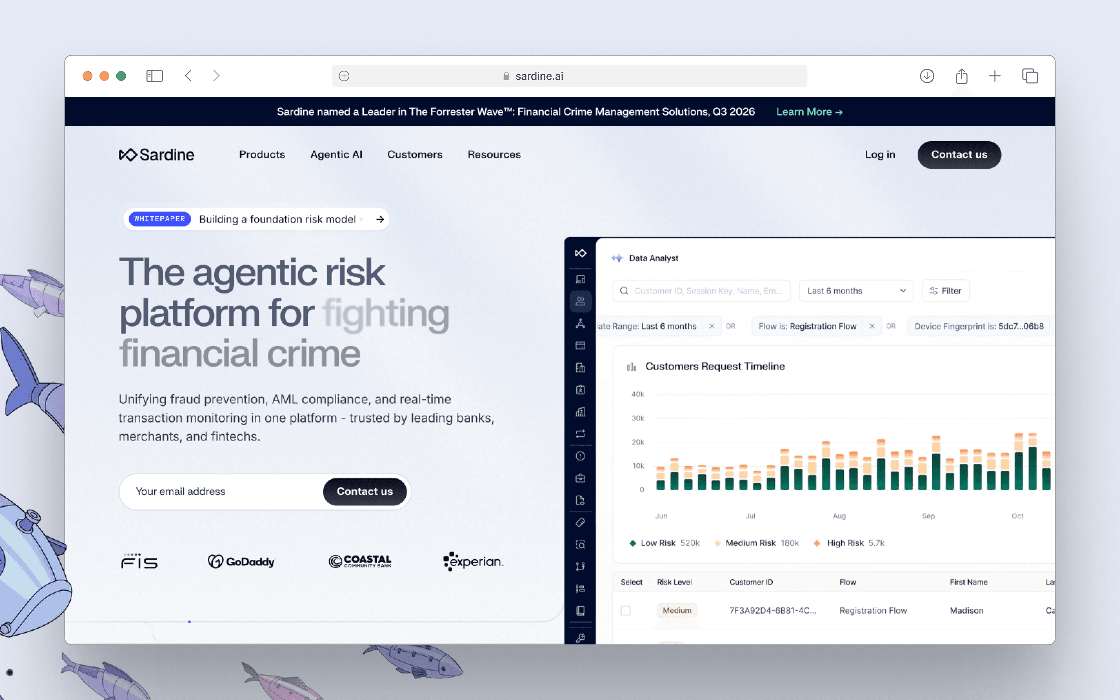
Sardine has rebuilt its brand. The homepage now leads with "Agentic Financial Crime Platform for Fraud Prevention & AML," and the oceanic visual metaphors and fish-themed illustrations are no longer evident in the current navigation or hero content. In their place is a lineup of nine named AI agents, including an OSINT Search Agent, a Sanctions Screening Agent and a Transaction Monitoring Agent, positioned as a team that works alongside a human risk analyst.
The repositioning tracks the same shift showing up across this article's fraud and blockchain sections: financial crime platforms are racing to brand themselves around agentic AI as fast as banking platforms are racing to serve it. Sardine's site still keeps a light, clean layout with clear product cards.
Best aspects of Sardine's current design:
- Named, specific AI agents in place of a generic automation pitch
- A unified platform narrative spanning onboarding, fraud, cyber and AML in one navigation structure
- A clean, minimalistic layout that keeps focus on the agent lineup
Insurtech Website Design Examples
Insurance is a promise that only gets tested when something goes wrong, and most buyers have been burned before by slow claims or unclear coverage. Insurtech websites carry the weight of overcoming that skepticism upfront, using transparent pricing, plain-language coverage details and visible proof of fast payouts to build trust before a customer ever needs to file a claim.
Clearcover
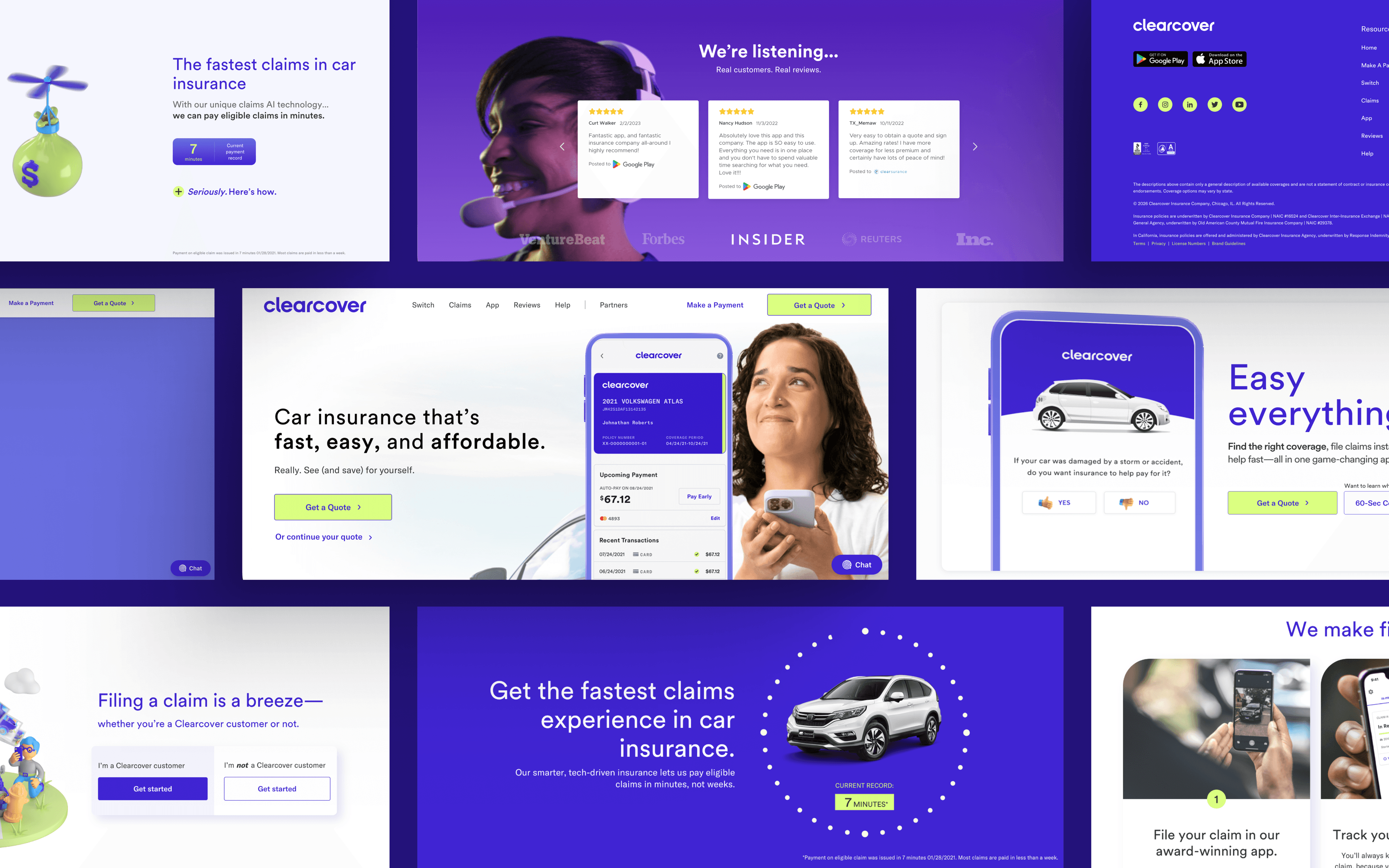
Clearcover is an insurtech startup rethinking how people pay for car insurance.
From the homepage, Clearcover signals a design as innovative as its approach to insurance. Effects and animations reinforce a clear message: car insurance made easy. As visitors scroll, the site keeps reinforcing speed and convenience, with multiple distinct conversion points aimed at driving app downloads.
Top callouts from Clearcover:
- Well-designed CTAs placed at strategic points throughout the scroll
- Short, informative video content that explains coverage without extra clicks
- An immersive scrolling experience that reinforces speed and convenience
ERGO Next Insurance
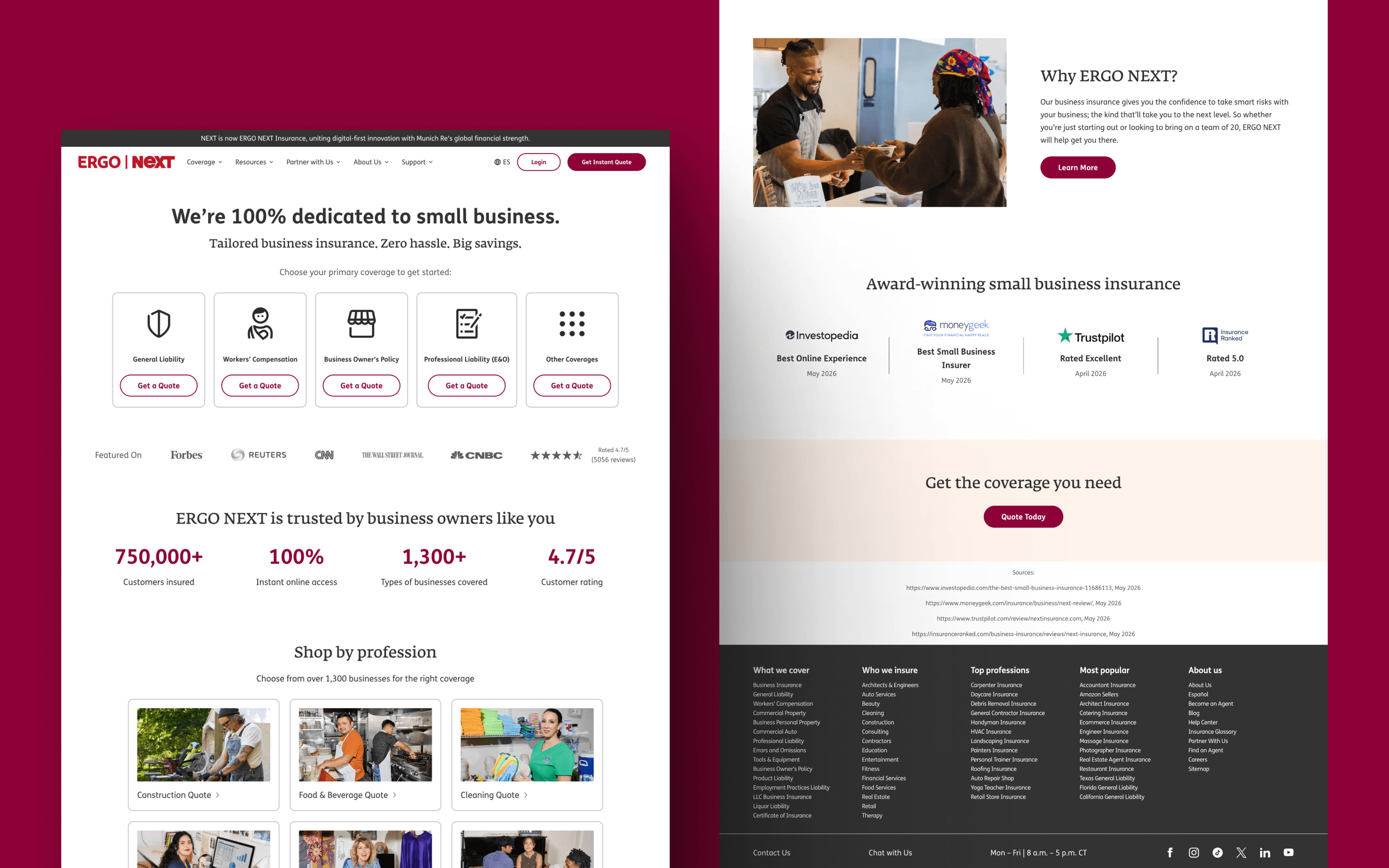
If you own a small business and want flexible, industry-tailored insurance policies, look no further than Next, now operating under the formal brand ERGO NEXT Insurance following its integration into Munich Re's ERGO Group. The site still refers to itself as NEXT throughout the body copy.
The homepage leads with a shop-by-profession structure: a visitor picks from more than 1,300 business types and gets routed straight into a quote flow for that specific trade. Real photography of small business owners has replaced the illustration-heavy style the category tends toward, paired with hard trust numbers instead of vague reassurance: 750,000-plus customers insured, a 4.7-out-of-5 rating across more than 5,000 reviews and pricing that starts at $19 a month for general liability. Partner logos for QuickBooks, LegalZoom, Square and Gusto sit further down the page, alongside a row of 2026 award badges from Investopedia, MoneyGeek and Trustpilot.
What's to like from Next Insurance:
- Shop-by-profession navigation that routes a visitor to relevant coverage fast
- Real customer photography and named testimonials in place of generic stock imagery
- Specific, visible numbers, including customers insured, star rating and starting price, doing the trust-building work
Lemonade
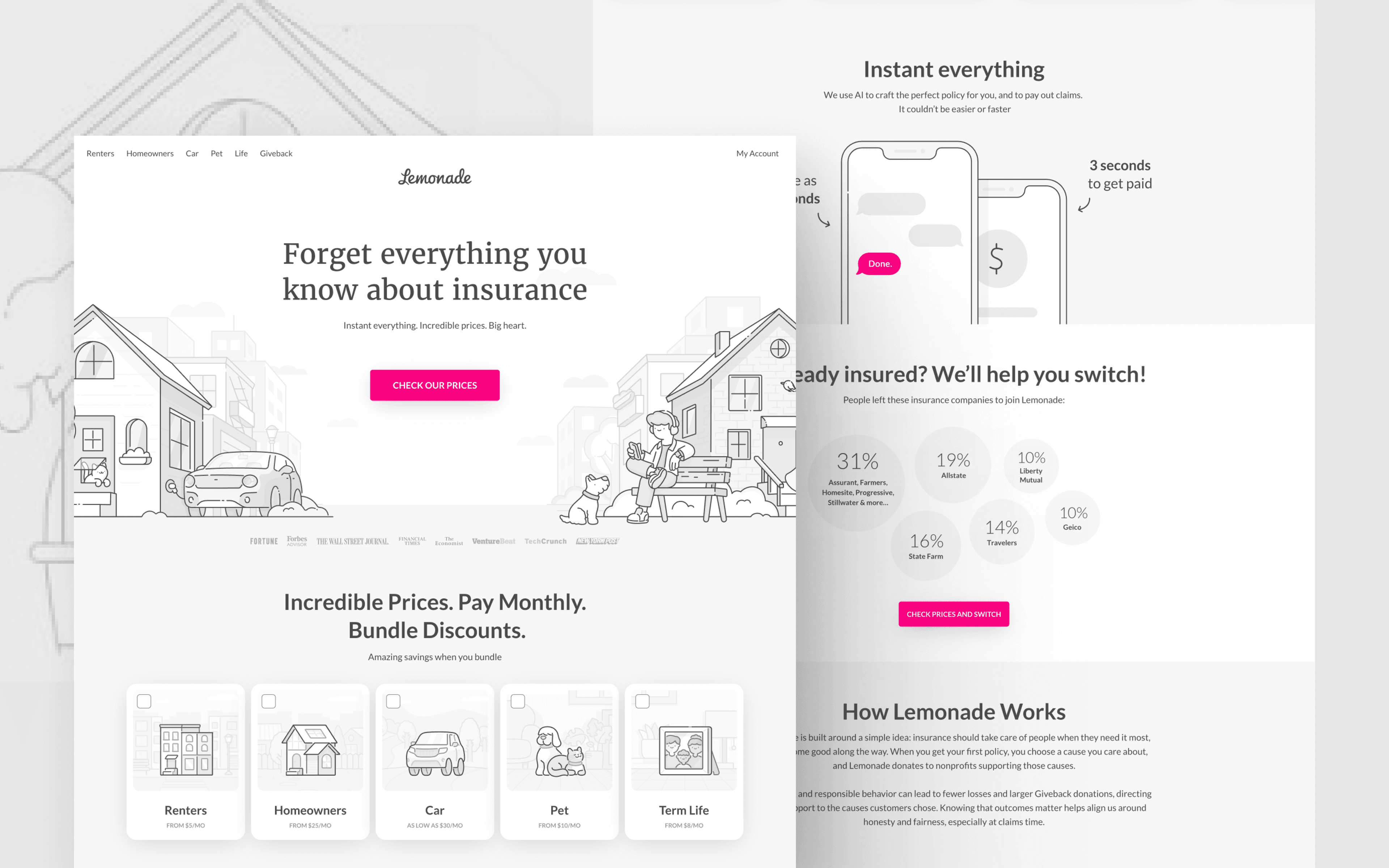
Lemonade is a "21st-century" insurance company offering policies for homeowners, renters, car owners and pet owners.
The highlight of Lemonade's design is its use of trust signals. Consumers are often hesitant to switch insurance providers, and an important, comparatively expensive purchase decision can take longer to reach.
Lemonade eases that hesitation by building credibility through several channels:
- Media mentions from outlets like Inc., Forbes and TechCrunch
- Top ratings alongside customer reviews and testimonials
- Switch statistics showing which providers current users left
- Charitable giving disclosures
- B Corporation status, publicly traded and fully regulated
Things to like about Lemonade:
- Plenty of trust signals reinforced through media mentions, ratings and public filings
- Cute doodles that keep a serious subject approachable
- Extensive, detailed FAQs that answer objections before they come up
- Hover states and other microinteractions throughout the page
RegTech Website Design Examples
Regulation technology, or RegTech, is a fast-growing space. As regulations grow more complex across industries, RegTech automates and simplifies compliance processes that would otherwise be slow and manual. These solutions matter most for businesses and institutions facing costly non-compliance risk.
Drata
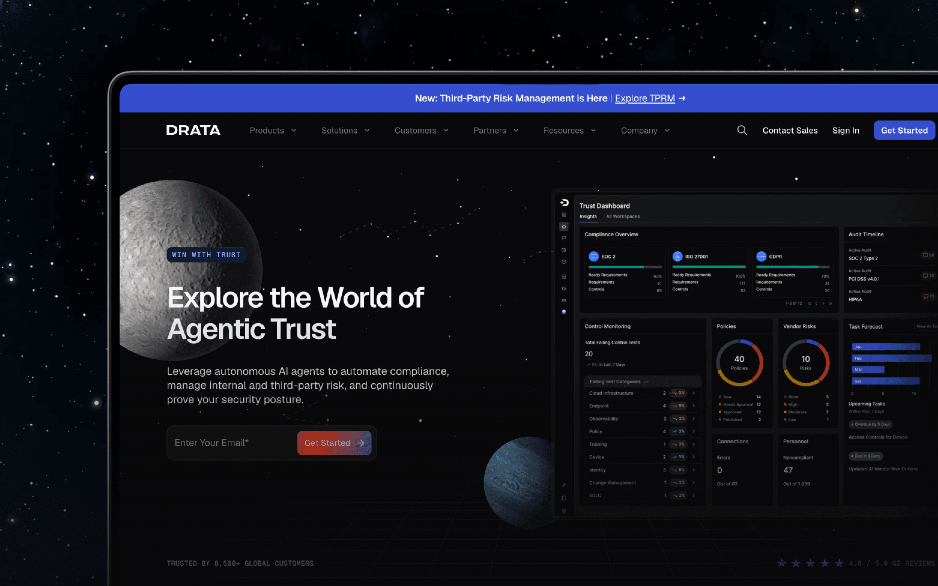
Drata has rebranded as "The Agentic Trust Management Platform," wrapping the entire site in a space-mission conceit: sections carry names like "Command the Mission," "Initiate Launch," and "Chart Your Course," and customer proof points are labeled "Flight Reports." The rebrand centers on a new enterprise product that discovers and governs every AI agent running inside a customer's environment, producing audit-ready proof of what each agent did.
The through-line to the original design still holds. Drata's message is still built entirely around trust, and the site uses testimonials, trust bars and accolades the same way it always has, just now applied to a bigger claim: that Drata can prove trustworthiness for AI agents the same way it proves compliance for humans.
- A distinctive narrative conceit, space mission language, carried consistently through every section
- Client, partner and integration logos used to reinforce scale and credibility
- New product messaging for AI agent governance, positioned as a natural extension of existing GRC work
- Customer quotes attributed by name and title, framed as "Flight Reports"
Hummingbird
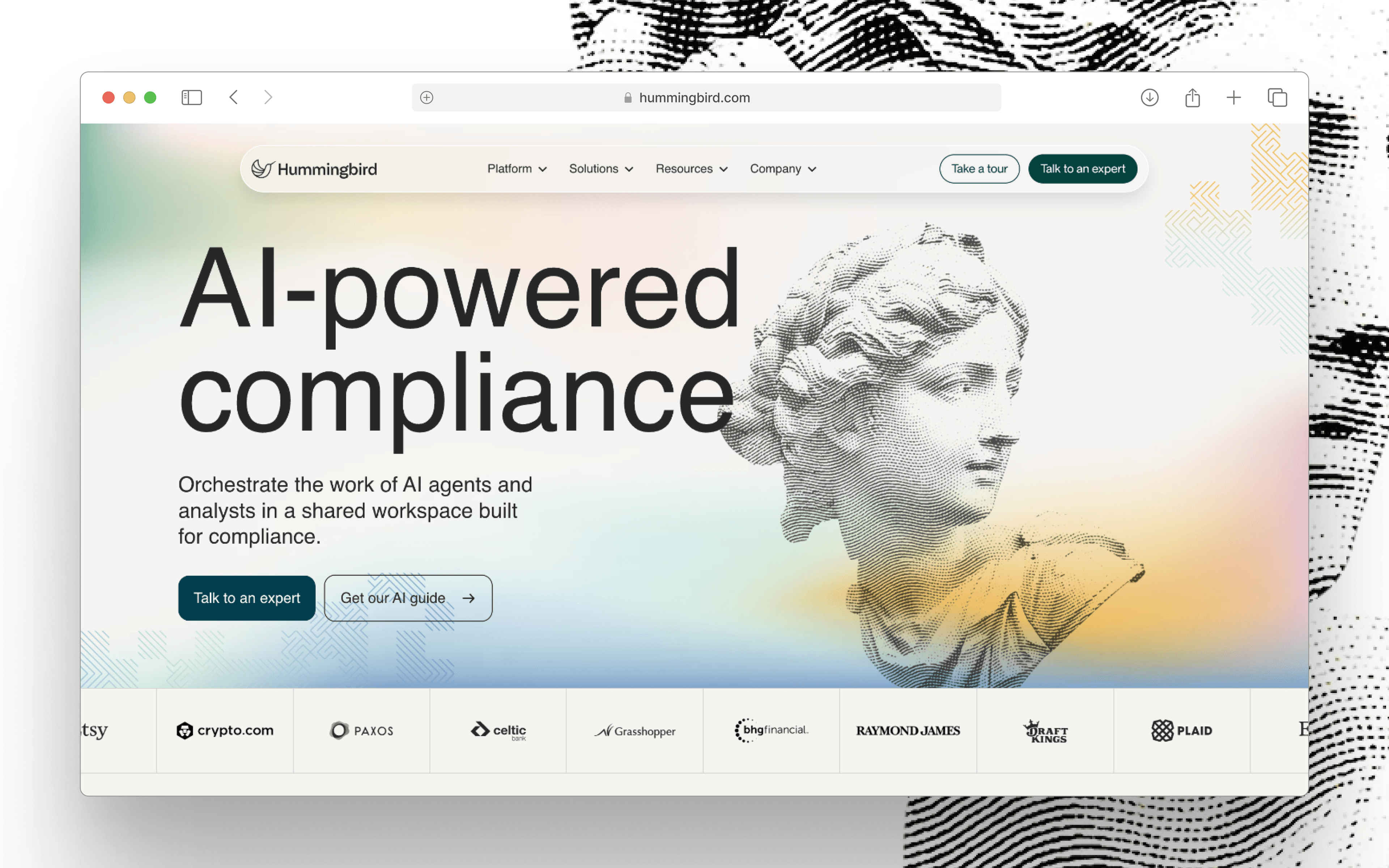
Hummingbird is a compliance CRM selling anti-money laundering software to financial institutions and fintechs.
Hummingbird may be one of the sharpest websites in this list. Every page is meticulously crafted with strong imagery, compelling copy and clean site architecture.
There is no filler or walls of text. Each page says what it needs to, then uses screenshots or artwork to reinforce the point. The site now shows a second CTA alongside its demo request and leads with "AI-powered compliance" as the primary headline. Hummingbird has also shipped named Research and Review Agents that automate entity research and routine casework, joining the same agentic-AI pattern showing up across this article's fraud and RegTech picks.
- Precise iconography in the navigation menu that supports quick scanning
- Rich gradients paired with an off-white background and black text for contrast
- A distinct illustration style carried consistently across the site
- Typography that shifts style as the user moves their mouse
Sift
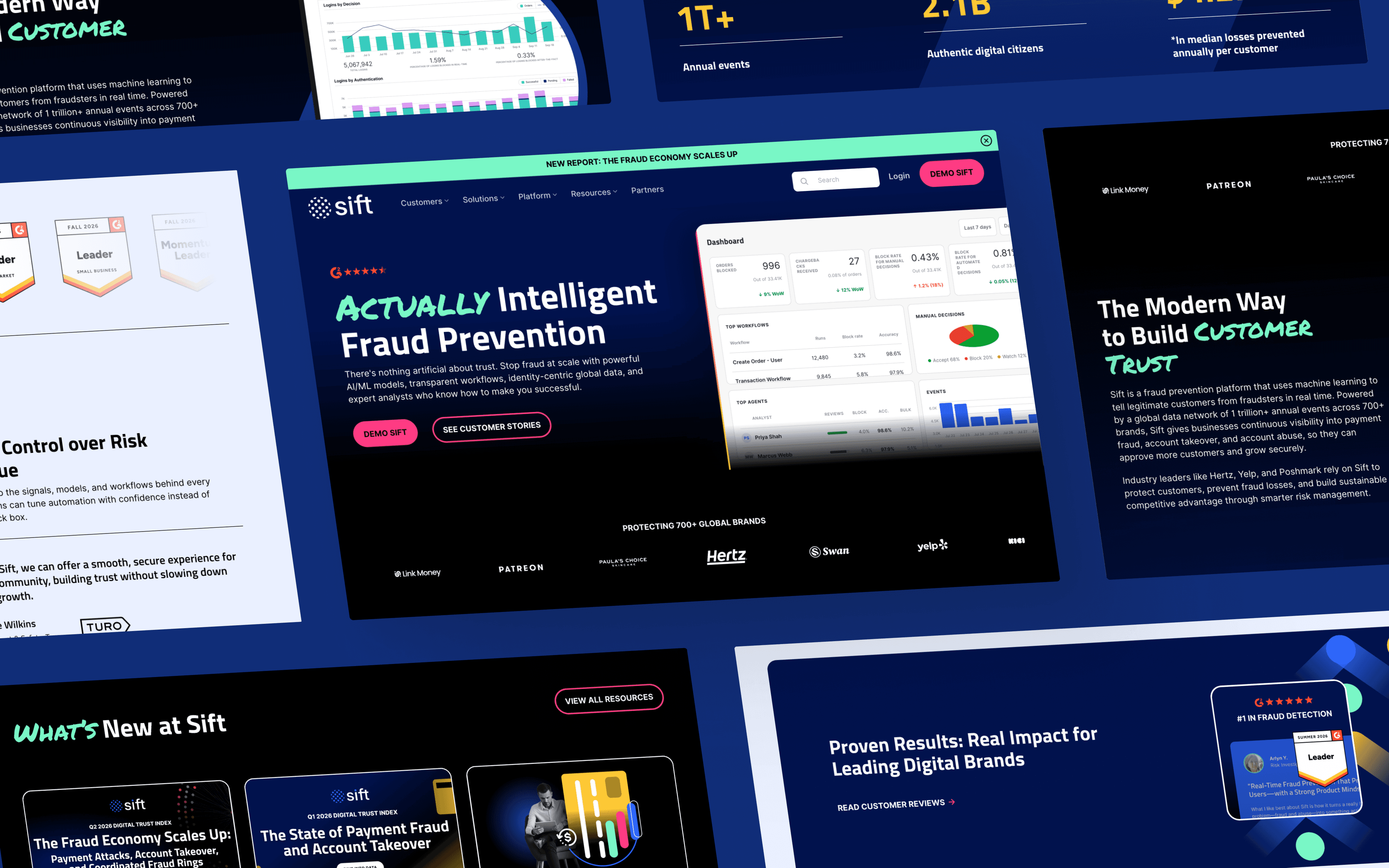
Last in RegTech is Sift, a Digital Trust & Safety platform.
Because its products are rooted in trust and safety, Sift builds integrity into the site itself. Content spans customers, partners, a fraud center and a "Trust and Safety University," with illustrations and statistics that pair well with the copy.
What stands out most from Sift:
- A sleek demo form that keeps the conversion path short
- Diagrams used to visualize how the platform's trust and safety products work
- Strong contrast between text and background that keeps content legible
- Consistent shapes across buttons, cards and illustrations that unify the site
Blockchain Fintech Website Design Examples
The rapid growth of blockchain and cryptocurrency continues to fuel Web3 fintech. A January 2026 ResearchAndMarkets report values the global Web3 in financial services market at roughly USD 4.76 billion in 2025, projecting growth to USD 50.41 billion by 2031 at a 48.19 percent compound annual growth rate.
Many players in the space have taken a strategic approach to web design, facing the challenge of educating and onboarding users to the on-chain world. See if you can spot the themes across these Web3 examples.
Circle
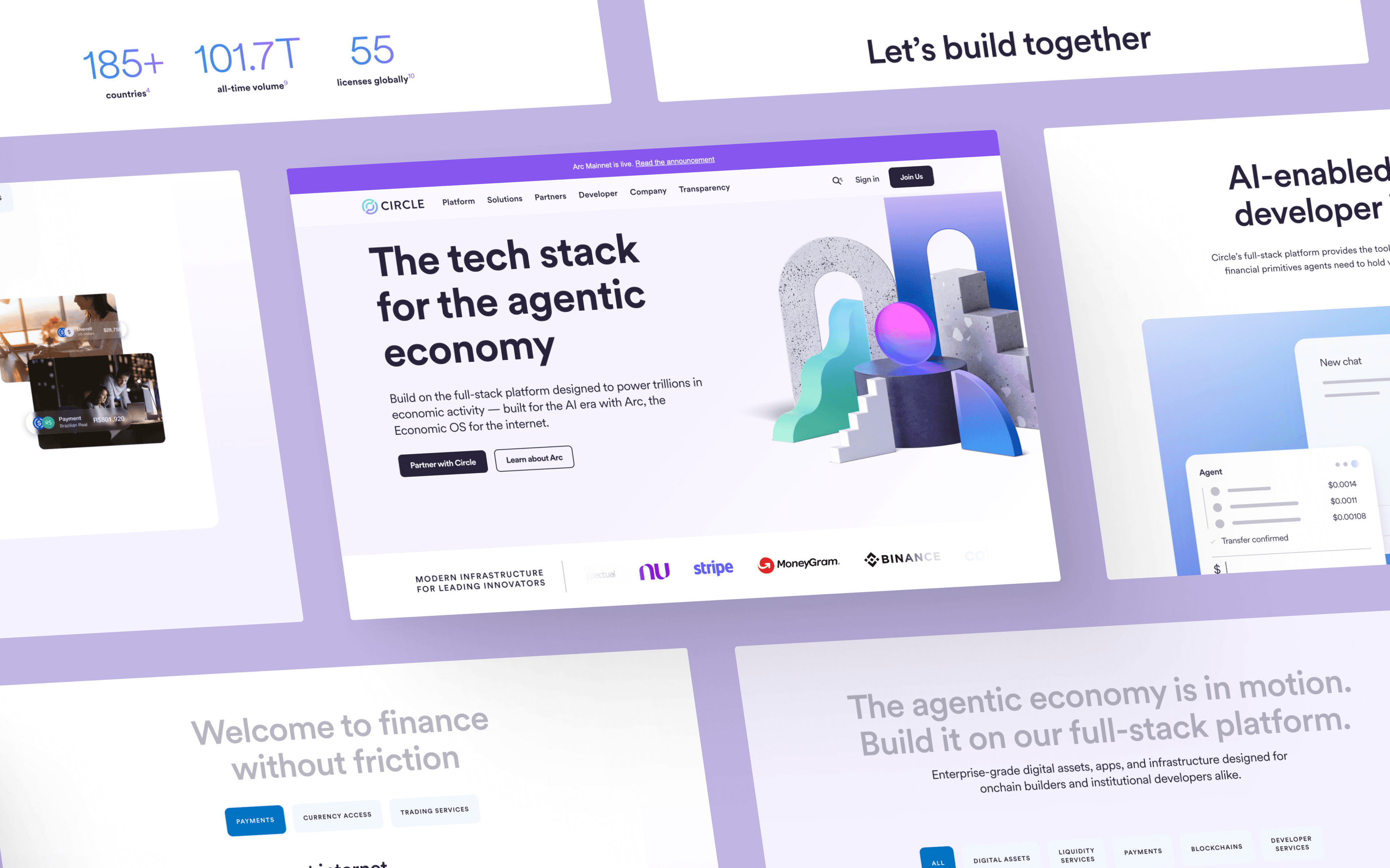
Circle created the on-chain, dollar-backed stablecoin USDC. A notable feature from the Best Web 3.0 Designs blog, Circle helped pioneer trends seen across crypto marketing. The homepage headline now reads "The tech stack for the agentic economy," backed by a dedicated Circle Agent Stack, Agent Wallets and an Agent Marketplace built so AI agents can hold value and transact on their own.
Like many Web3 organizations, part of Circle's audience is new to cryptocurrency and blockchain technology. Organized, intuitive web design helps Circle explain how blockchain-based fiat currency is faster, cheaper and largely better than its traditional counterpart. For more technical audiences like developers, and increasingly for the AI agents building alongside them, Circle makes it easy to dive into its resources, including API keys, docs, blogs, videos and events.
Top callouts from Circle:
- A headline built around agentic infrastructure rather than stablecoins alone
- Futuristic custom illustrations that reinforce a forward-looking brand
- Short, compelling headings and copy that keep dense technical topics approachable
- Trust indicators from leading finance companies, including its own regulatory license map by country
Consensys
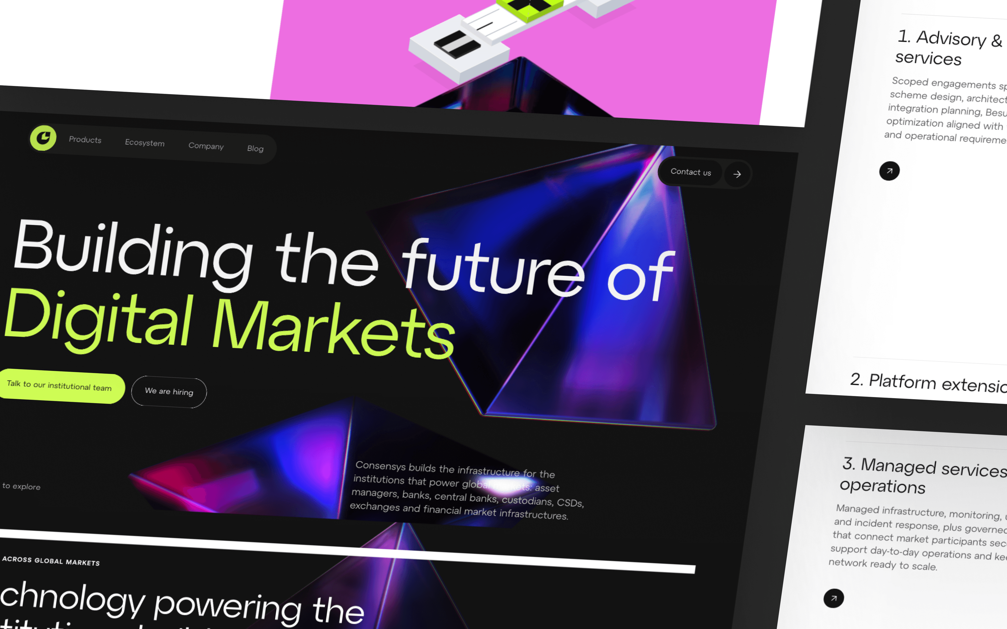
From the creators of the leading Ethereum wallet, MetaMask, Consensys designs specifically for its audience of blockchain developers. Flashy animations, neon components and code-inspired typography make the site resonate with that audience.
The site feels more like a hub or community forum than an ordinary marketing website, with plenty of fun, quirky details to explore.
Highlights from Consensys:
- A neon color scheme suited to its Web3 developer audience
- Creative imagery that gives the site a distinct personality
- Animation and motion carried throughout the page
- Dark mode paired with bold, high-contrast text
Alchemy
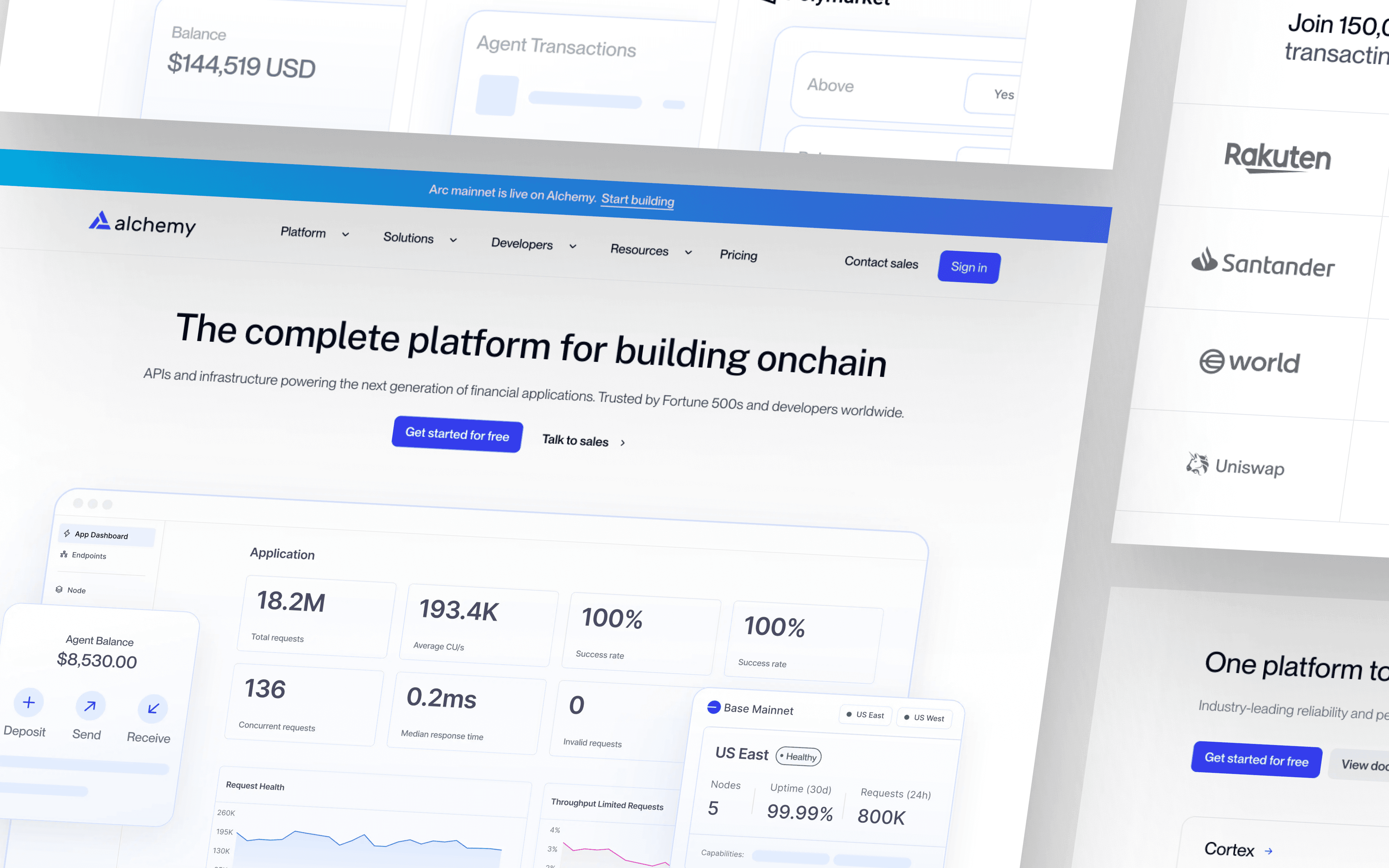
Rounding out this blockchain roundup is Alchemy, a platform for Web3 developers.
Alchemy embodies a trendy, engaging website that speaks to its community and frames the company as a one-stop shop for Web3 builders. Its navigation bar stands out for its layout, submenus, unique icons and quick animations. The homepage now leads with performance claims powered by "Cortex," its named intelligent blockchain engine, alongside a dedicated "Agents onchain" section offering a CLI, an MCP server and skills so AI agents can read blockchain data and send transactions directly, the same agentic thread running through Circle's and Meow's redesigns elsewhere in this article.
What makes Alchemy a winner:
- Popping gradients that carry the brand's energetic visual identity
- Clear, concise headings that keep technical content approachable
- Design built around the end user rather than the product alone
- Testimonials with name, logo, title and a supporting stat
Where Fintech Website Design Is Headed Next
The clearest signal across this list is where fintech design is spending its energy next. Nearly a third of the companies here have already rebuilt part of their homepage around AI agents, on both sides of that shift: platforms enabling agents to act, and fraud and compliance platforms racing to detect and govern them.
Individual brands are moving fast on their own fronts too: Wealthfront went public, Next Insurance folded into ERGO Group and Deel widened from payroll into a full people platform. The common thread is a group of companies that treat their website as a living part of the product rather than a one-time launch, which is exactly the instinct behind every example on this list.
As a web design agency for SaaS companies, Webstacks has seen the impact a first-rate website can have on a company's brand identity, leads and sales.
A fintech website either earns trust or costs a conversion, and design is what decides which one happens. Talk to Webstacks about building a site that does the former.

Your website is your biggest growth lever—are you getting the most out of it? Schedule a strategy call with Webstacks to uncover conversion roadblocks, explore high-impact improvements, and see how our team can help you accelerate growth.