12 Modern Website Design Trends for 2025 + Examples
In 2025, web design is set to evolve with trends that will enhance user experience and redefine visual aesthetics. From minimalist designs and UX-focused layouts to interactive storytelling, these trends are shaping the future of websites.
In this article, we’ll explore the top modern website design trends projected to dominate in 2025. With 75% of users forming opinions on website credibility based on design, you need to get it right.
We'll also show you examples of great sites to serve as web design inspiration for your next project.
Key Takeaways
- Minimalist and UX-focused design will continue to dominate, emphasizing simplicity and intuitive user experiences.
- Dark mode aesthetics remain popular for their visual appeal and user-friendly features.
- Advanced interactivity and motion effects will enhance user engagement with dynamic elements.
- Mobile-first design is essential as mobile traffic continues to dominate.
- AI-generated content and interactive storytelling will provide personalized and immersive user experiences.
Webstacks websites don’t just look good—they scale with you and drive real results.

12 Modern Web Design Trends
Keeping up with design trends ensures your website captures visitors' attention and provides an enjoyable user experience. Here are the top modern web design trends:
1. Minimalistic and UX-Focused Design
Minimalist design focuses on simplicity, clean aesthetics, and intuitive user experience. It utilizes whitespace, simple color palettes, and streamlined layouts to create visually appealing and user-friendly websites.
While we do see a wave of websites adopting loud, dynamic, and unconventional designs, the majority are trying to simplify visual elements and user journeys. This is perhaps the most effective way to get users to complete desired actions.
With the need to capture attention immediately, there’s a strong argument to be made for keeping things fairly straightforward. However, achieving an effective minimalistic design relies on a harmonious relationship between CRO and UX.
This doesn’t mean that minimalist design can’t be beautiful and engaging. With the right color schemes, layouts, content, and functionalities, you can successfully do more with less.
2. Dark Mode Aesthetics
Dark mode started becoming popular around 2020 and is still gaining traction, with more than 55% of websites incorporating it into their design. So far, the trend has been seen most across social media platforms, B2B SaaS, B2C e-commerce, and blog/content sites.
Dark mode not only enhances visual appeal but also reduces eye strain. Websites adopting dark mode create a modern, sleek look and often improve readability in low-light environments.
3. Immersive Full-Screen Experiences
Immersive full-screen experiences utilize large, visually stunning imagery or videos that occupy the entire screen, aiming to captivate visitors and create a memorable experience.
This web design trend often combines storytelling elements, interactive animations, and engaging content to immerse users in the website's narrative. Elements can shift without any movements from the user.
Or, if you really want to bring out from the static page norm, consider adding interactivity and animations that transform the scrolling experience. This is where 3D design can be extremely useful.
4. Advanced Interactivity
As users, we like it when a website fosters intimate experiences. Advanced interactivity involves giving feedback to create a dynamic and immersive user experience.
Some examples of this include:
- 🖱️ Hover animations
- 👉Swipe features
- 👆Scrolling gestures
- 📊 Dynamic tables and graphs
- 🛠️ Interactive tools
- 🎤️ Voice commands
The goal is to make the website feel alive and interactive, encouraging users to explore and interact with different components.
5. Modern Typefaces
Modern typefaces in 2025 focus on enhancing readability and visual impact while maintaining a clean and contemporary look. This trend emphasizes the use of versatile, minimalist fonts that adapt well across various devices and screen sizes.
Variable fonts, which allow adjustments in weight and width, are increasingly popular for their flexibility and performance optimization. Additionally, high-contrast typography with clear, sharp lines helps draw attention to key content, ensuring that important messages stand out.
This approach not only improves user experience but also creates a visually appealing and cohesive design.
If you want to explore modern typefaces for yourself, be sure to check out TypeType.org.
6. Kinetic or Dynamic Typography
Keeping with the theme of text design, kinetic or dynamic typography uses animated or moving text to create visual interest and capture users' attention. This approach adds a dynamic and engaging element to website design, bringing text to life and conveying messages creatively.
By animating text, websites can guide users' attention, emphasize important information, and create a more interactive and visually appealing experience. This trend is gaining popularity as websites look for innovative ways to communicate information and create compelling content.
7. Sci-Fi Inspired Design
Embraced most by the Web3 industry, Sci-fi inspired design draws from futuristic and spacey themes, incorporating bold typography, vibrant colors, abstract shapes, and advanced imagery. This design style creates a sense of excitement and intrigue, making websites stand out and leave a lasting impression on visitors.
Websites adopting this trend often aim to showcase their unique brand personality and appeal to audiences interested in cutting-edge and imaginative aesthetics.
8. Noises and Textures
In 2025, noise and textures are gaining traction in web design, adding depth and realism to digital interfaces. Grainy effects, in particular, introduce dimensionality, making flat designs feel more tangible and engaging. Incorporating subtle textures and noise creates a more immersive experience, drawing users into the content.
These elements move away from overly polished, sterile designs, providing a tactile feel that enhances the visual richness and overall aesthetic of the site.
9. Illustrations
Illustrations are transforming SaaS websites into vibrant canvases, offering a unique and creative way to convey messages and brand stories. This trend uses custom artwork to enhance the visual appeal and personality of a brand and its website.
Whimsical characters, detailed landscapes, or abstract designs add a distinctive touch that static images or text alone cannot achieve.
Treating websites as a canvas allows designers to craft engaging narratives and visually striking elements that captivate visitors and differentiate brands in a crowded digital space.
10. Personalization
More and more, websites are delivering tailored experiences based on geographic, demographic, and behavioral characteristics. Not only does this create a more engaging experience, but it also helps you achieve your objectives (more sales, more conversions, etc).
Personalization can be as simple as altering the color of a button. But in 2025, personalization has reached new levels that transform the entire digital experience. And, things are only going to get more customized.
More websites are implementing larger changes, such as dynamically updating content based on user behavior and preferences, or changing the layout of the site depending on user interactions.
Tools like Mutiny and Optimizely enable swift and data-driven personalization.
11. Kinetic Typography
Text doesn’t have to sit still. Kinetic typography adds motion to words: text that slides, fades, stretches, or pulses on screen.
It’s a simple way to draw attention to headlines, calls to action, or stats you don’t want people to miss.
Used well, it makes a page feel alive without being distracting. For B2B brands, it’s a smart tactic to bring energy to a message while still keeping things professional.
You don’t need to go overboard.
Even subtle movement, like a phrase that gently appears as someone scrolls, can add rhythm to the experience and highlight key points.
12. Dynamic Grid Layouts
The old-school column-based layout still works, but it can get predictable.
A dynamic grid breaks that pattern.
Content blocks shift, overlap, or scale in interesting ways. This gives a site a modern, custom feel, like it was designed with care, not cranked out from a template.
For B2B companies, especially startups or teams trying to stand out in a competitive space, this kind of layout sends a message: you’re not afraid to do things differently.
Just keep readability and flow in check. The goal is to make the layout feel intentional, not chaotic. When it’s done right, visitors spend more time exploring.
Modern Website Design Examples
Now, let’s take a look at some examples of modern web design in the wild. It’s important to note that these websites were chosen based on a few key factors:
- Innovative, unconventional UIs that break the traditional mold of website design
- Strategic calls to action that tie the entire user experience together
- Consistent, in-your-face, unmistakable branding
- Motion and microinteractions that bring pages to life
- Bold, powerful copywriting that harmonizes with the ambitious visuals
1. Stripe
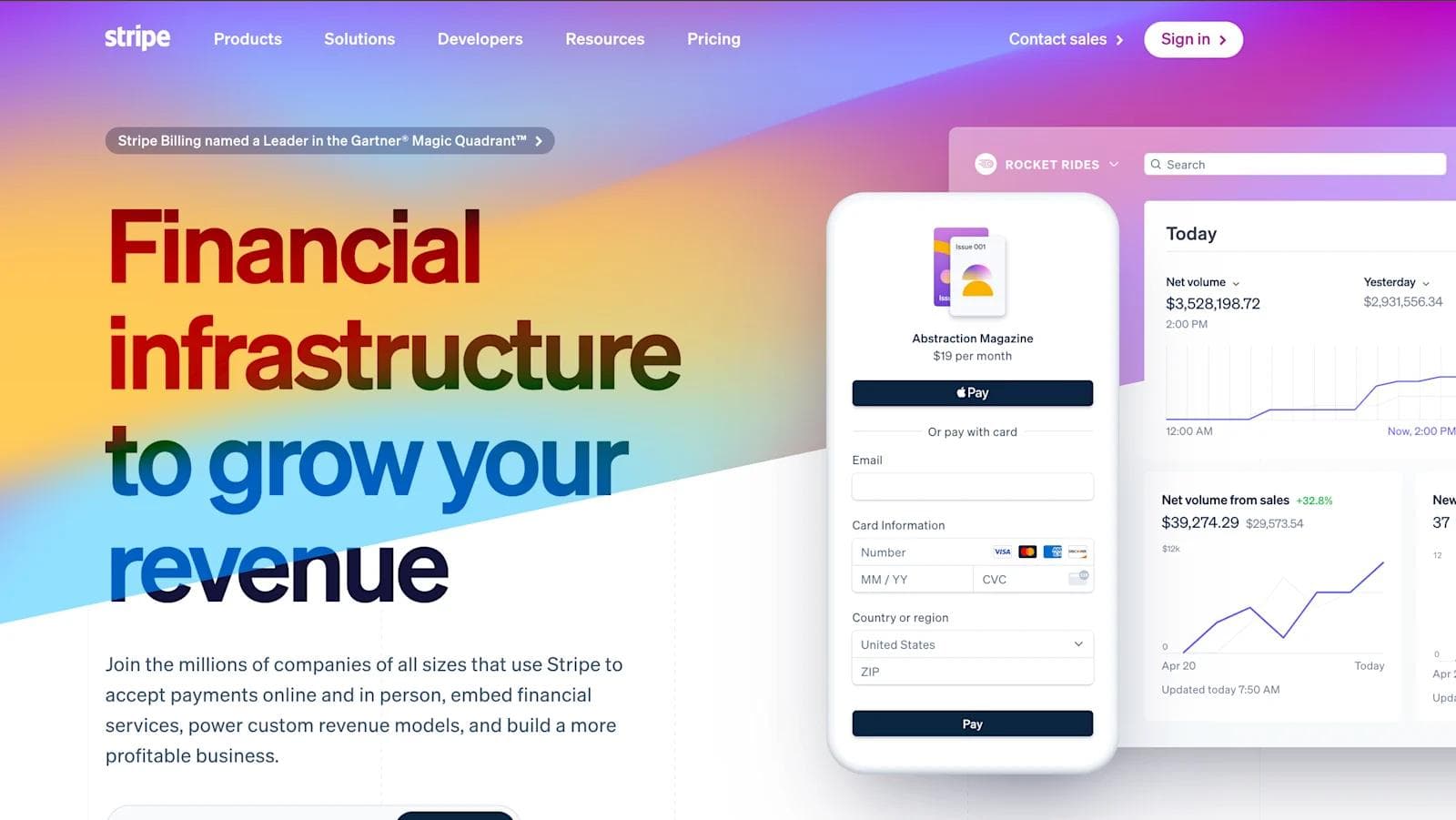
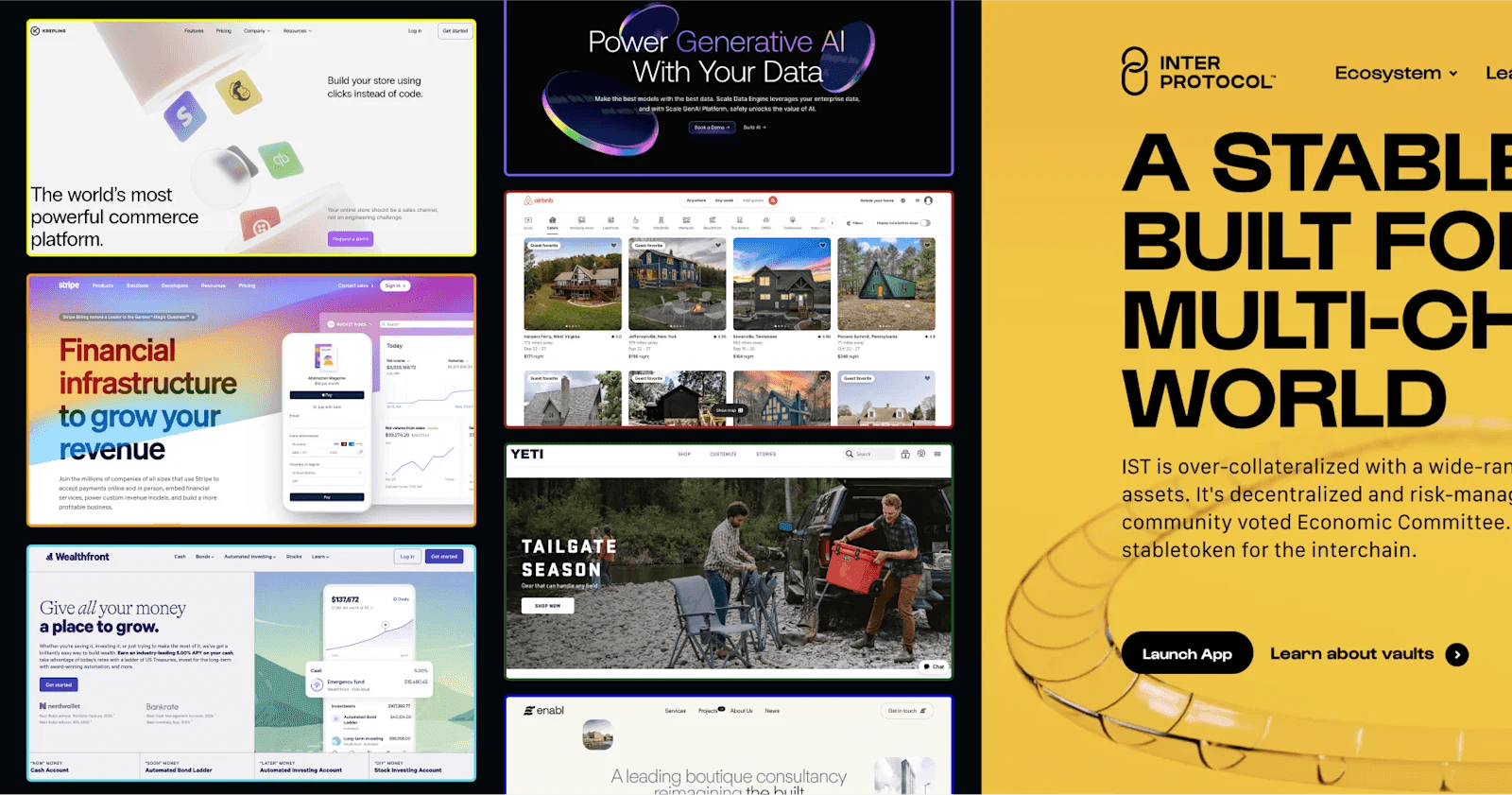
Stripe is one of our go-to’s when it comes to the best websites in B2B SaaS, and there are a few key design elements that raise it above typical websites in the same industry.
- Dimensionality: Colors, shapes, and shadow effects make certain elements on the page pop.
- Illustrations: Stripe utilizes high-quality, animated SaaS illustrations that let prospects get a look a their actual product right from the homepage.
- Animations: With or without user inputs, something on the page is always in motion. This is a subtle way to keep users engaged for longer.
2. Rivian
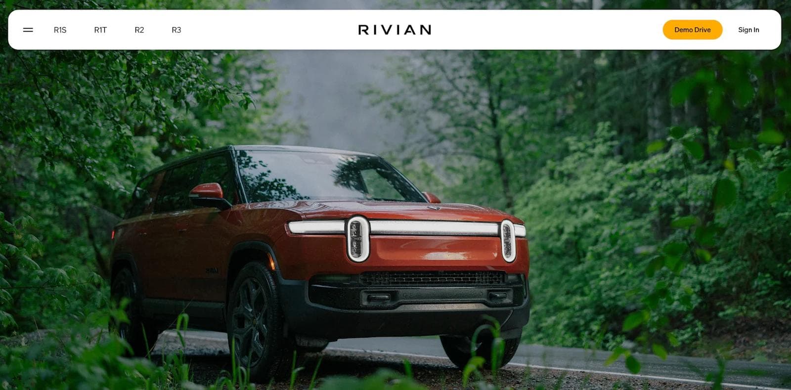
Rivian's website takes digital design in the automotive space to the next level, merging adventure with sleek functionality in a way that feels fresh and captivating.
- Adventure-Driven Imagery: The site immerses users in Rivian's world with breathtaking visuals of their electric vehicles navigating through rugged landscapes. These images tell a story of exploration and freedom that resonates with the brand’s mission.
- Interactive Product Discovery: Rivian’s site encourages interaction through features like the 360-degree vehicle views and customizable build options. It’s not just about browsing; it’s about experiencing the product in a way that feels personal and hands-on.
- Seamless User Journeys: With smooth transitions and intuitive navigation, the site makes exploring Rivian’s offerings feel like a journey in itself—one that’s both engaging and effortless.
3. Enabl
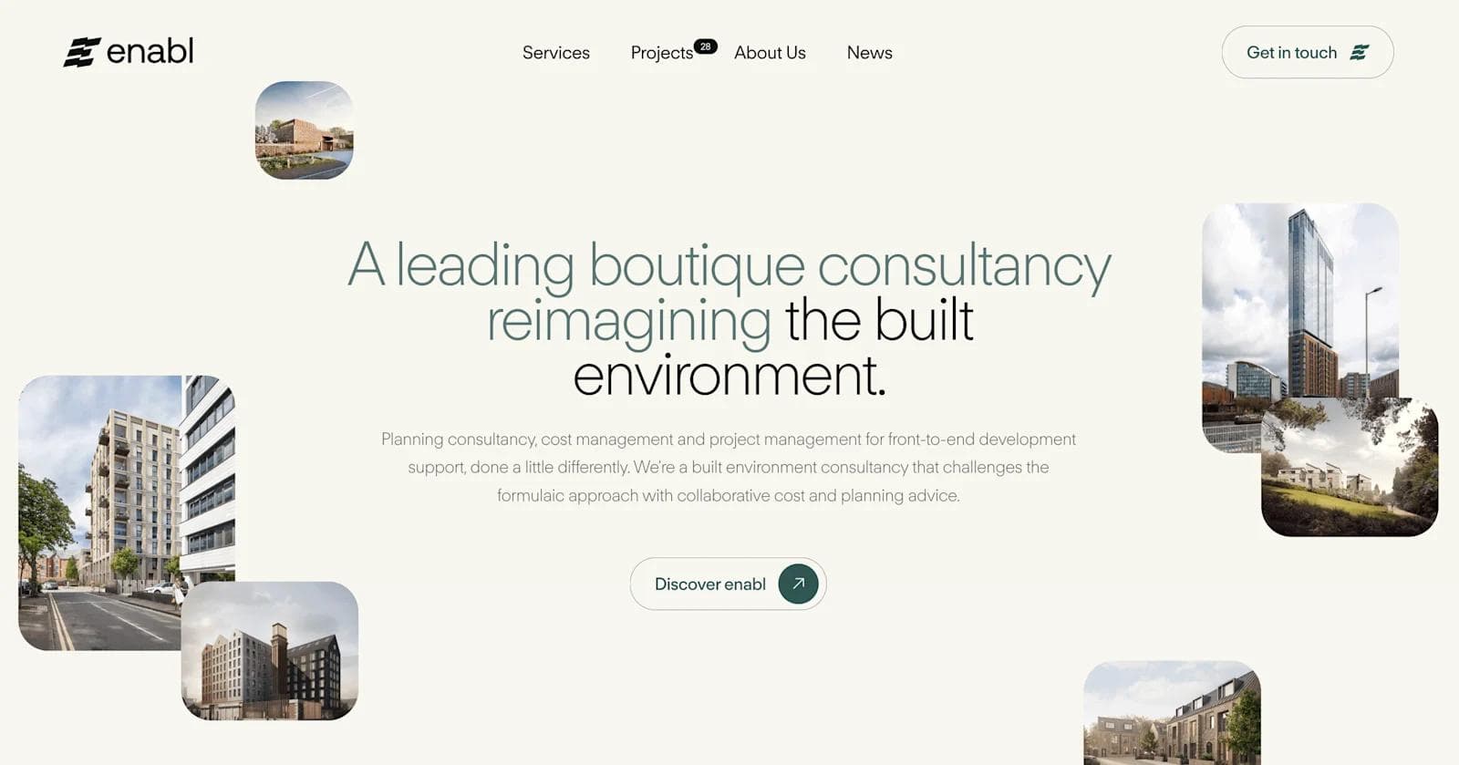
Enabl’s website is a refreshing take on B2B design, blending simplicity with visually striking elements that capture attention and communicate value.
- Vibrant Color Palette: Enabl’s use of bright, contrasting colors adds energy to the site, making it both memorable and visually appealing. The colors are strategically used to guide the user’s eye and highlight calls to action.
- Engaging Illustrations: Custom illustrations throughout the site add a playful touch while clearly conveying complex concepts. These visuals break up the text and make the content more digestible, adding to the overall user experience.
- Subtle Animations: The site comes to life as you scroll down the page. Text elements fade in and out, images slide across the screen, and CTAs pop when hovered over.
4. Krepling
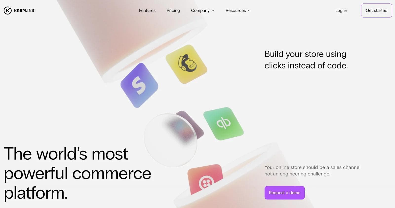
Krepling modern website design stands out because it expertly balances functionality with visual appeal, creating an inviting experience for users exploring their platform.
- Gradient Overlays: The site employs vibrant gradient overlays that add depth and dimension to the imagery, creating a dynamic and contemporary look that captures attention.
- Consistent Visual Themes: Krepling maintains a cohesive visual theme throughout the site, with consistent use of colors, shapes, and iconography that reinforces brand identity and enhances the user experience.
- Intuitive Navigation: The site’s straightforward navigation and clear, strategically placed CTAs ensure that users can easily find the information they need, facilitating a smooth journey from discovery to conversion.
5. Framer
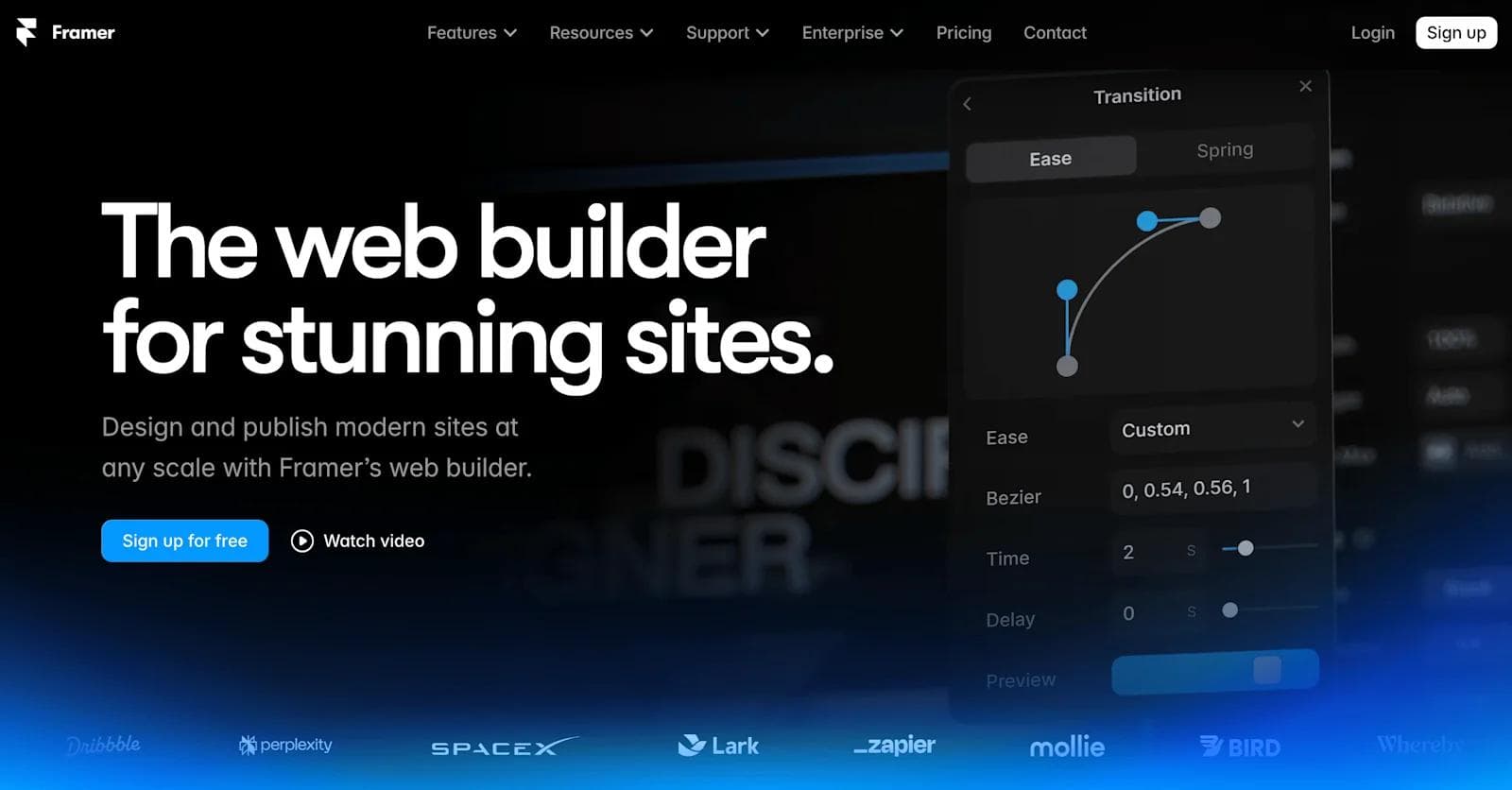
Framer is a prime example of how to blend cutting-edge design with a seamless user experience, making it a go-to resource for creatives and designers.
- Interactive Homepage: Framer greets visitors with an interactive homepage where users can experience the power of the platform through real-time product demonstrations. This immediate engagement sets the tone for an exploratory user journey.
- Fluid Animations: The site features smooth, fluid animations that enhance the browsing experience without overwhelming the user. These subtle movements guide attention and add a layer of sophistication to the overall design.
- Dark Mode Aesthetics: Framer embraces a sleek dark mode design, offering a modern, polished look that’s easy on the eyes and perfect for showcasing vibrant content and intricate designs.
6. YETI
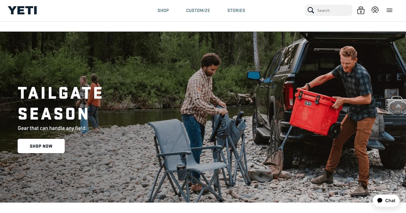
YETI’s website embodies the brand’s rugged, outdoor ethos with a design that’s as durable and straightforward as the products it showcases.
- Adventure-Focused Imagery: The site is filled with high-definition images of YETI products in action—whether it’s on a mountain trail or by a campfire. These visuals instantly connect with outdoor enthusiasts and highlight the products’ reliability in real-world settings.
- Robust Product Pages: YETI’s product pages are designed with attention to detail, featuring interactive elements like 360-degree product illustrations and detailed specifications. This allows users to thoroughly explore each product and understand its capabilities.
- Compelling Copywriting: Yeti doesn’t just sell you on their product’s look and capabilities - they use a strong, witty, and fun voice that enhances the shopping experience. Everything from headings and product descriptions go outside the box and turn what are typically generic words into linguistic genius.
7. Scale
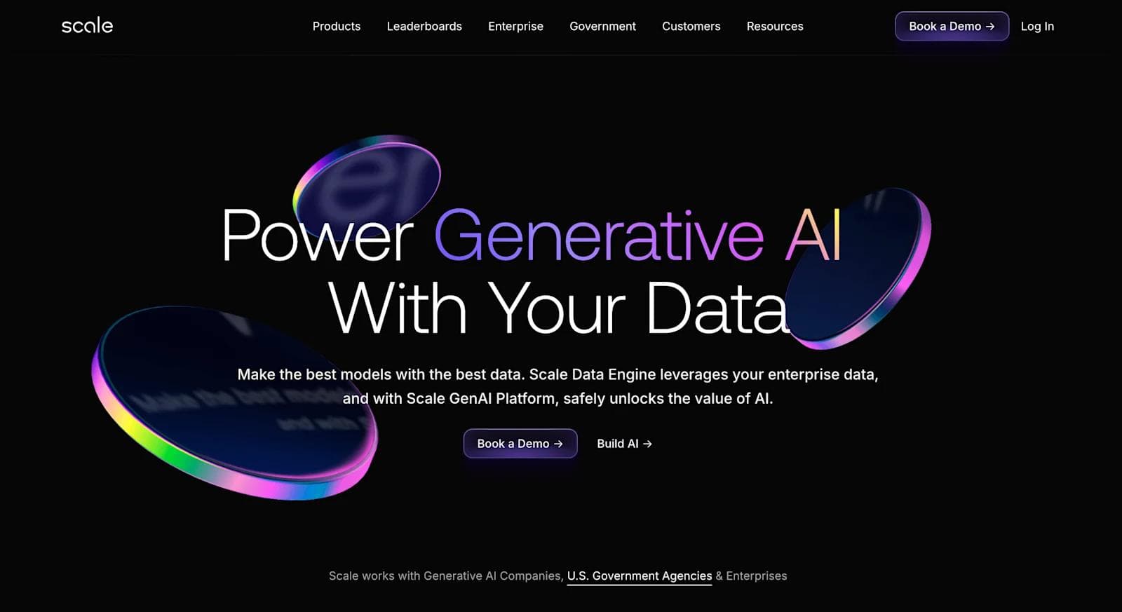
Scale - a top AI website design - exemplifies modern design principles with a focus on clarity and functionality. With a great understanding of their audience, their site is tailored for clients seeking enterprise innovative AI data solutions.
- Interactive Data Visualization: Scale showcases interactive data visualizations that allow users to explore complex datasets dynamically. This engaging feature highlights the platform's capabilities and enhances user understanding of its AI solutions.
- Minimalist Design: The site adopts a minimalist design approach, utilizing ample white space and clean typography to create a sleek and professional appearance. This design choice helps users focus on the core content and offerings without distraction.
- Bold Imagery: Scale employs bold, high-quality imagery to illustrate real-world applications of its technology. These striking visuals not only capture attention but also effectively communicate the impact of Scale’s solutions across various industries.
8. Airbnb
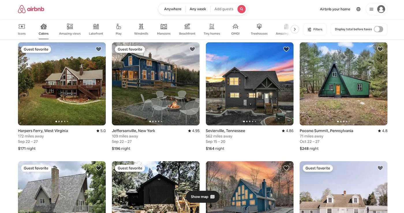
Airbnb’s website exemplifies modern design trends with a focus on immersive experiences and user-centric functionality, perfect for travelers and hosts alike.
- Vibrant Imagery: Airbnb uses vibrant, high-resolution imagery that immerses users in the destinations and accommodations they’re exploring. This visual storytelling creates an inviting atmosphere and sparks inspiration for future trips.
- Personalized Search Experiences: The site features an intuitive search interface with personalized recommendations based on user preferences and past interactions. This tailored approach enhances the user journey and simplifies the booking process.
- Interactive Maps: Airbnb integrates interactive maps that allow users to explore listings in relation to local attractions and amenities. This feature adds an extra layer of convenience and helps users make informed decisions about their stays.
9. Inter Protocol
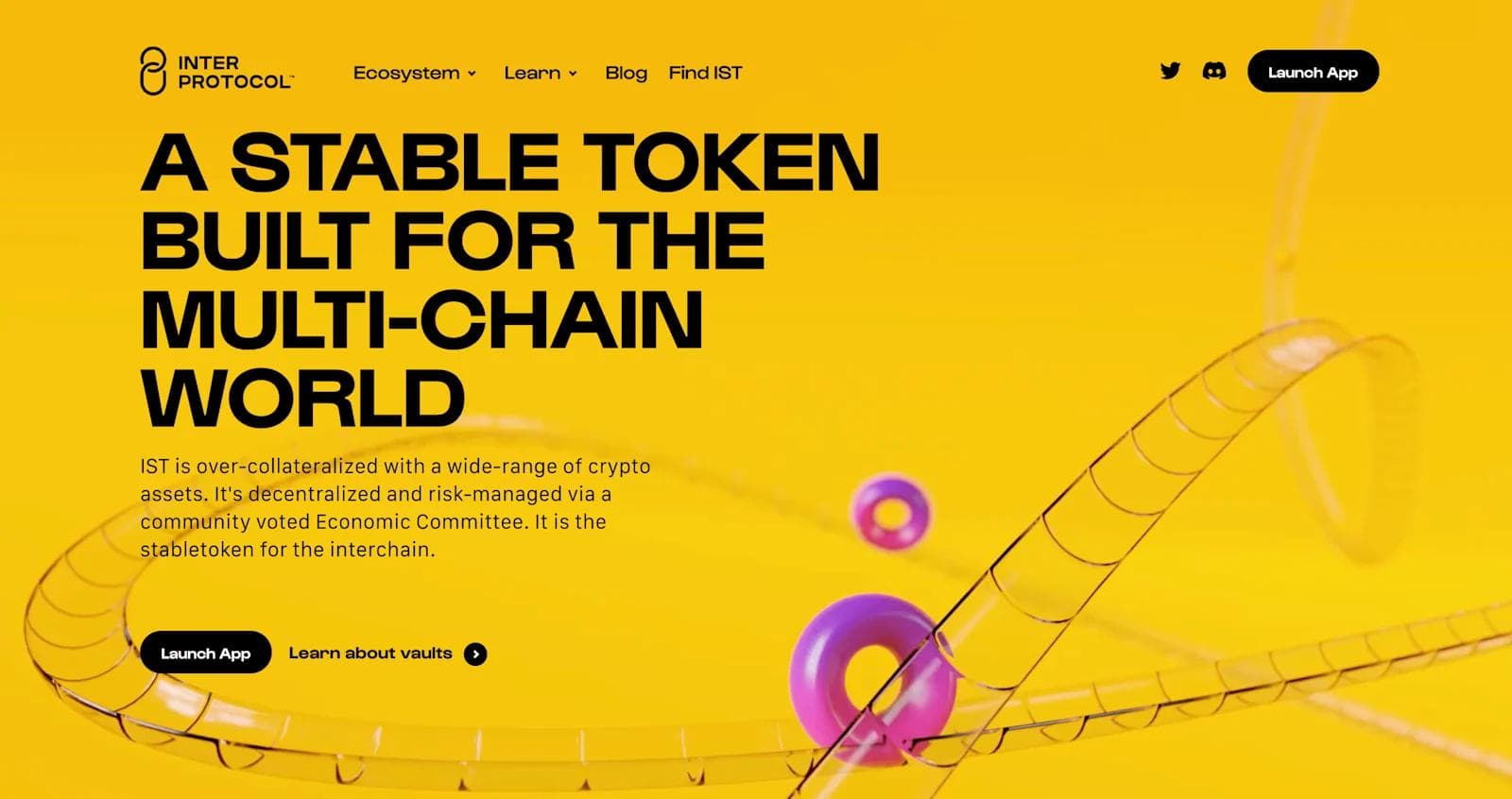
Inter Protocol’s website stands out with its innovative approach to Web3 design, catering to developers and blockchain enthusiasts with a sleek, cutting-edge interface.
- Monochrome Color Palette: Inter Protocol uses a monochrome color palette with subtle gradients, creating a sophisticated and modern look. This restrained color scheme adds a touch of professionalism while maintaining visual interest.
- Dimensionality: Inter Protocol’s dynamic illustrations and icons are top-notch. They create an unforgettable user experience, as well as an elevated brand identity.
- Interactive Micro-Interactions: The website includes subtle micro-interactions, such as smooth hover effects and animated transitions. These small, yet impactful details improve the user experience and highlight the site’s attention to detail.
10. Wealthfront
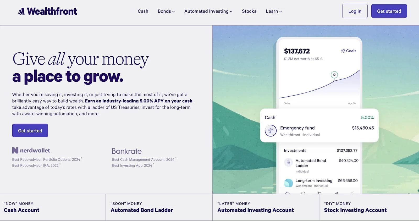
Wealthfront’s website impresses with its modern and user-friendly design, reflecting its focus on innovative financial solutions.
- Bright and Clean Aesthetic: The site features a bright, clean aesthetic with a well-balanced mix of white space and vibrant colors. This design choice creates a fresh and approachable look, making complex financial concepts more accessible.
- Straightforward Typography: Wealthfront employs straightforward, sans-serif typography that enhances readability and contributes to a professional yet friendly tone. The use of clear, concise fonts supports the site's goal of simplifying financial management.
- Visual Data Representation: The website uses visually engaging data representations, including colorful charts and infographics, to effectively communicate financial information. These elements make data more digestible and visually appealing.
Need Modern Website Inspiration?
Looking for modern website inspiration? There are plenty of resources to help you stay updated with the latest design trends.
Watch industry-leading websites and brands that align with your target audience. Analyzing successful sites can reveal what works well, from color palettes and typography to layout structures and interactive features.
Staying informed and gathering inspiration will help you create a modern website that captures attention and provides an exceptional user experience.
Here at Webstacks, we help tech leaders enhance their online presence with next-gen solutions for SaaS website design. If you want to upgrade your web design, feel free to reach out to us!
Webstacks websites don’t just look good—they scale with you and drive real results.


I create SEO-driven content for B2B SaaS companies, from blog posts to case studies. I focus on research-backed writing that ranks on the first page and drives meaningful organic traffic.

