A marketing website is the most powerful digital asset you can fully own.
This is especially true for SaaS companies, which heavily rely on digital experiences to attract engagement, instill trust, and ultimately generate revenue. When leveraged properly, it can also be one of the chief differentiators between yourself and your competitors.
All in all, their experience directly influences your brand perception and speaks directly to the quality of your products.
Therefore, a professional, beautifully designed, and functional web experience is a must for any SaaS company looking to grow.
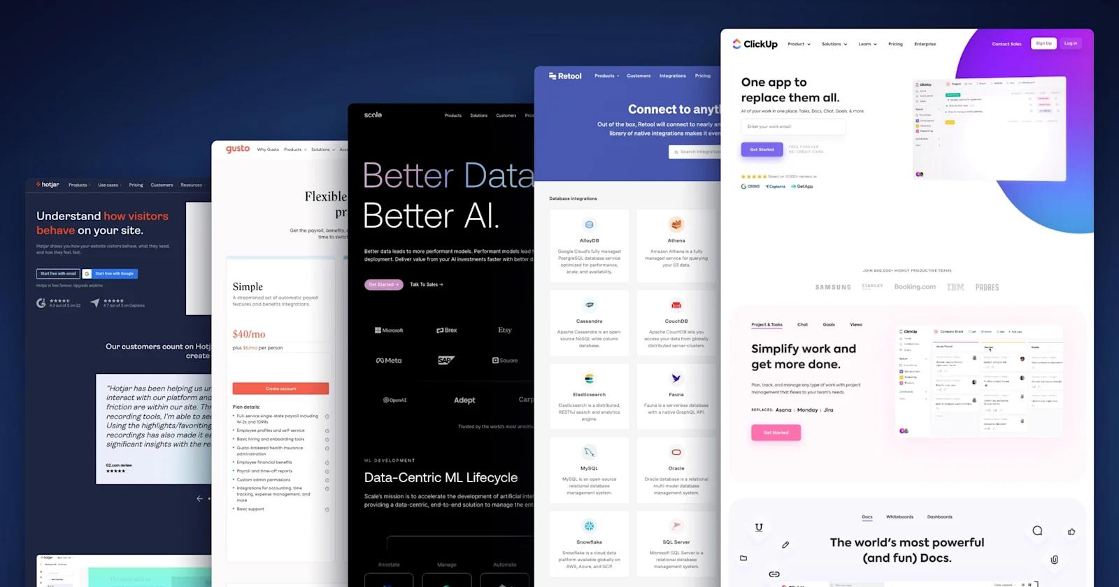
In this article, we present the best-of-the-best when it comes to B2B SaaS websites.

Top B2B SaaS Websites
Here, we highlight the many important pages of a SaaS website and the design elements that can make them successful.
There are many types of pages that make up an entire SaaS website. Things like the homepage, pricing page, and careers page each serve a unique purpose - and need to be designed around the particular objectives of that page.
Across all the different pages, the best SaaS websites that we feature follow some basic principles:
- They are incredibly creative - from beautifully simplistic to remarkably detailed.
- They have informative content that satisfies the needs of their target audience.
- They are designed with functionality in mind - prioritizing a superb user experience.
- They are optimized for driving traffic, maximizing conversions, and increasing revenue.
Keep reading to understand the unique methodology behind each page on a SaaS website, and see the companies that are executing on them the best.
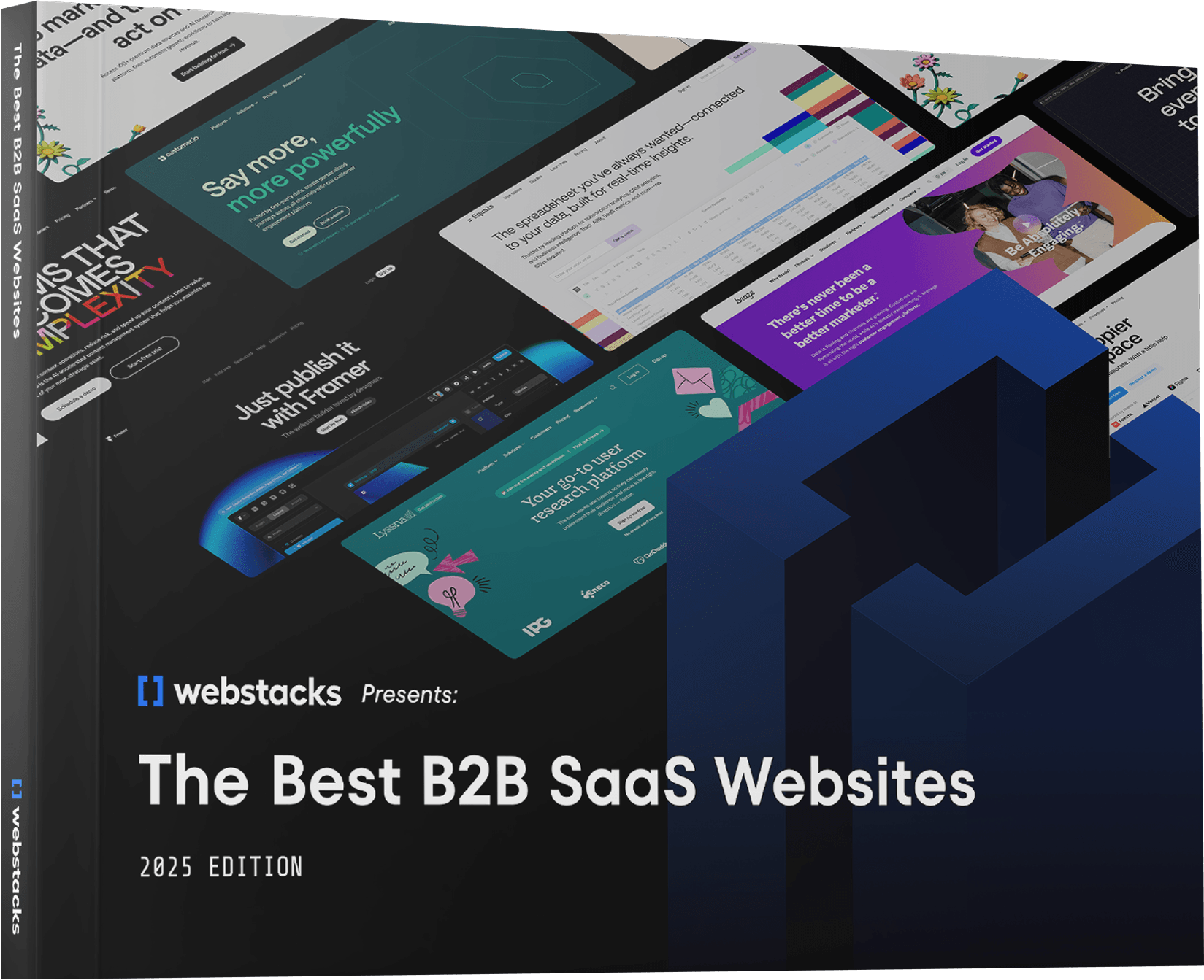
We highly recommend you check out the complete collection of the industry's best B2B websites in our eBook below 👇
Homepages
The homepage is the HQ of your SaaS website. It is responsible for leaving an exceptional first impression and guiding visitors to their desired destination. If your homepage is cluttered, uninviting, or untrustworthy, it can have significant consequences on the whole website.
First and foremost, clearly establish your identity. Make your homepage unique and memorable. Adopt color schemes, typography, and imagery that are consistent with your brand.
Secondly, encourage engagement. With a striking design, visitors should be intrigued to explore your website. Deliberately communicate your organization’s core competency upfront, which will reaffirm a potential customer’s for visiting your site. Then, add highly relevant content along with enticing call-to-actions to prolong their journey.
Best SaaS Homepage Example: Scale

Scale homepage
Kicking off our best SaaS website examples is Scale, a platform that uses artificial intelligence and data analysis for machine learning teams.
Everything about this AI website is memorable. From the vibrant text on a dark background, the bold headline, the companies in their trust bar, and that cool transforming 3D animation. Hats off to Scale, this is a clear winner in our books!
Signs we look for in a high-quality homepage:
- 🧭 An organized navigation bar
- ✍️ Clear, purposeful copywriting
- 🤝 Social proof - such as trust bars, reviews, or testimonials
- 🎨 Captivating illustrations
Landing Pages
Landing pages are critical for driving conversions. This is especially true for SaaS product pages. You need to effectively present your product by showcasing its unique features and capabilities. Keep it simple and automatically draw users toward the desired outcome (a download, a submission, etc).
An important callout: ensure that your mobile landing pages are designed for smaller screens. With more and more users accessing the internet through their phones, your landing page must have a dedicated layout for every view.
Best SaaS Landing Page Example: Hotjar

hotjar-landing-page
A product experience application, Hotjar lets you visualize website engagement data through heatmaps, session recordings, and other insightful tools.
Hotjar does a great job of conveying its value proposition through this landing page. Many of the elements like the headline, copy, videos, and reviews directly support the CTAs. Overall, the content effectively educates users, without introducing information overload.
Top callouts for a SaaS landing page:
- 📰 An engaging yet concise headline
- ✍️ Compelling copy
- 📹 Videos, FAQs, and other helpful content
- 🔍 A strategically placed CTA
Pricing Pages
A SaaS pricing page is an important gateway for you to convert visitors into paying customers. Oftentimes, SaaS pricing tables can get complex when varying tiers, bundles, and subscription durations are introduced.
Our recommendation: create a pricing page that prioritizes readability. The last thing you want is for a potential customer to get confused, and subsequently exit out of confusion. An important aspect of the pricing page we commonly see SaaS companies falling to account for is mobile design. With the limited amount of space available, it can be a struggle to fit all relevant information into one screen size. Just keep it simple, utilize dropdowns, sliders, and other moving components to help expand your canvas.
In some cases, it may be worth taking a step back and rethinking your entire pricing model before starting the redesign process. If you haven’t already, consider adopting a “freemium” pricing model. In the SaaS industry, including a no-cost version of a product has consistently proven to increase conversion rates.
Best SaaS Pricing Page Example: Gusto

gusto-pricing-page
Gusto makes the most of its simple pricing model. It’s well-organized and makes good use of subtle coloring. The tooltips are a clever solution for including additional relevant text, without overcrowding the pricing tier box. Last but not least, the extensive FAQ section (with collapsing drop downs) will probably address any question potential customers could be asking.
Key features of a SaaS pricing page:
- 💰 📑 Toggles and tabs
- 🆓 Free offerings
- ❓ An FAQ section
Solutions Pages
SaaS Solutions pages are extremely important on SaaS websites, as they allow you to showcase your product’s capabilities, and explain exactly how you solve your potential customer’s problem. Here, you'll want to address those nagging pain points your target audiences deal with, and portray how your product solves issues better than alternatives on the market.
Best Solutions Page Example: Truework

truework-solutions-page
Another client of Webstacks is Truework - the income and employment verification platform. We recently gave their solutions web pages a significant revamp. With the new and improved design, visitors can experience a more intuitive and organized page layout. Moreover, our new design system introduced a new color palette and several new reusable components for every solutions page. Now, Truework has elevated its digital presence to become one of the best fintech website examples.
Ways to improve a SaaS solutions page:
- 📞 🤝 Trust signals such as testimonials and trust bars
- 📸 Visuals taken directly from your SaaS platform UI
- 🌈 Vibrant, unique, and memorable branding
Product Pages
The heart of any tech website, a SaaS Product Page, must succinctly convey the core value proposition of the software. It should blend compelling copy with dynamic visuals to demonstrate the product’s benefits. It's worth noting that some organizations may alternatively classify these as Features Pages.
High-quality screenshots, short videos, and interactive demos can help visitors visualize the user experience. Clear, persuasive CTAs guide users toward taking the next step, whether it’s signing up for a trial or scheduling a demo.
Best SaaS Product Page: Braze

braze product page
Webstacks redesigned Braze’s B2B website, including the product pages, to give its brand and website a fresh feel. With bright colors and intriguing layouts, Braze got a major upgrade that speaks to the competencies of its product offerings, like Sage AI.
Top Callouts:
- 🟪 Rich gradients
- 📱 Product UI illustrations
- 🎤️ Testimonials and case studies
- 👾 Subtle yet meaningful icons

Demo Page
The demo page is where potential customers get a firsthand look at what a SaaS product can do. The most effective demo pages simplify the process of requesting or starting a demo with clear, enticing calls to action. They often include a brief overview of what the demo will cover, setting expectations for the user. Incorporating testimonials or case studies on this page can further validate the product's impact and effectiveness.
Best Demo Page: Mutiny

Mutiny - Demo Page
Interactive product tours are quickly changing the way SaaS companies present their demos. Mutiny, one of our favorite startup websites, is one who is taking advantage of Navattic’s software to deliver engaging, realistic demos for its CRO and personalization offerings.
Top Callouts:
- 🔋 Interactivity powered by Navattic
- 👣 Step-by-step instructions
- 📞 Optimized Demo CTAs
- 😮 Realistic demo UX
Integrations Pages
There are two components to integration design on B2B websites: an integration marketplace, and the individual integration pages.
The hub should neatly present all the integrations for which your SaaS products connect with. If you have many integrations, add categories and a search field to enhance each one’s visibility. Moreover, use logos to make them even more apparent.
When it comes to individual integration pages, make sure the CTA is above the fold. Include a short and sweet callout, giving the user exactly what they are looking for. Trust bars, FAQs, tutorials, and other helpful content can greatly support your integration and increase conversions.
Best Integrations Page Example: Retool

retool-integrations-page
Retool is a SaaS platform for building internal tools such as dashboards, admin panels, and custom applications.
This page’s layout is very straightforward, making it painless for users to find the integration they are looking for. Much of their success can be attributed to solid design, programmatic SEO, and accurately addressing users' search intent.
Ways to elevate your integrations page:
- 🧽 A sleek arrangement
- 🔍 Search functionality and categorization
- 👀 Visual identities (like logos) for integration partners
- 🌊 A straightforward user flow
Partner Pages
Partner pages are designed to engage potential business collaborators, showcasing how a partnership can be mutually beneficial. These pages often highlight different types of partnerships, outline the benefits of joining, and provide an easy path for businesses to apply. A successful partner page uses clear copy, social proof, and tangible incentives to attract new partners.
Best Partner Page: Deel

deel partners
Deel’s Partner page is a standout example of a well-structured, visually appealing design. The page immediately draws users in with a compelling headline, “Grow on a global scale as a Deel Partner,” paired with modern, abstract visuals that reinforce Deel’s global reach and scalability.
What sets this page apart is the clarity in which it communicates partnership benefits and the streamlined process for becoming a partner. With well-organized sections, Deel makes it easy for potential partners to understand the advantages of joining their ecosystem.
Top Callouts:
- 🌍 Eye-catching visuals illustrating global reach
- 💡 Clear breakdown of partnership types (Solution Partner vs. Product Partner)
- 🎯 Simple, actionable CTAs (e.g., “Become a Deel Partner”)
- 💼 Strong social proof with logos of major partners (Slack, HubSpot, AWS)
Why Us Pages
The "Why Us" Page is a SaaS company's chance to articulate its unique value proposition. It goes beyond product features to delve into the company's mission, vision, and the problems it solves. Successful "Why Us" pages are relatable and use storytelling to connect on an emotional level. They also highlight customer success stories and testimonials to reinforce credibility and build trust.
Best Why Us Page: People.ai

People.ai - Why Us page
If you want some Why Us page inspiration, look no further than People.ai. Through modern web design and persuasive copy, this page effectively engages prospective buyers.
Top Callouts for Why Us Pages on B2B Websites:
- ⏩ Subtle animation in the hero
- 📹 Explainer video
- ✏️ Product illustrations
- 🏅 Awards and recognition
Competitor Pages
A SaaS Competitor Comparison Page is an opportunity to highlight your product's advantages over others in the market. Effective competitor pages are factual, respectful, and focused on differentiators. They leverage comparative tables and feature lists to offer a clear, side-by-side analysis of how products stack up against each other. This transparency builds trust with potential customers by helping them make informed decisions.
Best SaaS Competitor Comparison Page: Rudderstack

Rudderstack - Comparison page
Rudderstack has a simple comparison hub that showcases 6 head-to-heads with competitor’s platforms. Each comparison has its own landing page that provides an in-depth analysis of how Rudderstack stacks up against alternatives. These pages include tons of compelling design elements, such as tables, testimonials, awards, and product illustrations.
Top Callouts:
- 📢 Request demo CTA
- 🔍 SEO best practices
- 🆚 Detailed comparison tables
- ⬇️ Jump links
About Us Pages
An About Us Page tells the story of a company’s origins, mission, and team. The most engaging About Us pages blend compelling narratives with visuals, like team photos or behind-the-scenes videos, to humanize the brand. This content and design should connect with readers by sharing the company’s values and vision, making them feel part of a larger journey.
Best About Us Page: Aircall

Aircall - About Us page
Aircall is a prime example when it comes to About pages. The design is very modern, and it covers everything you would expect to learn about Aircall. It also subtly includes microinteractions that bring life to the experience.
Top Callouts:
- 📖 Organization’s story🕰 Unique historical timeline🗺 Office locations🔗 Link to careers page

Careers Page
Looking to assemble the best team in SaaS? Then you need to have a careers page that impresses and attracts top-level talent. Rather than just having a bunch of job postings, your careers page should take on the personality and culture of your organization. Take the opportunity to pitch your mission, values, opportunities, and benefits. Include employee reviews or any accolades your organization has received.
Depending on the size of your organization, you may want to consider adding filters and search functionality for your hiring section. This way, potential employees can sort and find the best possible role for them.
Best SaaS Careers Page Example: ClickUp

clickup-careers-page
With ClickUp, project management has never been simpler - with collaboration tools, task toolbar, task assignments, statuses, and alerts. A good SaaS website like ClickUp builds credibility through visual elements that mesmerize in addition to copywriting that evokes attention. This careers page would make any prospective employee want to browse their job openings and learn more about life at ClickUp.
Things that make a SaaS careers page stand out:
- 📣 A compelling mission statement
- 💼Filtering by role, department, or location.
- 🏅Social proof, such as testimonials or awards
- 🏖️Perks and benefits
Enterprise Pages
An Enterprise page is where the top B2B websites showcase their ability to serve large-scale organizations with advanced solutions. It’s an opportunity to highlight features like security, scalability, and performance—core concerns for enterprise clients. Successful enterprise pages focus on building trust through social proof, a professional tone of voice, and distinct value props.
Best Enterprise Page: GitHub

GitHub-enterprise
GitHub’s Enterprise page showcases sleek design and compelling content, making it an excellent resource for developers and decision-makers alike. The page is visually striking with a dark, futuristic theme and vibrant accent colors that highlight key elements.
This page is optimized for engagement, with concise messaging that speaks directly to GitHub’s unique value in the enterprise space. The combination of modern design, strategic animations, and powerful social proof ensures that users stay focused on what matters most—GitHub’s ability to scale, secure, and streamline software development.
GitHub is also one of our favorite websites from an enterprise-level company.
How to improve an enterprise page:
- 🧭 Sticky navigation for easy exploration
- ✍️ Benefit-driven, concise copy
- 🤝 Strong trust signals (Fortune 100 logos, testimonials)
- 🎨 Subtle 3D animations for added visual interest
Industry Pages
Industry pages allow SaaS companies to tailor their offerings to specific sectors, demonstrating how their platform addresses unique challenges within that industry. A successful industry page combines relatable use cases, targeted solutions, and testimonials to build trust with prospects from that sector. These pages should be visually engaging and highlight features most relevant to that industry’s needs.
Best Industry Page: SevenRooms

SevenRooms-industry-page
SevenRooms knocks it out of the park with its restaurant-focused industry page. The clean, modern design immediately draws you in, while the targeted messaging speaks directly to the needs of restaurant operators. Everything about this page—from the industry-specific features to the strategic use of customer success stories—feels carefully crafted for its audience.
Best design elements:
- 🍽️ Sharp product visuals tailored to restaurant operations
- 📊 Industry-relevant stats and benefits
- 🔁 Features designed for guest retention and service efficiency
- 🧑🍳 Social proof from 10,000+ restaurants worldwide
Interactive Calculators
Interactive marketing can be an excellent source of organic traffic and lead generation. SaaS tools such as a calculator can provide visitors with a much more engaging and meaningful SaaS user experience than ordinary content, like a blog post. Furthermore, a calculator can help you collect valuable data, and tailor content based on a user’s inputs.
Best SaaS Interactive Calculator: Hubspot

hubspot-website-grader
Hubspot’s Website Grader is an incredibly handy calculator, and it’s designed beautifully. It’s intuitive and comprehensible for any site owner. For the Hubspot team, this calculator also provides massive value as a lead generation tool. Your website’s score is only accessible after you supply an email, and the interface includes a CTA that directly links to its own CMS.
Include these features to enhance a SaaS calculator:
- 📋A form to capture contact information
- 👆Interactive elements such as input fields, toggles, and scroll bars
- 🌀Lively animations
AI Tools
A SaaS marketing website AI tool revolutionizes how businesses interact with their digital audience, offering personalized experiences at scale. The hallmark of an effective AI tool is its ability to analyze visitor data in real time and deliver content, recommendations, or assistance that matches the user's intent and journey stage. Key features include chatbots for instant communication, content personalization engines, and predictive analytics to anticipate user needs
Best AI Tool: UpKeep

UpKeep - AI Website tool page
Perhaps one of the coolest website features we’ve seen this year is UpKeep’s AI global search. Powered by the OpenAI API, this isn’t anything like your traditional website chatbot. It uses the entire website’s content as a repository of information and is able to answer any user queries about UpKeep and its products. This generative AI tool can also direct users to supplemental UpKeep web pages, and predict other questions the user may have.
AI design highlights:
- 👤 Intuitive user interface
- ❓ Recommended prompts
- ✍️Clever copywriting
If you’d like to hear more, check out our client story on building this AI tool for UpKeep.

Resource Centers
A Resource Page is a treasure trove of knowledge that positions a SaaS company as an industry thought leader. The most engaging centers are well-organized, searchable, and cover a wide range of topics relevant to the target audience. They feature a mix of guides, blogs, webinars, and case studies, offering valuable insights and solutions. A great Resource Hub is not just informative but also engaging, encouraging visitors to dive deep into content.
Best Resource Center: ServiceTitan

ServiceTitan - Resource Center
ServiceTitan’s resource center has an extensive content hub that provides an exceptional amount of value to its target audience. Moreover, it’s constructed in a manner that is seamless to navigate.
Read more about the development of ServiceTitan’s “Toolbox” resource hub here.
Top Callouts:
- 🗃 Superb content organization
- 🛠️ Diversification (tools, podcasts, templates)
- 📧 Prominent email capture
- 🖼 High-quality thumbnail images
Case Study Pages
Case study pages are critical for SaaS companies to demonstrate real-world success and the impact of their solutions. These pages highlight customer stories, showcasing how the product or service helped achieve tangible results. A well-crafted case study page includes clear storytelling, performance metrics, and relatable examples to build credibility and trust with potential buyers.
Best Case Study Page: Sanity

sanity case study
Sanity’s case study page is a masterclass in blending storytelling with concrete results. The layout is clean and professional, guiding visitors through compelling customer success stories with eye-catching visuals and data-driven results. The customer interviews are scroll stoppers, along with the bold logos from some of the most recognizable brands in the world.
Aspects of a standout case study:
- 📈 Data-driven success metrics to quantify impact
- 🎯 Clear storytelling structure (challenge, solution, results)
- 🖼️ Engaging visuals and real-world examples
- 💬 Customer quotes to provide authenticity and trust
Blog Listing Pages
There are several benefits to having an expansive SaaS blog on your website. When executed properly, blogs can help you establish thought leadership, drive organic traffic through effective SEO strategies, and even generate leads.
First, we will cover the blog listing page, which displays all your blog’s posts in one hub. Think of this as your blog’s main menu, which guides website visitors to find the content they are looking for. Like many other aspects of an effective SaaS website, a blog listing page should be well-organized, visually appealing, and easy to navigate.
Furthermore, it should be scalable alongside content production. While you grow your content hub, it should evolve with the design. This goes hand in hand with our emphasis on SaaS websites adopting modular design.
Best SaaS Blog Listing Page: Buffer

buffer-blog-listing-page
Buffer is a social media management platform for brands, businesses, agencies, and individuals. Buffer’s blog listing has a number of things that most blogs either misplace or disregard; such as featured articles, category tags, dates, authors, and read times. There’s also a conversion panel for their newsletter and a component for marketing their podcast.
Highlights of a SaaS blog listing page include:
- ⭐ Featured content in the hero component
- 🏷️ Categories, tags, and search functionality
- 📖 Blog post details such as reading time and a preview snippet
- 📧 Email capture for newsletter
Blog Details Pages
A good blog details page has a well-ordered layout with a hierarchy of information, headlines, subheadings, and bullet points. It should also be instinctual to read with an adequate font size, color scheme, and sufficient spacing between lines and paragraphs.
Appealing imagery should be used to break up long blocks of text, and you can take this one step further by embedding videos. Additionally, related content, author bios, social media sharing, and clear calls-to-action upgrade customer engagement and encourage readers to explore your website further.
These design elements make your content more user-friendly and have a noteworthy impact on your SEO.
Best Blog Details Page Example: Calendly

calendly-blog-details-page
A client of ours here at Webstacks, Calendly is a leading scheduling software that integrates with electronic calendars like Google, Outlook, and iCloud. There’s a sticky table of contents, cool custom illustrations, and user-friendly typography. It also has various different components embedded within the blog to break up the monotony of text, like block quotes and videos. An elegant design like this really enhances the reader experience and is invaluable to their content team.
SaaS blog details page winning features:
- 📸 A branded, high-quality featured image
- 📒 Table of contents
- ⛓️ Related content section
- 👍 Social icons for sharing
Podcast Pages
Podcast pages serve as a hub for SaaS companies to share thought leadership and engage audiences through audio content. A well-designed podcast page should make it easy for visitors to explore episodes, understand the focus of the show, and subscribe across platforms. Successful pages also highlight key guests and topics, drawing attention to the unique value the podcast offers.
Best Podcast Page: Lattice

lattice podcast
Lattice’s podcast page does a fantastic job of showcasing its episodes while maintaining a clean and engaging design. The page features a minimalist layout with prominent episode cards, each paired with concise descriptions to help users easily find content relevant to their interests.
The clear focus on content, along with easy-to-use navigation, ensures users can dive right into episodes, whether they’re learning more about company culture or strategies for scaling teams.
Signs of a great podcast page:
- 🎙️ Minimalist, intuitive episode cards
- 🔍 Searchable content to quickly locate specific topics
- 🖼️ High-quality guest headshots for credibility
- 🔗 Simple links for subscribing across multiple platforms

Navigation Menu
A SaaS navigation menu (or navigation bar) is one of the most important components of a website. It’s the main tool for navigating to and from any web page. The nav bar should link out to your most important pages. In the SaaS world, this usually includes headings like “Products”, “Solutions”, “Pricing”, “Company”, and “Resources”. Some headings can have drop-downs, where additional pages can be displayed to direct users to subpages.
Best SaaS Navigation Bar Example: Asana

asana-website-navigation-bar
Asana is one of the most popular work management platforms on the market. They also have a fantastic website. Here, we highlight the most impressive feature in our opinion - their nav bar. Asana’s website is massive. But looking at their navigation bar, they have done such a tremendous job of masking complexity with outstanding design. As your content grows, it’s important to not let things get lost or unorganized. Asana shows us how to keep a huge Saas site in order with this nav bar.
Some great SaaS website navigation bar features:
- 👑 Structured heading hierarchy
- ⬇️ Drop down menus
- 🔍 Icons for contextual cues
- 📱 Design for all devices
Mobile Menus
A mobile menu must navigate the fine line between simplicity and comprehensiveness. In the constrained space of mobile screens, prime mobile menus are intuitive, employing a clear hierarchy and touch-friendly design. Often utilizing a hamburger icon for compactness, these navigations expand to offer easy access to key sections of the site, ensuring a seamless user experience across devices.
Best Mobile Menu: Rippling

Rippling - Mobile Menu
Mobile menus can be a headache to design and develop in a way that enhances the navigability of your site, but Rippling came up with an outstanding solution. In addition to amazing responsibility for smaller screen sizes, the layout is very intuitive.
Top Callouts:
- 🌀 Smooth transitions
- 🗂 Intuitive layout👀 Icons for visual cues
- ✍️ Description of each menu item
Mega Menus
A mega menu organizes extensive website content in a way that is visually accessible and easy to navigate. Ideal for SaaS companies with a wide range of products or resources, these menus display options in a dropdown format, often categorized with headings, icons, and sometimes images. This approach allows users to see the breadth of available content at a glance, facilitating quick navigation to specific areas of interest.
Best Mega Menu: Toast

Toast - Mega Menu
Toast’s navigation bar is an extremely effective way of simplifying a complex site architecture. Their icons and descriptions also make each link a lot less intimidating.
Top Callouts:
- 🧱 Well-planned site architecture
- 🍔 Helpful iconography
- 🖱 Responsiveness with hover states
- 🆕 Eye-catching “New” badges
Bonus: Web 3.0 Design
Back by popular demand, we are identifying the premier websites from organizations building on blockchain.
Web 3.0 has introduced an entirely new style of web design, and the most prominent websites are leveraging it to enhance their brand and the crypto onboarding experience. Especially in these times of uncertainty, a professional, aesthetically pleasing website can assist in solidifying yourself as a legitimate, trustworthy organization. A sound online presence will help to build a community and attract top-level talent throughout the crypto winter.
With Web3 design, we’ve seen everything from futuristic to retro, vibrant to neutral, and abstract to minimalistic. There are a lot of different directions you can take your Web 3.0 site, which is dependent on a number of factors like your organization’s personality and your target audience. Overall, we take note of Web3 designs that prioritize building trust while expressing a unique brand identity.
Best Web3 Design Example: Cosmos

cosmos-web3-homepage
Cosmos is a great example when it comes to Web3 design. They take advantage of their name and embrace the spacey theme a lot of the crypto world has adopted. The bold white text contrasts perfectly with the bright gradients, along with their other subtle illustrations. Overall, Cosmos makes blockchain seem a lot less complicated, while still highlighting the innovativeness of the technology through captivating design.
Popular design trends in Web3:
- 🌈 Colorful gradients and other vibrant, futuristic styling
- 🖋️ Bold and simple headings
- 🌀 Interactive and immersive animations
- 🎮 Elements of gamification
Closing Thoughts
That wraps up our best SaaS website designs. We hope you learned a thing or two about web design strategy, and took some inspiration away from our examples.
When evaluating the effectiveness of your own SaaS website, ask yourself the following questions:
- Does my SaaS website adequately represent my organization’s brand?
- Does it look visually appealing and intrigue visitors to learn more about our products?
- Is my SaaS website intuitive to navigate, and are users finding the information they are looking for?
- Is my SaaS website’s tech stack falling short? Is it capable of scaling?
- Does my tech stack hinder the marketing team from owning the website?
- Are they too reliant on development resources to operate properly?
These are all critical factors that can make or break a SaaS website. Thankfully, there are solutions for these problems by working with a B2B SaaS website design agency.
Here at Webstacks, we help many leaders in tech level up their online presence through next-gen solutions for SaaS website design and web development. If you want to learn more about B2B SaaS website redesigns, feel free to reach out to us!
