Features Page Guide: Best Practices & Design Tips
The purpose of a features page is to showcase what makes a business unique. It highlights the features and services that set a company apart from the competition, giving visitors clear and compelling reasons to engage with the brand.
More than just a presentation, this page boosts user engagement and increases conversion rates by helping visitors quickly understand the business's value proposition.
In brief:
- A features page showcases a company's unique offerings, improving user engagement and boosting conversion rates.
- Effective features pages include clear descriptions, easy navigation, interactive elements, and trust-building sections.
- Key design elements involve grid-based layouts, visual hierarchy, visual appeal, simplicity, responsiveness, and clear calls-to-action.
- Top companies exemplify best practices in features page design, balancing aesthetics and functionality to drive user engagement.
Webstacks websites don’t just look good—they scale with you and drive real results.

What Is a Features Page?
A features page is a dedicated section on a B2C or B2B website that highlights the distinctive attributes and benefits of a product or service.
Similar to a product page, it communicates the value of what you're selling. This page isn't just a list of specifications; it's a strategic tool that engages users by providing relevant and persuasive information.
By using detailed descriptions, high-quality images or videos, and customer testimonials, the page captures user interest and guides them through the sales process. Strategically placed call-to-action (CTA) buttons further encourage visitors to interact with the page, whether it's to purchase the product, sign up for a newsletter, or request more information.
What Should a Features Page Include?
Here's what you should include on your features page to make sure it's both engaging and informative.
Clear and Concise Feature Descriptions
At the heart of any successful features page is clear and concise messaging. This means providing straightforward descriptions of your products or services, helping users quickly understand what they do and how they benefit from them.
Avoid unnecessary jargon to prevent overwhelming readers and keep their interest.
User-Friendly Features Page Navigation
An intuitive navigation system is another core component of an effective features page. It allows users to easily find the information they need and explore your offerings without frustration.
Following basic web design principles, such as keeping navigation options simple and consistent across all pages, can significantly boost the user experience.
Using large, visually appealing buttons can also easily guide users.
Interactive Features Design
Adding interactive elements like videos, animations, and demos can make your features page more engaging. Consider using motion design to create eye-catching animations that grab attention and allow users to explore features dynamically.
An interactive design creates a more compelling and immersive experience that can significantly influence user perception and likelihood to buy.
Trust-Building Sections on the Features Page
Trust-building components like an 'About Us' section and FAQs will help you establish credibility with your audience.
An 'About Us' page provides insights into your company's background, values, and mission. Meanwhile, an informative FAQ section addresses common questions or concerns, offering reassurance to potential users.
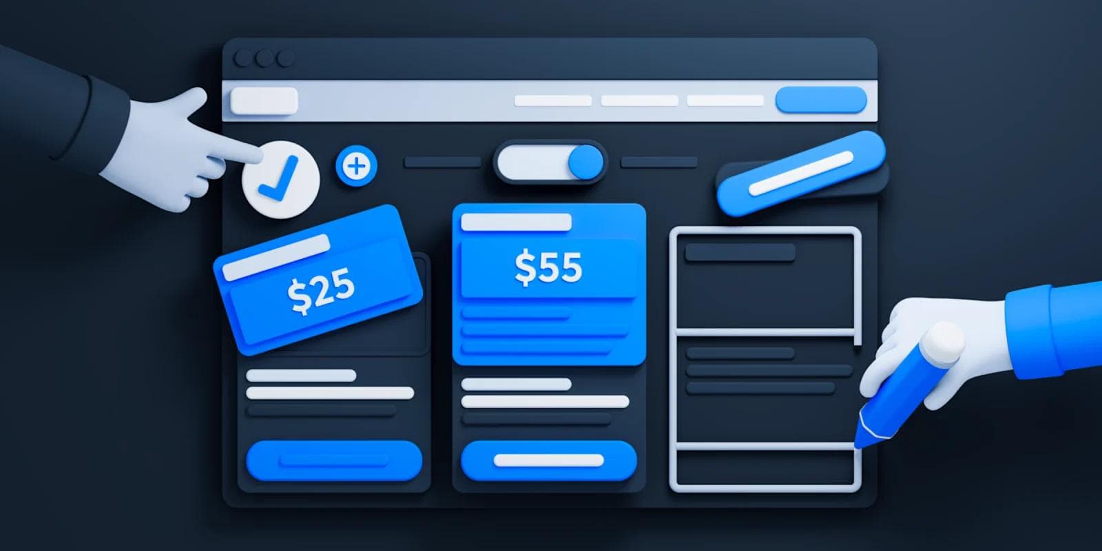
The Key Design Elements of a Features Page
Just like creating high-converting landing pages, designing a features page involves incorporating several elements that leave a positive impression on users.
Here are the core design components to consider:
- Grid-Based Layout for Features: Using a grid-based layout provides a structured and organized look to the features page. This layout method involves arranging content within a clean and rigid grid, using columns and sections that align to deliver a balanced and visually appealing design.
- Visual Hierarchy in Feature Presentation: Establishing a clear visual hierarchy involves emphasizing important content first by strategically using size, color, contrast, typography, whitespace, and imagery.
- Visual Appeal and Structure: A visually engaging and clearly structured design helps guide users smoothly through the content. Using elements like large buttons and appealing interfaces makes navigation intuitive and user-friendly.
- Prominent Feature Exposure: Features should be prominently displayed to help users instantly grasp available functions.
- Simplicity and Clarity in Features: Keeping the design simple prevents users from feeling overwhelmed. The goal is to make features easy to understand and engage with.
- Responsive Features Page Design: Make sure the page is optimized for multiple devices and screen sizes. Using a responsive design checklist can help with improving accessibility on desktops, tablets, and mobiles.
- Interactive Elements on the Features Page: Using interactive components like buttons, hover effects, and animations make the page livelier and more engaging.
- Clear Call-to-Action (CTA) for Features: A persuasive and well-positioned CTA guides visitors towards intended actions, like signing up or starting a trial.
Best Features Page Examples
When designing your features page, take inspiration from the following businesses:
Attio

Attio's features page is clean, modular, and highly visual, emphasizing customizability.
The hero section introduces Attio as a flexible CRM, with a diagram of its database structure. Below, a spreadsheet-style UI is shown in action, demonstrating how users can adjust fields, create filters, and organize their pipelines.
The design is light, airy, and structured, using wide spacing and subtle animations to keep the content digestible. As the user scrolls, each section transitions into a new feature demonstration.
Standout Features:
- Relational database visualization – A flowchart-style diagram immediately showcases Attio's flexible data structure.
- Interactive CRM preview – The dashboard screenshot mimics an actual session, making the page feel functional.
Clay

Clay's features page emphasizes workflow automation and AI-driven data enrichment with a bold, dark-themed hero section. The page quickly introduces Clay's conditional logic engine, displaying a realistic, interactive table view of workflows.
Feature breakdowns are visually separated using large screenshots, floating UI elements, and dynamic illustrations. Further down, a section on AI formulas includes a video demo, showing its real-world applications. The page ends with a vibrant, 3D-styled CTA featuring a lush, garden-inspired illustration, reinforcing the theme of growing leads efficiently.
Standout Features:
- AI formula generator demo – A video walkthrough highlights how AI automates lead enrichment.
- Thematic CTA section – A whimsical, garden-style illustration reinforces the "growth" messaging.
- Playful 3D visuals – Floating UI components and soft shadows make the page feel interactive and dynamic.
See what’s working for industry-leading websites and find inspiration to improve yours.

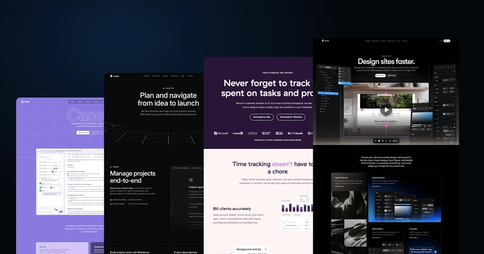
Tines

Tines' features page has a striking purple background with a blueprint-inspired grid pattern, emphasizing automation and low-code workflows. The page introduces "Cases", its incident management tool, through a clean, minimalistic hero section.
Below, large floating UI screenshots showcase its automation interface, complete with structured workflows and dashboards. Further down, colorful blocks break down key features like AI-driven automation and seamless integrations. The final CTA section features a playful confetti-like visual, reinforcing collaboration and efficiency.
Standout Features:
- Unique purple blueprint theme – A design choice that gives the page a technical and futuristic feel.
- Floating UI elements – Screenshots feel integrated into the page, enhancing immersion and interactivity.
- Animated feature explanations – Smooth transitions help visualize automation workflows in action.
- Confetti-style CTA design – A playful, celebratory ending reinforces automation success and ease of use.
Framer

Framer's features page is sleek, dark-themed, and futuristic, reflecting its focus on high-end web design tools. The page opens with a bold headline and an embedded video demonstrating Framer in action. Large floating UI elements showcase the interface, while subtle animations enhance the visual storytelling.
The sections smoothly transition between layout tools, styling features, Figma import, AI rewriting, and collaboration tools, each illustrated with dark-themed UI previews. The typography is clean and minimal, with high contrast and blue highlights adding a tech-forward aesthetic.
Standout Features:
- Cinematic video integration – The hero section uses a full-width video to showcase Framer's design capabilities.
- Sleek dark-mode UI – The entire page embraces a futuristic, high-contrast aesthetic.
- Floating tool panels – The design makes UI elements appear interactive and alive.
- AI-powered features – Dedicated sections highlight AI rewrite tools and automated layout suggestions.
Linear

Linear's features page is a dark-themed, highly structured layout designed for efficiency and clarity. It emphasizes project management, issue tracking, and team collaboration, presented through a combination of minimalist UI mockups, smooth scrolling effects, and subtle animations.
The page opens with a bold headline followed by an immersive UI preview of Linear's workspace. Each section methodically explores key functionalities such as roadmapping, issue tracking, integrations, and workflow automation, using monospaced fonts and grid-based design to enhance readability.
A subtle neon green accent is used for interactive elements, reinforcing the futuristic and technical feel.
Standout Features:
- Code-inspired design – UI elements mimic a developer-friendly interface with monospaced fonts.
- Roadmap visualization – Interactive elements help users see long-term planning in action.
- Deep GitHub integration – Showcases seamless issue tracking within development workflows.
- Performance-focused messaging – Highlights speed, efficiency, and automation as core principles.
Mixpanel

Mixpanel's features page is designed with clarity and data-driven storytelling in mind. The layout is clean and modern, using a white and deep purple color scheme to establish contrast. The page starts with a bold headline followed by a hero section showcasing Mixpanel's analytics dashboard, giving users an immediate visual of its capabilities.
Scrolling down, each feature is explained through interactive graphs, clean card layouts, and concise descriptions. The page maintains a balance between data-heavy visuals and simple explanations, ensuring that even non-technical users can grasp Mixpanel's power.
Sections highlight data exploration, goal setting, performance measurement, and regression analysis, all accompanied by high-resolution UI screenshots.
Standout Features:
- Customizable metric tracking – Users can see how to define and refine their own analytics KPIs.
- Deep segmentation tools – Highlights Mixpanel's ability to break down user behaviors at scale.
- Emphasis on speed & accessibility – UI elements are designed to feel intuitive and fast to navigate.
Miro

Miro's features page emphasizes collaboration and visual thinking, structured around an open, spacious layout with a light background and vibrant accents of yellow and blue. The hero section presents a real-time interactive Miro board, immediately showcasing its dynamic and visual nature.
As you scroll, different use cases are highlighted through clean card layouts and high-resolution product images depicting diagramming, brainstorming, and planning. The sections are modular, making it easy to scan through capabilities like AI-powered insights, integrations, and security measures.
There's a strong focus on interactivity, with visual previews for templates, workshops, and presentations, reinforcing the idea that Miro is a tool designed for live collaboration.
Standout Features:
- Live Miro board preview – The hero section features a working board, making the experience feel interactive.
- AI-powered assistance – Miro Assist AI is presented with clear, in-context UI visuals for automation.
- 150+ integrations showcased visually – Apps like Asana, Slack, and Notion are presented in icon-based layouts.
- Security section with certification logos – A dedicated dark-mode security block adds credibility.
Zendesk

Zendesk's features page emphasizes rich conversational experiences, balancing text with large, high-quality visuals of its messaging interface. The color palette blends soft peach and deep green tones, reinforcing a modern yet professional aesthetic.
The page follows a structured layout, leading with customer-centric messaging and progressing through automation, AI bots, omnichannel support, and agent workspaces. Each section is accompanied by minimalist product mockups and contextual photography, making the features feel more intuitive.
The final CTA block reinforces the brand's ease of use with a simple, compelling statement.
Standout Features:
- Realistic chat UI previews – Feature descriptions include floating chat bubbles and real-life chatbot conversations.
- Warm, human-centric design – The peach-toned backgrounds and lifestyle imagery contrast with typical tech-heavy interfaces.
- Blended photography and product visuals – Screenshots are overlaid on real-world scenes, making features feel more relatable.
See what’s working for industry-leading websites and find inspiration to improve yours.
Descript

Descript's features page focuses on making video editing accessible to everyone, even those without prior experience. It opens with a bold, conversational headline that immediately removes intimidation around video editing.
The design is clean and professional, using ample white space, crisp typography, and embedded UI demos that showcase how Descript works in real-time. The page moves through AI-powered editing, drag-and-drop functionality, and business use cases, ending with a pricing comparison table.
A mix of customer testimonials, feature highlights, and animated UI previews keeps the content dynamic.
Standout Features:
- Live UI demo inside a framed laptop screen – A realistic preview of Descript's editing interface grabs attention at the top.
- AI-powered editing cards – Features like Overdub, Studio Sound, and AI transcriptions are displayed in interactive boxes.
- Polished, modern visual elements – The design uses gradient highlights, soft shadows, and well-spaced content blocks for readability.
Toggl

Toggl's features page presents time tracking as effortless, privacy-friendly, and seamlessly integrated into work processes. The design uses a warm, pastel color palette with deep purple contrasts, reinforcing a friendly and non-intimidating feel.
A mix of screenshots, custom illustrations, and testimonials guide visitors through Toggl's automation capabilities, privacy policies, and team benefits.
Sections are clearly defined, leading users through accuracy, automation, and trust elements before wrapping up with customer success stories and FAQs.
Standout Features:
- Privacy-first assurance – A dedicated section directly addresses concerns about employee monitoring, reinforcing trust.
- Customer success highlights – A bold statistic-driven section showcases Toggl's impact, with testimonials styled in quote bubbles.
- Minimalist yet effective UI previews – Screenshots are placed within clean frames, making the interface look inviting and intuitive.
ClickUp

ClickUp's features page for its AI-powered assistant is a visually striking dark-themed design with glowing neon purple and pink accents, reinforcing a futuristic, high-tech feel.
The page emphasizes AI's ability to centralize knowledge, automate tasks, and enhance productivity.
Key sections highlight ClickUp AI's integrations, real-time content retrieval, automatic progress tracking, and its customization capabilities. The use of framed UI previews, dynamic typography, and a clean comparison table keeps the page both informative and engaging.
Standout Features:
- Neon-glow UI previews – ClickUp showcases AI-generated responses inside glowing, cyberpunk-style UI boxes.
- Data visualization security – A dedicated section visualizes how ClickUp AI keeps user data private, adding trust-building credibility.
- "Superpowers" feature breakdown – A sleek, icon-driven section highlights ClickUp AI's advanced chat functionalities.
- Side-by-side AI pricing comparison – A bold, interactive pricing matrix visually compares ClickUp AI with competitors in a digestible way.
Cake Equity

Cake Equity's features page presents a clean, modern, and friendly interface with a soft blue and purple gradient theme. The design emphasizes employee motivation through equity ownership, using a mix of interactive elements, testimonials, and step-by-step explanations.
The page combines bold headlines with minimalistic UI mockups to visually explain how Cake Equity simplifies equity grants, onboarding, and long-term employee engagement.
The structure flows seamlessly from social proof, to feature breakdowns, to a strong closing CTA.
Standout Features:
- Soft gradient background – A mix of blue, purple, and yellow gradients creates a smooth and engaging visual journey.
- Floating mobile UI mockups – Key features are showcased with floating card-style mockups displaying real in-app screens.
- Customer testimonial spotlight – A dedicated large quote section brings authenticity to the platform's value.
- Final CTA with handwritten annotation – A standout "No credit card required" note adds a human touch to the closing call-to-action.
UpKeep

This features page on UpKeep's website presents a clean and highly structured layout, prioritizing clarity and ease of navigation. The page follows a white and blue color scheme, emphasizing modern simplicity with distinct sections for video demos, feature explanations, benefits, and real-world use cases.
It balances text-heavy content with interactive elements like dropdown FAQs and embedded testimonials. The hierarchical arrangement of information ensures that users can quickly grasp the platform's value for work order management while also diving into more in-depth technical details.
Standout Features:
- Embedded product demo video – A large, centered video section allows visitors to instantly see UpKeep's work order management in action.
- Real-world industry use cases – The page features detailed explanations of how UpKeep benefits multiple industries, making the software feel tailored and versatile.
- Cost savings and success stories – Prominent statistics and real company case studies showcase UpKeep's ability to boost efficiency and reduce operational costs.
Grammarly

Grammarly's features page is sleek, minimalistic, and highly informative, with a structured layout that effortlessly guides visitors through the platform's AI-powered writing tools.
A clean green and white color scheme enhances readability, while interactive elements and inline product previews help users understand Grammarly's capabilities.
The page follows a progressive disclosure approach, starting with broad AI writing features and gradually diving into specific use cases like rewriting, team collaboration, and enterprise security. With another standout design, Grammarly reigns as a top Edtech website for other SaaS companies to take inspiration from.
Standout Features:
- Cross-platform integration grid – A visual matrix displays Grammarly's compatibility with apps like Google Docs, Outlook, and Slack, reinforcing its versatility.
- Data protection section with certification badges – A visually compelling trust segment highlights Grammarly's commitment to security and compliance.
- Embedded video tutorial – The page includes a short explainer video, allowing users to see Grammarly in action before signing up.
Lokalise

The Lokalise features page presents a compelling value-driven narrative, emphasizing speed, cost savings, and accuracy in AI-powered translation.
The page follows a structured flow, starting with bold impact stats and gradually diving into how Lokalise AI works, key benefits, and real-world testimonials.
A clean white background with red-orange highlights improves readability while making critical points stand out. The design is text-focused, with occasional contrast blocks for testimonials and product explanations.
Standout Features:
- Big, bold impact metrics - A striking "10X faster, 80% cost savings" banner immediately conveys Lokalise AI's advantages.
- Customer testimonials in alternating contrast blocks - Real-world success stories are interwoven throughout, reinforcing credibility.
- Step-by-step onboarding graphic - A visually structured guide explains the AI translation process in five clear steps.
See what’s working for industry-leading websites and find inspiration to improve yours.
It's Time to Upgrade Your Features Page
Redesigning your features page using modern design tools can do a great deal for your marketing goals and website performance.
Start by identifying what truly matters to your customers. Use analytics to figure out which features are most used and put them front and center on the page.
Don't forget to use the examples featured in this article to guide you through this process and inspire your design choices.
Ready to take your B2B website to the next level? Download Webstacks' Best B2B SaaS Websites eBook to discover more inspiring examples and actionable insights that can transform your digital presence.
Your website is your biggest growth lever—are you getting the most out of it? Schedule a strategy call with Webstacks to uncover conversion roadblocks, explore high-impact improvements, and see how our team can help you accelerate growth.

I lead growth at Webstacks, connecting strategy, design, and engineering to build websites that drive results. I specialize in website strategy, CMS implementation, and helping B2B teams scale their web presence.