20 Best SaaS Pricing Page Examples of 2025
Your SaaS pricing page is one of the most-visited parts of your website. It’s where most prospects go before they convert so it needs to be clear, helpful, and easy to navigate.
But designing a pricing page that works isn’t always straightforward.
Every product has its quirks, and your pricing model may not fit into a standard layout.
In this guide, we’ll break down some of the best SaaS pricing pages out there. You’ll see how smart UX, clean layouts, and thoughtful pricing tables can turn a visitor into a customer.
We partner with high-growth tech brands to design, build, and scale websites that marketers and end-users love.

SaaS Pricing Page Best Practices
So what makes a SaaS pricing page great? Here's what gets potential customers intrigued.
🖼 Exceptional design layout
First and foremost, information on a pricing page should be organized in a manner that is easy to follow. This is most important for your pricing table. Pricing tables are best presented in a column format, and ideally, fit above-the-fold as best as possible.
🖋 Headlines
Support your value proposition and entice potential customers to continue exploring.
🏷 Pricing Tiers
Each tier should identify a target market and clearly articulate its value. Include feature lists that highlight the significant characteristics or benefits each tier provides.
🆓 Free options
Consider giving potential customers the option to sign up for your offerings before sending any payment. Whether that is a trial or a very basic version of your software, this strategy reduces customers’ hesitancy and can boost your conversion rate.
🗂 Toggles/ Tabs
Allow users to quickly switch between options if your pricing model is more complex.
🛠️ Tooltips
Unhide information that is less relevant, but still important enough to include on the page if a user wants more context.
📞 Call-to-action (CTA) buttons
CTAs should directly assist and influence potential customers’ decision-making - whether that is to learn more, talk to a sales rep, or (ideally) make a purchase.
❓ FAQ sections
Address any and all recurring questions that potential customers may have. The more informed and confident a user is in your services, the better.
🤝 Trust signals
A tried and true method for generating more leads is increasing your credibility. Add trust bars, testimonials, or customer reviews.
Next, let’s see these elements put into practice with our best SaaS pricing page examples in 2025!
Best SaaS Pricing Page Examples
These SaaS pricing design examples can serve as great inspiration for you website:
1. Aircall
For SaaS companies with more complex pricing models, Aircall is an excellent reference to check out!
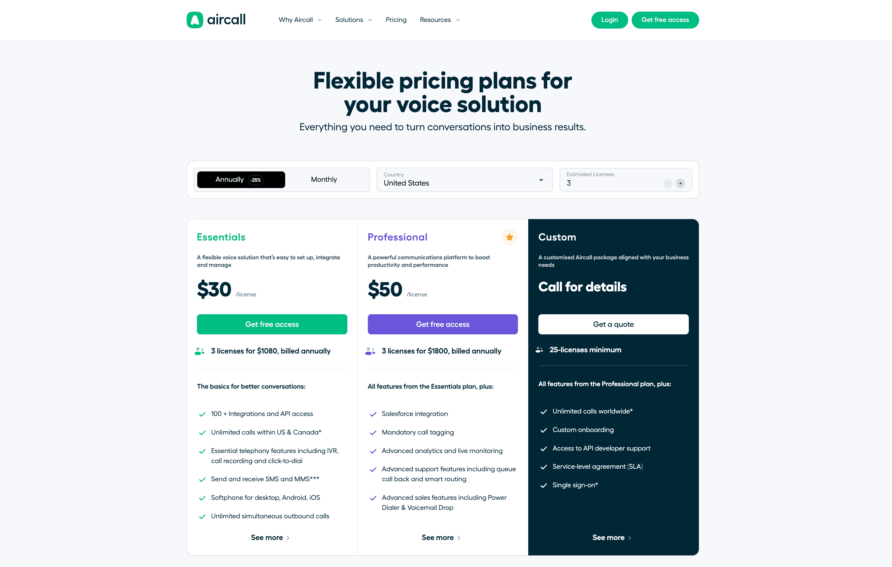
With pricing contingencies based on location, number of licenses, and payment periods, Aircall utilizes drop-down menus, buttons, and toggles to minimize the amount of content on the screen at once. These functionalities also update instantly, providing a seamless UX.
Browse Aircall's pricing page here!
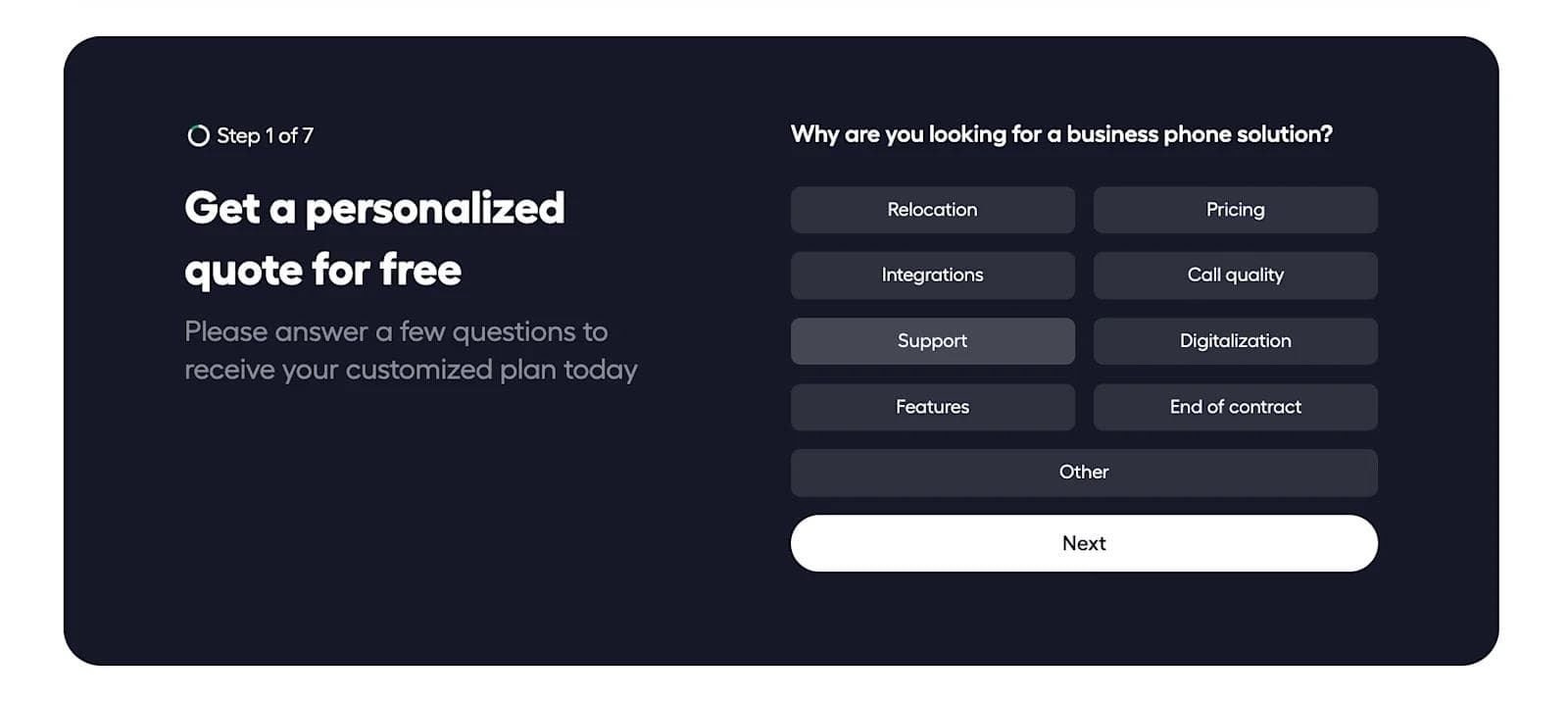
Aircall also utilizes an interactive pricing tool - an extremely unique and effective way of giving personalized quotes for prospects and generating leads for sales.
SaaS Pricing Page Design Choices We Love From Aircall
- 🖱 Functionality
- 👉 Interactivity
- 👥 Personalization
- ✔️ Detailed pricing tables
2. Retool
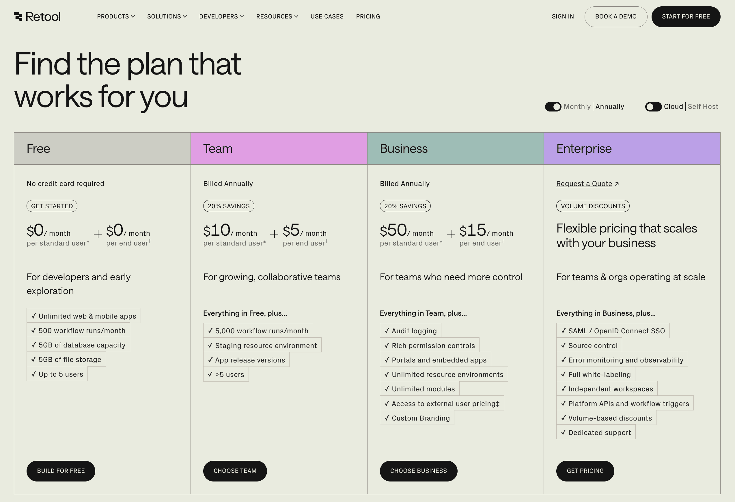
Now, onto something a little simpler - Retool.
A client of ours here at Webstacks, Retool is a low-code software platform for building internal tools. An exciting project we recently undertook was the redesigning of Retool’s pricing page.
Take a look at Retool’s pricing page for yourself here!
In our opinion, this page is exceptional at establishing authority and trust. It is relatively concise, but delivers all the necessary information. The “Cloud / Self Hosted” toggle and tooltips in the features section prevent clutter and make the page look sharp.
We’re really proud of how this pricing page came out!
SaaS Pricing Page Design Choices We Love From Retool
- 🌈 Subtle pastel colorway
- 🧹 Clean features lists
- 🤝 Impactful trust signals
- ✔️ Neat feature comparison table
3. Gusto
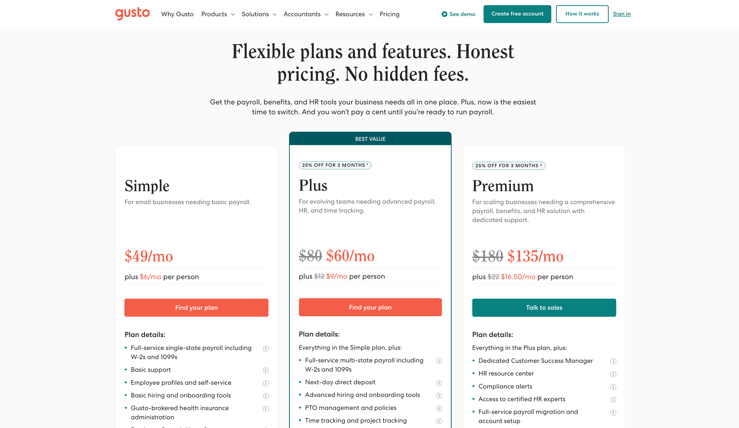
Next up… Gusto! A leader in HR software, Gusto provides services for over 200,000 small, medium, and large businesses across the United States.
View the Gusto pricing page here!
In regards to their pricing page design, Gusto checks all the boxes for us. Every element is very straightforward, and the layout is super user-friendly. The use of tooltips and drop-down menus adds to the page’s cleanliness.
Even the typography, colors, and icons all compliment each other and fit seamlessly into the page’s design. The attention to detail here does not go unnoticed by us, Gusto.
SaaS Pricing Page Design Choices We Love From Gusto
- 👈 Actionable headline
- ✔️ Collapsable features table with tooltips
- 🔌 Integrations bar
- ❓ Extensive FAQ section
4. Upkeep
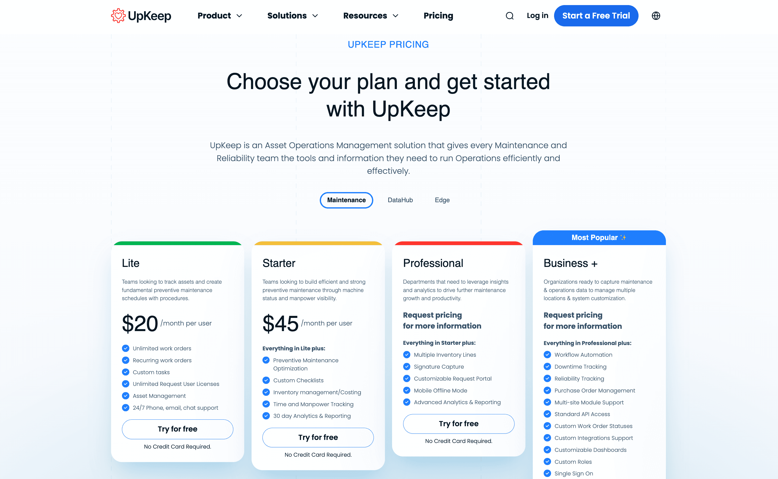
Next, we have Upkeep — a leading computerized maintenance management system and amazing client of Webstacks!
We love a pricing page that helps you get started on the right plan for you. From the start, users can toggle between the pricing plans they want to learn more about. We especially like the indication of the most popular plan, which simplifies the buyer's decision-making process.
Dive into Upkeep’s pricing page here!
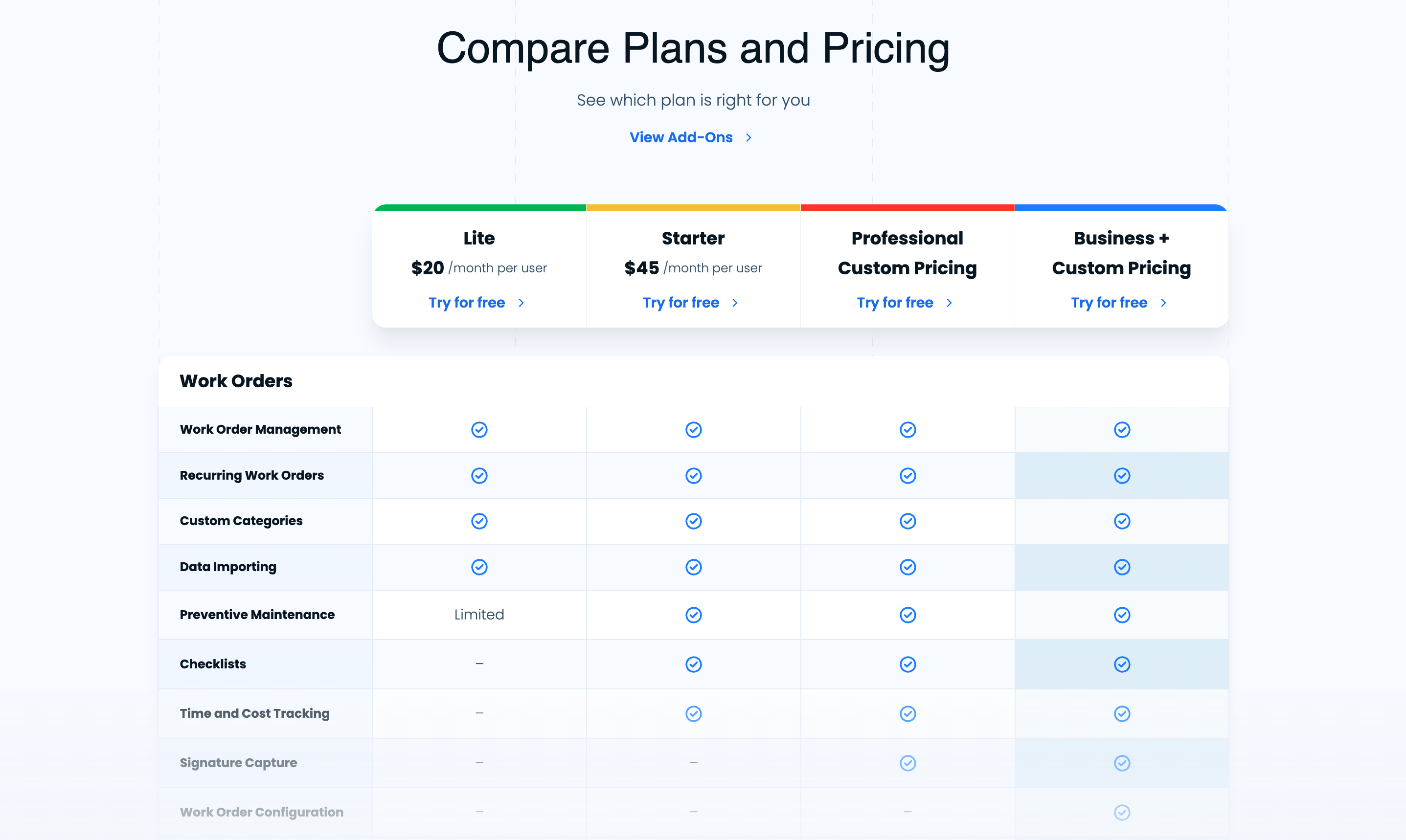
There’s a variety of elements we can appreciate on this pricing page. For instance, their polished features table allows interested buyers to compare each pricing tier with ease. Other noteworthy features include detailed “Add-ons” sections that users can click through to learn more and helpful FAQs to address any concerns of potential customers.
All in all, Upkeep absolutely ranks high on our best pricing page shortlist!
SaaS Pricing Page Design Choices We Love From Upkeep
- 🧹Crisp, organized layout
- ✔️Useful toggles
- 🤝Trust signals
- ➕Orderly “Add-ons” sections
5. Chili Piper
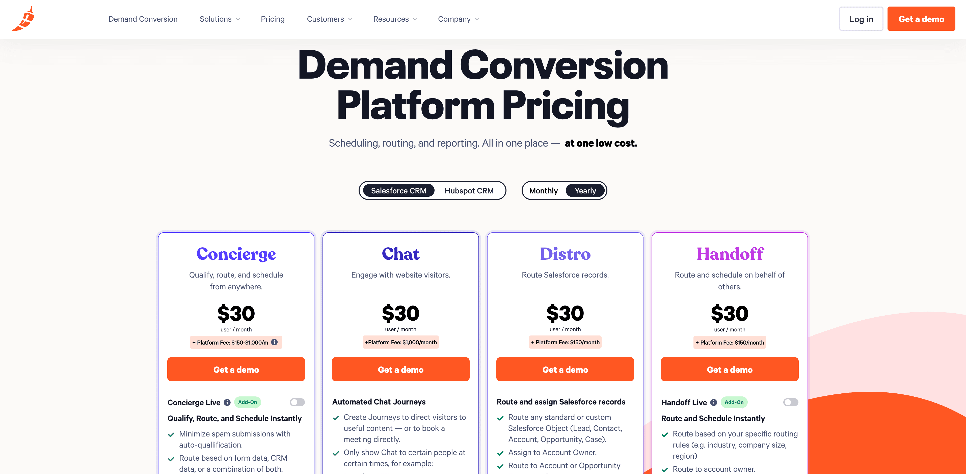
Chili Piper is a popular demand conversion platform helping revenue teams instantly qualify, route, and schedule leads. With multiple products tailored for different sales workflows, their pricing page keeps things clean, visual, and easy to compare.
👉 Explore Chili Piper’s pricing page here!
One thing that stands out right away is how product-specific each plan is. Instead of grouping features into traditional tiers, Chili Piper separates pricing by solution—Concierge, Chat, Distro, and Handoff—so users can quickly zero in on what they need. Each plan follows a consistent card layout, making comparisons effortless.
This pricing page hits the mark with transparency, clarity, and intuitive navigation.
SaaS Pricing Page Design Choices We Love From Chili Piper
- 🧩 Modular pricing structure based on individual products
- 🔄 Toggle filters for CRM integration and billing frequency
- 💡 Transparent platform fees displayed front and center
- 🟠 Consistent “Get a demo” CTAs across each pricing card
6. Amplemarket
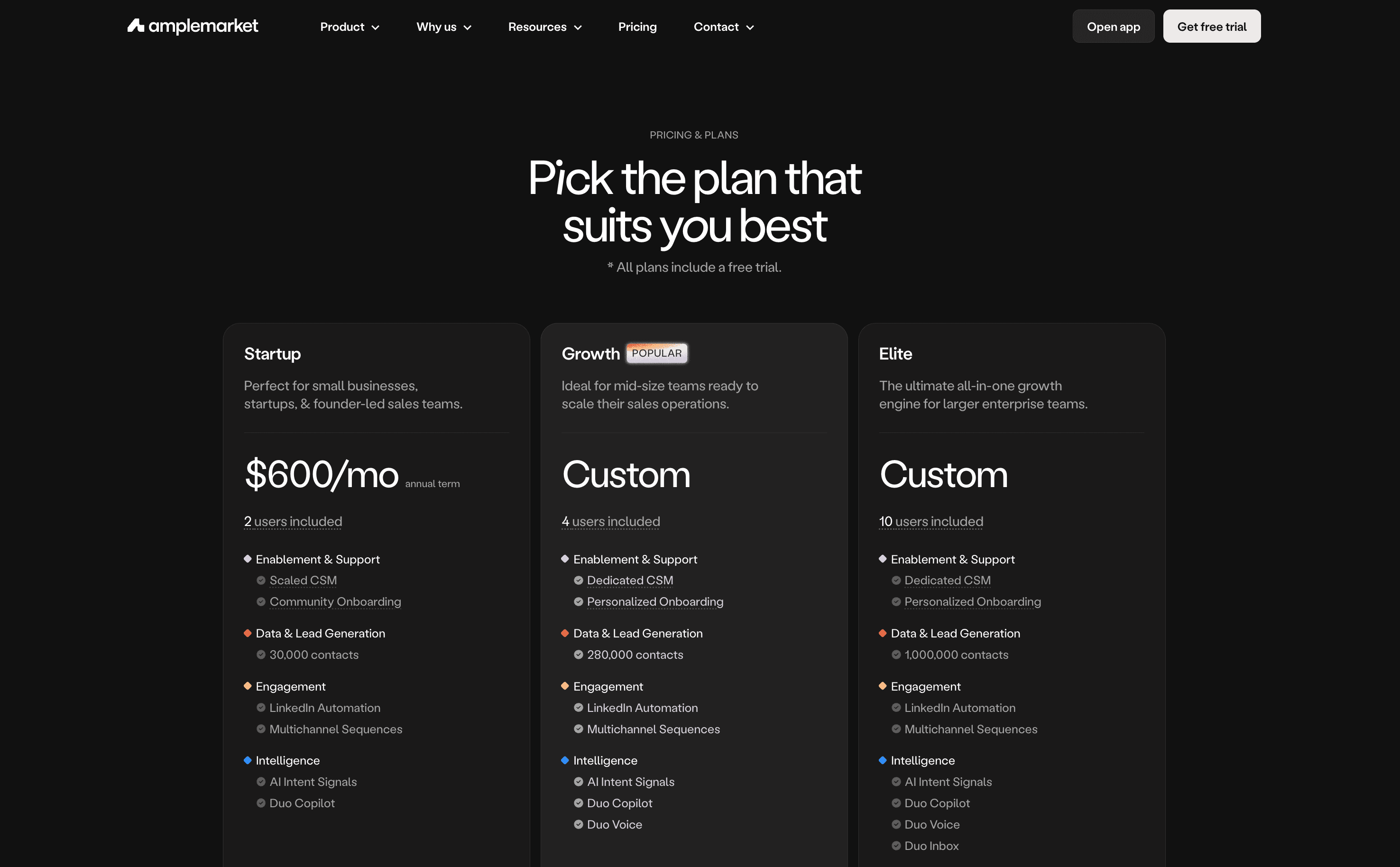
Next up is Amplemarket — an AI-powered sales platform that equips GTM teams with everything from lead sourcing to multichannel engagement.
Take a peek at Amplemarket’s pricing page here!
This one immediately gives off enterprise energy with its dark UI and sleek layout. Pricing is split into three tiers — Startup, Growth (labeled as popular), and Elite — each one built around team size and sales maturity. The “Custom” pricing approach for higher tiers keeps things flexible for larger orgs.
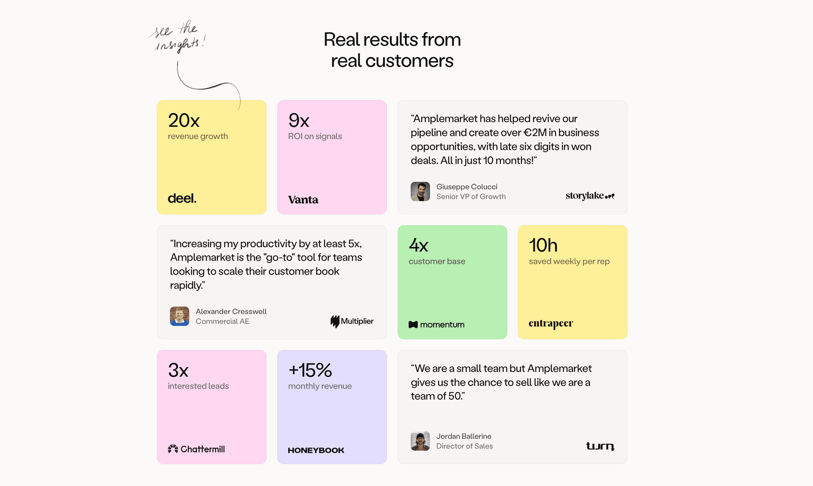
And let’s not forget the results section — colorful customer quotes and metrics like “20x meetings growth” give the page an added punch of credibility.
SaaS Pricing Page Design Choices We Love From Amplemarket
- 🌚 Bold, modern dark-mode layout
- 📊 Scrollable comparison table with detailed breakdowns
- 🧭 Tier names that speak to team maturity
- 💬 Real results section with eye-catching social proof
7. Vercel
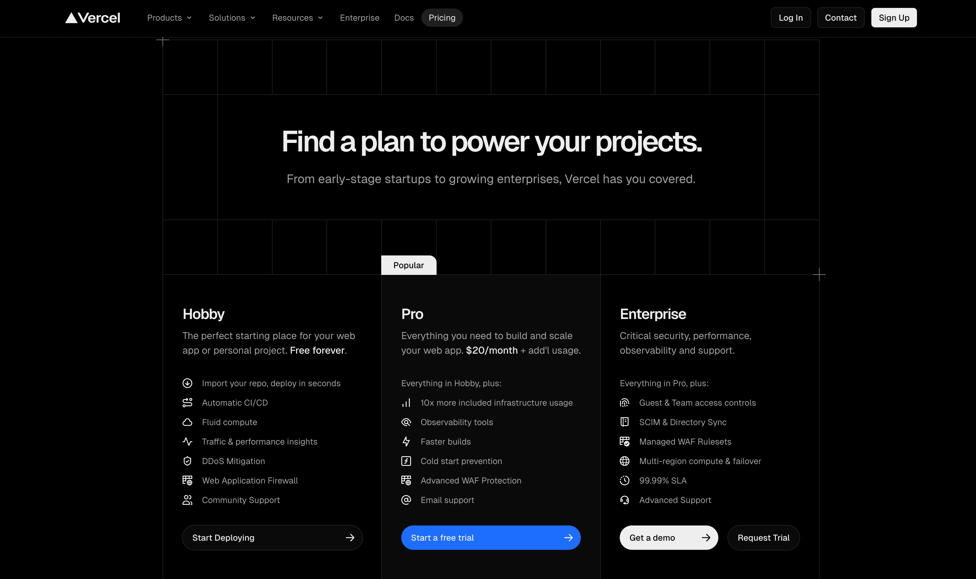
Vercel’s pricing page is a perfect match for its developer audience—dark mode, clean layout, and packed with technical clarity.
Check out Vercel’s pricing page here!
Each tier is clearly defined, with bold CTAs and sharp copy that highlights who each plan is for. We especially love the sticky subheaders in the feature comparison table—super helpful for scanning through categories like Collaboration, Infrastructure, and Compliance. And tooltips? Perfectly placed for added context without clutter.
Vercel also nails the visual hierarchy. The blue CTA button for the “Pro” plan draws the eye immediately, guiding users toward their most popular package.
SaaS Pricing Page Design Choices We Love From Vercel
- 🖤 Developer-friendly dark mode design
- 🧭 Sticky table headers for smooth comparison
- 💡 Well-placed tooltips for technical context
- 🔵 Eye-catching CTA on the Pro plan
8. Blocknative
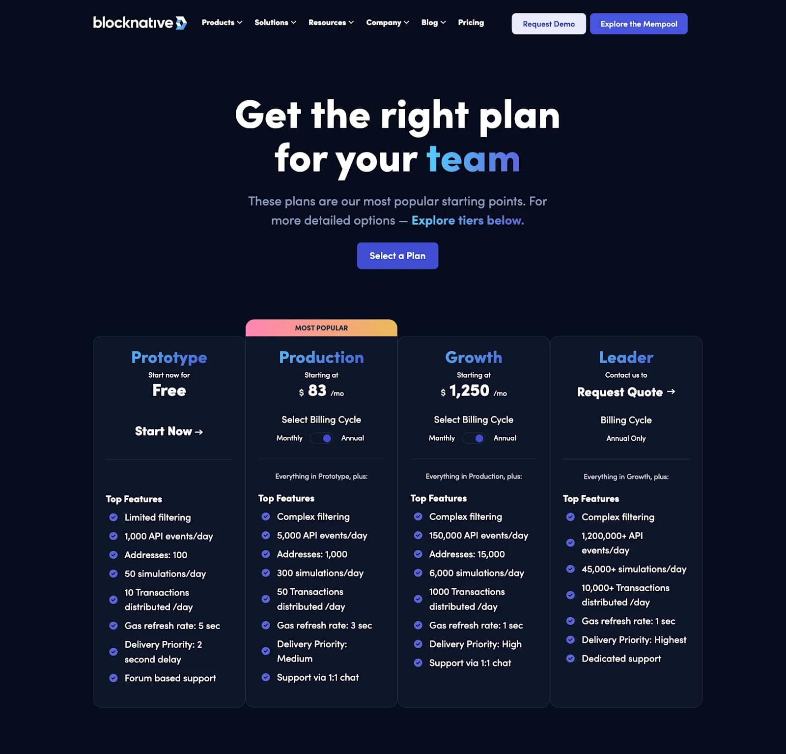
Moving into the world of crypto, we have Blocknative. Blocknative is a data monitoring platform for blockchains like Bitcoin, Ethereum, and Polygon.
Another Webstacks client, Blocknative counted on us to build a new and improved pricing page around their updated pricing model.
Here, we really wanted to embrace elements of Web 3.0 design that we already implemented across Blocknative’s website. This includes things like gradients, futuristic icons, and dark mode.
Given the complexity of Blocknative’s pricing, we added a second, separate table that breaks down each tier further.
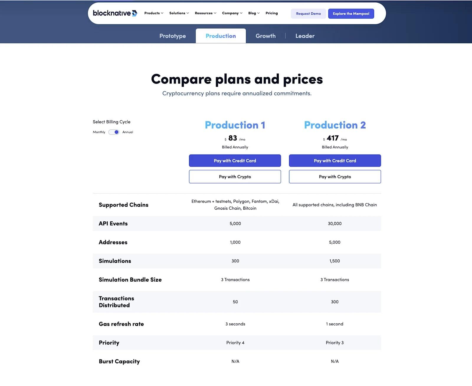
This is definitely a more unique approach to pricing table design, and it allowed us to present each tier and their subsequent plan far more orderly. For example, the tiers in the first pricing table were turned into tabs for the second table. This greatly reduced the amount of space and scrolling required.
This pricing page came out amazing, and Blocknative could not wait to push it live!
Read our Client Story on designing Blocknative's pricing pages here!
SaaS Pricing Page Design Choices We Love From Blocknative
- 🎨 Web 3.0 stylistic design elements
- 🆓 Freemium plan
- 🤝 Trust bar with reputable crypto companies
- ❓ Relevant FAQ section
9. Slack (Mobile)
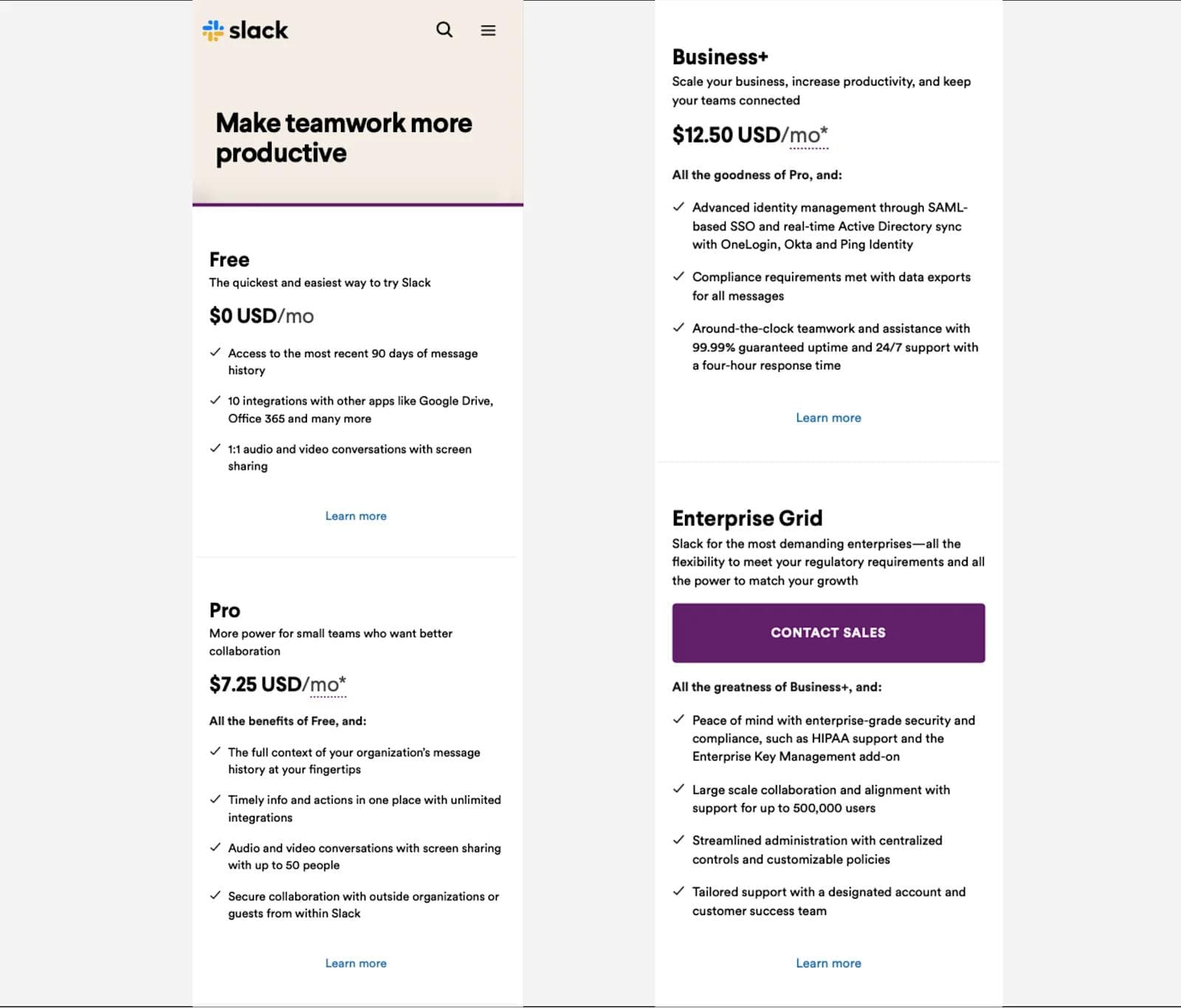
For our best SaaS pricing page examples, we had to make sure to also include a pricing page design in mobile layout.
Oftentimes, organizations can neglect the importance of user-friendly mobile design. Especially for pricing pages, it can be challenging to create an excellent user experience with such limited real estate.
Slack was able to achieve a responsive and mobile-friendly pricing page with a few unique features.
We recommend visiting Slack’s pricing page from your phone here.
First and foremost, mobile pricing pages make the most sense when they are easily scrollable.
With this in mind, Slack makes sure each section is short and to the point. This way, users are not endlessly scrolling (and not leaving out of frustration).
Instead, Slack inserted buttons for users to click if they want to learn more about a specific tier.
Furthermore, the page embraces an accordion-style FAQ, and users can swipe to view customer stories. All in all, Slack really took the mobile UI into consideration when developing their pricing page. Well done, Slack.
SaaS Mobile Pricing Page Design Choices We Love From Slack
- ↕️ Vertical orientation
- 📞 Well-placed CTAs
- ❓ Accordion FAQs
- 📖 Customer stories and trust bar
10. Posthog
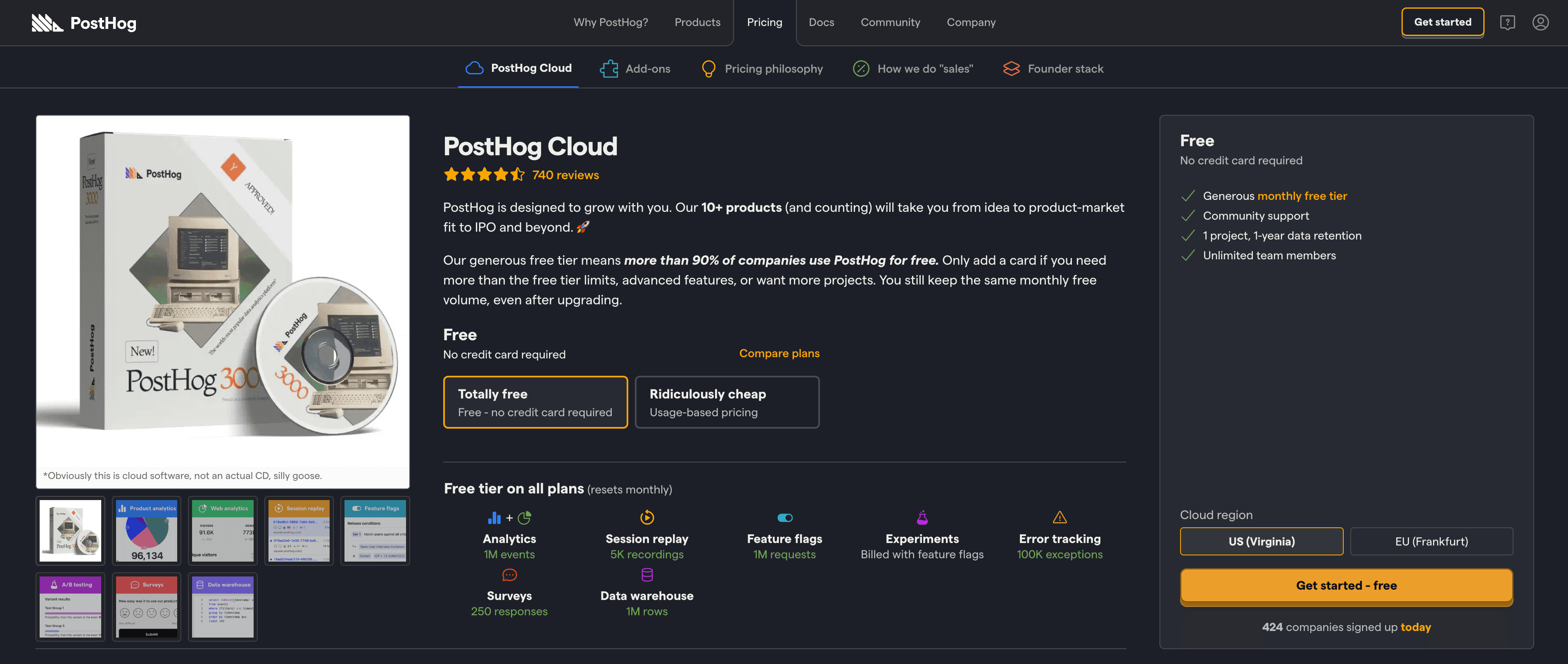
PostHog throws out the SaaS pricing playbook—and we’re here for it.
👉 Check out PostHog’s pricing page here!
Rather than forcing users into rigid tiers, PostHog embraces usage-based pricing with a highly interactive, modular layout. You can toggle between self-hosted and cloud, adjust monthly usage sliders, and even see live cost estimates based on your actual volume. For marketers with complex products or metered models, this is an absolute gem of an approach.
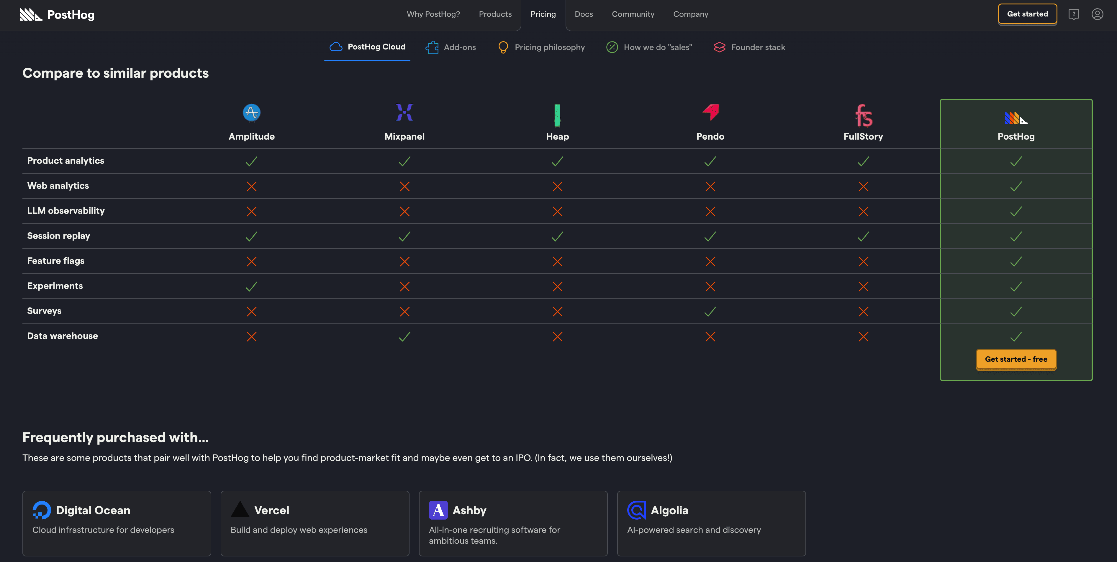
What also stands out? The bold dark theme, playful microcopy (“This is the call to action.”), and an ultra-detailed cost calculator that builds trust through transparency. It's a great reminder that pricing doesn’t have to be boring—it can be a branded experience all its own.
SaaS Pricing Page Design Choices We Love From PostHog
- 📊 Fully interactive cost calculator with real-time pricing estimates
- 🧩 Modular layout tailored to self-hosted vs. cloud setups
- 🕶️ Edgy, developer-first design that still feels approachable
- 🧠 Smart copy that turns complexity into clarity
11. Tines
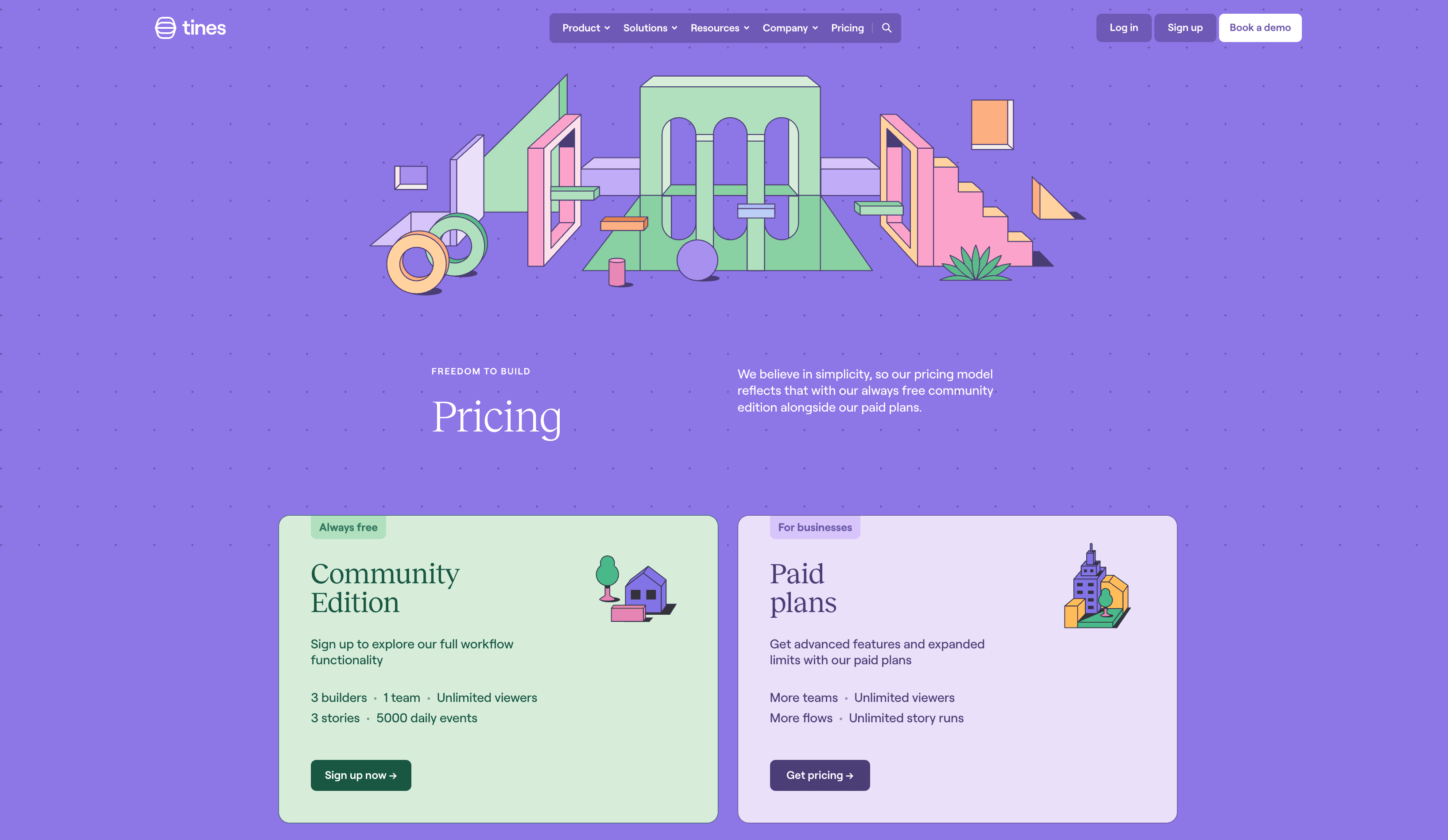
Let's continue along the theme of non-traditional pricing pages with Tines.
Rather than defaulting to the usual three-tiered matrix, Tines uses a narrative-driven layout to tell a story about their product, audience, and values. The page leans into transparency and flexibility, starting with a free Community Edition and moving into usage-based Paid Plans without overwhelming visitors with pricing tables.
👉 Take a look at the Tines pricing page here!
The playful, pastel design reflects Tines' focus on automation without intimidation—while the platform + add-ons model gives buyers the control they need to scale. This approach makes total sense for a technical, security-conscious audience that values flexibility over fixed plans.
SaaS Pricing Page Design Choices We Love From Tines
- 🎨 Brand-forward design that mirrors product simplicity
- 🧱 Modular pricing strategy: platform fee + add-ons
- 🌱 Dedicated startup program for early-stage teams
- 🧭 Narrative layout that guides users instead of comparing tiers
12. Brex
Let's check out Brex- the global corporate spend platform.
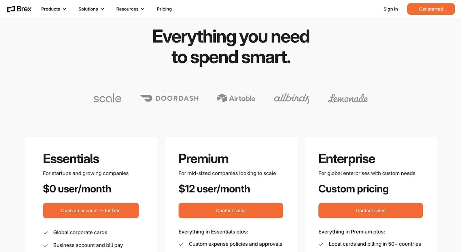
Their 3-tiered pricing table keeps the page pretty straightforward. The pricing tier naming conventions, descriptions, and features checklist provide plenty of context making it easy for the user to know exactly where they would fall.
We're also huge fans of Brex's features comparison design!
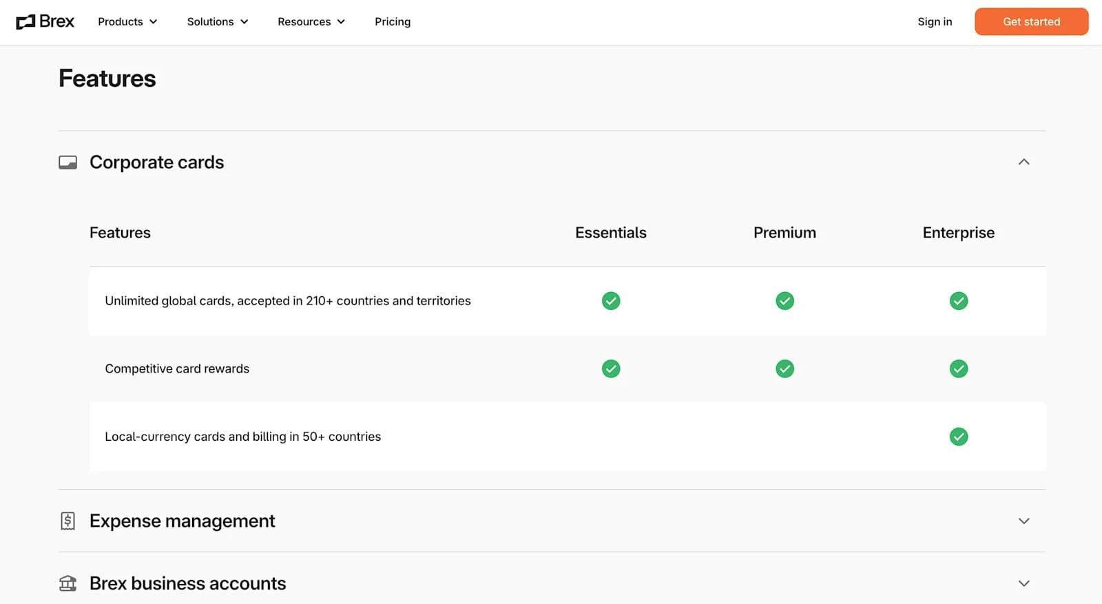
The little icons are excellent visual queues, and the drop-down menus eliminate a ton of unnecessary scrolling.
SaaS Pricing Page Design Choices We Love From Brex
- 🙂 Overall simplicity
- 👏 Impressive trust bar logos
- ✔️ Extensive feature comparisons
- 🆓 "Open an account for free" option
13. Netlify
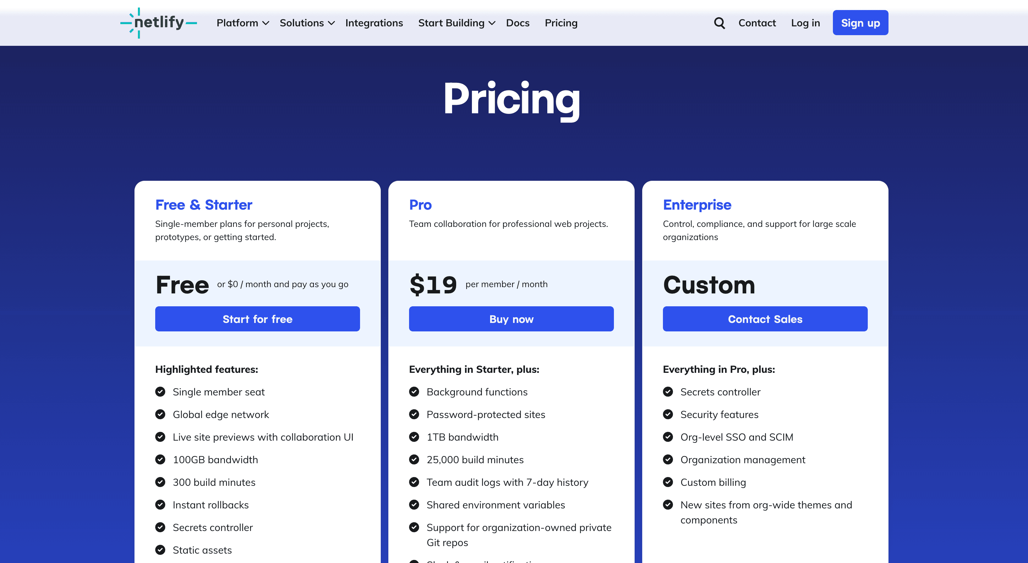
On to SaaS pricing page example number 6… Netlify. If your organization wants a fast, scalable, and secure website, look no further than Netlify.
There’s a ton of takeaways for this pricing page.
Get a closer look at Netlify's Pricing Page here!
It includes just about every element we hit on in the beginning: a smooth tagline, a well-organized pricing table, memorable tier names, multiple trust signals, tooltips and toggles, as well as plenty of FAQs.
SaaS Pricing Page Design Choices We Love From Netlify
- ✨ Elegant minimalism
- 🆓 Free plan and Free Trial
- ✔️ Collapsable feature comparison table
- 🤝 Trust bar, testimonials, and case studies
14. Privy
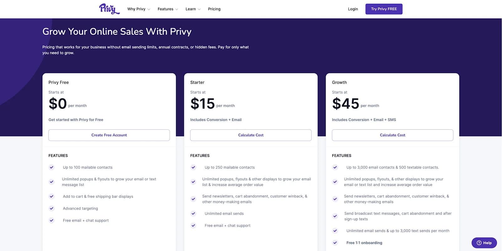
Last but not least, we have Privy - the #1 rated Shopify application! Privy is another organization that Webstacks has had the pleasure of collaborating with.
While Privy has a 3-tiered pricing table, the main component on this page is the calculator.
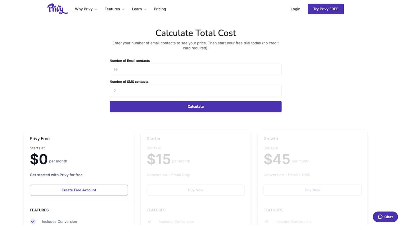
See the Privy calculator and entire pricing page here!
Developed by Webstacks, this tool allows Privy’s potential customers to approximate their monthly cost based on the number of email and SMS contacts. With these inputs, Privy will recommend plans to users.
Ultimately, this pricing page includes many valuable features that are directly tailored to Privy’s target audience. Other than being stylistically sound, this page addresses many of the questions, pain points, and interests Shopify sellers may have.
SaaS Pricing Page Design Choices We Love From Privy
- ⬛ Purposeful simplicity
- 💰 Interactive cost calculator
- ❓ Thorough FAQ section
- ⭐ Animated customer reviews
15. Jasper
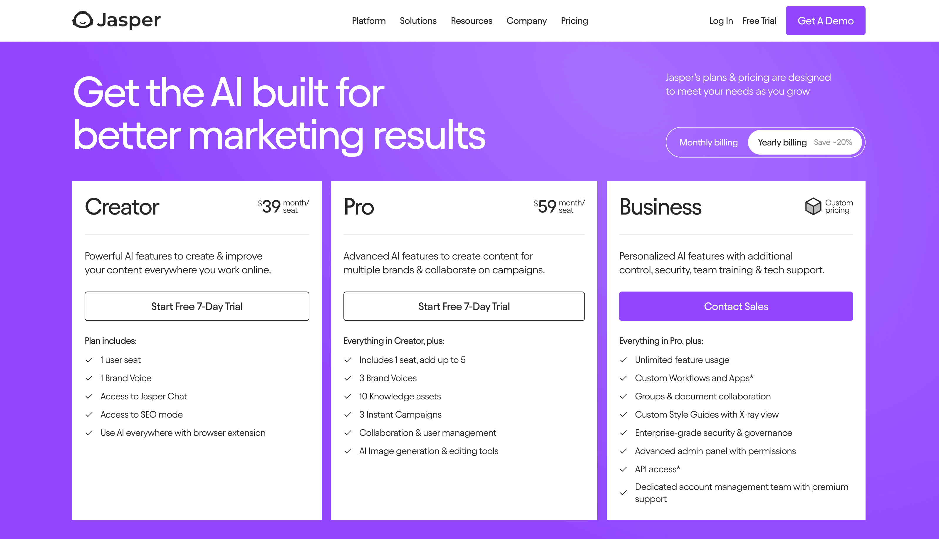
Time to shine some light on this awe-inspiring pricing page from Jasper, a popular AI writing tool.
First things first — we love the use of a bright purple background that make each pricing offering pop off the page.
Jasper’s pricing page is full of outstanding design elements that we mentioned before, from distinct pricing tiers to intuitive toggle switches that allow users to shift between monthly and yearly billings. Kudos for incorporating microinteractions into the CTAs of each pricing tier, as it effectively engages users on the page and entices them to click!
Take a glance at Jasper’s pricing page here!
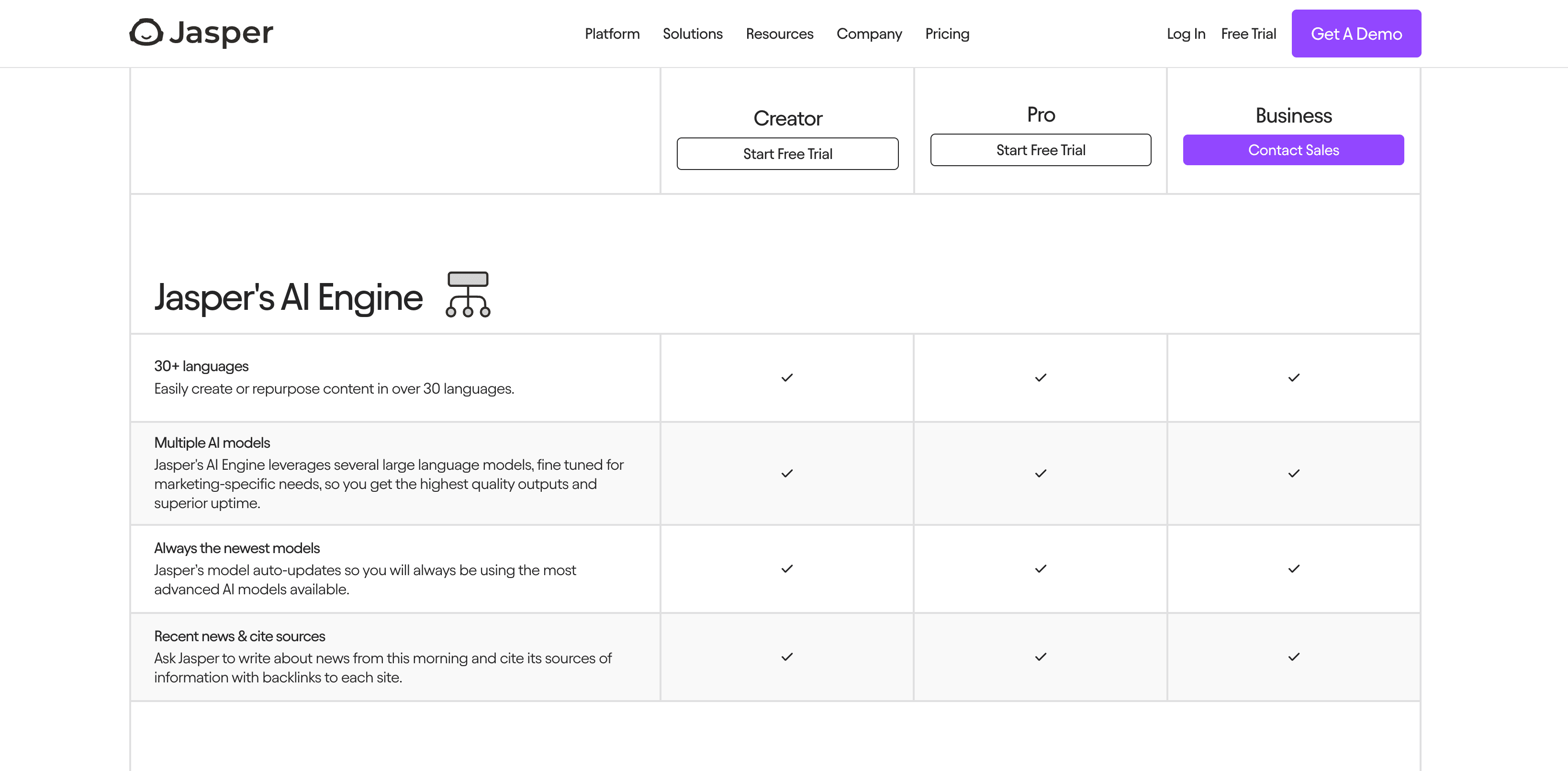
Another aspect we admire is Jasper’s features list. We love how each offering’s name and CTA are designed as static components, allowing users to easily navigate their extensive features list. Talk about an intuitive design decision!
SaaS Pricing Page Design Choices We Love From Jasper
- 🧹Well-structured features list
- 🛠Engaging microinteractions
- ❓Collapsible FAQ section
- 🤝Noteworthy trust signals
16. Loom
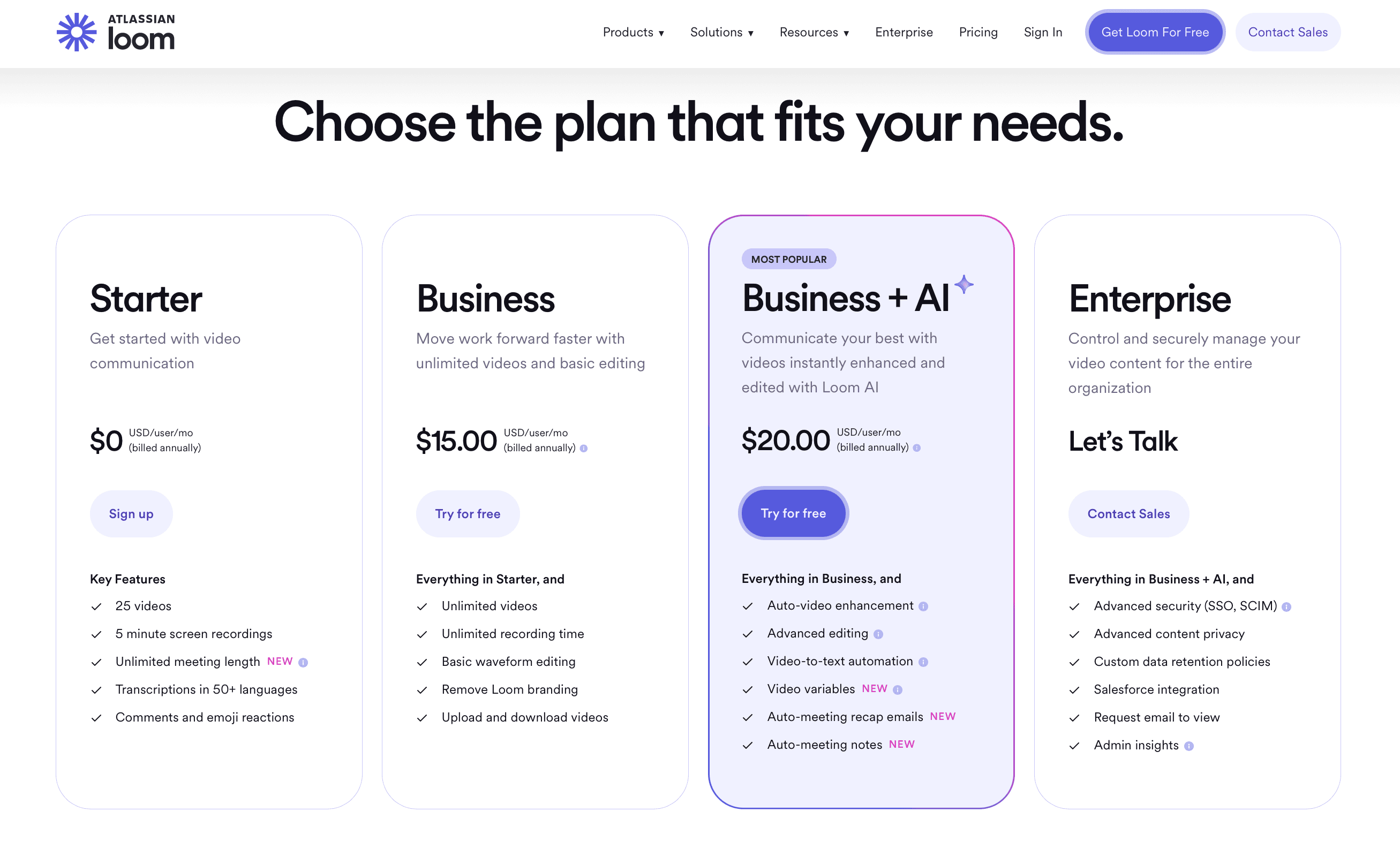
Let’s move on to a pricing page that’s more modern and minimalist — courtesy of Loom, a popular video communication software.
When it comes to clean light UI design, Loom’s pricing page is undoubtedly a top-notch example. Here, you can easily discover each pricing plan’s unique features that are neatly displayed on organized card components.
Scroll a bit further down and you’ll find a strategically placed CTA that brings users directly to their features list. A simple yet impactful design choice!
Experience Loom’s pricing page here!
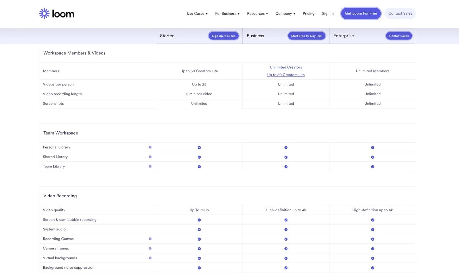
Thanks to Loom’s minimalist layout, users can effortlessly scan through Loom’s extensive features list and locate each pricing tier’s benefits. In addition, the use of bright blue icons are a nice visual element that aids users in their decision making.
Without question, Loom’s pricing page definitely earned its spot on our list!
SaaS Pricing Page Design Choices We Love From Loom
- ✨ Sophisticated, minimal colorway
- ✔️ Fixed pricing tier bar
- 📞 Compelling CTAs
- ❓ Expandable FAQ section
17. Ahrefs
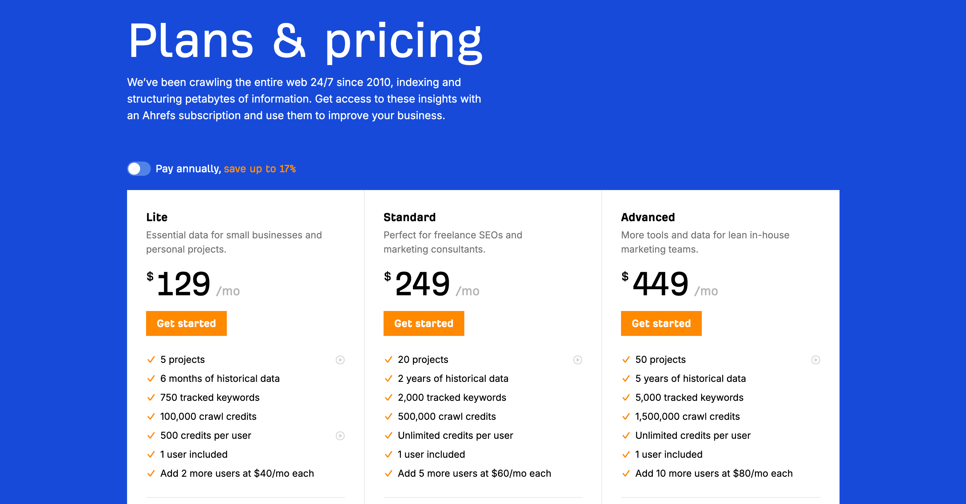
Next on our list is Ahrefs, an SEO software suite that is very popular amongst digital marketers.
To begin, we love how users are immediately given the choice to toggle between Ahrefs’ monthly and annually pricing plans. Now, potential customers can effortlessly scan their neatly organized features list that keeps each offering fixed at the top for constant visibility.
Have a look at Ahrefs’ pricing page here!
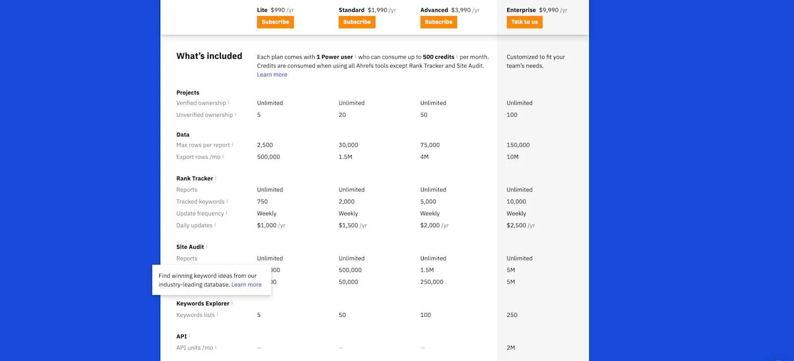
Got any questions about each feature? Ahrefs provides tooltips to offer additional context for each feature, ensuring comprehensive information for potential customers. Another great design element that addresses the interests or challenges Ahrefs buyers may have.
Whether you’re a small business or marketing agency, this pricing page delivers useful features that simplify decision-making when considering Ahrefs’ offerings. A 10/10 in our books!
SaaS Pricing Page Design Choices We Love From Ahrefs
- ✍️ Bold headlines
- 💡 Helpful tooltips
- ⚓ Anchored pricing plan bar
- 🗣️ Customer testimonials
18. Semgrep
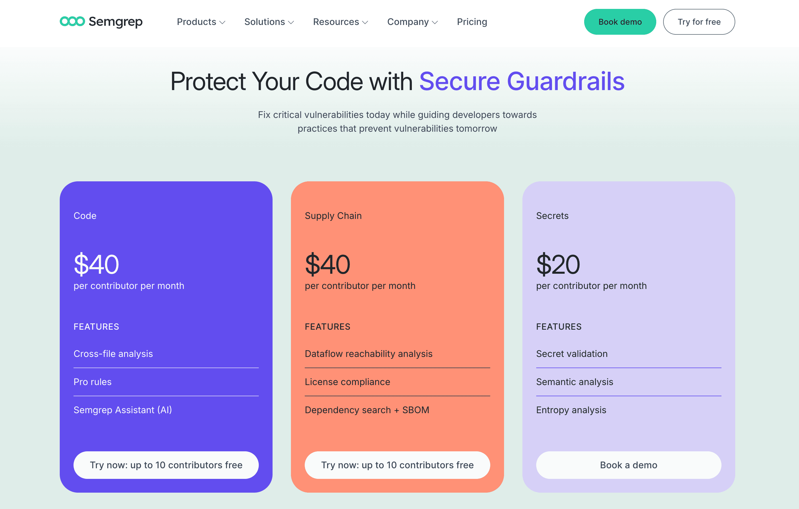
We couldn’t be more excited for this next pricing page! Semgrep is an open-source static code analysis tool that Webstacks has had the joy of working with.
Semgrep's pricing page puts your best interests first by showcasing the products included in each pricing plan and specifies the ideal plan for different use cases. With their sleek layout and purposeful copy, potential customers can easily discern which offering caters to their needs.
Peep Semgrep’s pricing page here!
Browse further and you’ll find your classic features table, a dynamic trust bar, informative FAQs, and scrollable testimonials. Needless to say, Semgrep’s pricing page is full of essential elements that build confidence around each offering and addresses potential customers’ questions. A round of applause for this amazing pricing page!
SaaS Pricing Page Design Choices We Love From Semgrep
- 🌈 Subtle gradients and pastels
- 📞 Clickworthy CTAs
- ❓ Collapsible FAQs
- 🤝 Scrolling trust bar and testimonials
19. Hubspot
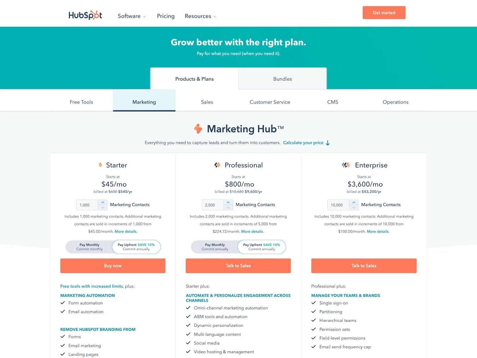
With perhaps the most dynamic SaaS company pricing page we’ve ever seen, Hubspot does an impressive job of making something complicated seem remarkably simple.
Check out the full Hubspot Pricing Page here!
HubSpot’s pricing page includes a number of tables for free tools, platforms, and bundles - all combined into one interface. Navigating through them is extremely intuitive, while the interactive toggles and adjusters add a unique element of engagement for the user.
Overall, we’re huge fans! 5 stars.
SaaS Pricing Page Design Choices We Love From HubSpot
- 🧠 Intuitiveness
- 🛠 Interactive tools
- ❓ Vast FAQ section
- 📞 Well-placed CTAs
20. Customer.io
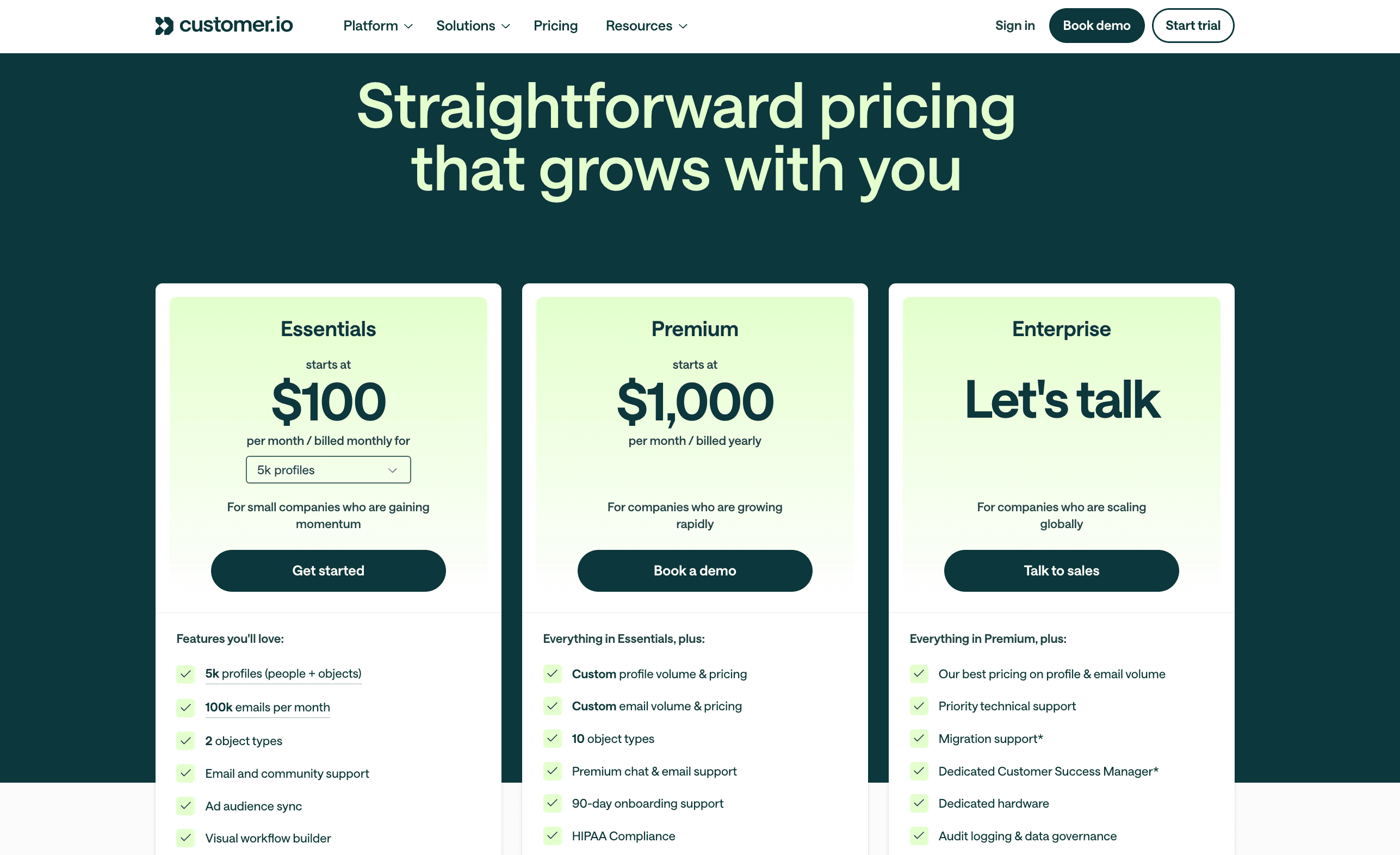
Customer.io keeps it real with a pricing page that’s as straightforward as their pitch: automation that grows with your ops team.
👉 View Customer.io’s pricing page here!
Each plan—Essentials, Premium, and Enterprise—is cleanly laid out with zero fluff. We love how the soft green gradient draws attention without overdoing it, and the “Let’s talk” CTA for Enterprise is right where it should be for high-intent buyers.
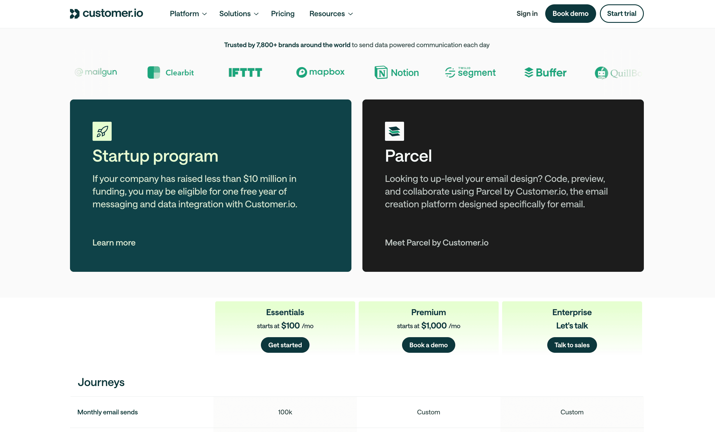
The feature breakdown is extensive (in a good way), but collapsible sections and subtle row styling make it super scannable. Oh, and shoutout to the startup program banner mid-page—great move for attracting early-stage SaaS teams.
SaaS Pricing Page Design Choices We Love From Customer.io
- 🍃 Calming gradient visuals with just the right pop
- 🧾 Clean, collapsible feature matrix that doesn’t overwhelm
- 🚀 Strategic startup callout mid-page
- 💬 Clear, tiered CTAs that guide intent
SaaS Pricing Page Takeaways for Your Organization
There you have it, our favorite SaaS pricing pages this year.
From our experience with SaaS websites, we believe everyone must treat their pricing page like they would any other core website page. If executed correctly, your pricing page can become your advantage in the heavily competitive SaaS industry.
In closing, here are some things to keep in mind when redesigning your own pricing page:
- Having a sound pricing strategy and model will greatly aid the design process.
- Do not overlook the mobile design of your pricing page.
- Ensure your pricing table and copy are easily digestible for new website visitors.
- Sometimes, less is more when it comes to information on a page. Avoid clutter.
- Establish trustworthiness throughout the page.
- Strategically place CTAs to move leads down the funnel and maximize your conversions.
Of course, we would be happy to discuss any questions your organization may have about SaaS pricing page design. Feel free to check out more of Webstacks’ creative services or contact our sales team to get in touch with us!
Your website is your biggest growth lever—are you getting the most out of it? Schedule a strategy call with Webstacks to uncover conversion roadblocks, explore high-impact improvements, and see how our team can help you accelerate growth.

I create SEO-driven content for B2B SaaS companies, from blog posts to case studies. I focus on research-backed writing that ranks on the first page and drives meaningful organic traffic.

