12 Product & Feature Comparison Table Design Examples
Making an informed decision is paramount for users exploring B2B products and services online. Whether they're evaluating brands, comparing product features, or assessing costs, having a clear and accessible comparison can significantly influence their choice.
Yet all too often, this vital information is scattered or far too complex.
This is where the comparison table proves invaluable. By consolidating key features and benefits into a single, easy-to-read format, comparison tables streamline the decision-making process.
In this blog, we'll explore how to create comparison tables that improve the user experience and facilitate decision-making.
Webstacks websites don’t just look good—they scale with you and drive real results.

Why Use Product and Feature Comparison Tables
There are two key use cases for creating a visual like a comparison table:
- Comparing your products to alternatives on the market.
- Exhibiting the differences between your own product tiers and pricing plans.
In the first part of this guide, we’ll examine their application when comparing yourself against alternatives within the industry. After, we’ll take a look at how to create comparison tables that contrast the various pricing tiers and product offerings of your own organization.
Use Case #1: Compare Your Products to Competitors
With a product comparison table, you can quickly and simply showcase the features, capabilities, benefits, and other key metrics that set you apart from the competition.
This is the perfect opportunity to display where your offering excels the most in terms of performance, or showcase unique aspects of your product that make it stand out from the rest of the market.
So, how do you effectively use competitor comparison tables on your website?
The best application is dedicated landing pages. For some organizations, a single comparison page may be enough (you vs all alternatives in one table). Others may create an individual page for every product or competitor.
This part cannot be overstated. Comparison charts can be a major driver for lead generation - but only if executed properly!
Here are three ways to have success with competitor comparison pages:
- Educating direct traffic - This type of content is highly relevant for prospects who are already familiar with your brand. They’ve begun exploring your website, and are starting to consider you as a potential solution. You can add comparisons to your site navigation, or link to them from product pages. You can also send prospects to these pages when they ask your sales team, “How does your product compare to [competitor]’s?”.
- Drive traffic from organic search - Comparison tables can also be a valuable SEO play. The strategy is quite simple: rank for high-intent, branded keywords and generate leads through demos and free trials. As a quick example, you can create a bunch of comparison landing pages following the same format (“[You] vs [Competitor]”. On the page, you include the comparison table, FAQs, and other semantic copywriting that will help you rank #1 in search engines.
- Run paid campaigns - These pages can also be used for PPC ads. Whether you want to show up under the paid positions in Google for your competitor’s name, or you want to experiment with LinkedIn ads, comparison content can be very effective when delivered to the right audience.
Best Practices for Competitor Product Comparison Tables
As you will see with these examples, tables allow you to share lots of information without an overwhelming amount of page copy.
From a design perspective, this head-to-head format is ideal because of its minimalistic approach. Oftentimes, a simple “X”, Yes/No, checkmark, or a couple of words is enough to get your point across.
In addition to presenting factual data, you also get to provide your own perspective and insights as to how your company and its products stack up against alternatives. Ultimately, you get to control the narrative of your brand and where your offerings stand in the marketplace.
Just as important as the information presented in the tables is the design of the tables themselves. While comparison tables can seem simple on the surface, it's surprisingly easy to end up with a design that is cluttered and unintuitive.
Beyond the chart's design, we also have the layout of the entire web page.
As you can see, there’s a lot to uncover here. So let’s break down some key feature comparison tips:
Keep things user-friendly:
- 📊Organization - Start by establishing the number of rows (features) and columns (competitors) in the table.
- 🎨Colors - Use brand colors to make the table pop and establish subtle reminders of your organization.
- 🖊 Bold headings - Make row and column headings larger and darker.
- 🗂 Categorization - If your table has many rows, break it by using subheadings that group comparison criteria (i.e. “Performance”, “Cost”, etc).
- ✅ Iconography - Use checkmarks and Xs within tables.
- ℹ️ Tooltips - Hide additional, valuable context that users can only see by hovering over.
- 🚨 Highlighting - Outline, color, and bold where your offering wins head-to-head.
Make it clear why customers should choose you:
- 🎤️ Explain your most significant and unique benefits
- ❌ Address any common objections or misconceptions
- 📣 Add CTAs to get engagement
- ❓ Include frequently asked questions related to the comparison
Feature social proof:
- ™️ Client logos
- 💬 Testimonials
- 🏅 Awards and certifications
- 📕 Success stories (bonus points if they showcase customers who switched from the competitor to you)
See what’s working for industry-leading websites and find inspiration to improve yours.

Competitor Comparison Table Examples
Now, let’s review a few real-world comparison table designs, many of which come from the best websites in B2B SaaS.
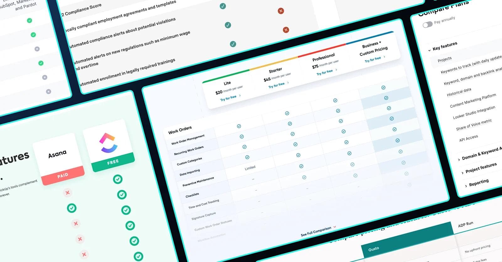
ClickUp vs Asana

This product comparison table from ClickUp may be the most well-rounded example.
While it is certainly not the most complex table, it includes a ton of complementary pieces that drive users to take the desired action of getting started with their project management software.
Take, for instance, the email capture in the hero, logo trust bar, testimonials, and awards. If you’re thinking about the larger strategy for comparison content, take notes from ClickUp.
Deepgram vs OpenAI

A client of ours here at Webstacks, Deepgram is a startup that provides APIs for speech-to-text, text-to-speech, and language understanding.
They compete with other AI platforms such as Google Cloud STT, Microsoft Azure STT, and OpenAI’s Whisper.
To exhibit the superior performance of their own tool, Deepgram has a product comparison chart that contrast dozens of features and capabilities. The page also includes tons of graphics, trust signals, and an embedded form to capture conversions.
Chili Piper vs Calendly

Here’s another awesome example courtesy of Chili Piper. Before we even scroll down to the table, we have to acknowledge the dark mode background and deep gradients.
These are also some impressive graphics that deserve to be a part of our Best SaaS Illustration Examples.
As for the table, they’ve constructed a subtle yet neat design (the rounded edges, alternating row colors, and checkboxes to name a few elements). Chili Piper incorporated just the right amount of rows for this table. There’s enough info to adequately inform the user without having it seem like an endless scroll.
Gusto vs ADP

Gusto has a ton of pages for comparing its platform to its most similar alternatives, like ADP. By looking at this table, you would gather that Gusto is a cheaper, more resourceful option.
Overall, this example isn’t anything flashy but it follows basic design principles that make it easily digestible for the end user.
Rippling vs Deel

Another prime example is Rippling. Their comparisons follow a fairly simplistic design, but they did a great job of splitting tables into distinct sections. Furthermore, compelling headings and supporting copy reemphasize the data points shown in the tables.
One last worthy callout from this page is the section with the G2 scale ratings. This could have very easily been included in a table, but Rippling went out of its way to create a more unique visual that utilizes animations and a neat scrolling effect.
This is a great reminder that static, traditional tables are not the only option when it comes to product and feature comparisons.
Rudderstack vs Segment

Last up in our competitor table comparisons is Rudderstack, showing how its features compare to alternatives like Segment. This customer data platform has perhaps the most complex comparison tables of these examples, providing extensive information for users.
This is primarily because many of the comparative features require much more than a simple “yes” or “no”. However, they also created a less elaborate table, only showcasing the most important advantages.
See what’s working for industry-leading websites and find inspiration to improve yours.
Use Case #2: Comparing Your Own Products and Pricing
Now that we’ve covered comparison tables for competitors, we also have to discuss the use cases for your own offerings.
You may want to use a table to display the differences between your products. This most commonly will apply to your pricing page.
We’ve already created an article on Best SaaS Pricing Pages, but we’ll share some additional examples here and focus on the table rather than the full page design.
Product Tier Table Comparison Table Best Practices
Many of the same design principles from the competitor tables apply here. So, we’ll just highlight a few key takeaways when they specifically apply to comparisons between your own product tiers/ pricing plans.
- 🏷 Naming conventions - Use clear and distinct naming for each tier
- 💡 Clarity - Clearly articulate the unique benefits of each offering, allowing users to easily identify which plan is best for them
- 🔧 Simplicity - Be creative in organizing information when including lots of rows (use tabbing, accordions, tooltips, and other elements that minimize the page at first glance).
- 👀 Categorization - Categorize features to enhance scanability
- 📞 Action-oriented- Incorporate CTAs (“Try for Free”, “Book a Demo”, “Contact Sales”, etc)
Product and Pricing Table Examples
Now, let's examine some pricing charts that excel in modern, user-friendly design.
Customer.io

Customer.io has an extensive table for comparing each of its three “Journeys” pricing tiers. At the top of the page, they feature a condensed version that provides only the most important features.
The table itself includes a bunch of excellent design elements. The pricing tiers are sticky, meaning they stay on the screen as you scroll down the table. For scannability, data is broken up into 7 separate categories, and the rows have a hover state to provide users with subtle feedback.
UpKeep

Another client of ours here at Webstacks, UpKeep worked with our design team to construct a more robust and user-friendly features table for their pricing page (and we absolutely loved the end result!). The table is expandable for those who wish to see the full comparison, and the slight blur towards the bottom is a great touch. When expanded, the sticky pricing bar at the top follows you down the page. Alternating colors make it easier to follow across rows and columns.
Semrush

Here, things get a little more complex, mainly because of Semrush’s dynamic pricing model. This table is more than checks and X’s. Semrush utilizes "feature indicators" or "feature availability indicators." They visually represent the level of access or the number of features included in each pricing plan. Also, many features require numerical inputs to show the maximum usage of certain aspects of the platform. Lastly, each feature category is set up as an accordion, which prevents the table from appearing too over-complicated at first glance.
Intercom

Next, we head to Intercom’s pricing page. Much like Customer.io, Intercom pays a ton of attention to detail, elevating this page to a whole new level. There are tooltips, icons, hover states, toggles, dropdowns, and much more. Prospective buyers can heavily engage with this table and the entire page.
Gusto

We figured Gusto was worthy of a second feature because its pricing table is that good. It only includes icons within each row and uses tooltips to hide supporting details. Some tooltips even have links, so users can visit another page for more information. Finally, each heading is collapsable and seamlessly transitions to the next when moving down the page.
Aircall

Aircall’s tiered features table is slightly different than our other examples. When clicked, it expands into its own page. It features a bright blue background, several subcategories, and alternating row colors. Overall, the design is very intuitive for the end user to discern what is and isn't included in each plan.
Webstacks websites don’t just look good—they scale with you and drive real results.
Final Tips
For prospective buyers, tables are an ideal means to consume information, evaluate multiple options, and reach a conclusion.
They can present the capabilities of your competitors and your own products, allowing you to share tons of objective, compelling information quickly, and in a straightforward manner.
To round up this article, here are a few tips you can take away for each of the two types of tables.
Product comparisons table/page design:
- Identify your competitor
- List your comparison aspects (categorize if applicable)
- Determine the outcome of each comparison aspect (Check/ X, quantitative number, etc)
- Design your table with UI/UX best practices in mind
- Devise an SEO + content strategy
- Work with product marketing to create compelling page copy
- Optimize for conversions (free trial, demo, talk to sales)
- Identify potential user journeys to keep visitors on the website
Pricing table/page design:
- Nail your product’s pricing model (including tiers, add-ons, etc)
- Identify what features/benefits are included in each tier
- Create a design that aligns with your pricing model and features
- Add elements that enhance interactivity and overall UX
- Optimize for conversions
Your website is your biggest growth lever—are you getting the most out of it? Schedule a strategy call with Webstacks to uncover conversion roadblocks, explore high-impact improvements, and see how our team can help you accelerate growth.

I create SEO-driven content for B2B SaaS companies, from blog posts to case studies. I focus on research-backed writing that ranks on the first page and drives meaningful organic traffic.