14 Best B2B Case Study Examples to Be Inspired By
B2B case studies provide social proof for your solutions and also serve as powerful marketing tools that can help you acquire new clients. They weave stories that resonate with potential clients, illustrating how your products or services can solve real-world problems.
In this guide, we’ll break down the best B2B case study examples and best practices you should follow.
In brief:
- B2B case studies help build trust and credibility by showing real-world problem-solving and measurable results.
- They play key roles in marketing, supporting the sales funnel, standing out from competitors, driving conversions, and helping with customer retention.
- Key parts of a successful case study include a compelling story, measurable outcomes, testimonials, and engaging visuals.
- Best practices involve focusing on a problem-solution-outcome framework, using data visualization, storytelling, and offering the case study in multiple formats.
Reasons to Create B2B Case Studies for Your Business
A case study isn’t just another piece of content on your B2B website. It’s an important piece of bottom-of-the-funnel content that can turn casual visitors into buyers.
Build Trust and Credibility
Case studies serve as compelling stories that showcase real-world examples of how your products or services have worked for others.
By including client testimonials and using their real names when possible, you create authentic social proof that resonates with potential clients. This transparency lets prospects see how similar challenges they've faced have been effectively tackled, which boosts your credibility.
Showcase Problem-Solving Expertise
By highlighting your problem-solving skills and industry expertise, B2B case studies demonstrate your ability to handle complex challenges.
Case studies typically follow a "Challenge-Solution-Result" format, starting with the client's initial issues, detailing the approach taken, and concluding with tangible outcomes. This sequence not only highlights your strategic thinking but also helps potential clients relate to the story, envisioning similar successful solutions for their own problems.
Also, providing insights into the decision-making process builds confidence in your methods and shows the value added through your solutions, positioning your company as a reliable partner and a thought leader in your field.
Feature Real-World Use Cases
Decision-makers in B2B often need relatable examples to make informed purchasing decisions, and B2B case studies help you provide just that.
When you explain specific challenges and how your solutions were applied, this lets potential clients see your offerings in action. This relatability assures them that your products or services can meet their unique business needs.
Storytelling elements like characters and conflicts make case studies even more engaging and memorable, adding a human touch to the technical details.
Provide Quantifiable Results and ROI
One of the most compelling aspects of B2B case studies is showcasing quantifiable results and return on investment (ROI).
Detailed metrics and KPIs—like cost savings, efficiency improvements, or revenue increases— give potential clients the data they need to justify investing in your solutions.
Key Marketing Functions of B2B Case Studies
B2B case studies support marketing strategies by influencing various aspects of the sales and marketing cycle. Through detailed stories and real-world examples, they provide clarity and assurance to potential clients. Let's look at how B2B case studies are used across different marketing functions:
Support the Sales & Marketing Funnel
B2B case studies act as powerful tools in guiding potential customers through the sales funnel.
They're especially impactful at the consideration and decision stages, where potential clients evaluate different solutions. By presenting successful outcomes and detailed client testimonials, case studies demonstrate the tangible benefits and ROI of a product or service, giving prospects the confidence to move forward with purchasing decisions.
Differentiate from Competitors
A case study helps differentiate your business by highlighting unique value propositions through real-world successes. Unlike generic marketing materials, they focus on customer experiences, providing authenticity and credibility. This targeted approach allows potential clients to see how your solutions have benefited others.
Drive Conversions and Lead Generation
By offering tangible evidence of success, B2B case studies significantly aid in lead generation and conversion.
They provide proof that can ease customer doubts. And encourage them to move further in the sales funnel.
Case studies can also be an effective tool to boost website traffic, as they draw in potential clients who are using search engines to look for proven examples of successful implementations.
Support Customer Retention and Expansion
Beyond attracting new customers, B2B case studies promote customer retention by highlighting successful collaborations and rewarding loyalty.
They let businesses showcase customer achievements that inspire other clients to explore additional services.
Regularly sharing case studies about successful client partnerships reinforces the idea that you are a reliable partner. This encourages clients to continue working with youlong-term. And strengthens the idea that working together leads to success and growth for everyone involved.
What Should Be Included in a B2B Case Study?
Creating a case study seems simple, but there’s quite a bit of work involved if you want to do it right. Start by including the following elements.
- Company Name and Logo: Displaying the client's company name and logo prominently. This immediately builds credibility and sets the context for the story.
- Company Background: Provide a brief background of the company, including its industry, size, and strategic goals. This helps readers understand the context of the challenges faced and solutions provided.
- Compelling Headline: Craft a headline that grabs attention and sums up the essence of the case study. When possible, use specific numbers or results you generated for your client.
- Key Results: Highlight measurable outcomes achieved through your solutions. Emphasize metrics like ROI, revenue growth, or efficiency improvements to show the tangible benefits of your offerings.
- The Challenges, Solutions, and Outcomes: Clearly explain the challenges the client faced, the solutions you provided, and the resulting outcomes. This storytelling approach effectively shows how your solutions addressed the client's specific needs.
- Visuals: Use visuals like graphs, charts, or photos to break up text and create a more engaging read. Incorporating illustrations can make your case study more engaging and visually appealing.
- Testimonials: Include authentic client testimonials to add credibility and a personal touch. Direct quotes from satisfied clients serve as powerful endorsements of your solution.
- Videos (Interviews or Breakdowns): If possible, add videos featuring interviews with stakeholders or breakdowns of the project. Videos can add a dynamic element to the case study and engage readers even more.
- Calls to Action: Finish with a clear call to action that guides the reader toward the next steps, whether contacting your sales team, requesting more info, or scheduling a demo.
See what’s working for industry-leading websites and find inspiration to improve yours.

B2B Case Study UX Best Practices
What separates the visually appealing case studies from the bad ones? Well-designed case studies typically follow these best practices:
- Include Quantifiable Results in Your B2B Case Study: Use data and statistics to back up the results achieved. Metrics like ROI, increased revenue, cost savings, or improved efficiency can be very convincing. If hard data isn’t available, qualitative feedback like testimonials can help.
- Use Data Visualization: Break up the text with appealing charts, graphs, images, and infographics. This not only improves engagement but also makes important points more accessible to readers, even at a glance.
- Use Stories to Drive Engagement in B2B Case Studies: Craft a compelling story that makes your case study memorable. Use quotes, internal conversations, and expert analysis to add depth and personality.
- Offer the Case Study in Multiple Formats: Make your case study accessible in different formats like PDFs, videos, and blog posts to cater to diverse preferences. Share it across various marketing channels, including your website, email newsletters, and social media.
Best B2B Case Study Examples
When looking at B2B case studies, the design and presentation are just as important as the content in effectively communicating your message and value proposition.
Let's see how various companies use unique design elements and presentation strategies to create compelling B2B case studies.
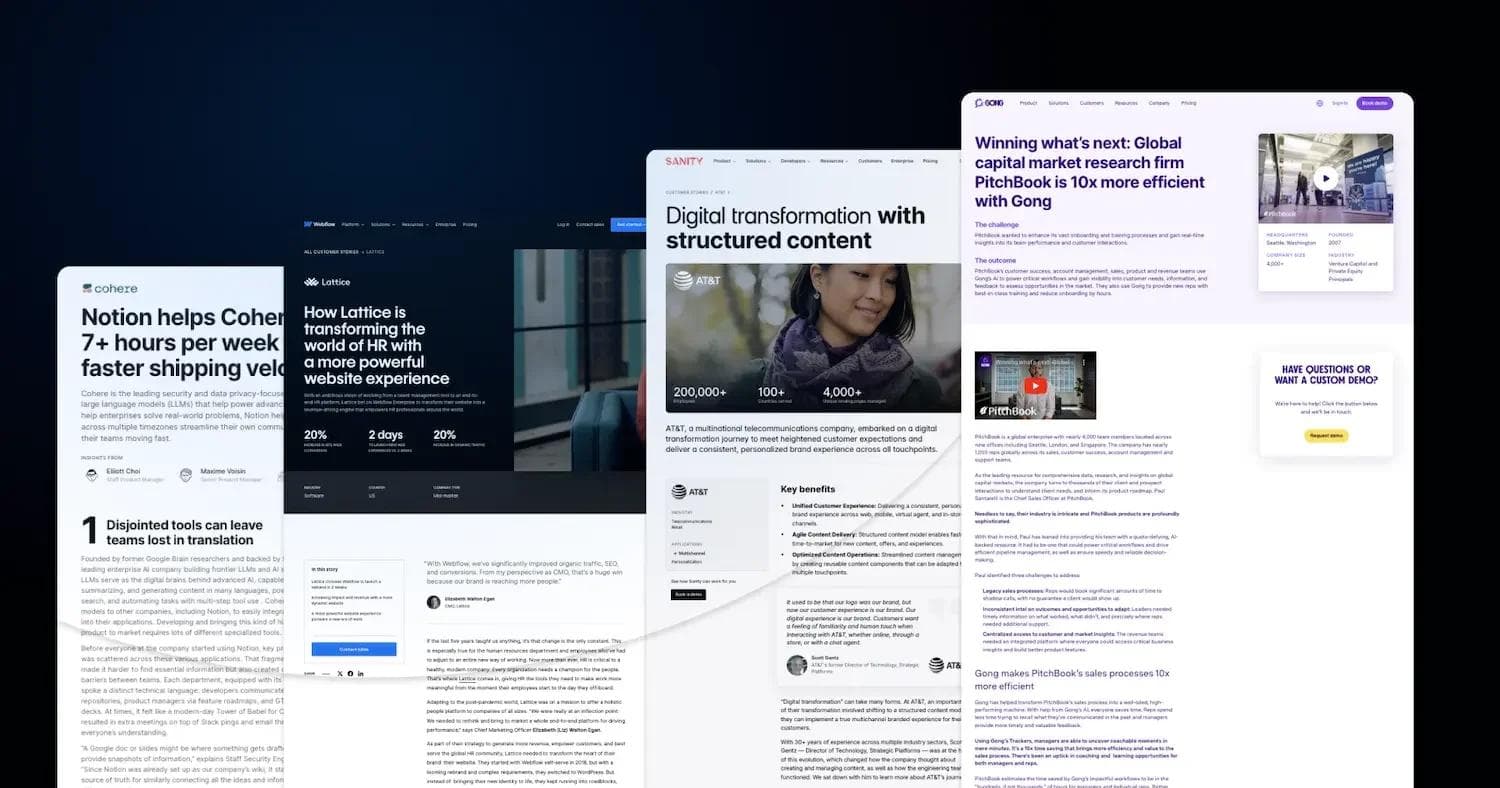
Webflow

Webflow’s case study with Lattice is visually engaging and structured for easy reading, combining bold statistics, storytelling, and multimedia elements to highlight how Lattice transformed its website experience.
The dark, high-contrast hero section establishes authority, with a large background image of a Lattice employee adding a human element. The case study follows a linear narrative format, blending quotes, key results, and video content to reinforce the impact of Webflow’s solution.
Typography is clean and modern, with clear distinctions between sections to maintain readability.
Standout Elements:
- 🎥 Embedded Video Demonstration – A mid-page YouTube embed visually explains how Lattice’s new website streamlined HR experiences.
- 📊 Bold Performance Metrics – The hero section immediately presents three key impact figures (20% increase, 2-day launch, 20% growth) to capture attention.
- 📰 Magazine-Style Layout – The combination of full-width images, large pull quotes, and staggered content blocks creates an engaging reading experience.
See what’s working for industry-leading websites and find inspiration to improve yours.
Sanity

Sanity’s case study with AT&T showcases digital transformation through structured content, using a sleek, editorial-style layout.
The hero section features a large, high-quality image of an AT&T customer, overlaid with bold impact statistics (200,000+ employees, 100+ brands, 4,000+ locations) that immediately establish scale.
The content is structured into sections that blend storytelling, expert insights, and multimedia elements. A fireside chat video embed adds a conversational dimension, while pull quotes and key benefits are presented in digestible blocks.
Standout Elements:
- 🎬 Executive Fireside Chat Video – A highlighted YouTube-style embedded discussion between AT&T and Sanity executives gives firsthand insights into structured content adoption.
- 📝 Key Benefits in an Easy-to-Scan List – Instead of paragraphs, Sanity condenses AT&T’s transformation highlights into an actionable, bullet-pointed benefits section.
- 🔗 Related Customer Stories Section – A carousel of similar success stories (Mejuri, Tecovas, Tata Digital) encourages users to explore other case studies.
- 🏆 Branded Testimonial Callout – A bold, yellow-highlighted testimonial box makes customer praise stand out.
Stripe

Stripe’s case study with Alaska Airlines presents a sleek, structured approach to detailing how Tap to Pay on iPhone is transforming in-flight payments.
The page opens with a high-impact headline, a bold statistic banner (44M+ annual passengers, 7,000+ flight attendants using the solution), and a hero image featuring Bernadette Berger, Director of Innovation at Alaska Airlines.
The design is minimalist yet informative, incorporating sections for challenges, solutions, and results, each broken into digestible paragraphs with clear headings. A testimonial quote box reinforces credibility, while a related customer stories section encourages further engagement.
Standout Elements:
- 📊 Quick-Glance Stats Panel – A floating sidebar provides key performance figures (passengers served, flight attendants using the solution) without disrupting the reading flow.
- 📖 Storytelling-Driven Layout – Instead of just listing features, the case study reads like a narrative, breaking down Alaska Airlines' payment challenges, iterative improvements, and measurable success.
- 🔗 Seamless Next Steps CTA – A well-placed "Ready to get started?" section flows naturally after the case study, guiding businesses to learn more or contact Stripe’s sales team directly.
Loom

Loom’s case study with Intercom is a visually compelling, structured narrative detailing how video prospecting helped boost reply rates by 19% while reducing the time to close deals by 12 days.
The page uses a warm gradient header that draws attention to the core impact metrics. Below, a well-structured challenge-solution-results breakdown provides clear storytelling. The case study also integrates testimonial callouts and other customer success stories to maintain engagement.
Standout Elements:
- 🗂 Challenges & Solutions in Collapsible Sections – The problem-solving journey is structured in easily scannable sections, with testimonial blocks woven into the text.
- 📹 Subtle Video Theme – The use of soft motion graphics and rounded card designs reinforces the visual feel of a video-centric tool like Loom.
- 🔗 Seamless Navigation to Other Stories – A soft pastel carousel at the bottom showcases additional customer stories, ensuring continued exploration.
Braze

Braze’s case study with ShareTheMeal is a visually dynamic and data-driven success story highlighting how targeted in-app video boosted fundraising efforts.
The vibrant gradient header immediately captures attention, and a structured Problem → Strategy → Results format improves readability.
The page blends data insights, storytelling, and real-world campaign visuals, reinforcing the impact of ShareTheMeal’s donation campaigns. Custom illustrations and UI screenshots make abstract concepts more tangible, guiding the reader through the journey.
Standout Elements:
- 📊 Problem, Strategy, and Results in Modular Cards – The three-column layout provides a quick overview of the key takeaways before diving into detailed storytelling.
- 📹 Campaign Imagery & UI Screenshots – Real screenshots of in-app video elements and campaign assets show exactly how the strategy was executed.
- 🎭 Playful, Rounded Design Motifs – Custom illustrations and curved content blocks keep the page engaging, reflecting Braze’s user-friendly and interactive branding.
See what’s working for industry-leading websites and find inspiration to improve yours.
Gong

Gong’s case study with PitchBook presents a sleek, data-rich success story about how Gong’s AI-powered platform boosted efficiency by 10x for the global capital market research firm.
The page features a bold purple-and-white theme, reflecting Gong’s branding, with a strong header statement that immediately communicates impact.
Embedded videos, data-driven insights, and real-world outcomes are blended into a structured narrative, keeping the reader engaged while reinforcing Gong’s revenue intelligence capabilities.
Standout Elements:
- 📊 Bold Data Highlights in Callout Cards – Key business metrics like 10x efficiency boost and global impact are emphasized in separate content cards.
- 🔥 Branded Purple CTA Box – A floating custom demo request box follows the reader, keeping lead generation top-of-mind without being intrusive.
- 🏆 Success Story Carousel at the Bottom – Instead of ending abruptly, the page suggests more case studies with interactive preview cards.
Notion

Notion’s case study with Cohere uses a clean and structured narrative-driven format, emphasizing how Cohere saved 7+ hours per week using Notion’s all-in-one workspace.
The black-and-white, minimalist design aligns with Notion’s branding, while hand-drawn illustrations and inline screenshots help visualize key points.
Each section follows a numbered progression, showing how Notion streamlined Cohere’s product development workflow from vision to execution.
Standout Elements:
- ✍️ Hand-Drawn Illustrations – Small, playful sketches next to key sections make the case study feel less corporate and more approachable.
- 📄 Live Notion Pages Embedded – Readers can see interactive examples of the exact Notion setups Cohere used, making the case study highly practical.
- 🔄 Step-by-Step Breakdown – Instead of a generic success story, the numbered format clearly walks through four key stages of transformation.
Atlassian

Atlassian’s case study with Roblox highlights how the company saved $150K+ annually while improving cross-team collaboration and productivity by migrating to Atlassian Cloud Enterprise.
The design is professional and structured, using a clean layout with blue accents, mirroring Atlassian’s brand identity.
Quote callouts, embedded video, and real customer metrics reinforce the study’s credibility, while a step-by-step narrative walks readers through Roblox’s cloud migration journey.
Standout Elements:
- 🎬 Embedded Customer Testimonial Video – A first-person video from a Roblox team member adds authenticity and a human touch.
- 🗂️ Side Panel for Quick Info Access – A vertical sidebar on the left lists key takeaways and relevant Atlassian products.
- 🔗 "More Case Studies" Carousel – The bottom section suggests additional Atlassian success stories.
Salesforce

Salesforce’s case study with Wiley highlights how the publishing company leveraged AI-powered automation to achieve a 213% return on investment, $230K in annual savings, and 40% higher case resolution than their previous chatbot.
The design is clean and professional, with a structured layout, engaging callouts, and a strong emphasis on key performance metrics. A hero video adds credibility, while the breakdown of challenges, solutions, and outcomes makes it easy to follow Wiley’s transformation.
Standout Elements:
- 🎥 Hero Video for Storytelling – A prominent video at the top helps visualize Wiley’s experience with Salesforce, adding a personal touch.
- 📌 "Products Used" Callout – The Agentforce and Einstein AI products are visually emphasized, reinforcing Salesforce’s AI-powered automation benefits.
- 🔗 Additional Success Stories Grid – The bottom showcases related case studies in an easy-to-browse card format, encouraging further engagement.
Coda

Coda’s case study with Qualtrics showcases how the research company saved thousands of dollars annually by consolidating redundant tools into a single source of truth using Coda.
The design is modern and clean, featuring bold typography, customer quotes in visually distinct callouts, and illustrated infographics that reinforce key savings and benefits.
The content flows logically from problems to solutions and results, making it easy to digest and engaging to read.
Standout Elements:
- 🎨 Illustrated Infographics – The "Consolidated 5+ Tools" and "Thousands in Savings" visual elements provide a fun, digestible representation of cost reductions.
- 📝 Customer Quotes in Standout Blocks – Key Qualtrics employee testimonials are emphasized with contrasting background colors, making their insights stand out.
- 🔍 Request a Demo Section with Visual Prompts – A visually structured CTA with icons for "Cut Excess," "See Collaboration," and "Get Started" simplifies lead capture.
Optimizely

Optimizely’s case study with Dovetail Furniture follows a video-centric storytelling approach, featuring interview clips and key takeaways in a structured, modern layout.
The dark theme with contrasting highlights gives it a sleek, premium aesthetic.
The case study walks through their "Business to Human" digital strategy, content-driven commerce, and scaling personalized online experiences with Optimizely.
Standout Elements:
- 🎥 Embedded Video Interviews Throughout – Every section is accompanied by short-form videos featuring Dovetail executives, making the content highly engaging.
- 🎯 Key Takeaways in Bullet Point Format – Each section has clearly defined takeaways, making it easy to skim and absorb insights quickly.
Rippling

Rippling’s case study with Harver is designed with a bold, high-contrast dark theme, utilizing deep brown and gold tones to evoke a premium and sophisticated feel.
The structure follows a clear problem-solution-impact format, breaking down how Harver doubled its candidate management efficiency using Rippling Recruiting.
Large numerical highlights immediately communicate the success metrics, while section dividers and iconography add to the case study's visual hierarchy.
Standout Elements:
- 🔢 Bold Callouts – The 50% efficiency improvement and 2x candidate volume increase are presented prominently at the top for immediate impact.
- 🌑 Rich Dark Theme with Gold Accents – The deep brown background with golden highlights creates a distinctive and premium aesthetic, making it stand out from standard white-background case studies.
- 🎯 Pain Points, Solution & Impact Sections with Icons – Each section features small, meaningful icons, improving readability and visual flow.
Pipedrive

Pipedrive’s case study with Tiffany Largie is a success-driven narrative wrapped in an energetic green and white color scheme.
The page opens with a bold success metric ($2.5M business growth) and seamlessly transitions into Tiffany's entrepreneurial journey.
The layout is highly structured, with key challenges, solutions, and results visually separated, for a smooth reading experience. Icons and data-driven elements improve readability, while testimonial quotes add a personal touch.
Standout Elements:
- 📊 Feature Breakdown with Icons – The Lead Management, Multiple Pipelines, and Automation features are visually represented with icons and short explanations, making it easy to digest key tools.
- 🎬 Embedded Testimonial Video – A video featuring Tiffany Largie’s firsthand experience adds authenticity and engagement to the case study.
Attio

Attio’s case study with Modal highlights how the CRM system empowered a product-led growth strategy.
The design is minimalist and clean, with a heavy emphasis on structured storytelling through challenges, solutions, and results. A high-resolution hero image featuring an active work setting reinforces the business-oriented context.
The case study is deeply narrative-driven, focusing on Modal’s transition from HubSpot to Attio, and how the shift enabled a more flexible and scalable CRM strategy.
Standout Elements:
- 📖 Story-Driven Format – The case study reads like a business growth journey, detailing Modal’s struggle with HubSpot, the “Attio moment,” and how automation and intelligence improved their operations.
- 🔗 Modular Content Blocks – Each challenge, solution, and impact is formatted into distinct sections, making the page easy to scan and navigate.
- 🏆 Final Impact Statement with CRM Call-to-Action – The closing banner, “The CRM behind thousands of companies,” serves as a powerful takeaway.
Build the Case Study Page Your B2B Website Deserves
A visually appealing case study page on your website will help you showcase your product's success stories and build trust among potential clients. Remember to make your case study easy to share by offering it in multiple formats, such as PDFs or short videos, and distribute it across multiple channels.
Ready to take your B2B website to the next level? Download Webstacks' Best B2B SaaS Websites eBook to discover more inspiring examples and actionable insights that can transform your digital presence.

I create SEO-driven content for B2B SaaS companies, from blog posts to case studies. I focus on research-backed writing that ranks on the first page and drives meaningful organic traffic.