Mobile Menu Design: 8 Best Ideas & Solutions

Mobile navigation is the first conversion checkpoint on a B2B SaaS website, not a layout afterthought. 57% of users will not recommend a business with a poorly designed mobile site, and navigation is the cornerstone of that judgment.
The stakes are higher for B2B SaaS than for consumer apps. Buyer journeys span weeks across stakeholders moving between desktop and mobile. The mobile menu has to surface pricing, route to a demo and serve a buying committee on a 6-inch screen. The best menus solve this through deliberate pattern selection, disciplined content hierarchy and a component-based architecture built for continuous optimization.
This article covers the three dominant mobile navigation patterns and where each fits, the five best practices that separate functional menus from conversion-ready ones, eight B2B mobile menu examples worth studying, how to measure menu effectiveness and why a component-system approach is the foundation for getting mobile navigation right.
3 Common Types of Mobile Navigation Menus
Choosing the right mobile navigation pattern requires matching interaction models to specific user journeys and content complexity. B2B SaaS sites manage more complex information architectures than consumer apps, with navigation systems that need to accommodate product suites, industry solutions, resource libraries, and conversion pathways simultaneously. The right pattern depends on information density, audience sophistication and conversion goals.
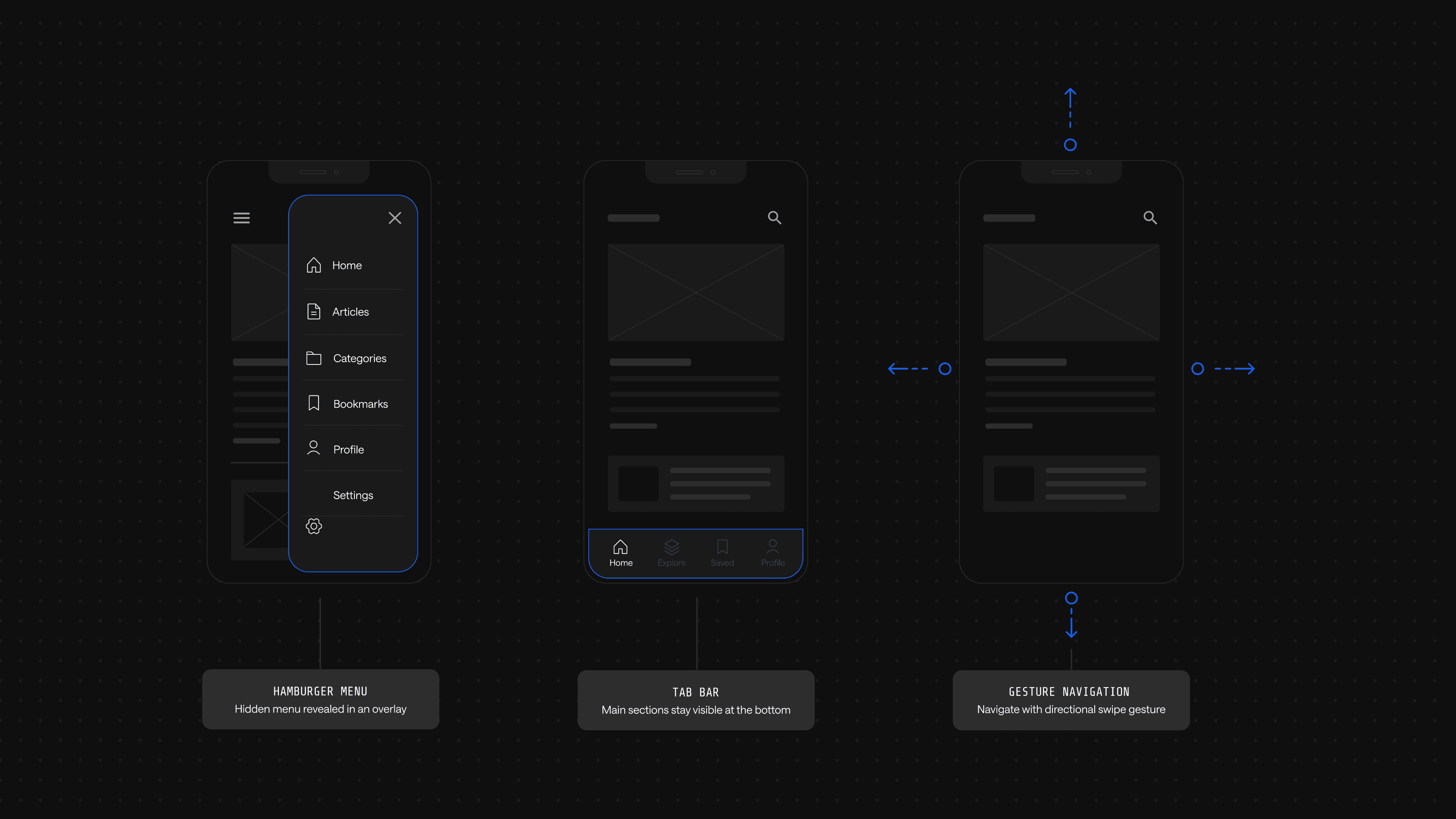
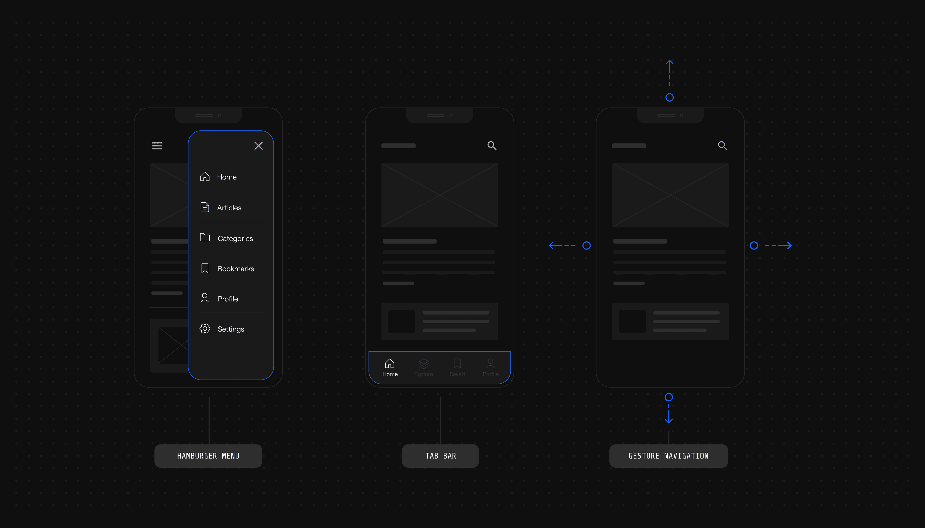
Hamburger Menu
The hamburger menu uses a three-line icon that, when tapped, reveals a hidden menu. It is widely adopted across B2B SaaS sites because it keeps the interface clean while accommodating deep navigation trees.
Strengths:
- Conserves screen space by hiding the menu until needed, giving content room to breathe
- A familiar interaction model that users recognize across nearly every mobile site
- Scales to deep architectures without overwhelming the visible interface
Tradeoffs:
- Low discoverability for first-time users who may not associate the icon with navigation
- Extra taps required to reach any destination, adding friction to high-intent actions
- Hides revenue-critical CTAs like pricing and demo requests behind the icon
The hamburger pattern maximizes flexibility for complex navigation structures, but its hidden-by-default nature creates challenges for conversion-focused sites. Elements most critical to pipeline generation (demo CTAs, pricing pages, contact forms) become less discoverable. This visibility problem becomes acute for B2B sites where prospects need constant access to evaluation resources throughout their journey.
Tab Bar Navigation
Tab bar navigation places icons and labels at the bottom of the screen, letting users switch between sections with a single tap. The pattern is straightforward and efficient when the destination set is small.
Strengths:
- Persistent visibility keeps primary destinations one tap away at all times
- Thumb-zone placement at the bottom of the screen matches natural hand position
Tradeoffs:
- Caps at 3-5 destinations before icons crowd and labels truncate
- Poor fit for deep architectures common in B2B SaaS with product suites and resource libraries
Tab bars excel at surfacing a small set of primary destinations but break down quickly when forced to accommodate the breadth of content typical in B2B SaaS sites.
Gesture-Based Navigation
Gesture-based navigation relies on swipes, taps and other touch interactions to move through the interface. It can create a more immersive experience when users invest time learning the model.
Strengths:
- Maximizes content area by removing visible navigation chrome
- Feels modern and intuitive for audiences accustomed to mobile-native apps
Tradeoffs:
- Inconsistent across devices, as Android and iOS handle gestures differently
- Steep learning curve for first-time visitors who do not expect non-standard patterns
Gestures work well in consumer apps where users invest time learning interaction models, but B2B buyers conducting rapid competitive evaluations rarely have patience for non-standard navigation paradigms.
The reality for most B2B SaaS sites is that no single pattern satisfies every requirement. Effective mobile navigation typically combines approaches: a hamburger menu for comprehensive site structure, a persistent bottom-bar or sticky CTAs for conversion actions and contextual navigation within specific flows.
5 Best Practices for Mobile Menu Design
Mobile menu design for B2B SaaS sites balances exposing deep product information against severe screen real estate constraints. Done well, each discipline below makes the next one easier.
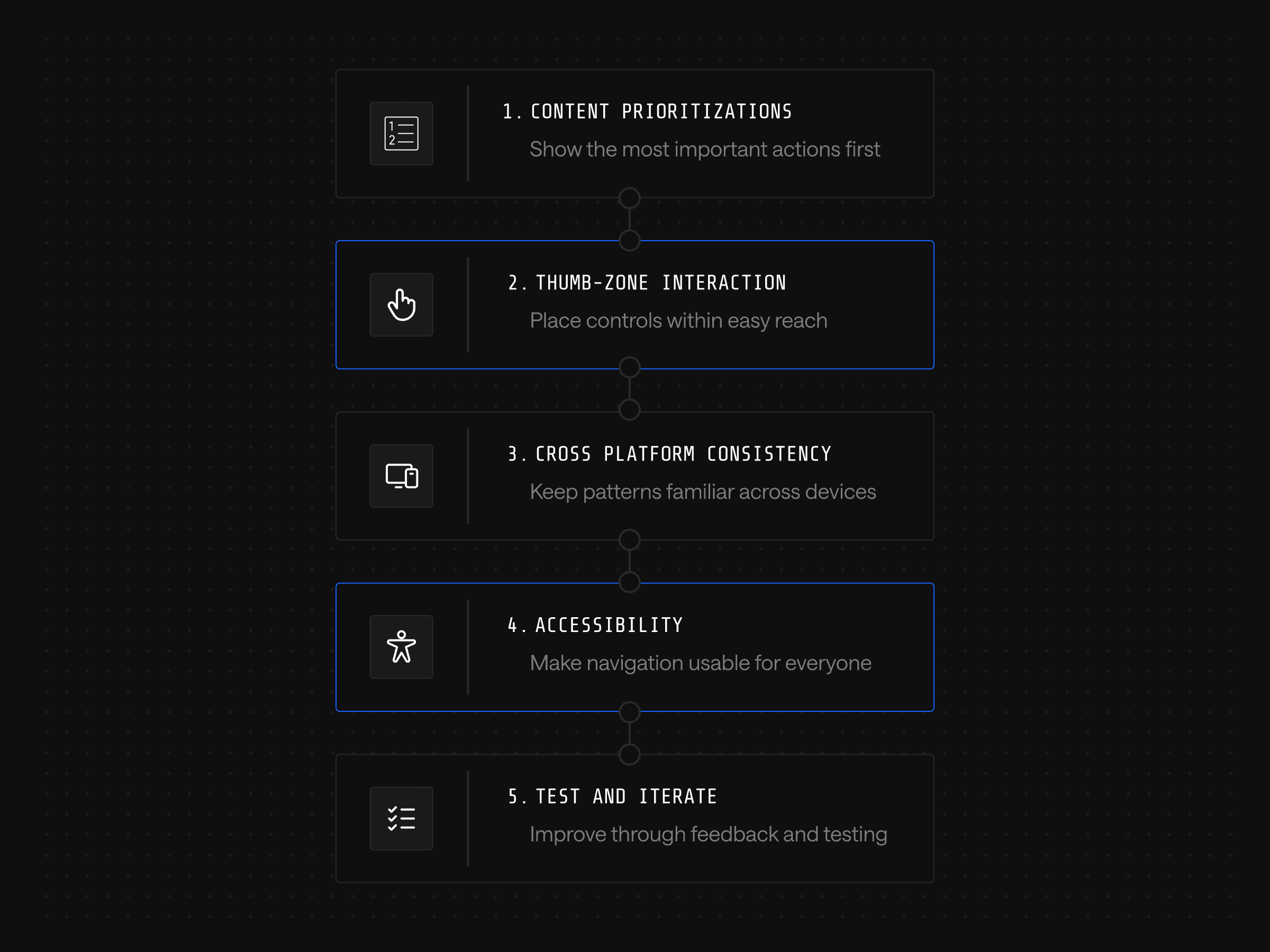
1. Prioritize Content and Simplify Navigation
Hierarchy follows the buyer's journey, not the org chart. Surface product categories, pricing and use cases at the top; move secondary items like careers or press further down. Sharpen this with dynamic options: a persistent demo button while browsing product pages, or a scroll-triggered CTA that adjusts based on where the user is on the page.
2. Design for Thumb-Friendly Interactions
Most users hold their phones with one hand and reach with their thumb. Place interactive elements in the lower half of the screen and size tap targets large enough to avoid mis-taps. Spacing matters as much as size: critical actions should not cluster tightly enough that users hit the wrong link. For time-strapped executives scrolling between meetings, fiddly menus cost demo requests.
3. Ensure Consistency Across Platforms
B2B buyers rarely complete an evaluation on a single device. They start on desktop at work, research on mobile during a commute and return to desktop to share findings with a buying committee. Use consistent icons, labels and structures across iOS, Android and mobile browsers; when a user learns that pricing lives under Solutions on mobile, the same path should exist on desktop. Violating learned patterns signals organizational disarray to enterprise buyers already worried about implementation complexity.
4. Optimize for Accessibility
Accessible mobile navigation extends beyond compliance to revenue. Semantic HTML that supports screen readers also improves SEO and helps AI systems parse content for generative search. The fundamentals are high-contrast colors, alternative text for icons and images, screen-reader support and adjustable text sizing. This Webstacks guide on web accessibility covers the broader framework.
5. Test and Iterate Based on User Feedback
Treat the menu as a living experiment, not a finished artifact. Teams that ship and walk away inherit decay; teams that build iteration into their development cadence compound improvements over time. This is where AI-driven personalization earns its place: behavioral data fed into a system that adapts menu structure to persona or intent turns navigation into a continuously optimized asset. Voice and augmented reality menus get attention, but most B2B SaaS sites have not yet exhausted the gains available from disciplined iteration on the fundamentals.
The examples that follow show how leading B2B SaaS companies apply these principles in production.
8 Best Mobile Menu Examples
Principles are hypotheses, and the menus that follow are the evidence: production decisions made by leading B2B SaaS companies under real constraints. Watch how Stripe segments Solutions by buyer type, where UpKeep places its language toggle, how Gong breaks a deep information architecture into scannable chunks. Those decisions are the difference between principle and product.
1. Toggl
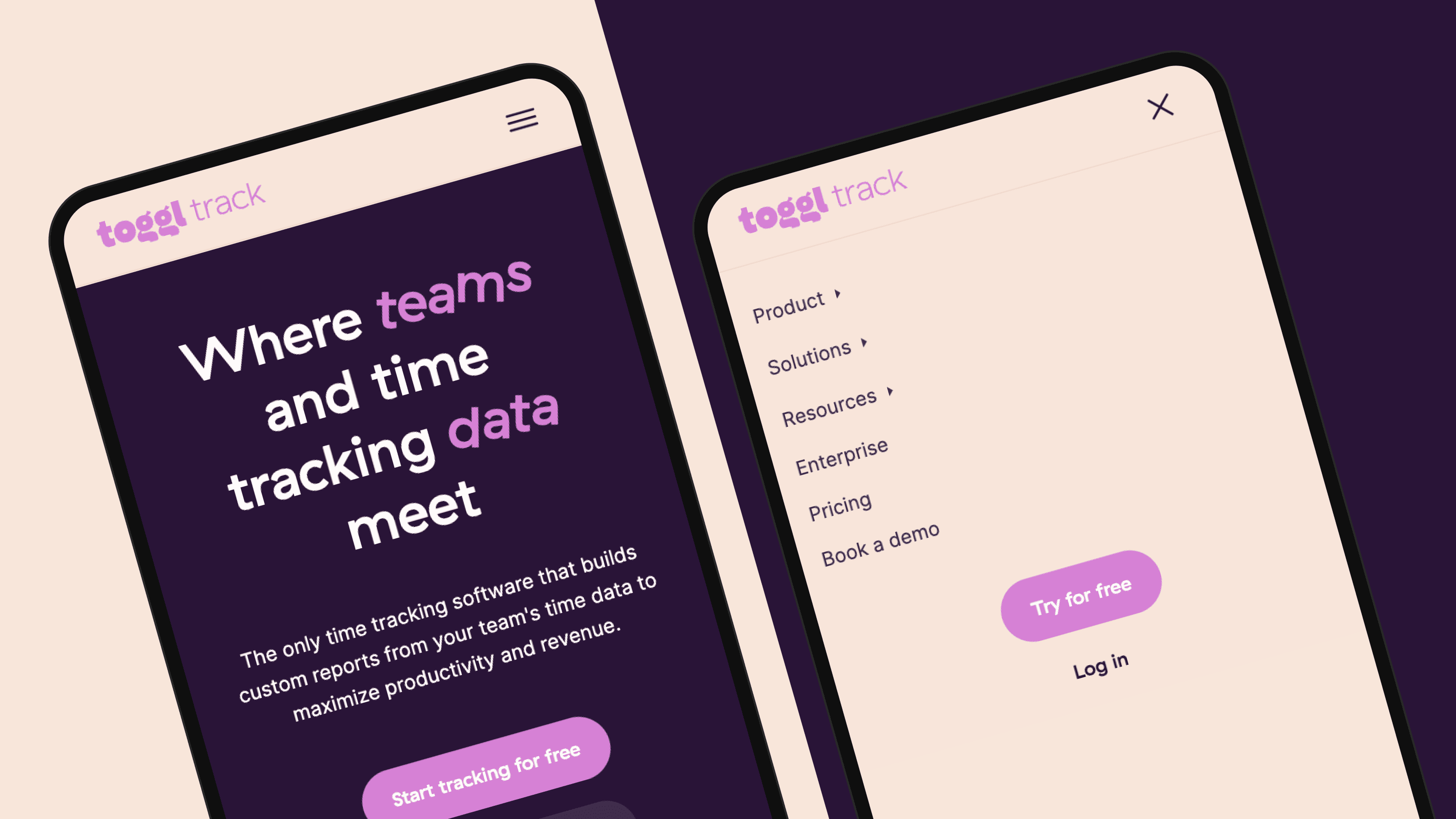
Toggl is a time-tracking application that allows users to track employee time, send client reports and calculate profitability. Its mobile navigation does three things well:
- Full-screen expansion opens the menu cleanly without partial overlays
- Sized icons alongside labels speed scanning for the right destination
- Preview text under company resources gives users context before they tap
Bright colors, clear fonts and large buttons round out a menu that is easy to read and easy to use.
2. UpKeep
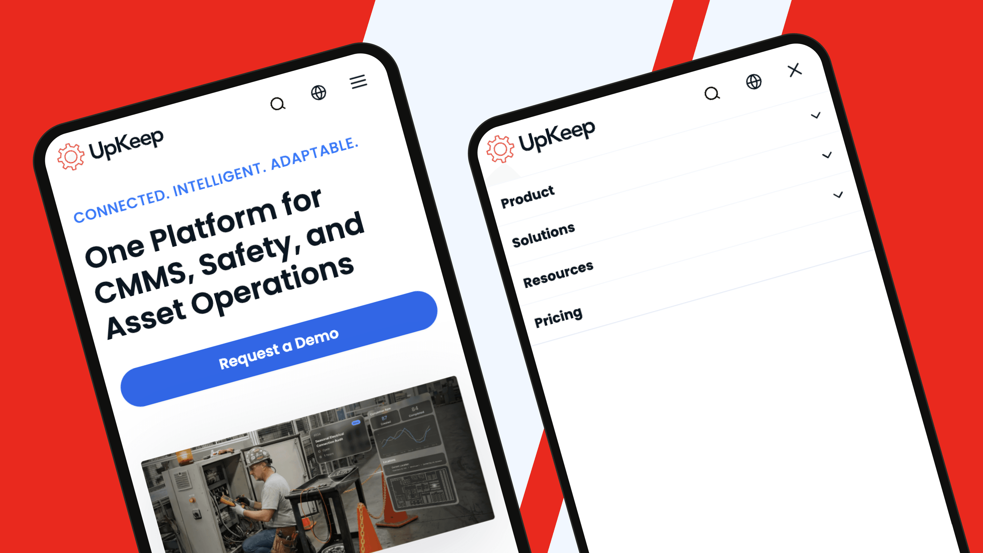
UpKeep, a Webstacks client, provides Computerized Maintenance Management System (CMMS) solutions for maintenance and reliability teams. Like most B2B SaaS sites, UpKeep manages a deep content set spanning customer stories, product pages and a comprehensive learning center.
The mobile menu handles that depth without clutter:
- Minimalist layout delivers all content offerings with generous whitespace
- Two CTAs are clearly visible at the bottom of the menu for high-intent access
- English and Spanish toggle via a globe icon broadens reach without adding friction
The result is a menu that handles enterprise depth while staying approachable for first-time visitors.
3. Loom
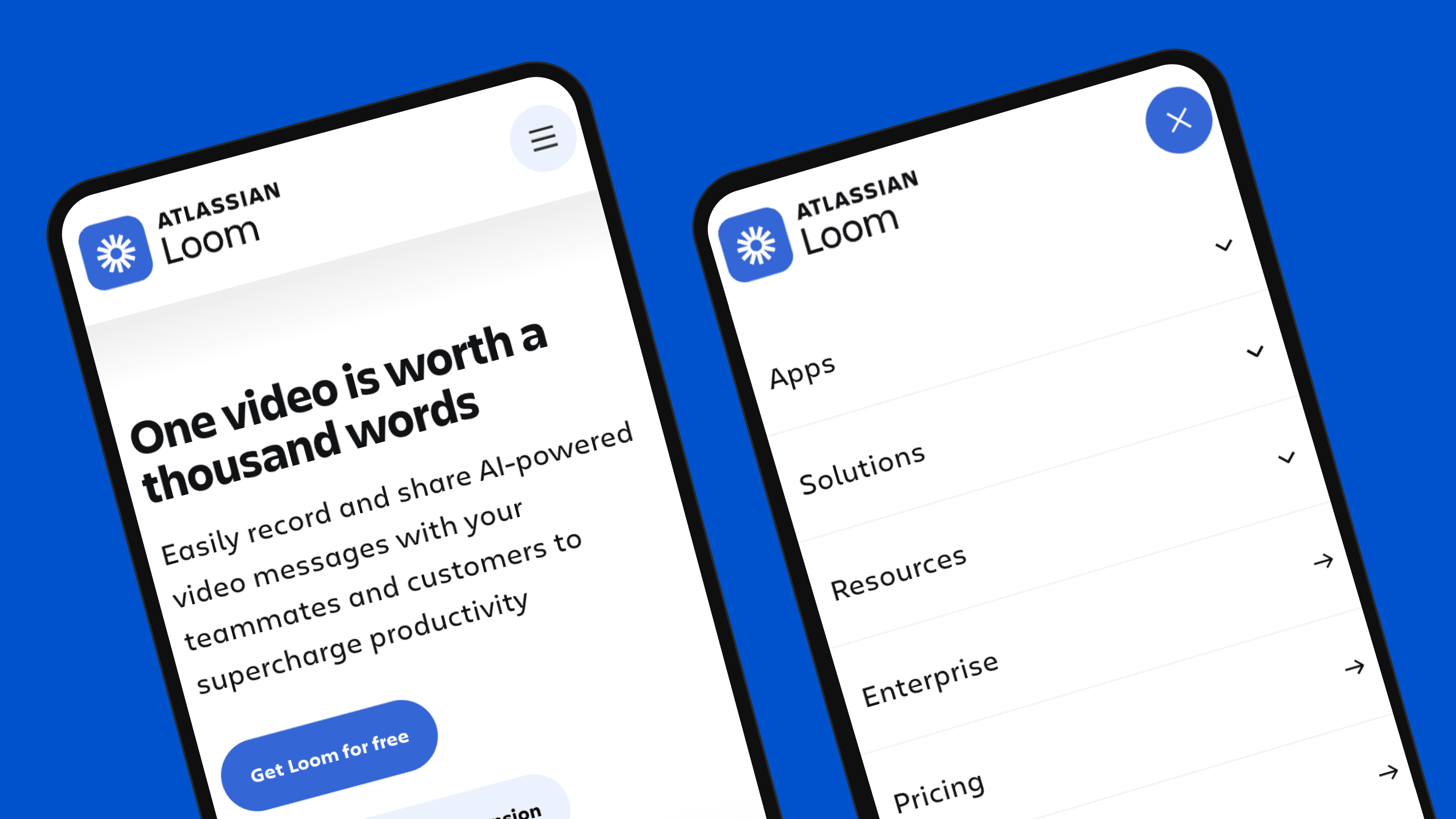
Loom, also featured among the best SaaS pricing pages, is a screen recorder for desktop and mobile devices. Its mobile navigation handles deep architectures gracefully:
- Generous font sizing and spacing keep options legible at a glance
- Nested hamburger menus route users from parent pages to specific mobile landing pages
- Contained expansion means dropdowns open without forcing continuous scrolling
Depth is handled through hierarchy rather than scroll, keeping the interaction feel light.
4. Rippling
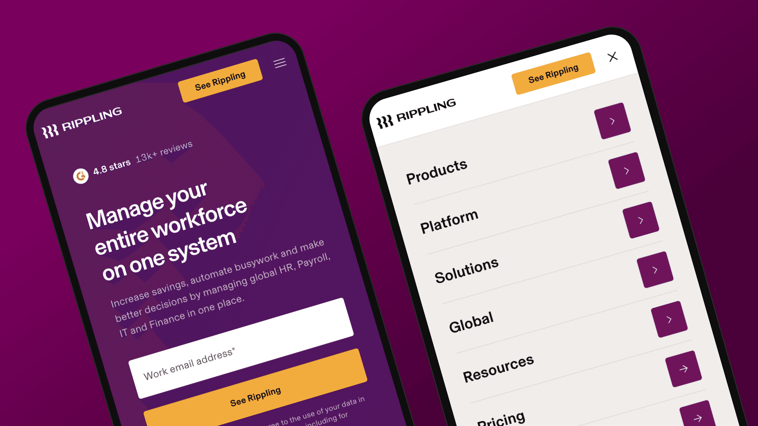
Rippling provides workforce management software for Human Resources (HR), IT and finance teams, with a unified data platform spanning all three. The mobile menu reflects that scope:
- Sub-page layouts with custom icons and typography give each section its own identity
- Region toggle supports English variants for Australia, Canada, France, Ireland, the United Kingdom and the United States
- High-intent demo CTA sits within the menu structure, making conversion one tap away
The menu carries the same design weight as a product surface.
5. Stripe
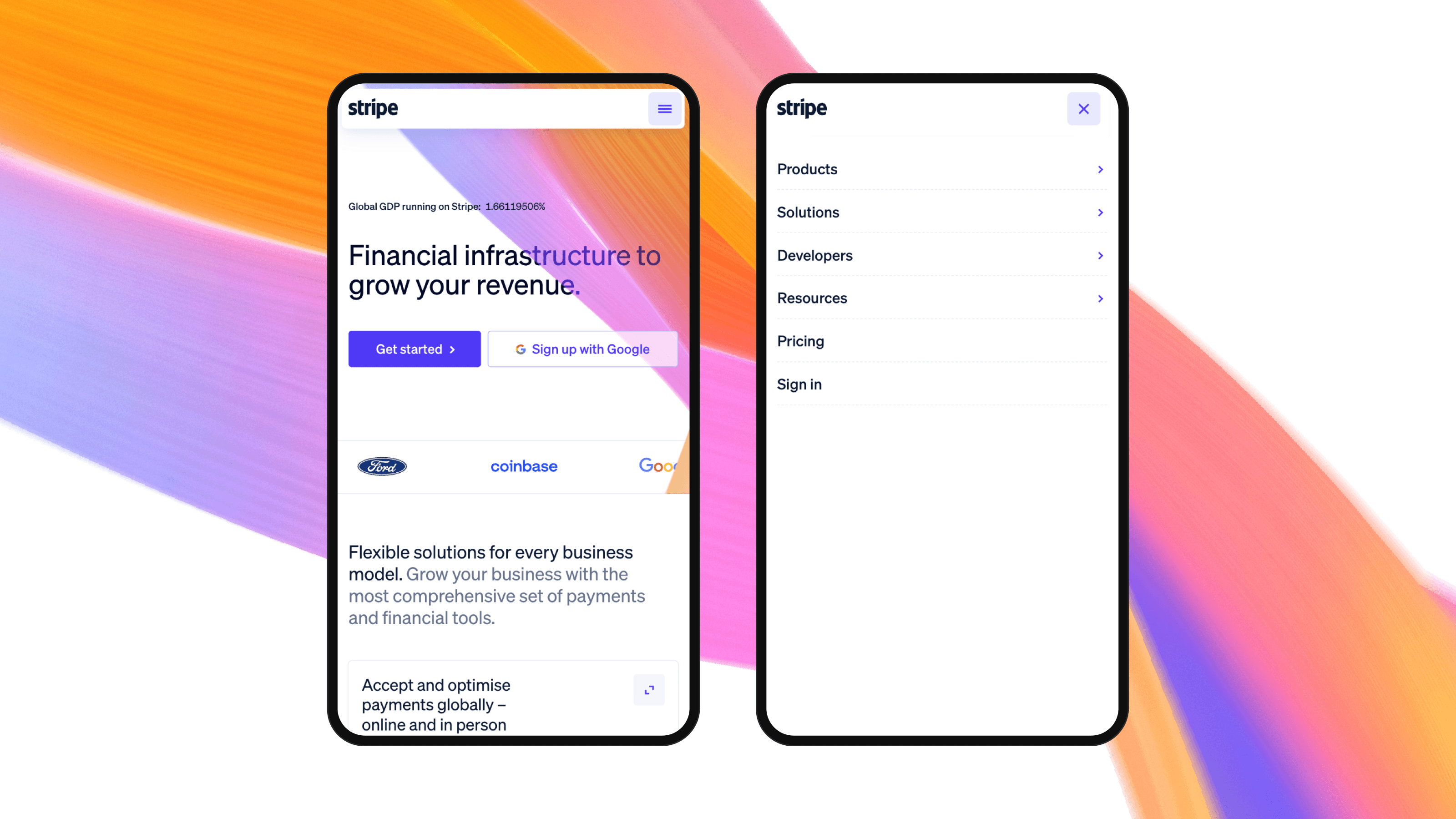
Stripe is a financial services provider offering payment processing software, valued at $159 billion and processing over $1.9 trillion in total payment volume in 2025. Its website is one of the strongest in fintech and manages an enormous content footprint through disciplined mobile navigation:
- Products menu breaks an enormous catalog into clear sub-categories like Payments, Revenue and Money Management that mirror how buyers think about the work
- Solutions menu is structured around buyer self-identification, segmented by company stage, use case and industry
- Developer resources are laid out for scannability, from API documentation to help center articles
Every layer is structured for self-selection, which is what makes deep content navigable on a small screen.
6. Optimizely
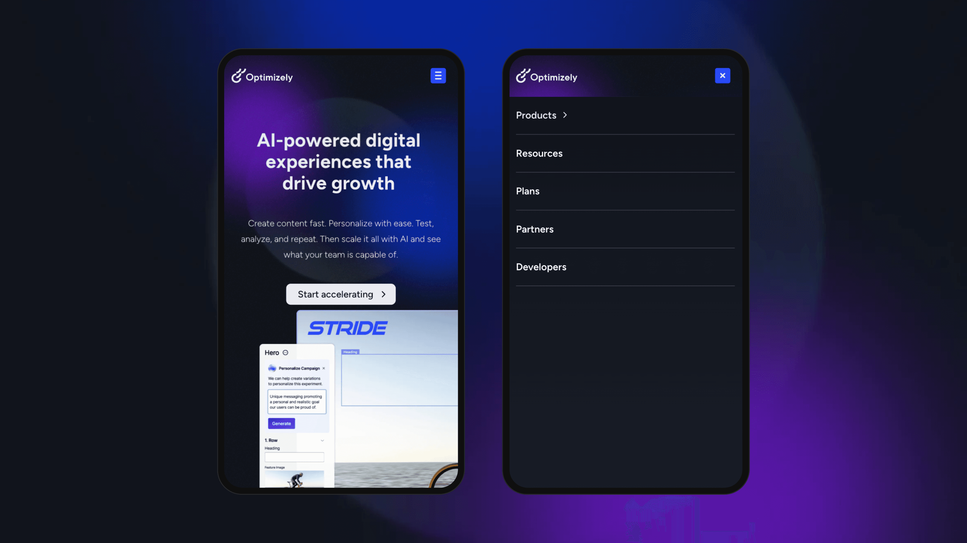
Optimizely operates a digital experience platform covering A/B testing, website personalization and web content management. Its mobile menu shows polish in the details:
- Animated icon transition from hamburger to close state gives clear interaction feedback
- Products submenu opens into a dedicated layout with product use cases, icons and supporting copy
- Direct routing to the resource center skips a layer, sending users to a categorized asset hub
Small interaction details add up to a menu that feels designed rather than templated.
7. Gong
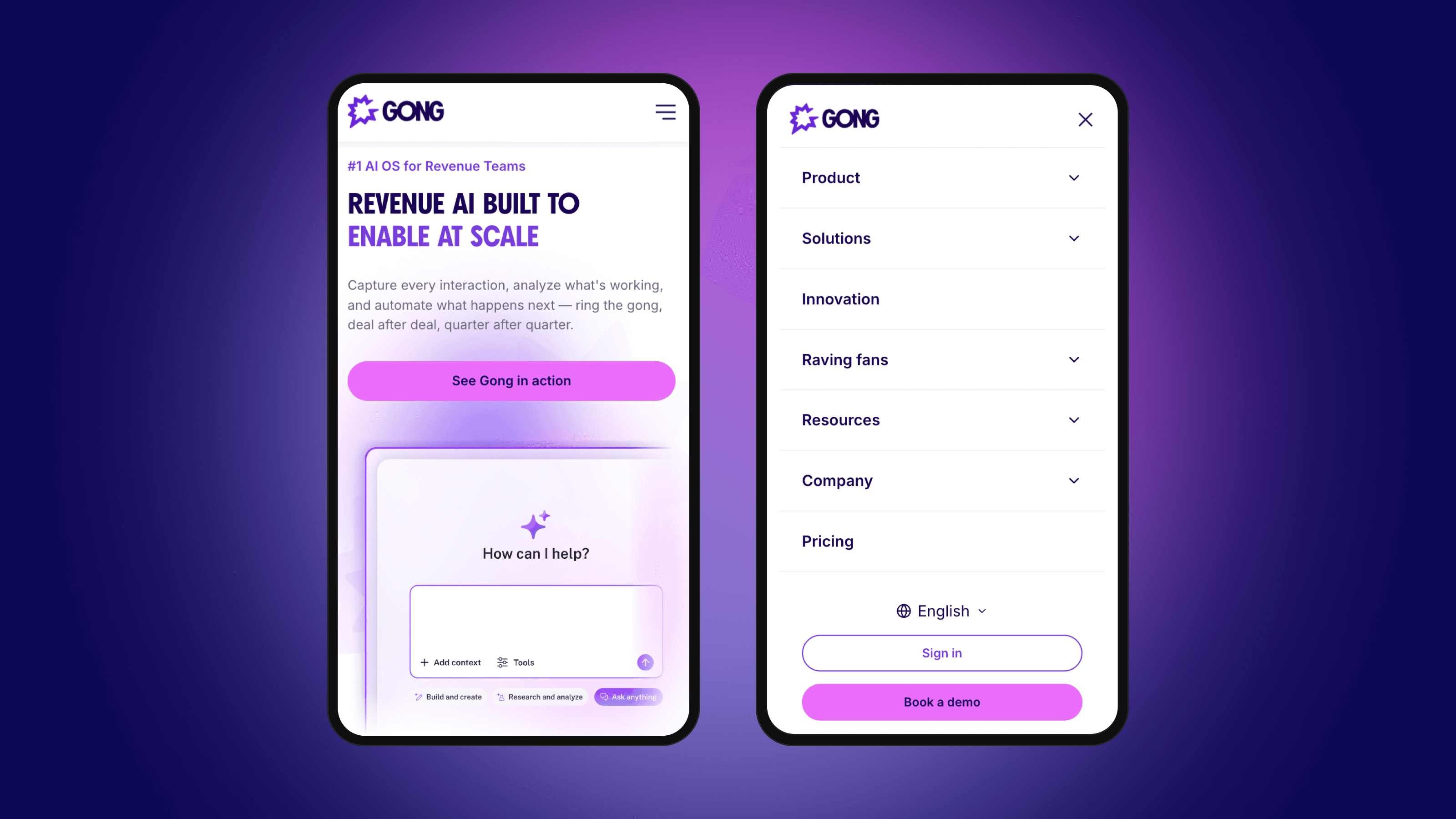
Gong, a Webstacks client, operates a revenue intelligence platform that gives businesses visibility into sales operations. Its mobile menu earns its place through structure:
- Animated icon state confirms each tap with a clear visual transition
- Compact font sizing paired with nested submenus, icons and subtitles keeps depth navigable
- Logical sub-page structure breaks Solutions into Teams and Use Cases for easy scanning
Structure does the heavy lifting, letting the menu carry depth without feeling crowded.
8. Freshworks
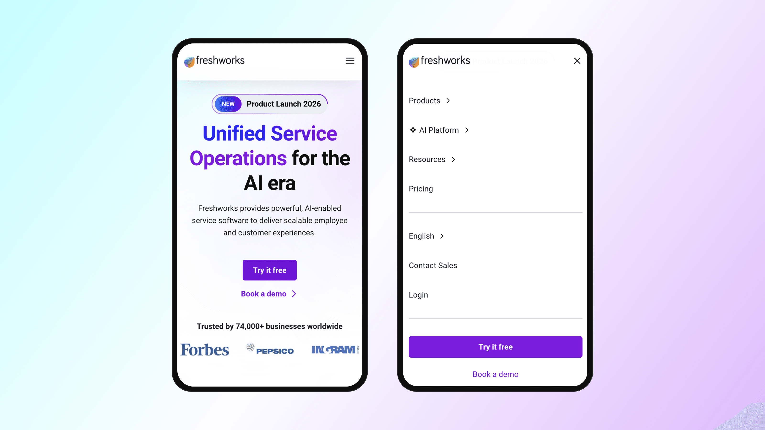
Freshworks offers a suite of business solutions covering multi-channel marketing and Customer Relationship Management (CRM) software. Its mobile menu is built for global reach and clear hierarchy:
- Multi-language support spans English through Portuguese and beyond
- Headers and subheaders on every page give users a logical structure to follow
- The prominent "Try it Free" CTA is impossible to miss for prospects ready to convert
Global reach and conversion intent share the same menu without either getting buried.
Studying production menus is useful, but copying surface-level patterns from competitors rarely works. What separates the menus above from average ones is not the specific pattern choice but the discipline of measuring what works and refining accordingly.
How to Measure Mobile Menu Effectiveness
A mobile menu is only as good as the data behind it. Evaluating effectiveness requires measurements that connect navigation performance to actual business outcomes. For B2B SaaS, navigation success means facilitating the specific actions that move buyers through evaluation stages: accessing technical documentation, comparing pricing tiers, reviewing security certifications, and requesting demos.
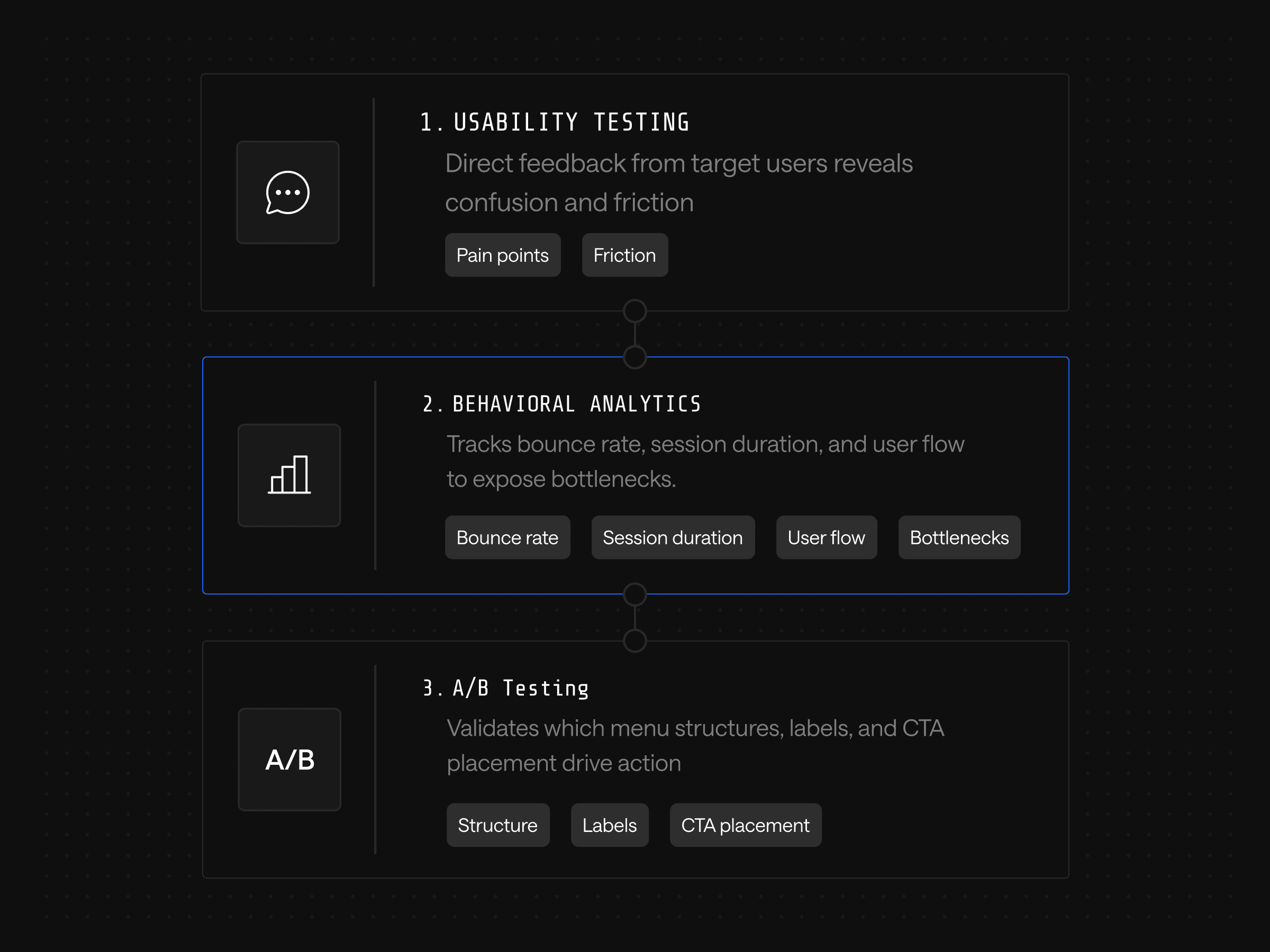
Three measurement layers do this work together:
- Usability testing captures direct feedback from target users, surfacing pain points and confusion that analytics alone will miss
- Behavioral analytics track bounce rate, session duration and user flow through the menu, identifying bottlenecks and dead ends
- A/B testing validates which menu structures, labels and CTA placements actually drive desired actions
When mobile bounce rates climb, look at the menu first; content review can wait. Longer session durations and deeper flows suggest users are finding what they need. Heatmaps and session replays reveal where users tap, hesitate or abandon, exposing patterns that no amount of strategic thinking would predict on its own.
Effective measurement creates systematic knowledge of what specific navigation choices drive results for a specific audience. That knowledge compounds: each test informs the next, and the team builds a competitive advantage in optimization decisions that competitors operating on intuition alone cannot match.
Measurement only delivers value when the architecture allows fast iteration on what the data reveals. The most disciplined testing program produces nothing if every change requires a developer ticket and a release cycle.
Mobile Menu Design as a Component System
Webstacks treats mobile menu design as a component system problem. The composable architecture philosophy turns navigation into a modular system that evolves with performance data and business priorities. Optimization continues long past launch.
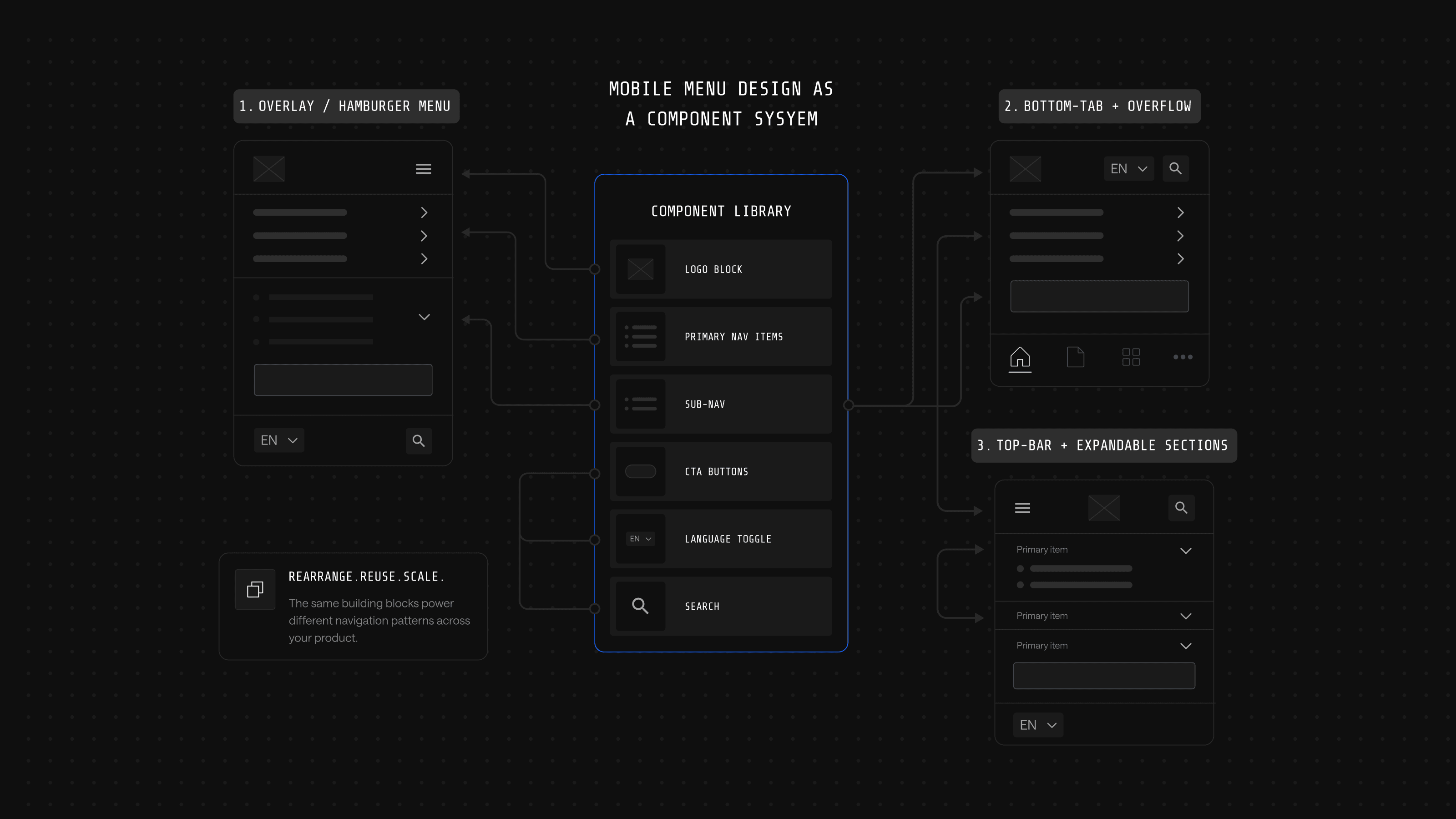
The practical advantages show up in specific moments:
| Scenario | Traditional navigation | Component-based navigation |
|---|---|---|
| New product launches | Full navigation redesign | Reconfigure existing components |
| A/B testing a menu label | Manual updates across every template | Change propagates automatically |
| Information architecture grows | Structure breaks, requires overhaul | System evolves with the business |
| Optimization cadence | Periodic redesign | Continuous iteration |
Solana is one example of this in production. Webstacks rebuilt navigation as a component system for the Solana Foundation, replacing a fragmented, hard-to-maintain structure with a unified design system and a Builder.io content backbone. Solana's content team can now publish and update pages without developer support, and the modular framework lets navigation evolve alongside the blockchain ecosystem rather than forcing a periodic overhaul.
For B2B SaaS companies, this means the mobile menu serves business strategy instead of constraining it. Teams can test different approaches for different personas, implement AI-driven personalization without rebuilding core systems and optimize based on pipeline data rather than engagement metrics alone.
Ready to Treat Your Mobile Navigation as a Growth Product?
Mobile menu design exemplifies the broader challenge facing B2B SaaS marketing teams: balancing immediate tactical execution against long-term architectural decisions. The specific menu pattern chosen today matters less than ensuring the technical foundation supports continuous optimization as the business evolves.
Webstacks builds these adaptive systems for B2B SaaS companies. Composable architectures, design systems engineered for scale and a continuous optimization model that treats navigation as a product rather than a project. Talk to Webstacks to see what a component-based mobile navigation looks like for a growing B2B SaaS business.
Your website is your biggest growth lever—are you getting the most out of it? Schedule a strategy call with Webstacks to uncover conversion roadblocks, explore high-impact improvements, and see how our team can help you accelerate growth.