15 Best B2B Website Design Examples

A well-designed B2B website does more than serve as a digital presence. It’s a valuable business asset that builds user trust throughout complex sales processes and supports prospective buyers at every stage. With modern approaches, many organizations adopt composable and user-friendly designs to drive conversions and cater to sophisticated user journeys.
In brief:
- B2B websites benefit from designs that foster trust across extended sales cycles
- Many organizations use composable architecture for modular, flexible site-building
- Key elements include intuitive navigation, strong CTAs, and consistent branding
- Real-world examples show how these methods improve conversion and user engagement
What is B2B Website Design?
B2B website design means creating online platforms tailored for businesses that sell products or services to other businesses. Unlike B2C websites targeting individual consumers, B2B designs focus on engaging professional decision-makers through detailed information and features that support complex sales processes.
Effective B2B website design emphasizes relationship building and lead generation through comprehensive resources like product information, case studies, and resource libraries.
Key Design Elements of the Best B2B Websites
Your B2B website’s design can make or break your digital success. Let’s explore elements that distinguish high-performing B2B websites from the rest.
Intuitive Navigation and User Flows
Clear navigation helps keep visitors engaged with your content. The best B2B websites feature well-organized menus and logical user paths that guide visitors through their journey.
- Well-Organized Navigation Menus: Keep visitors engaged and help them find information easily.
- Logical User Paths: Guide visitors through their journey on your site.
- Breadcrumb Trails: Help users maintain context while navigating.
- Categorized Options: Assist users in quickly accessing resources, services, and support.
Strategic CTAs and Lead Generation
The best B2B websites convert visitors into leads through strategically placed calls-to-action (CTAs). Using actionable language in CTAs can help increase your conversion rates.
- Prominent CTAs: Place calls-to-action where they are easily noticed.
- Actionable Language: Use language that prompts users to take action, such as “sign up” or “download”.
- Strategic Placement: Position CTAs strategically for maximum visibility.
- Contrasting Colors: Use colors that make CTAs stand out from the rest of the content.
Professional Visuals and Branding
Your visual design directly impacts user trust and engagement. If the content or layout is unappealing, users are more likely to leave your website. High-converting B2B websites maintain consistent branding with the following:
- Clean Layouts: Maintain uncluttered designs for better user engagement.
- High-Quality Visuals: Use images and graphics that are professional and relevant.
- Professional Typography: Choose fonts that enhance readability and brand perception.
- Consistent Color Schemes: Ensure colors align with branding and appeal.
Marketing Tools Integration
Modern B2B websites integrate with marketing and sales tools for better functionality and streamlined processes.
- CRM Integration: Connect your site to customer relationship management systems.
- Marketing Automation: Use tools to automate marketing tasks and workflows.
- Analytics Platforms: Implement analytics to track user behavior and site performance.
- Lead Tracking: Monitor and manage leads generated from the site.
Mobile Responsiveness and Performance
With mobile traffic continuing to grow, responsive design isn’t optional—it’s now a requirement. If your website is too slow, the likelihood of buyers continuing to use it is low.
- Responsive Design: Ensure layouts adapt to any screen size.
- Fast Loading Times: Optimize images and code for quicker load speeds.
- Readable Text: Make sure text is legible without zooming.
- Optimized Interactions: Size buttons and forms appropriately for mobile users.
Best B2B Website Examples
We’ve analyzed 15 leading B2B websites that excel in engaging and converting business audiences through thoughtful design and functionality. Here’s a breakdown of what makes them stand out:
1. Braze
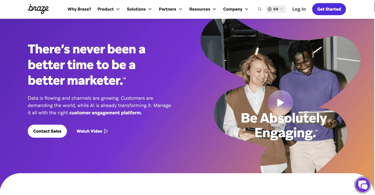
Braze’s website masterfully balances design and functionality, featuring a clean white-and-purple aesthetic. The homepage delivers a clear value proposition with storytelling animations, trust-building testimonials, and measurable stats showcasing the platform’s impact (e.g., increased revenue and reduced support tickets).
With a focus on mobile optimization, cross-channel marketing, and tailored industry solutions, the site enhances engagement while guiding users through intuitive navigation and actionable features.
B2B Web Design Elements We Like From Braze
- 🎨 Modern Aesthetic and clean design
- 📈 Storytelling content
- 🖱️ Prominent demo request and free trial options.
- 📚 Industry-specific content, case studies, and user guides.
- 📱 Ensures consistent performance across all devices.
2. Amplitude
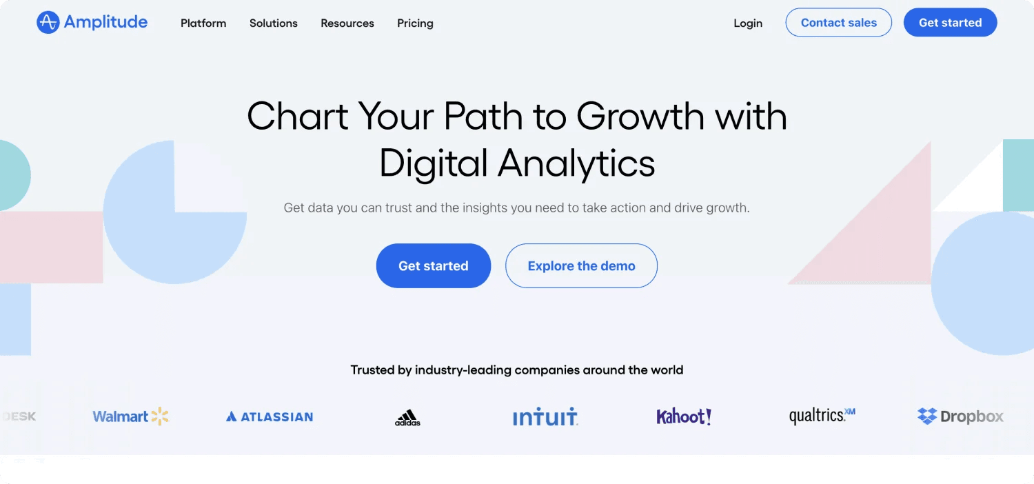
Amplitude’s website combines a modern design with powerful insights into product analytics and growth strategies. The homepage highlights its capabilities with real-world testimonials and statistics.
From the homepage, users can easily reach tools like Session Replay and Experimentation to optimize digital experiences in real time. With seamless navigation and access to resources like the North Star Playbook and monetization frameworks, the platform empowers users to elevate their data-driven strategies.
B2B Web Design Elements We Like From Amplitude
- 🌟 Numerous customer logos build trust.
- 🎥 Key product features are highlighted on the homepage.
- 📖 Easy-to-find downloadable resources such as playbooks.
3. Lattice
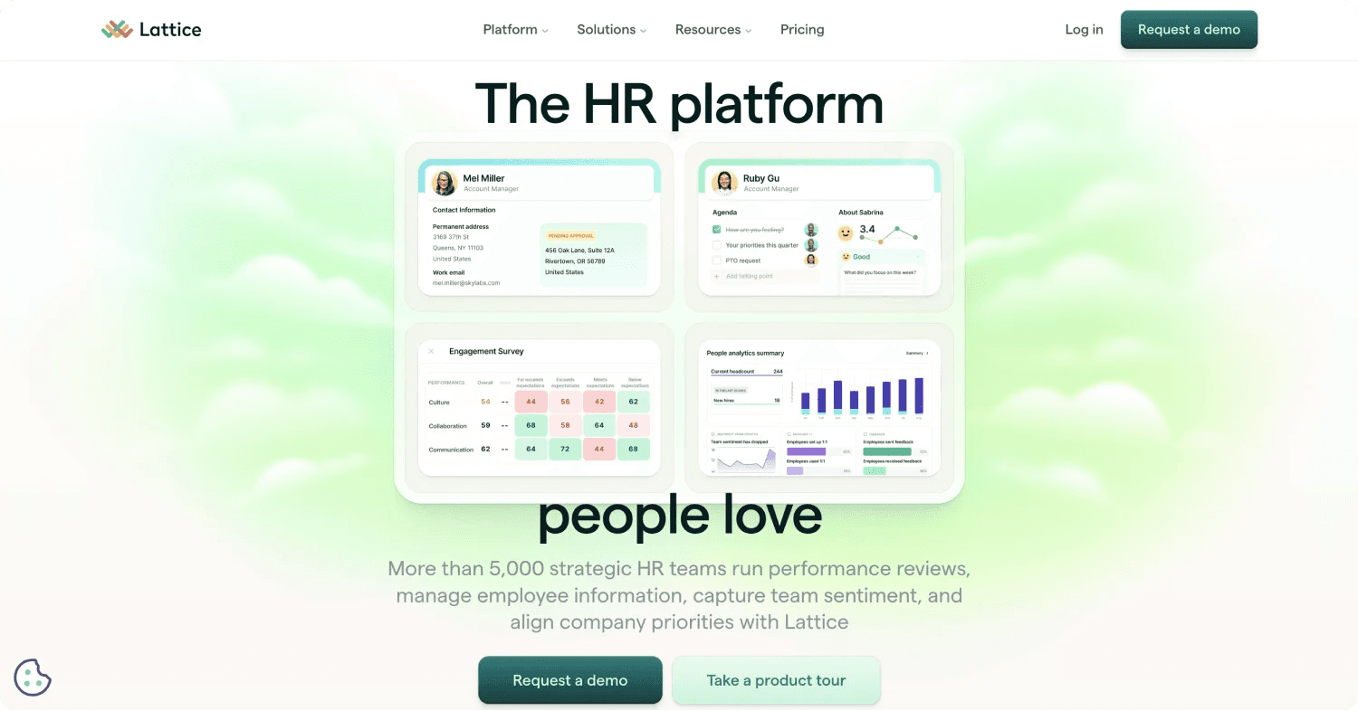
Lattice’s website is thoughtfully designed to reflect its focus on employee performance and HR solutions. With a clean and modern layout, the homepage immediately highlights key features like OKRs, engagement surveys, and AI-powered insights.
Strong user testimonials and success metrics (e.g., 27% reduction in turnover) add credibility, while clear calls-to-action like “Request a Demo” guide users effectively. Seamless navigation and resource-rich sections, including templates, guides, and Lattice University, make the website a valuable destination for HR professionals.
B2B Web Design Elements We Like From Lattice
- 🌟 Clean, soft color palette and design
- 📊 Success stories and stats demonstrate tangible benefits.
- 🛠️ Tools like OKRs, 1:1 agendas, and analytics are easy to explore.
- 🚀 Streamlined pathways to product demos and key solutions.
4. ClickUp
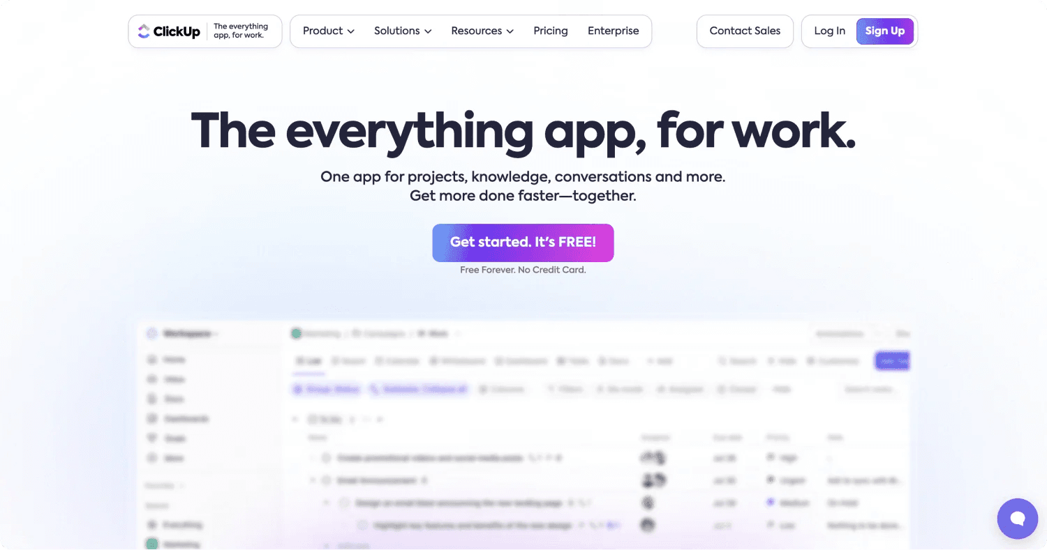
ClickUp’s homepage incorporates drag-and-drop functionality, allowing users to interact with the product directly from the website. It immediately highlights its core message as “The everything app for work,” combining sleek visuals with compelling CTAs like “Get Started. It’s FREE.”
The color scheme creates a vibrant and professional look. The site effectively showcases its features with interactive elements, animations, and clear navigation, ensuring visitors quickly find solutions, pricing information, and anything else they need.
B2B Web Design Elements We Like From ClickUp
- 🎨 A mix of white, black, purple, and green, creating an engaging aesthetic.
- 📊 Clear comparison charts help customers make informed decisions.
- 🖱️ Displays key tools like dashboards, sprints, and automations with minimal scrolling.
- 👍 Highlights whiteboards, collaborative docs, and centralized communications.
5. Cribl

Cribl’s website is designed with simplicity and clarity, emphasizing its role as the “Data Engine for IT and Security.” The homepage uses a clean white and blue color scheme with bold black accents, creating a professional and visually engaging aesthetic.
The site effectively showcases its core offerings, such as data routing, transformation, and observability solutions, through straightforward navigation and clear sections. CTAs like “Explore the Data Engine” and “Try a Sandbox” are strategically placed to guide users toward demos, trials, and more hands-on experiences. Customer stories and success metrics add credibility, while integrations with popular tools enhance its appeal.
B2B Web Design Elements We Like From Cribl
- 🎨 Clean white and blue design with bold black accents
- 📈 CTAs that encourage user engagement.
- 📊 Highlights customer success stories with measurable results
6. Retool
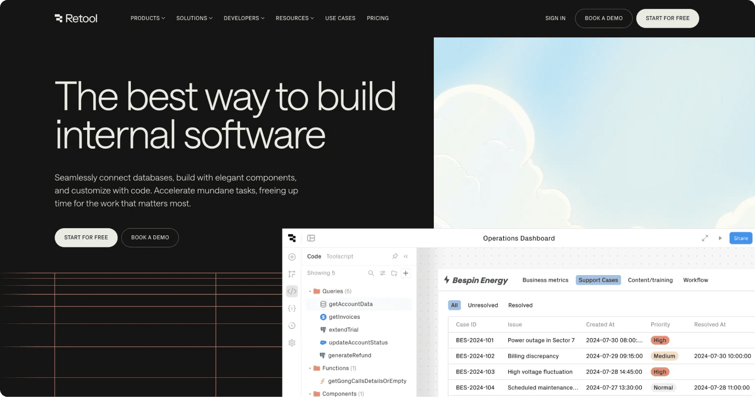
Retool’s website delivers a seamless user experience with a clean and developer-focused design. The color scheme primarily uses black and light gray, complemented by engaging animations, to draw attention to important elements like CTAs.
The homepage highlights Retool’s core offerings for building custom software through its intuitive messaging and detailed visuals. CTAs like “Start for Free” and “Book a Demo” are strategically placed to encourage quick action, emphasizing simplicity and accessibility for developers of all levels.
The site is well-organized, with clear navigation to explore features like integrations, workflows, and templates, ensuring visitors can easily find relevant solutions.
B2B Web Design Elements We Like From Retool
- 🎨 Striking dark theme with vibrant accent colors
- 🖱️ Strong CTAs to guide users effectively.
- 🔗 Highlights 70+ integrations, including APIs, databases, and cloud storage.
7. ServiceTitan
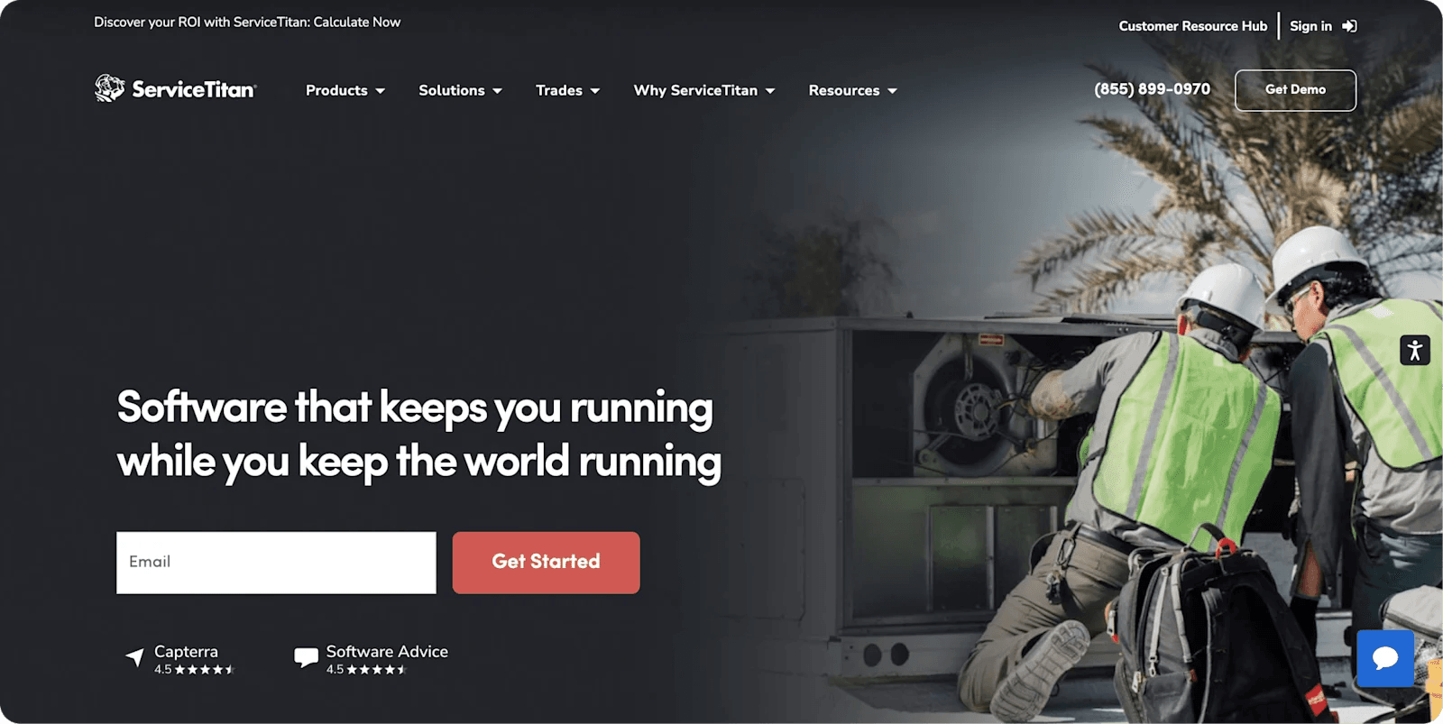
ServiceTitan’s website is tailored for contractors and service professionals, offering a clean and professional design. The homepage clearly conveys the platform’s value with features like real-time scheduling, intelligent dispatching, and customer experience tools.
The color scheme uses white, blue, and gray, while well-placed CTAs like “Get Demo” guide users effectively. Detailed sections for industries, features, and resources ensure users can quickly find relevant solutions and explore how the software can grow their business.
B2B Web Design Elements We Like From ServiceTitan
- 🎨 White and blue design with red accents for highlighting actions.
- 🖱️ CTAs like “Take a Tour” encourage engagement and exploration.
- 💬 Customer success stories highlight measurable business growth.
8. Rippling
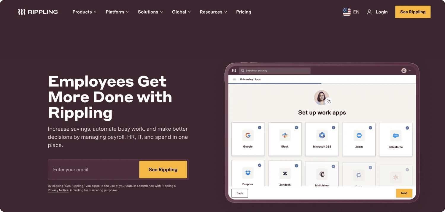
Rippling’s sleek homepage leads with a compelling value proposition and clear messaging that immediately communicates the benefits of its platform. The website features clean lines and modern design elements. Live chat integration is available, offering immediate customer support and fostering engagement with potential clients.
Animated graphics simplify complex service descriptions, making it easier for visitors to understand what Rippling offers. The site also highlights integrations with various tools, emphasizing flexibility and scalability.
B2B Web Design Elements We Like From Rippling
- 🖥️ Minimalist white and dark purple design with orange accents for CTAs.
- 💬 Live chat integration to offer immediate customer support.
- 🌐 Easy navigation with dedicated sections for solutions and resources.
9. Notion
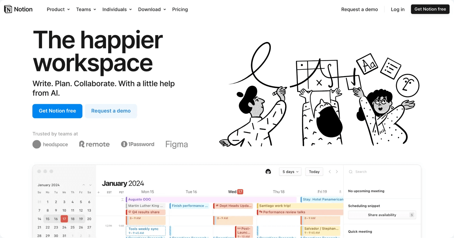
Notion’s website reflects its versatility and focus on streamlined productivity with a clean, minimalist design. The homepage effectively communicates its all-in-one approach, integrating docs, projects, and AI tools into a unified workspace.
The color scheme primarily uses white and black, with subtle color accents to maintain a modern and professional feel. CTAs like “Get Notion free” and “Request a demo” are strategically placed to encourage user engagement. With sections highlighting features such as templates, collaborative tools, and AI-powered automation, the site provides a clear path for exploring its capabilities.
B2B Web Design Elements We Like From Notion
- 🎨 Minimalist white-and-black design with subtle highlights.
- 🖱️ CTAs that focus on onboarding new users.
- 🛠️ Features 30,000+ templates to help users customize their workflow.
10. UpKeep

UpKeep’s website is designed to cater to maintenance and reliability teams with a professional and practical layout. The homepage clearly showcases its mobile-first approach to asset operations management with tools for work order management, preventive maintenance, and analytics.
The color scheme is dominated by white and blue with orange accents, which effectively highlight key CTAs. Detailed sections on features, industry use cases, and customer success stories make it easy for visitors to understand how UpKeep optimizes operations and reduces downtime.
B2B Web Design Elements We Like From UpKeep
- 🎨 White and blue design with orange accents to highlight CTAs.
- 🖱️ CTAs like “Start a Free Trial” guide users to immediate action.
- 📋 Features such work order management and analytics are prominently displayed.
- 💬 Customer success stories, such as McDonald’s and Orangetheory Fitness, add credibility.
11. Vanta
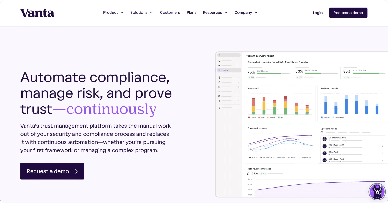
Vanta’s website is sleek and modern, effectively showcasing its compliance automation platform. The homepage highlights how Vanta simplifies processes for frameworks like SOC 2, ISO 27001, and GDPR through continuous automation.
The color scheme uses white with purple accents for emphasis. Metrics such as productivity boosts to demonstrate the product’s impact. Navigation is intuitive, with sections for solutions by business size, integrations, and partner programs, making it easy for users to explore offerings.
B2B Web Design Elements We Like From Vanta
- 💬 AI-powered chatbot for live chat as you enter the website.
- 🖱️ CTAs like “Request a Demo” guide users to immediate action.
- 📊 Highlights impressive metrics, like saving users time and boosting productivity.
12. Sanity
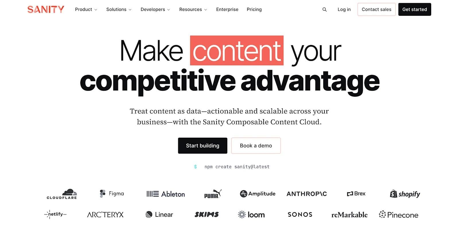
vantSanity’s website delivers a sleek and modern interface that reflects its focus on composable content. The homepage promotes its “Content Operating System” with features like Sanity Studio and APIs.
A clean white background is paired with black text and red highlights, while CTAs like “Start Building” encourage user action. The site emphasizes flexibility with customizable templates and developer tools. Real-time collaboration and AI-powered features are prominently featured, appealing to teams aiming for scalability.
B2B Web Design Elements We Like From Sanity
- 🎨 White design with red accents for a clean, modern look.
- 🖱️ CTAs like “Book a Demo” and “Start Building” encourage engagement.
- 🌟 Customer success stories from brands like Puma and Tata Digital.
13. Vercel
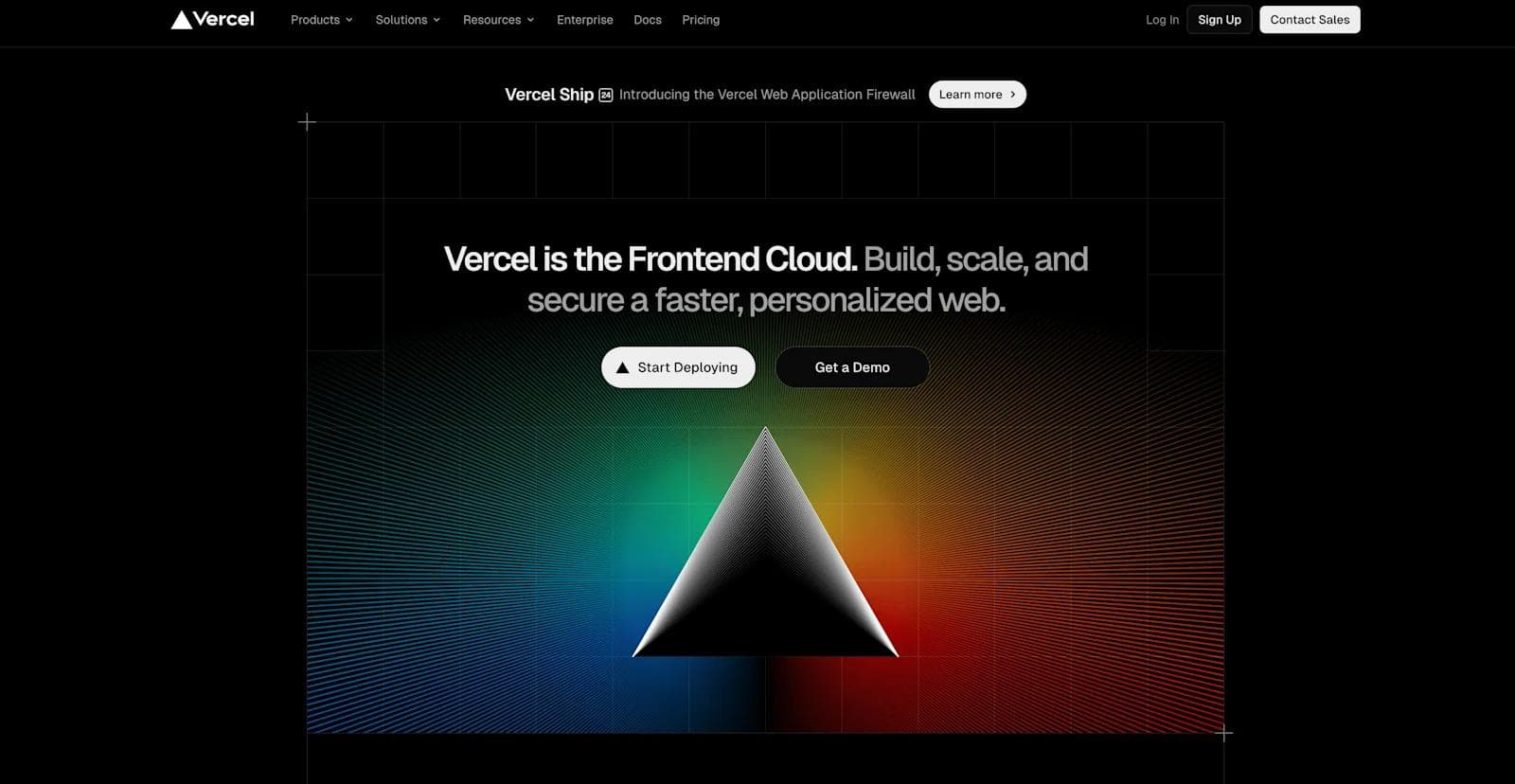
Vercel’s website is sleek and developer-focused, highlighting its platform for building and deploying web experiences. The homepage emphasizes speed, scalability, and performance, with features like Git-connected deploys, serverless storage, and real-time insights.
A modern black-and-white theme with colorful accents reinforces a tech-driven aesthetic. CTAs like “Start Deploying” and “Get a Demo” are prominently placed to attract immediate engagement. The site’s navigation is straightforward, guiding users to explore its tools for frontend developers, deployment infrastructure, and global scalability.
B2B Web Design Elements We Like From Vercel
- 🎨 Black-and-white design for a tech-savvy look.
- 🖱️ CTAs to encourage quick onboarding.
- 🌟 Highlights instant rollbacks, observability tools, and elastic scalability.
14. Marvin
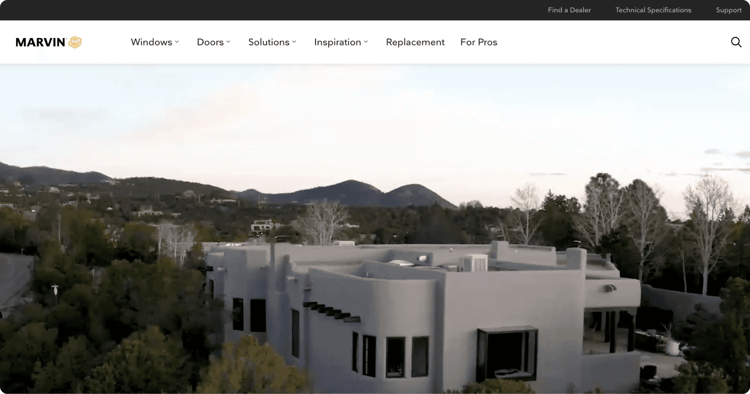
The Marvin website highlights its dedication to creating custom windows and doors that merge design and functionality. The homepage combines sleek visuals with storytelling, showcasing project case studies and customer testimonials.
The white-and-black color palette, accented with yellow, gives the site a refined and inviting feel. CTAs such as “Find a Dealer” and “Get Details” guide users to explore personalized solutions. The site is well-structured, offering inspiration galleries, professional resources, and in-depth product details to cater to architects, builders, and homeowners alike.
B2B Web Design Elements We Like From Marvin
- 🎨 White-and-black design creates a clean aesthetic.
- 🖱️ CTAs like “Find a Dealer” encourage engagement with local experts.
- 📋 Features galleries and case studies to inspire design choices.
15. 3form

3form’s website showcases its focus on sustainable and innovative architectural solutions. The homepage highlights key products like recycled resin panels, partitions, and acoustic solutions, paired with a sleek and modern layout.
The color scheme incorporates clean whites and grays with pops of vibrant color to accentuate its eco-friendly focus. The site includes resources for architects and designers, such as material guides and installation tips, alongside an emphasis on sustainability with 100% recycled materials.
B2B Web Design Elements We Like From 3form
- 🎨 Clean white-and-gray design with vibrant accents for a modern look.
- 📋 Provides in-depth resources for architects and designers, including material guides.
- 🌟 Features innovative solutions like translucent panels and acoustic partitions.
Why B2B Websites are Going Composable
B2B websites are increasingly adopting composable architectures to enhance flexibility, scalability, and user experience. This approach involves assembling independent, specialized software modules—known as Packaged Business Capabilities (PBCs)—that handle specific tasks like product management, payments, and marketing.
These modules communicate through APIs, allowing businesses to tailor their digital platforms to specific needs.
Key Benefits of Composable Architecture for B2B Websites
- Flexibility and Agility: Modular components enable rapid updates and integration of new features, allowing businesses to respond swiftly to market changes.
- Scalability: Independent scaling of components ensures optimal performance during varying traffic loads, accommodating business growth without overhauling the entire system.
- Enhanced User Experience: Composable architecture allows for the creation of personalized and seamless digital interactions, meeting the high expectations of B2B buyers.
- Cost Efficiency: By reusing existing components and integrating best-of-breed solutions, businesses can reduce development time and expenses.
- Future-Proofing: The modular nature of composable architecture enables easy incorporation of new technologies, ensuring the platform remains up-to-date with industry advancements.
Companies that have adopted composable architecture report benefits such as increased conversion rates, improved development efficiency, and better customer satisfaction.
Ways to Upgrade Your B2B Website
If your B2B website needs a fresh look, consider upgrading it with any of the following:
Website Redesign
Your website redesign should prioritize user experience while maintaining SEO performance.
Key elements to focus on include:
- User-centric design that reflects your target audience’s needs
- Mobile-responsive layouts that work across all devices
- Clear navigation structures to help users find information quickly
- Implementing accessibility best practices to ensure your site is usable for all visitors
Before starting your redesign, analyze your current website’s performance data to identify what works and what doesn’t. Consulting a B2B website redesign guide can help you navigate this process effectively.
CMS Migration
Moving to a modern CMS (Content Management System) can transform your website’s capabilities and performance. When selecting a new CMS:
- Prioritize built-in features that improve user experience
- Easy integration with marketing tools
- Scalability to support growth
- Advanced SEO capabilities to enhance search rankings.
Content Marketing
Content marketing plays a strong role in driving traffic and establishing authority. Research shows that successful B2B content strategies focus on educational content that addresses:
- Industry pain points
- SEO-optimized blog posts targeting specific keywords
- Comprehensive resources like whitepapers and case studies
- Regular updates to maintain engagement
Adopting Marketing Tools
Integrating advanced marketing tools can dramatically improve your website’s effectiveness. Key tools to consider include:
- Analytics platforms for tracking user behavior and conversion paths
- CRM systems for managing customer relationships
- Marketing automation tools for leading and nurturing
- A/B testing tools for optimization
Ready for a Better B2B Website?
Today’s B2B websites need more than good looks. They require strategic design that drives results. As you’ve seen from these leading examples, modern B2B sites combine intuitive navigation, compelling value propositions, and composable architecture to create powerful digital experiences. Take time to evaluate your website against these benchmarks and consider how strategic improvements could transform your online presence.
Ready to take your B2B website to the next level? Download Webstacks' Best B2B SaaS Websites eBook to discover more inspiring examples and actionable insights that can transform your digital presence.

I create SEO-driven content for B2B SaaS companies, from blog posts to case studies. I focus on research-backed writing that ranks on the first page and drives meaningful organic traffic.


