
Podcast landing pages are central hubs that pull together all podcast content so listeners can access everything seamlessly. With embedded episode streams, show notes, and extra resources, they make it easier for people to find and enjoy your content.
In this article, we'll dive into the key components of successful podcast landing pages, covering essential design elements, content strategy, and SEO best practices. By putting these all together, you can create a compelling online space that attracts new listeners and keeps your audience engaged.
In brief:
- Podcast landing pages act as central hubs for all your podcast content, boosting listener engagement and making it easy to access.
- Good landing pages include embedded media players, highlight top episodes, offer subscription options, and have a complete episode library.
- Using clear headers, consistent branding, simple navigation, and ensuring your page is mobile-friendly improves the user experience.
- Bringing all these key components and best practices together creates a compelling online space that draws in new listeners and keeps your audience coming back.
What is a Podcast Landing Page?
A podcast landing page is the central spot for all your podcast content. It's the place where listeners can access everything about your podcast series.
With an embedded media player, they can listen to episodes right on your site without needing to go elsewhere, which encourages more engagement.
Also, having a well-organized episode library on your landing page lets listeners easily browse through past episodes, often with extra content like videos or social media posts. This rich collection makes the overall listening experience better.
What Should Be Included on a Podcast Landing Page?
Creating a compelling podcast landing page for your B2B website will help you attract and keep listeners. Here are some key elements you should include:
- Embedded Media Player: Make sure your podcast landing page has an embedded media player so visitors can listen to episodes right on your site.
- Episode Showcase: Put your latest or most popular episodes front and center on your landing page. This gives new visitors a taste of what you offer and keeps existing fans engaged by highlighting standout episodes.
- Subscription Options: Provide clear links or buttons for subscriptions, making it simple for listeners to follow your podcast on platforms like Spotify, Apple Podcasts, and Google Podcasts.
- Podcast Description: Include a concise and engaging description of your podcast on your landing page. Mention what's unique about it and who it's for to quickly draw in potential listeners. Think of this description as your podcast's elevator pitch.
- Episode Library: Keep a well-organized library of past episodes on your landing page. This lets users explore your whole catalog, and adding search or filter functions can make navigation even better.
- Guest Submission Section: If your podcast features guest interviews, include a dedicated section on your landing page where potential guests can apply. Clearly state what you're looking for and any requirements.
Podcast Landing Page Design Best UX Practices
Here are some best practices to keep in mind when designing your podcast page’s UX:
- Headers and Concise Copy: Use clear and engaging headers on your landing page to grab visitors' attention right away. Keep your copy concise but informative, highlighting key details like guest speakers or episode themes. This way, you keep their interest without overwhelming them.
- Branding: Use your podcast's branding consistently across your landing page. This means integrating logos, color schemes, and typography to boost recognition and build trust with your audience. A cohesive brand identity helps users quickly associate the page with your podcast.
- Easy Navigation: Make navigation simple with intuitive menus and well-placed search bars on your landing page. This helps users easily find episodes, subscription options, and more.
- User-Friendly Layout: Focus on a clean and organized layout on your landing page. Adopting a minimalist page design can help present information without clutter. Use a good balance of text, images, and multimedia to present information effectively. Making good use of white space can draw attention to key elements and improve readability.
- Mobile Responsiveness: As more people access content on mobile devices, make sure your landing page is optimized for different screen sizes. Following a responsive design checklist and following mobile website design best practices will create a great experience for users on smartphones and tablets. Additionally, it's important to improve site speed to ensure quick loading times on mobile devices, enhancing user experience.
Best Podcast Landing Page Examples
Chilipiper

chilipiper podcast
Chili Piper’s podcast page delivers a visually engaging experience designed to captivate B2B marketers. With a bold mix of deep purple and vibrant orange, the design feels dynamic and energetic, reinforcing the brand’s personality.
The hero section clearly communicates the podcast’s value, featuring a striking cover image, a short but compelling description, and direct links to Spotify and Apple Podcasts.
Below, episodes are arranged in a card-based grid with guest headshots, making the content feel more personal and credible. Strategically placed CTAs encourage both immediate listening and email signups, ensuring continued audience engagement beyond the page.
Standout Elements
- 🎨 Vibrant, Branded Design – The bold orange and deep purple color scheme creates a high-energy, modern aesthetic.
- 🎧 Episode Grid with Faces – Featuring guest photos improves credibility and makes content more engaging.
- 🔗 Multi-Platform Listening Links – Direct links to Spotify and Apple Podcasts improve accessibility.
- 📩 Minimalist Email Signup – A simple, well-placed newsletter signup encourages ongoing audience engagement.
Lattice

lattice podcast
Lattice’s podcast page offers a clean and engaging layout, highlighting its All Hands podcast, which features leadership insights from top HR professionals.
The page uses a soft, pastel color palette combined with professional headshots and bold typography to create a friendly yet authoritative tone. A horizontal episode filter allows easy navigation between seasons, while neatly arranged episode cards provide clear entry points to each discussion.
Below, a dedicated host bio section adds credibility, and a prominent email subscription banner encourages continued audience engagement. The design balances approachability with professionalism, reinforcing Lattice’s focus on people-first leadership.
Standout Elements
- 🎨 Playful Yet Professional Design – Soft pastels and abstract patterns create a welcoming, modern aesthetic.
- 🎙️ Season-Based Navigation – A clean toggle system makes it easy to browse episodes by season.
- 📩 Subtle Email CTA – A visually distinct but non-intrusive signup form encourages continued audience engagement.
ServiceTitan

servicetitan podcast
ServiceTitan’s Toolbox for the Trades podcast page delivers a structured, professional, and highly functional layout tailored to home and commercial service professionals.
The page features a dark, high-contrast design with a clear, hero section showcasing the podcast’s branding, audio streaming options, and the latest featured episode.
A grid-based layout organizes episodes efficiently, making it easy to browse discussions on leadership, marketing, and business growth. The host, Jackie Aubel, is prominently featured at the bottom, adding credibility and a personal touch.
The pagination system enables seamless episode discovery, and the "Get on the Show!" CTA encourages engagement.
Standout Elements
- 🎙️ Highly Structured Episode Grid – A clean, card-based design makes finding relevant topics quick and intuitive.
- 🎧 Integrated Audio Player – Allows users to listen to episodes directly on the page without external redirects.
- 🏗 Industry-Specific Content Focus – Tailored for service professionals, reinforcing ServiceTitan’s brand authority.
Gong

gong podcast
Gong’s Reveal: The Revenue AI Podcast page embraces a bold, high-contrast purple theme that aligns seamlessly with Gong’s branding.
The hero section features a large podcast title, tagline, and embedded video player, offering a strong first impression. Hosted by Dana Feldman, the podcast focuses on insights from top sales leaders, exploring AI-driven revenue strategies.
Below, the "Recently Added" section presents episodes in a grid format with soft, pastel-colored cards, making them easy to scan. The clean layout, well-spaced typography, and CTA buttons drive engagement, while footer elements reinforce Gong’s credibility with links to enterprise solutions and resources.
Standout Elements
- 🎙️ Striking Visual Identity – A deep purple palette with gradient overlays and bold typography ensures strong brand consistency.
- 🏆 Host Highlight Section – Dana Feldman’s profile and career credentials add credibility to the podcast.
- 🔄 Minimalist Episode Cards – Soft-colored, well-structured blocks enhance readability and navigation.
- 🎧 Embedded Listening Options – Users can easily play episodes or jump to Apple Podcasts and Spotify for streaming.
Mailchimp

mailchimp podcast
Mailchimp’s podcast hub, Mailchimp Presents, stands out as a curated digital media experience rather than a typical podcast directory. The dark-themed hero section features a bold visual identity with cinematic photography and a prominent callout to the featured show, “Art of Work.”
Below, a grid-based layout elegantly showcases diverse shows spanning podcasts, films, and docuseries, each with a visually rich, magazine-style cover.
The design creates a highly immersive browsing experience, aligning with Mailchimp’s branding as a creative-first company. The page concludes with a highlighted show, "Call Paul," featuring a striking image and integrated audio player.
Standout Elements
- 🎨 Magazine-Style Design – Each podcast is displayed like a standalone editorial piece, using bold colors and high-quality imagery.
- 📺 Multi-Format Content – The platform doesn’t just feature podcasts but includes films and docuseries, broadening its storytelling scope.
- 🔊 Integrated Audio Player – The “Call Paul” feature at the bottom includes a waveform visualization.
Ahrefs

ahrefs podcast
The Ahrefs Podcast page embodies a bold, high-energy design that reflects the brand’s data-driven, SEO-centric personality.
The dark background enhances the vibrant, high-contrast thumbnails, which feature eye-catching colors, bold typography, and expressive guest images.
The custom-stylized podcast logo at the top is modern and playful, while the wave-like audio pattern adds a dynamic touch. Episodes are categorized by season, making it easy to explore content. The episode thumbnails mimic YouTube-style previews, while the footer highlights host Tim Soulo, reinforcing his role as a trusted voice in the SEO community.
Standout Elements
- 🔥 Bold Visual Branding – The vibrant, high-contrast thumbnails with oversized text drive maximum engagement and readability.
- 🎬 YouTube-Style Episode Previews – Each episode features video integration, making it feel like a cross-platform content hub.
- 🎧 Audio Wave Motif – A dynamic, wave-like divider visually reinforces the podcast theme.
Circle

circle podcast
The Circle Money Movement Podcast page presents a modern, futuristic design that aligns with the crypto and financial technology space. The dark-themed episode thumbnails feature a sleek, gradient wave motif that conveys a sense of motion and innovation.
The hero section is clean and minimal, with the podcast title and a large, engaging image of the host.
Episodes are organized by seasons, making navigation intuitive. The social icons and subscription CTA are placed strategically for seamless engagement. Overall, the page blends authority, professionalism, and a tech-forward aesthetic.
Standout Elements
- 🌊 Wave Motif Integration – A unique, undulating wave element connects sections visually and reinforces the “Money Movement” branding.
- 🎥 Polished Guest Thumbnails – Episode previews are unified in a professional, dark-gradient style, giving a sophisticated, editorial look.
- 📩 Clean Newsletter Signup Section – The CTA for updates is subtly embedded without overwhelming the primary podcast content.
- 🎙 Multi-Platform Listening Options – The integration of Spotify, YouTube, and Apple Podcasts ensures accessibility and audience reach.
Atlassian

atlassian podcast
Atlassian’s Work Check podcast page is a refreshingly clean and structured experience, designed to make workplace debates feel engaging and accessible.
The hero section immediately sets the tone, featuring a bold question that mirrors the podcast’s discussion-based format.
A large, contrasting CTA button invites users to dive into the latest episode. Below, episodes are neatly organized in a linear, scroll-friendly layout, each with an embedded audio player, a short description, and a clear “Listen now” button.
The content is approachable yet authoritative, with a conversational tone that aligns with the brand’s productivity-focused ethos.
Standout Elements
- 🎧 Embedded Audio Players – No need to leave the page; users can listen to full episodes inline, making for an uninterrupted browsing experience.
- 📢 Debate-Style Formatting – Episode titles are framed as questions, reinforcing the discussion-driven nature of the show.
- 🎙️ Meet the Voices Behind the Mic – A dedicated host and guest section at the bottom makes the podcast feel more personal and expert-driven.
- 📩 Simple but Effective Newsletter CTA – The “Stay Updated” signup blends naturally with the page without feeling intrusive.
Zendesk

zendesk podcast
Zendesk’s Conversations with Zendesk podcast page takes a polished, editorial-style approach, making it feel like an extension of a high-quality business insights publication.
The clean, structured layout immediately communicates expertise, with a bold, magazine-like headline and a featured episode that draws the eye.
Below, episodes are presented as digestible articles, each with a short, scannable summary and a vibrant, structured thumbnail. There’s an emphasis on AI-driven customer experience, reflecting Zendesk’s brand positioning. The overall aesthetic is sleek and professional, with a minimalist color palette, strong typography, and well-spaced content that guides the reader smoothly down the page.
Standout Elements
- 🎨 Magazine-Like Visuals – The podcast thumbnails use a bold, editorial-style design, making each episode feel premium and structured.
- 📖 Article-Like Summaries – Instead of just listing episodes, each has a compact, readable snippet, reinforcing Zendesk’s storytelling focus.
- 🔗 Seamless Blog Integration – The podcast page blends smoothly with Zendesk’s broader content ecosystem, making it feel like part of a bigger thought leadership initiative.
- 📩 Email Subscription CTA with a CX Focus – The page naturally encourages signups with a clear, benefit-driven newsletter prompt rather than just a generic opt-in.
ClickUp

clickup podcast
ClickUp’s "When It Clicked" podcast page brings a fresh, story-driven approach to business success. Instead of dry case studies, it focuses on the "aha" moments that defined major companies like Google Docs, Rippling, and Shopify.
The design is modern and polished, with a clean white backdrop, soft gradients, and playful illustrations that give the page a friendly, engaging feel. A floating laptop and mobile device mockup at the top immediately establishes a tech-forward vibe, while large, easy-to-read sections make navigation seamless.
The overall tone is conversational yet insightful, reflecting ClickUp’s brand as both innovative and approachable.
Standout Elements
- 💡 Illustrated Storytelling – Each episode is introduced with quirky, custom illustrations, reinforcing ClickUp’s visual identity and making the topics feel approachable.
- 🎙 Emphasis on "Aha" Moments – The storytelling angle makes this more than just another business podcast—it's about turning points and game-changing decisions.
- 🌈 Soft Gradient Visuals – The mix of pastel gradients and rounded UI elements adds a welcoming, almost whimsical touch.
- 🏆 Interactive Listener Feedback – The "Leave a Review" and "Follow on Twitter" section at the bottom actively invites audience engagement, keeping the conversation going.
Build the Podcast Landing Page Your Podcast Deserves
Creating a podcast landing page that truly connects with your audience is key to maximizing engagement and reach.
An effective landing page should include essential elements like a clear header, concise copy, and strong branding to instantly communicate what your podcast is all about. You’ll want to add compelling visuals and interactive features, like an embedded media player, so visitors can listen to your episodes right from the page.
By focusing on these key components, your landing page becomes more than just a place to listen—it's a vibrant hub for all your podcast content. If you need help crafting or optimizing your podcast landing page strategy, consider teaming up with Webstacks for expert guidance and resources.
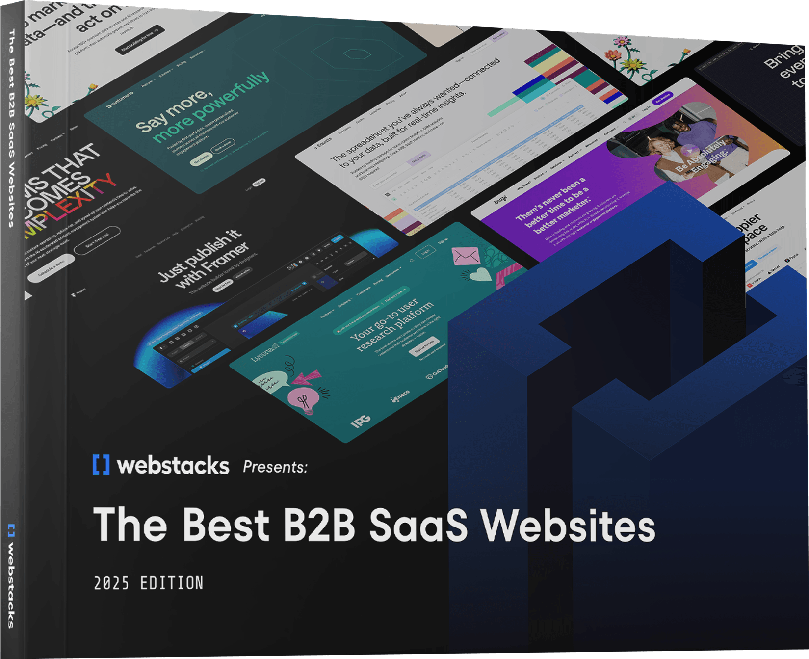
Ready to take your B2B website to the next level? Download Webstacks' Best B2B SaaS Websites eBook to discover more inspiring examples and actionable insights that can transform your digital presence.