8 Best Multi Step Form Examples in 2025
Are you seeing significant abandonment rates on key form submissions? Do you want to capture more data points from leads?
For either of these situations, you should consider adopting multi-step forms.
A multi-step form (also called wizard form or progressive form) divides the input fields into several smaller, logical sections or steps, which the user progresses through in sequence.
Implementing a multi-step form on a website can provide measurable benefits in terms of user experience, conversion optimization, and lead generation.
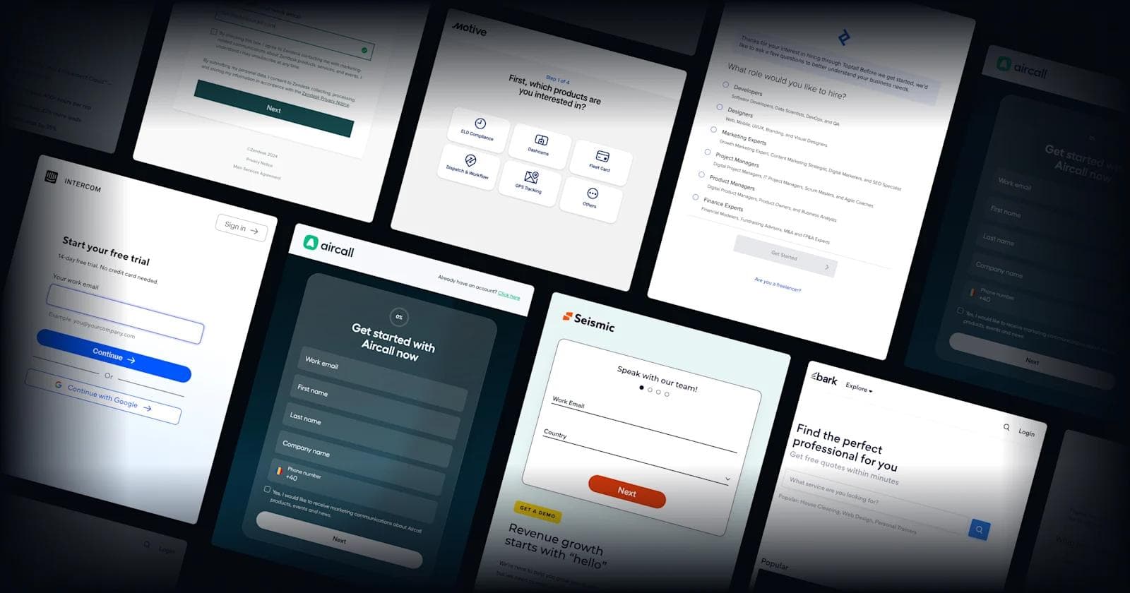
This article explores why multi-step forms are so effective, and provides high quality examples from some of the best SaaS websites.
Webstacks websites don’t just look good—they scale with you and drive real results.

When Should You Use Multi-Step Forms?
Multi-step form design breaks down complex tasks into smaller chunks, helping users stay focused and avoid overwhelm.
They're ideal for intricate processes like sign-ups, detailed feedback surveys, and comprehensive applications.
Recognize moments when user patience might be tested by a lengthy form.
During onboarding, a multi-page form can transform an exhaustive list of queries into an engaging step-by-step discovery. A multi-step form with progress bar gives users a clear sense of where they are in the process and how many steps remain, which lowers frustration and increases completion rates.
When filtering leads, a stepped form allows dynamic interaction, adjusting to the user's previous responses.
Multi-Step Form Use Cases
- Lead Generation: Captures essential contact information and segments leads through progressive questions, focusing attention on promising prospects.
- Free Trial Sign-ups: Breaks the process into smaller segments, lowering barriers to entry and improving conversion rates.
- Product Demos and Consultations: Facilitates a customized approach, tailoring the demo or consultation to the user's specific interests.
- Interactive Experiences: Turns quizzes and assessments into engaging experiences, maintaining interest and encouraging completion.
What Are the Benefits of Multi-Step Forms?
⏭️ Progressive Disclosure
Multi-step forms excel in managing user engagement through progressive disclosure. This approach strategically spaces out information requests across multiple steps, significantly reducing the overwhelm associated with confronting a barrage of fields at once.
➕ More Data Collection
Breaking down forms while increasing engagement means you can successfully gather more data from prospects without them getting bored and not converting.
👥 Enhanced User Experience
Segmenting complex forms into smaller, digestible parts drastically improves the user experience. This segmentation allows users to concentrate on a single question cluster at a time, thereby reducing cognitive load and increasing the likelihood of form completion.
🧭 Clear Navigation
Multi-step forms help users understand exactly where they are in the process and how much further they have to go, facilitating smooth transitions between steps and empowering users with the ability to navigate the form efficiently.
🚶 Lowered Form Abandonment Rates
The structure of multi-step forms inherently reduces the likelihood of user abandonment. By presenting information in bite-sized pieces, these forms make the data entry process seem less arduous and time-consuming compared to traditional, lengthy single-page forms.
🧠 Conditional Logic
The use of conditional logic is a hallmark of multi-step forms, enabling a personalized form-filling experience by adapting subsequent questions based on the user's previous responses. This intelligent design ensures that users only see the most relevant questions, streamlining the process and enhancing the quality of data collected.
☑️ Streamlined Data Validation
With data being input incrementally, multi-step forms simplify the validation process, allowing for real-time accuracy checks at each step. This methodical approach to data entry minimizes errors while enhancing the overall integrity of the data collected.
👀 Aesthetic Appeal
The division of a form into multiple steps opens up vast possibilities for creative and visually appealing designs. With the ability to assign a distinct visual theme to each step, designers can craft an aesthetically pleasing journey that captivates users and enhances their interaction with the form, making the data collection process both effective and enjoyable.
10 Multi Step Form Best Practices

1. Clear Progress Indicators
Display clear, visually prominent indicators of the user's current position in the form and the total number of steps.
- Why? This transparency reduces user anxiety by providing a sense of control and progress, making the form appear more manageable and less overwhelming.
2. Consistent Visual Design
Ensure all steps of the form maintain a uniform visual theme, including consistent use of colors, fonts, and styling.
- Why? A consistent design reinforces your brand identity and contributes to a seamless, cohesive user experience that builds trust and familiarity.
3. Intuitive Navigation
Design navigation elements like "Next" and "Back" buttons to be easily identifiable and accessible, enabling effortless progression through each step.
- Why? User-friendly navigation is key to the form's usability, encouraging completion by allowing users to move through steps without confusion or frustration.
4. Tone
Enhance the form with appealing copywriting that delights, supports, and engages the end-user.
- Why? Creating a more encouraging user experience can increase user satisfaction and form completion rates.
5. Mobile Responsiveness
Adopt a responsive design that ensures the form is easily navigable and visually coherent across a range of device sizes, particularly mobile screens.
- Why? With the increasing prevalence of mobile internet usage, ensuring a form is mobile-friendly is essential for reaching a wider audience and preventing drop-offs due to poor user experience.
6. Conditional Logic
Use conditional logic to dynamically alter which form fields are displayed based on the user's inputs, showing only relevant questions.
- Why? Tailoring the form in this way not only personalizes the user's experience but also streamlines the completion process by eliminating unnecessary fields.
7. Minimized Cognitive Load
Limit the amount of information presented at each step to avoid overwhelming the user, breaking down the required input into digestible sections.
- Why? Reducing cognitive load can significantly improve focus and engagement, leading to higher completion rates and more accurate data collection.
8. Feedback for User Actions
Offer immediate feedback for actions taken within the form, such as completing a step or encountering an error.
- Why? Real-time feedback informs users of their progress and any issues, reducing confusion and frustration that could lead to form abandonment.
9. Optimized Form Fields
Carefully consider the layout and spacing of form fields to promote readability and ease of completion.
- Why? A well-organized form minimizes user effort and enhances the overall experience, encouraging thorough and accurate submissions.
10. A/B Testing
Regularly conduct A/B testing on various design elements to identify which configurations yield the best completion rates and user engagement.
- Why? Continuous iteration based on direct feedback allows for the refinement of the form design, ensuring optimal performance and user satisfaction.
11. Give Users the Option to Save and Resume Later
Adding save and resume functionality gives users the flexibility to pause and come back without losing progress.
- Why? Not everyone can complete a multi-step form in one go, especially when the form requires detailed inputs like team size, budget, or technical specs.
8 Multi Step Form Examples in SaaS
Now, let’s take a look at some real-world multi-step form design examples.
1. Zendesk
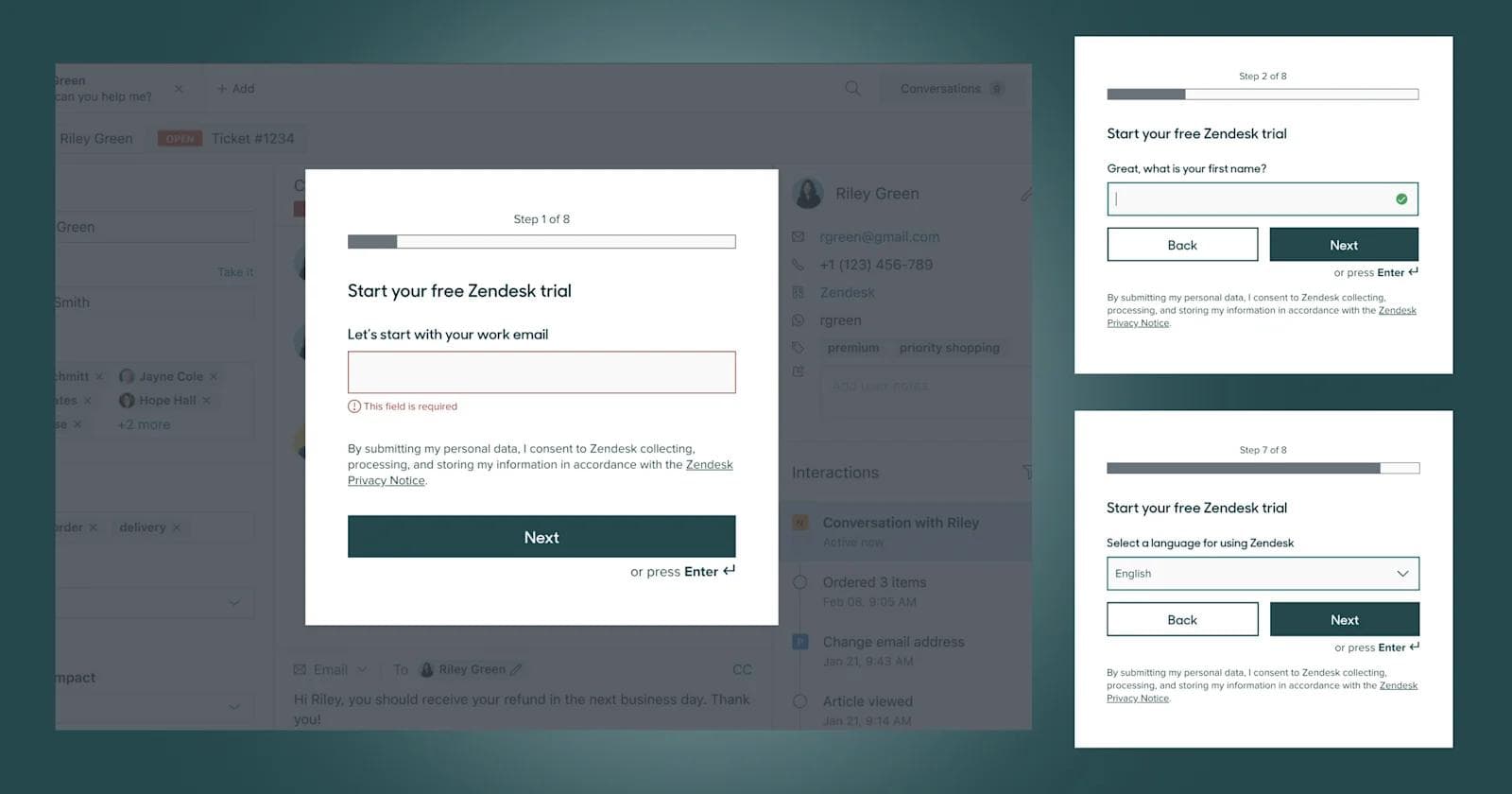
📢 Callouts
- 8-step form
- Overlaid on top of demo to entice completion
- Simple questions with 1 field per page
- Casual personable copywriting
2. Motive
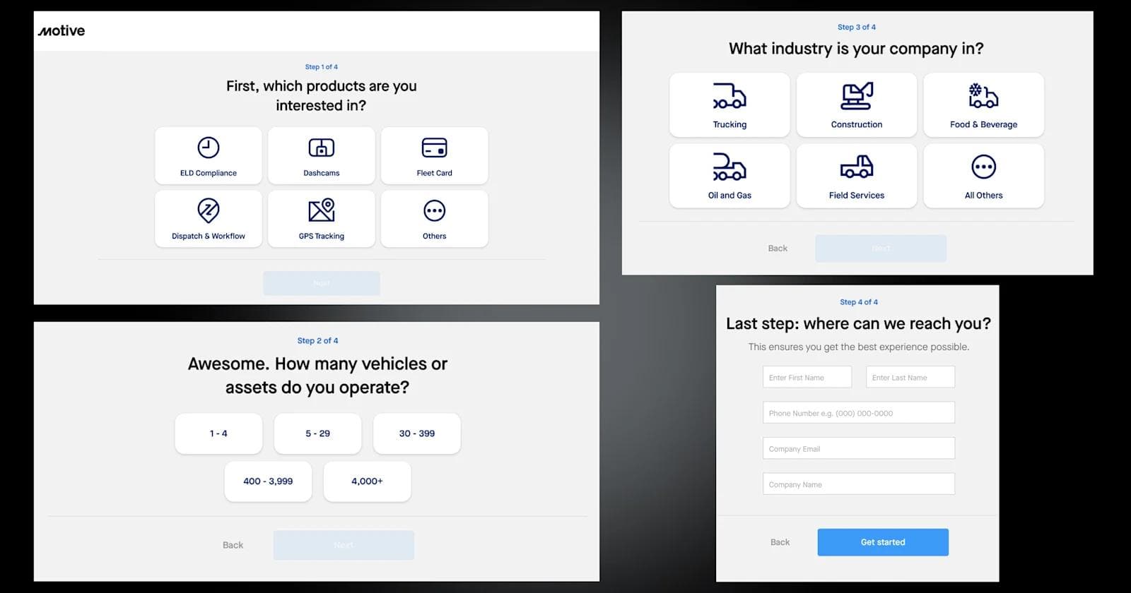
📢 Callouts
- 4-step form
- Increased interactivity with buttons and eye-catching icons
- Placeholder field text
- Instantaneous form loading speeds
3. Toptal
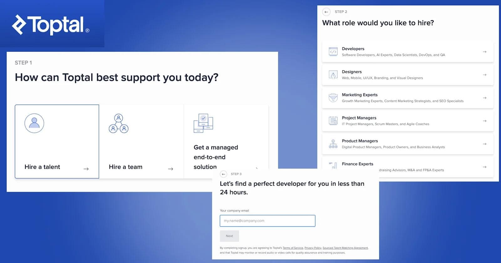
📢 Callouts
- A prominent side trust bar with client logos
- Straightforward, single-choice questions
- Inclusion of meeting scheduling details within the form
4. ServiceTitan
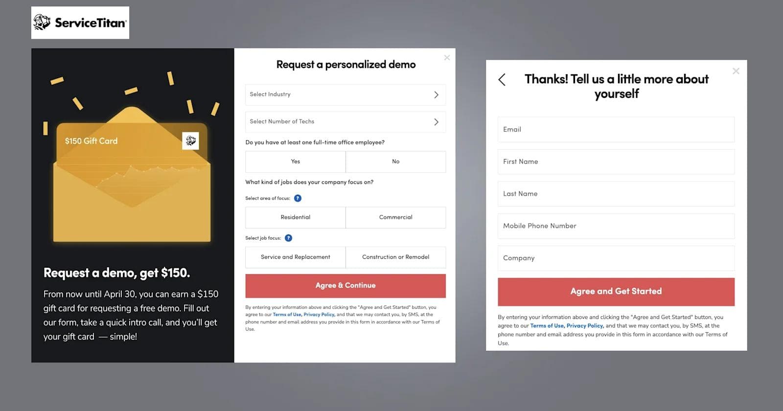
📢 Callouts
- A 2-step form submission
- Excellent feedback and responsiveness
- Copywriting that reaffirms the ease of completion
- No contact info required on first form
5. Intercom
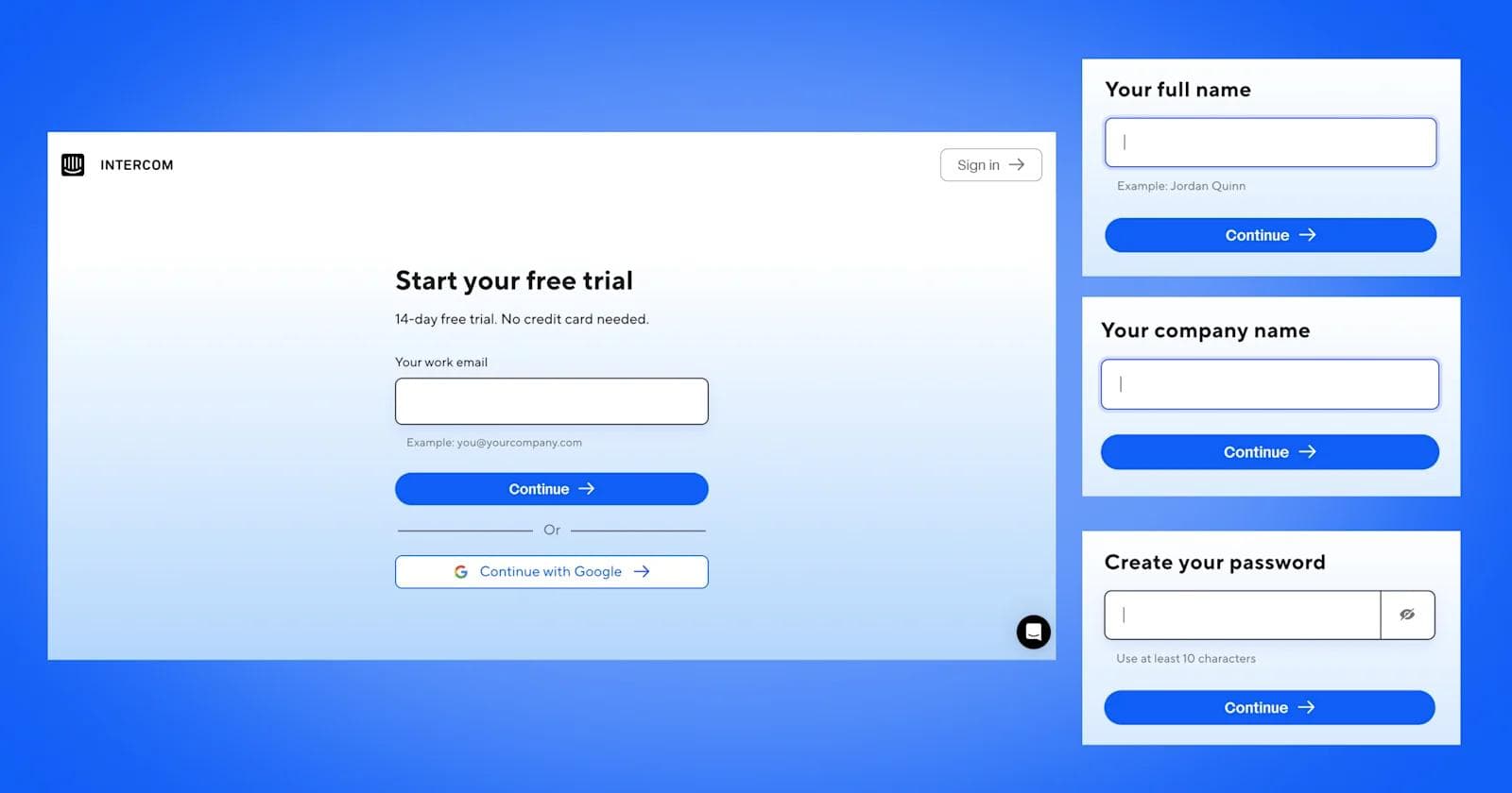
📢 Callouts
- Blue gradient background
- A progress bar to indicate advancement
- Minimalism with one question per page
6. Aircall
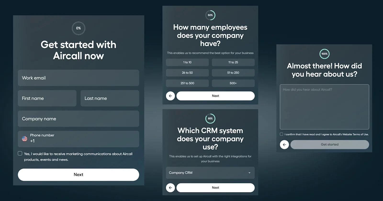
📢 Callouts
- A percentage completion wheel
- Colorful, clean interface
- Bold headings and supporting text
- Accordion design for CRM-related questions
7. Seismic
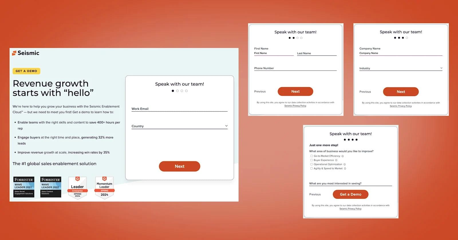
📢 Callouts
- Complete landing page with supporting content
- Awards, logo bar, and client testimonials
- Drop-down selections to simplify the UI
- A dotted progress bar
8. Bark.com
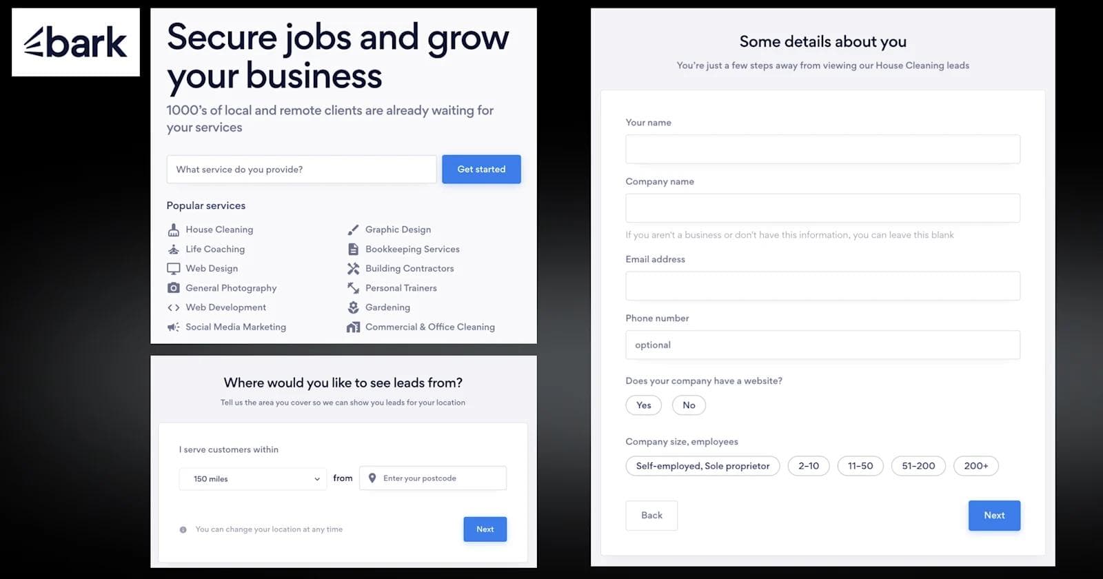
📢 Callouts
- Overlaying the form over the previous page can seem to create a more seamless experience.
- An exit intent pop-up can reduce bounce rates
- Prominent progress bar
- Additional fields for custom responses
Conclusion
Improving multi-step form UX directly impacts completion rates and user satisfaction.
By breaking down complex or lengthy data collection into more approachable, bite-sized steps, these progressive forms significantly enhance the user experience.
If done properly, you will learn much more about your prospects, allowing you to create personalized sales and marketing experiences that speak directly to that individual’s situation. Moreover, the improved UX from multi step forms results in significantly higher engagement, lower bounce rates, and ultimately, more sales opportunities for your business.
Your website is your biggest growth lever—are you getting the most out of it? Schedule a strategy call with Webstacks to uncover conversion roadblocks, explore high-impact improvements, and see how our team can help you accelerate growth.

I create SEO-driven content for B2B SaaS companies, from blog posts to case studies. I focus on research-backed writing that ranks on the first page and drives meaningful organic traffic.


