SaaS Website Redesign: A Complete Guide + 10 Examples
Every SaaS brand knows their website is never truly complete. In a fast-paced market, a website must evolve to stay competitive. Fresh design, new features, and a seamless user experience are key. The best SaaS websites constantly adapt to meet these demands.
You’ve got questions — we’ve got answers. Keep reading to discover key indicators that you’re in need of a SaaS website redesign.
5 Indicators Your SaaS Website Needs a Redesign
Whether or not you are considering one, it’s important to be mindful of the following signs that indicate your SaaS website needs a redesign.
1. Outdated Design
A website must captivate users immediately. If it looks dated, users will leave. An engaging design leaves a lasting impression and encourages exploration, with 59% of global users preferring a visually appealing website.
Take a step back and ask yourself: does your website feel fresh compared to your competitors? Design trends evolve quickly, and what felt cutting-edge a few years ago can now feel stale.
Colors, typography, imagery, and layouts all contribute to whether your site feels modern and trustworthy.
And it’s not just about aesthetics; a clean, up-to-date design also reflects the quality of your product.
2. Poor User Experience
Confusing navigation or cluttered layouts drive users away. An organized website helps users find what they need quickly. With mobile users accounting for 66% of global web traffic, a mobile-friendly design is essential.
If users can’t find key information such as pricing, product details, or support, they won’t stick around to dig for it.
Run usability tests, watch session recordings, and gather feedback to see where users are getting stuck.
Pay attention to mobile navigation, too. Small buttons, awkward menus, and slow load times frustrate mobile users. A redesign gives you a chance to rethink these flows and make your site genuinely enjoyable to use.
3. Decreasing Conversion Rates
A drop in conversion rates often signals design flaws. Optimize your site with clear CTAs, simple forms, and fast load times.
This means ditching poor design practices, such as:
- Unclear/misplaced CTAs
- Overcomplicated forms
- Poor copywriting
- Slow page load times
- Lack of trust signals
A redesign can address these shortcomings and skyrocket your conversions.
It's worth digging into your data to spot exactly where users drop off.
Are they bouncing from landing pages? Abandoning forms halfway through? Use these insights to guide your redesign.
Small tweaks such as repositioning a CTA or simplifying a signup form can have a big impact when paired with an updated design.
4. Limited Customization
Restrictive templates hinder growth. Modular design allows teams to create custom pages quickly and improve their scalability and flexibility.
As your SaaS company grows, so do your website needs. Launching new campaigns, testing different layouts, or creating landing pages for product updates shouldn’t require a developer every time.
Modular design puts that control into your hands. You can mix and match components without rebuilding pages from scratch.
5. Restrictive Tech Stack
A monolithic CMS limits innovation. Transitioning to a headless CMS offers scalability and modern features.
If your marketing team constantly waits on developers to make simple updates, or if integrating new tools feels like pulling teeth, your tech stack might be holding you back.
A headless CMS separates content from design, giving you more flexibility to connect with modern tools, experiment with new channels, and deliver content anywhere.
This approach lets your teams move faster and focus on improving user experience instead of fighting with your backend.
Avoid costly mistakes and last-minute surprises by preparing with our actionable checklist.

What Makes for a Successful Redesign?
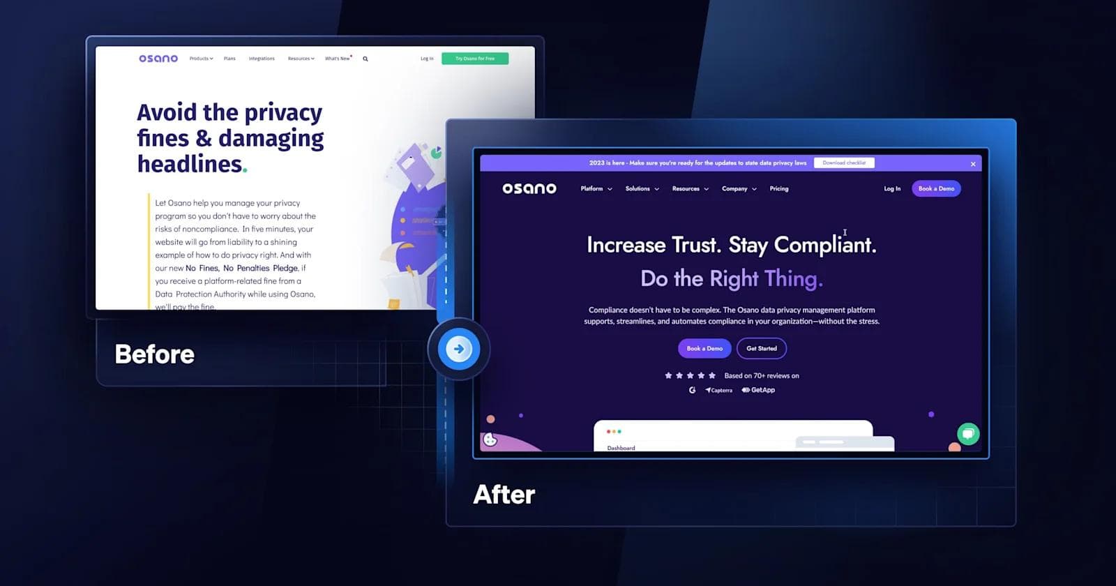
When redesigning a SaaS website, there are several factors to consider. To get you started on the right foot, here are a few components to add to your SaaS website redesign checklist!
User-centric Design
An intuitively designed website is essential for any SaaS company looking to grow. To ensure your website redesign prioritizes usability and efficiency, here are a couple of features you can implement:
- 🧭 Organized navigation bars with drop-down menus
- 👀 Clear visual hierarchy
- 👆 Responsive design
- 🛠️ Microinteractions and Tooltips
It’s also important to design with accessibility in mind. This consists of using other visual cues for colorblind users, such as an underlining and icons.
By following inclusive user-centric design practices, your website is bound to see an increase in user engagement and conversion rates.
Engaging Creative Elements
Your website only has a few seconds to make a lasting impression on visitors, which means having a captivating website design can make all the difference.
An effective SaaS website redesign can introduce eye-catching creative like:
- 🔠 Bold typography
- 🌀 3D/Interactive elements
- 🌈 Cohesive color schemes
- 🏃 Dynamic motion illustrations
Adding exciting elements to your SaaS website redesign creates a scroll-stopping experience for users, boosts time spent on your website, and increases the likelihood of driving conversions.
Consistency Across Pages
Consistency is key — especially when it comes to redesigning a SaaS website.
When users come across a consistent website, they can easily find information and engage with your content.
Here are a few key components that need to be kept consistent:
- 📰 Layout styles
- 🔤 Typography
- ❗ CTA buttons
- 🎨 Color palettes
Having a visually consistent SaaS website also generates positive brand perception, which inspires confidence in your product/services and makes for a memorable message.
Keep things consistent and your redesign will be set up for success.
Now that you understand what goes into creating a successful redesign, next we will explain how the redesign process goes from the perspective of a B2B SaaS web design agency.
The Process of Redesigning a SaaS Website
Let's shed light on how a SaaS website design agency like Webstacks navigates a successful website redesign.
Discovery Workshop
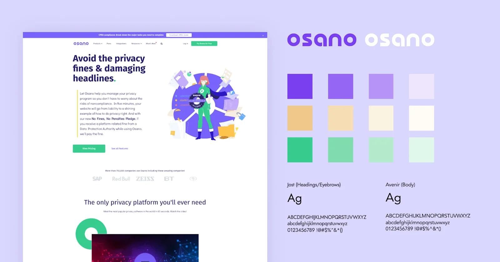
A successful website redesign starts with a collaborative meeting to align all stakeholders on the brand's current state, and goals of the project.
In this phase, we discuss your target audience, conduct a UX audit to identify desired changes for existing pages, and create mood boards to refine the website’s brand identity.
The final discovery step is a word association exercise that aims to understand a new website’s personality. On a scale of 1-5, stakeholders rate how well an adjective (like playful, futuristic, or fancy) resonates with their brand. Then, designers are able to get a sense of direction to begin experimenting with.
Design Vignettes
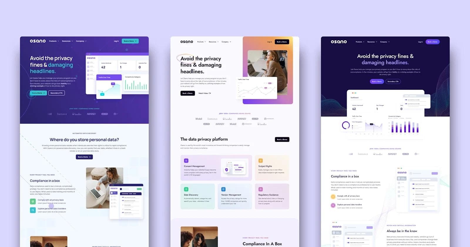
After the workshop, we design three vignettes of a landing page, each showcasing a unique design approach.
Vignettes are meant to display the key building blocks of the website redesign, like colors, typography, and buttons. Although the vignettes do not reflect the final designs, they are a vital step to gather feedback from stakeholders and refine the project’s direction.
Design System: From Atoms to Components
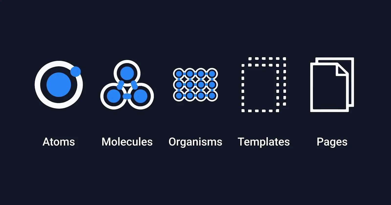
Following approval in the previous stage, Webstacks creates the design system for your website using atomic design principles.
An atomic design system breaks down a visual interface into the smallest, reusable atoms that can be combined to form molecules, organisms, templates, and pages.
This approach ensures the SaaS website’s redesign prioritizes scalability and consistency across the entire website.
Component Development
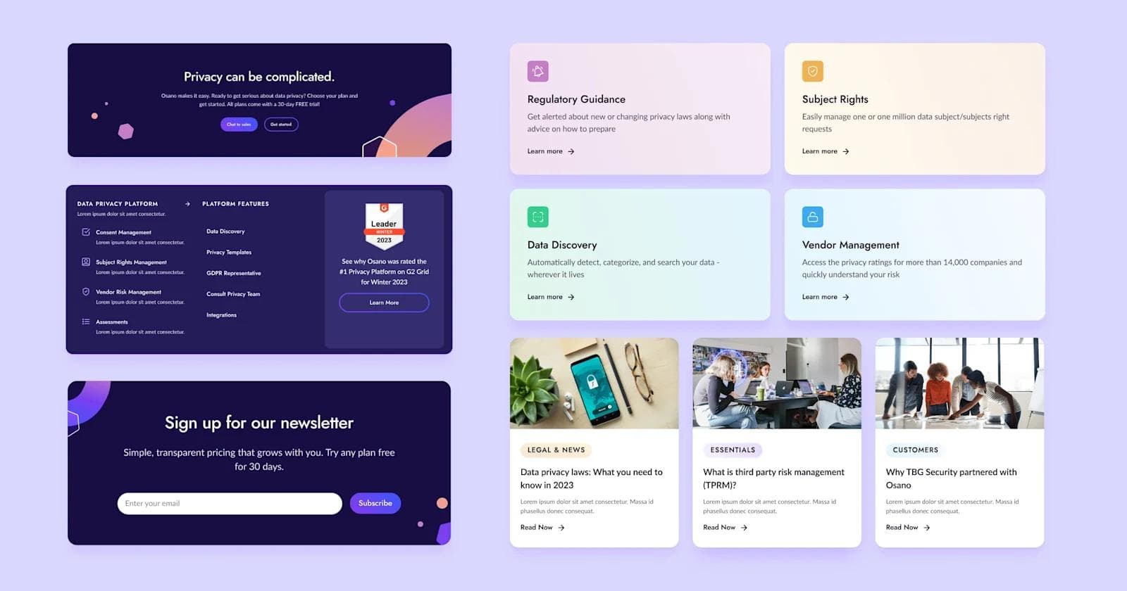
Once the overall design system is in place, it’s handed off to our development team who manages the entire front-end of the new website.
At this phase, developers take the atomic design system and build the website’s structure at the component level.
When it comes to front-end development, Webstacks utilizes modern React frameworks like Gatsby and Next.js to build the fastest, most secure websites.
CMS Development
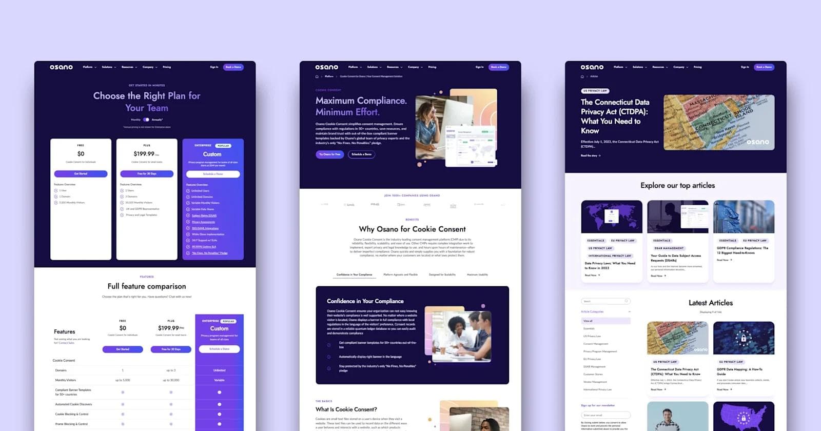
To empower your own team to continually build website pages, Webstacks uses a modular design methodology.
We start with the content modeling process, which involves constructing content types–from field text to media–to create reusable components. With those components, we assemble customizable page templates that can be implemented to build and publish pages at scale. Think of it as putting together web pages like lego blocks.
Now, your content editors have a strong foundation for efficient content personalization and distribution, as well as the flexibility to build as many pages as you want without the need for development resources.
Enablement and Training
Finally, Webstacks provides resources that teach our client’s teams how to autonomously edit and build net-new web pages.
Your team would be trained to use the best CMS that allows your team to provide omnichannel experiences for your customers. This means walking through the benefits of a headless CMS, such as Contentful, that allows content editors to update website content across multiple channels and scale content production.
Types of SaaS Websites
Choosing the right type of SaaS website shapes how you connect with your audience and present your value. Your website should reflect your business model, sales process, and how your customers prefer to interact with your product or service.
Here’s a closer look at the main types of SaaS websites and what makes each one work.
Product-Focused SaaS Websites
A product-focused website showcases the software. The goal is to help users quickly understand what the product does, how it solves their problem, and why they should use it.
This type of site works best for SaaS tools that are easy to try or buy without much help from sales.
Key elements include:
- Clear feature breakdowns and benefit statements
- Interactive demos or videos showing the product in action
- Pricing pages that encourage immediate sign-ups
- Case studies or testimonials that build trust
Examples include Canva and Spotify.
Both center their websites around the product experience. Canva invites users to start designing right away, while Spotify encourages immediate listening. Their sites make it easy to get started without speaking to sales or reading through long explanations.
Service-Centric SaaS Websites
Some SaaS products require a bit more explanation or support. Service-centric websites focus less on the product itself and more on how the company works with customers.
They highlight onboarding, customer success, and the support offered alongside the software.
These sites aim to build trust and encourage prospects to reach out for more information.
Elements include:
- Detailed descriptions of service offerings and processes
- Strong focus on customer support, success stories, and case studies
- Lead generation forms like “Request a Demo” or “Talk to Sales”
- Educational content, such as blogs or whitepapers, to guide decision-making
Good examples include Zendesk and Freshdesk. They emphasize how they help businesses improve customer service. And their websites highlight the full range of support they offer, including integrations, training, and success teams.
Hybrid SaaS Websites
Hybrid websites combine both product and service elements.
They highlight key product features while also offering services like onboarding, consulting, or ongoing support. This model works well for SaaS companies that serve a mix of customers: some ready to jump into the product, others needing more guidance.
Main elements include:
- Both self-serve options like free trials and high-touch CTAs like demo requests
- Product features alongside success stories and service descriptions
- Content for different audiences, including technical users and business leaders
- Flexible navigation that lets users choose how they want to engage
For example, Optimizely highlights its experimentation tools but also offers professional services to help customers get the most from the platform. Mailchimp, while mostly self-serve, provides resources and support that appeal to businesses with more complex needs.
SaaS Website Redesign Examples
Now, let’s explore some successful SaaS website redesigns and the enhancements that Webstacks has brought to some of the world’s fastest growing B2B SaaS companies!
1. Osano

Osano is a leading data privacy platform that works with businesses to ensure compliance with data governance regulations.
Stand-out results from Osano’s website redesign:
- A stylish, modern design that fully embraces their brand colors
- Sleek new illustrations of their platform’s UI
- Multiple trust signals establishing authority and credibility
- A navigation menu that neatly organizes over 35 different pages
2. Meow
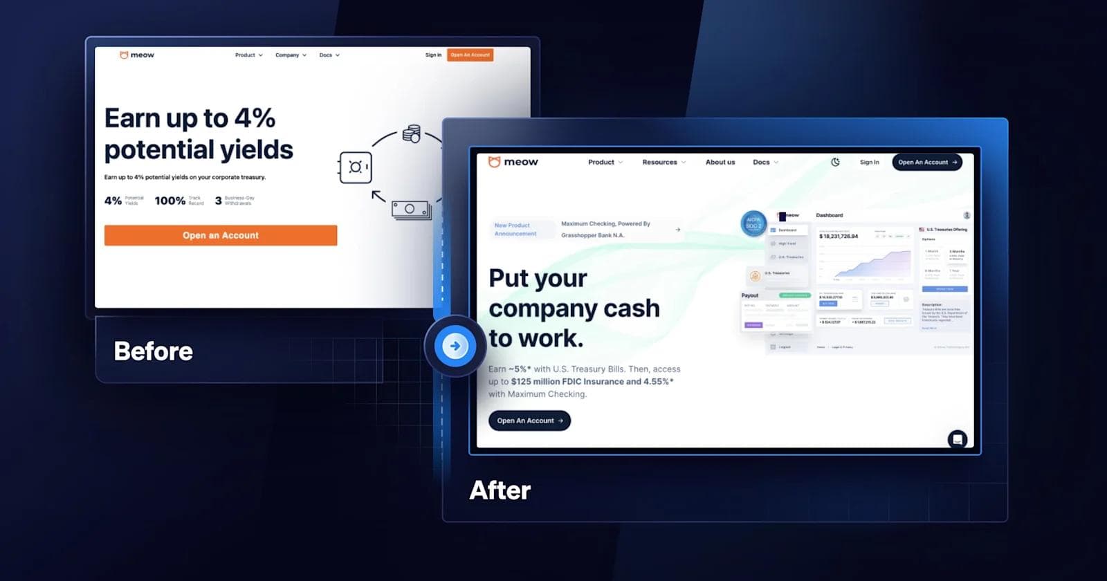
A fintech startup, Meow helps companies earn an extra yield on their cash by offering access to US treasuries and high-yield business checking accounts.
Design improvements we love from Meow:
- Bright text with shadow backgrounds that boldly stand out
- 3-dimensional and animated elements that are eye-catching
- Call-to-action in the hero to drive more interaction
- Light/dark mode toggle which makes for a cool Easter egg
3. Truework
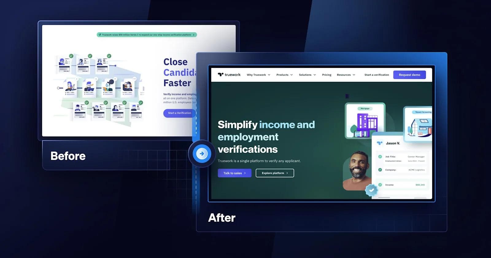
Truework is a one-stop platform that allows banks, lenders, and others to verify income and employment.
Callouts from the Truework redesign:
- Lively gradients to draw attention
- Restructured navigation bar that is more SEO-friendly
- Microinteractions within text and buttons to boost user experience
- Cards and card deck components for better organization
4. Shopmonkey
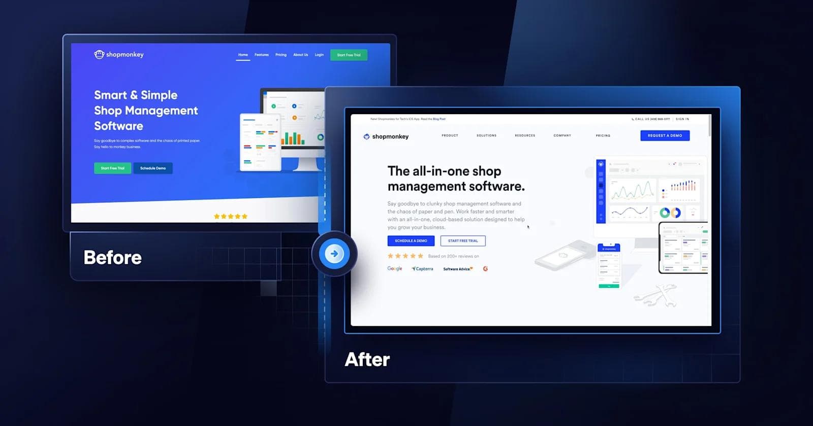
Shopmonkey is a cloud-based auto repair shop management platform that simplifies business operations for mechanics and shop owners.
Key aspects of Shopmonkey’s redesigned website:
- Refreshed illustrations highlighting the Shopmonkey platform
- Enhanced brand experience with testimonial videos and reviews
- Increased page speed by migrating from Webflow to a headless CMS
5. OctoML
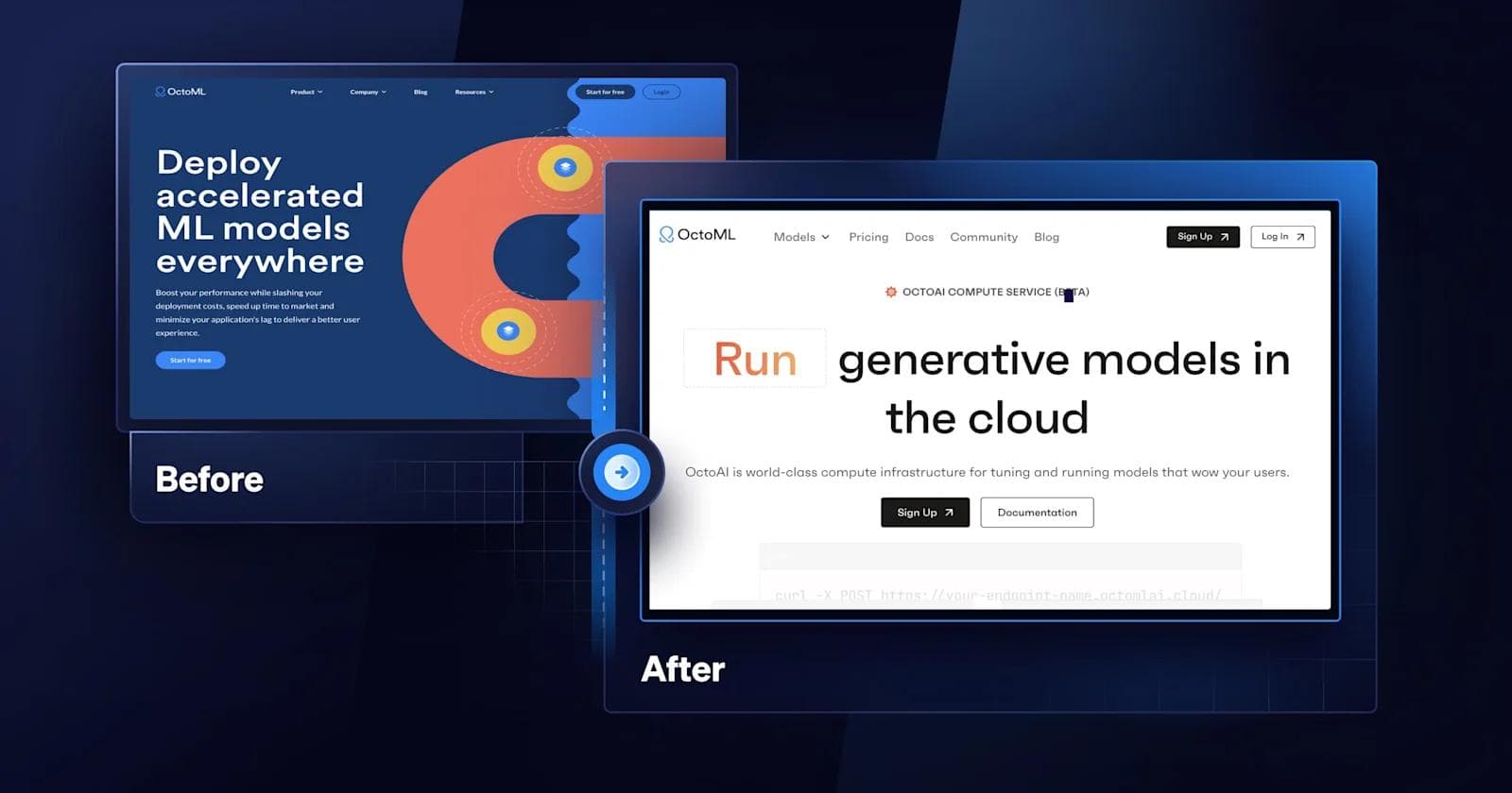
OctoML, the machine learning startup that helps enterprises optimize and deploy generative models, took their website to the next level with a modular design approach.
Highlights of the OctoML refresh:
- Demo video on the homepage which increases engagement
- A typography that fits AI and OctoML’s brand
- Addition of hover states and other microinteractions
- A simple and effective layout that speaks to OctoML’s core competencies
6. Lineup.ai

Another artificial intelligence company, Lineup.ai provides restaurants with automated forecasting software to improve their efficiency and profitability.
Things to point out from Lineup.ai’s redesign:
- Bold, straightforward headings to draw visitors in
- Animation of the Lineup.ai platform in the hero that attracts attention
- Clever use of iconography to provide contextual clues
- Playful illustrations that subtly fill whitespace
7. Deepgram

The leading Speech-to-Text API, Deepgram automatically transcribes real-time or pre-recorded audio and video into text with AI.
Favorite improvements from Deepgram’s redesign:
- Use of dark backdrops, white text, and colorful gradients
- Interactive component that let web visitors demo Deepgram
- Use of emojis, icons, and other symbols that give the brand a playful vibe
- Sharp and bold typography that fits with Deepgram and the overall design
8. Snowflake
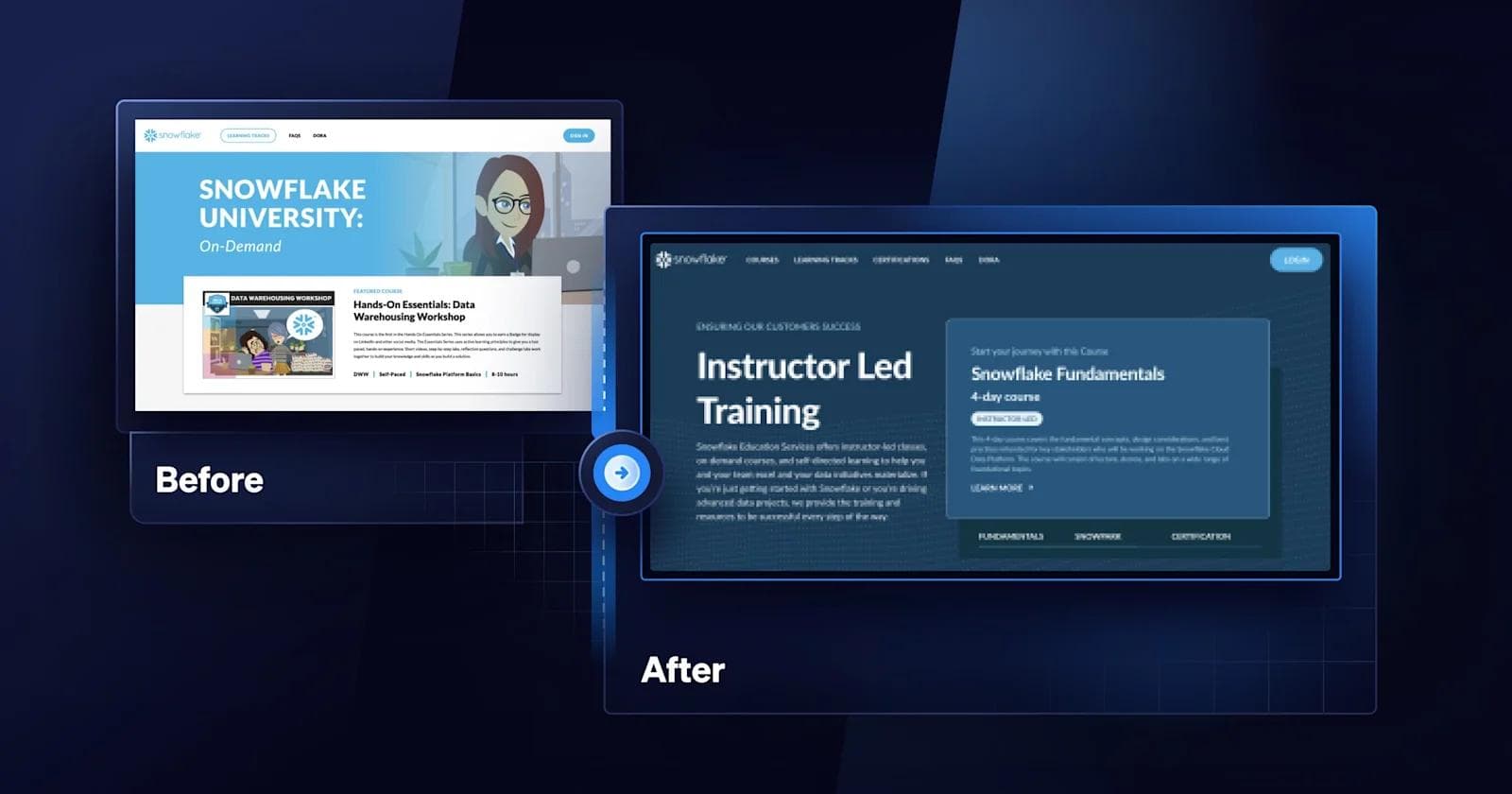
Used by organizations around the world, Snowflake has cloud data warehousing solutions that make it easy to transform, integrate, and analyze data. Webstacks partnered with Snowflake to redesign their educational microsite, Snowflake University.
Top takeaways the Snowflake University project :
- Color palettes matching Snowflake’s corporate branding
- Optimization for desktop, tablet, and mobile screen displays
- Revamped navigation bar for better accessibility
9. Semgrep
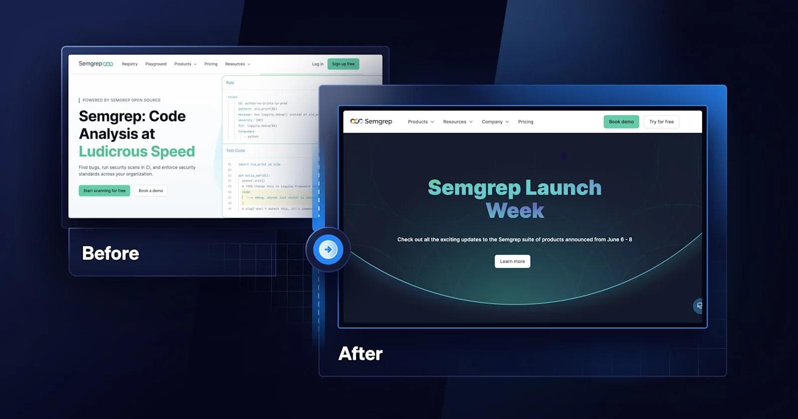
Semgrep is an open-source static analysis tool that helps developers find and fix security vulnerabilities and coding errors in their codebase.
Design features to note from the Semgrep site upgrade:
- Thoughtful use of Semgrep’s green throughout page components
- Captivating illustrations that complement copywriting
- Embedded videos that showcase Semgrep’s products
10. Trust Machines
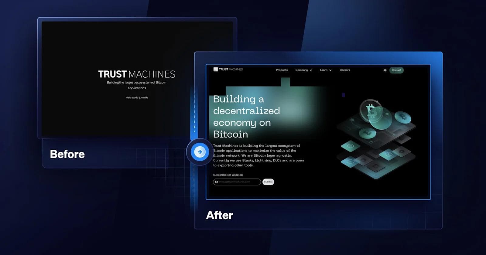
Trust Machines is a Web3 startup that specializes in building an ecosystem of decentralized applications and technologies to grow the Bitcoin economy. A brand new startup, Trust Machines came to Webstacks with a simple one-page Squarespace website. In this unique project, our designers, developers, and content marketers came together to build a brand and website from the ground up.
Highlights from Trust Machines website project:
- A futuristic, Web3-inspired design system to establish a consistent visual identity
- A dynamic navigation bar with drop downs to maximize accessibility
- Improved performance with Gatsby.js - a React front-end framework
- A better content editing experience with Builder.io - a visual CMS
Learn more about the Trust Machines website project here!
How Does Composable Architecture Benefit SaaS Websites?
Composable architecture is a smarter way to build SaaS websites that can grow and adapt alongside your business.
Instead of being locked into one rigid system, you can pick and choose the tools and services that work best for you, and swap them out as your needs change.
Here’s what that means in practice:
Design Flexibility
With composable architecture, your website is built from individual components that can be updated or replaced without touching the entire system. This makes it easier to test new layouts and refresh your branding for campaigns without a full site overhaul.
Faster Updates and Integrations
Need to add a new analytics tool, update your CMS, or integrate a new CRM? Composable systems make this process simpler.
Because each part of your tech stack operates independently, you can make changes without disrupting the rest of your website.
A Better User Experience
When your site is flexible behind the scenes, it’s easier to deliver a smoother experience for users.
Whether that’s faster load times, personalized content, or seamless navigation, composable architecture helps you build a site that feels modern and responsive.
Scales With Your Business
As your SaaS company grows, your website needs to handle more traffic, more features, and more complex integrations.
Composable architecture makes it easier to scale because you can upgrade or expand specific parts of your system without rebuilding the entire thing.
Saves Time and Money Long Term
While setting up a composable system can require more planning upfront, it pays off over time.
Your team won’t waste hours wrestling with outdated systems or trying to bolt on new features to a rigid framework.
Instead, you can focus on improving the site and delivering value to your users.
Closing Thoughts
Whether you’re considering a redesign or just interested in some SaaS website design inspiration, we hope you enjoyed reading about the ins and outs from Webstacks.
Now that we’ve covered the major indicators, qualities, and process behind successful redesigns in SaaS, you’re more than ready for your next website redesign.
If you’re seeking more inspiration, we got you covered with 50+ examples of the best B2B SaaS websites.
Need help planning a website redesign? At Webstacks, we help high-growth tech leaders maximize their website’s potential with next-gen solutions for SaaS web design and development. If you have questions about your next redesign project, feel free to connect with our team of website experts!
Your website is your biggest growth lever—are you getting the most out of it? Schedule a strategy call with Webstacks to uncover conversion roadblocks, explore high-impact improvements, and see how our team can help you accelerate growth.
SaaS Website Redesign FAQs
When should I consider a redesign project?
You should consider redesigning a SaaS website if you are experiencing any of the following pain points:
- “My website is slow”
- “I can’t easily make changes to my website”
- “My conversion rate is significantly dropping”
- "My website branding is outdated and inconsistent”
- “My attribution is a mess”
- “I’m having trouble outranking my competitors”
How often should a SaaS website undergo a redesign?
The frequency of redesigning a SaaS website depends on multiple factors, such as your specific business needs and goals, user expectations, industry trends, and technological advancements. While there are no strict timeframes for website redesigns, it’s generally recommended to consider a redesign every 2 to 3 years.
How much does a SaaS website redesign cost?
The cost of a SaaS website redesign depends on your specific needs and requirements. Factors that can impact the cost of a website redesign include the complexity of the design, number of pages, tech stack, type of functionality required, and any custom features or integrations. As a result, there is no one-size-fits-all answer to how much you should expect to spend on a SaaS website redesign.
How long does the process take to redesign a SaaS website?
The time it takes to redesign a SaaS website can vary depending on factors, such as:
- Complexity of the website
- Number of page templates
- Type of project (in-house, freelancers, or agency)
In most cases, it will take anywhere between 6-12 months to complete a website redesign.
At Webstacks, we manage website projects slightly differently than traditional agencies. Our processes allow us to move extremely fast, and ship new websites within 90-120 days.
Learn more about Webstacks’ unique approach to building SaaS websites here!
What are the benefits of working with an agency to redesign a SaaS website?
Hiring an agency like Webstacks to redesign a SaaS website has several advantages over using internal resources or freelancers. With an agency, you get to:
- Work with a full stack of web experts, ranging from design, development, search engine optimization, content marketing, and conversion rate optimization.
- Save valuable time and resources that would otherwise be spent on internally managing the redesign.
- Launch your website project exponentially faster.
- Receive training, enablement, and ongoing support for your team.
- Have a dedicated customer success manager and team that can match your velocity and meet tight deadlines.

I create SEO-driven content for B2B SaaS companies, from blog posts to case studies. I focus on research-backed writing that ranks on the first page and drives meaningful organic traffic.
