Testimonial Page Design: Best Practices for B2B
A testimonial page showcases positive feedback from customers.
This page plays a key role in building credibility and engaging users, since featuring authentic endorsements gives potential customers social proof, which can heavily sway their purchasing decisions.
As you read on, you'll discover strategies and best practices for designing a compelling testimonial page for your B2B website.
We'll explore how to leverage customer stories to enhance credibility and user engagement on your website, using real-world examples to show their potential impact.
In brief:
- Testimonial pages are essential for building trust and credibility by featuring genuine customer feedback and providing social proof.
- An effective testimonial page includes real attributions, storytelling, visually engaging content like videos, data-driven results, and smart organization.
- Design best practices focus on authenticity, diverse content formats, easy navigation, highlighting specific benefits, and regular updates.
- Well-crafted testimonial pages can significantly increase conversion rates and revenue, heavily influencing purchasing decisions.
See what’s working for industry-leading websites and find inspiration to improve yours.

What is a Testimonial Page?
A testimonial page is a dedicated section on a website where businesses showcase feedback from happy customers. This space plays a major role in presenting social proof—a psychological phenomenon where people look to others' behaviors and actions for guidance when they're unsure about decisions.
By featuring testimonials, businesses show that their products or services have been positively received by real people, which can greatly influence potential customers' purchasing decisions.
Similarly to a product page, the power of a testimonial page lies in its ability to build trust and credibility with potential customers. Testimonials provide specific insights into how a product or service meets customer needs, offering an authentic and relatable perspective.
What Should Be Included in a Testimonial Page?
Creating an engaging and effective testimonial page supports B2B companies looking to build trust and showcase client satisfaction. Here are some key elements to consider:
- Real Attribution: Make sure each testimonial is attributed to real people within your client organizations. This adds authenticity and credibility, as potential clients can connect the experiences shared with actual individuals.
- Storytelling: Include detailed narratives rather than short quotes. Highlight customer successes by describing the challenges they faced and how your product or service provided a solution.
- Visually Engaging Content: Use a mix of written quotes and video testimonials. Videos add a layer of authenticity by allowing potential clients to see and hear real users sharing their positive experiences.
- Data-Driven Testimonials: Whenever possible, pair emotional appeals with data-backed results. These social proof indicators include metrics or tangible outcomes that demonstrate the real-world impact of your offerings.
- Strategic Organization: Organize testimonials by industry or service type, making it easier for potential clients to find relevant examples. Regularly update the testimonials to reflect current client experiences, and create a user-friendly layout that makes navigation and engagement easy.
Testimonial Page Design Best Practices
When designing a testimonial page for B2B companies, there are several best practices that can help you effectively showcase your brand's credibility.
- Ensure Authenticity: An effective testimonial page features reviews from real people, complete with their names, titles, and company details. Including photos can enhance the personal connection and lend authenticity to each testimonial.
- Diversify Content Formats: Use a mix of written testimonials, videos, and audio snippets to cater to various audience preferences. Drawing inspiration from top SaaS website designs, video testimonials, in particular, can provide a powerful personal touch and convey genuine client satisfaction.
- Organize for Easy Navigation: It's important to categorize testimonials by industry, company size, or solution type. This organization helps visitors easily find stories that are most relevant to their needs.
- Highlight Specific Benefits: Choose testimonials that emphasize specific benefits or solutions your products or services provided. This specificity can help potential clients quickly grasp the value of your offerings.
- Regular Updates: Keep your testimonial page dynamic and up-to-date by continually adding fresh content.
Best Testimonial Page Examples
ServiceTitan

ServiceTitan's testimonial page is a powerhouse of real-world success stories from businesses in industries like HVAC, plumbing, and electrical services.
The page does an excellent job of putting customers front and center, featuring high-quality video testimonials with clear, compelling narratives.
The design feels structured but approachable, using a dark blue and white color scheme that reinforces trust and professionalism. The mix of logos, candid customer quotes, and embedded videos gives potential buyers multiple ways to engage with the stories.
With a clear CTA for booking a demo, this page is optimized for credibility and conversion.
Standout Elements
- Video-Driven Storytelling – Instead of just static quotes, ServiceTitan uses high-quality customer videos, making each testimonial feel authentic and personal.
- Strong Industry Focus – The testimonials aren't generic—they specifically highlight trade industries, ensuring relevance for the target audience.
- Scrollable, Interactive Layout – The light gray background behind testimonials creates a natural reading flow, making it easy to skim or deep-dive into customer stories.
- Conversion-Optimized Demo Form – Placed at the bottom, the form keeps visitors engaged after they've absorbed the success stories, subtly nudging them toward a commitment.
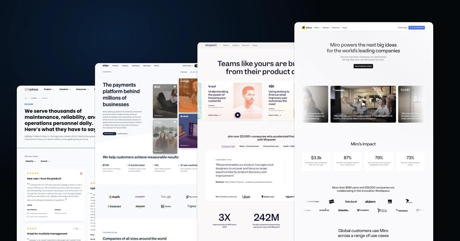
Miro

Miro's testimonial page is clean, modern, and impact-driven, showing how major companies leverage its platform to boost collaboration and streamline workflows.
Right away, visitors are greeted with a bold, confidence-inspiring headline and a rotating set of video testimonials from recognizable brands like PepsiCo and WebMD. Further down, impact stats make a compelling case for new users.
The page seamlessly integrates logo-based social proof, customer quotes, and case studies that show Miro's versatility across industries. The inclusion of customer-created templates at the bottom adds an extra layer of authenticity, proving that Miro isn't just a tool—it's a workspace staple for top teams.
Standout Elements
- Immersive Video Testimonials – High-quality, cinematic clips from major brands make the benefits feel real and actionable.
- Data-Backed Credibility – Percentage-based insights provide quantifiable proof of success.
- Industry-Spanning Case Studies – From Adobe to Fujitsu, Miro highlights use cases across corporate giants and creative teams alike.
Hotjar

Hotjar's testimonial page is all about building trust and credibility with clear, data-backed storytelling.
The page immediately asserts authority with a headline positioning Hotjar as the world's most popular product experience tool, followed by a visually engaging illustration that reinforces its UX-friendly brand identity.
A powerful trust signal, over 1.3 million websites in 180+ countries use Hotjar, anchors the page, supported by well-known logos like Adobe, T-Mobile and HubSpot. A compelling video testimonial from InVision adds real-world validation, while the page smoothly transitions into a strong CTA for immediate sign-ups.
The mix of playful branding and data-driven persuasion makes this an effective, conversion-friendly design.
Standout Elements
- Illustrative Storytelling – Instead of just relying on numbers, Hotjar uses custom, playful illustrations that align with its brand identity while reinforcing key messaging.
- Seamless Video Testimonial Integration – The embedded customer story from InVision is placed naturally within the page flow, breaking up text-heavy sections and adding emotional appeal.
- Frictionless Signup Callouts – The "Get started for free" CTA is impossible to miss, with clear benefits (no credit card required, GDPR-compliant, recent user stats) making it easier to convert.
See what’s working for industry-leading websites and find inspiration to improve yours.
Buy Me a Coffee

Buy Me a Coffee's Wall of Love is a vibrant, community-driven testimonial page that celebrates the voices of real creators who use the platform.
Instead of traditional case studies or long-winded reviews, this page curates authentic social media mentions from Twitter, TikTok, and YouTube, making it feel like an organic shout-out space rather than a sales pitch.
The tone is casual, uplifting, and filled with gratitude, reinforcing the company's mission of helping creators get direct support from their audience. With a clean, social-feed-inspired layout, the page feels interactive, making it both visually engaging and highly shareable.
Standout Elements
- Live Social Proof in Action – Instead of static testimonials, Buy Me a Coffee showcases real tweets, TikTok videos, and YouTube content, making feedback feel fresh and dynamic.
- Minimalist Yet Warm Design – The "Wall of Love" title with a heart icon and the soft beige background create a cozy, creator-friendly vibe that aligns with the brand's approachable feel.
- Encouraging UGC Participation – Users are invited to share their own experiences with the hashtag #buymeacoffee, fostering a community-driven content loop that keeps the page ever-growing.
Relume

Relume's Community Love page is a no-frills, high-impact wall of praise from real users who have experienced the power of their AI Site Builder.
Instead of curated case studies, it thrives on raw, authentic testimonials pulled from social media and direct user feedback, creating a transparent and community-driven vibe.
The layout mimics a social feed, making it feel like a space where Relume users genuinely celebrate their experiences rather than a traditional marketing showcase. It's a refreshing approach that embraces simplicity, leveraging real words from real people to do the selling.
Standout Elements
- Organic Social Feed Feel – Testimonials are displayed like posts in a timeline, some featuring profile pictures, emojis, and embedded tweets/videos, adding an informal and approachable touch.
- Minimalist Yet Functional UI – The clean, neutral-toned background ensures that user-generated content remains the focus, while subtle heart icons add a sense of social engagement.
- Direct Call to Action at the Bottom – Instead of breaking the flow, the "Experience the power of our AI Site Builder today" CTA blends seamlessly into the page, making the transition from reading testimonials to taking action feel natural.
Stripe

Stripe's customer stories page is a masterclass in sleek, high-impact storytelling, blending data, visuals, and real-world success to showcase how businesses thrive using their platform.
It's not just a list of testimonials—it's a carefully crafted experience that makes Stripe's impact feel measurable and tangible. The page seamlessly weaves together bold statistics, high-profile brands, and dynamic visuals, reinforcing the trust and credibility that comes with using Stripe.
From startups to enterprise giants, the testimonials feel personal yet scalable, showing how Stripe powers growth at every level. Each success story is wrapped in an engaging, modern aesthetic, ensuring that the page feels just as polished as the product itself.
Standout Elements
- Layered Visuals & Color Coding – The multi-colored story blocks create a vibrant, dynamic look while helping distinguish different industries or solutions. It's visually engaging and makes browsing feel effortless.
- Hard-Hitting Metrics Front & Center – Right away, Stripe quantifies its impact—faster checkouts, increased revenue, better conversion rates.
- Product UI Integrated into the Storytelling – Rather than just telling you Stripe is great, the page shows it in action with screenshots of real Stripe interfaces, giving a behind-the-scenes look at how the platform works.
Basecamp

Basecamp's testimonial page cuts through the noise and delivers customer feedback in a way that's bold, clear, and instantly digestible.
Instead of cluttering the page with excessive copy, they let the words of real users shine, focusing on the core improvements people experience after switching. The page feels practical, no-nonsense, and confident—just like the product itself.
The use of punchy, high-impact quotes keeps the focus on real-world benefits: fewer email chains, better collaboration, increased transparency, and happier clients. The high-contrast yellow highlights reinforce key takeaways, making it easy to scan and absorb the message instantly.
Standout Elements
- Striking Yellow Highlights – Instead of overwhelming users with dense paragraphs, Basecamp visually emphasizes the most important takeaways, making the page feel engaging and easy to skim.
- Conversational, No-Fluff Copy – The testimonial snippets feel natural, like genuine feedback from a colleague, rather than overly polished marketing speak.
- Modular Layout for Readability – Instead of long-winded case studies, Basecamp breaks feedback into bite-sized, high-impact chunks, making it fast to digest and effortless to navigate.
Dovetail

Dovetail's testimonial page feels like stepping into a community of real users, sharing their experiences face-to-face. The layout is built around authenticity, placing customer video testimonials front and center, while reinforcing trust with data-backed credibility stats.
The design is clean, simple, and inviting, making it easy to navigate and absorb insights.
From high-trust stats to real faces sharing real stories, everything about this page is built for relatability and credibility.
Standout Elements
- Video-First Approach – Instead of just text-based reviews, Dovetail leads with video testimonials, giving customers a human presence and adding authenticity to their words.
- Trust-Building Stats – The page immediately establishes credibility with hard numbers, reinforcing Dovetail's effectiveness before users even dive into the testimonials.
- Diverse Customer Voices – A mix of industries, roles, and experiences are showcased, making it clear that Dovetail works for teams of all shapes and sizes.
UpKeep

UpKeep's testimonial page is a wall of trust—a detailed, text-rich showcase of customer experiences from maintenance and operations professionals.
It's structured around real, in-depth reviews, providing highly specific insights into how UpKeep impacts daily workflows. Instead of short soundbites, these testimonials dive deep into what makes the platform useful, making it clear that this isn't just another software tool—it's an essential part of their workday.
From star ratings to category filters and direct customer names, this page leans into credibility, giving potential buyers unfiltered, practical opinions from users who share their industry challenges.
UpKeep doesn't rely on flashy visuals—this page is substance over style, making it a goldmine for anyone serious about evaluating the platform.
Standout Elements
- Review Filtering & Categorization – Customers can filter testimonials by most recent, highest rating, or industry relevance, making it easier to find experiences that match their needs.
- Detailed, Story-Driven Reviews – Instead of generic praise, these reviews go deep into how UpKeep solves real operational challenges, offering tangible examples of success.
- Trust-Building Badges & Recognitions – The footer highlights industry awards and customer satisfaction ratings, reinforcing UpKeep's authority in the maintenance and reliability space.
Mixpanel

Mixpanel's testimonial page is a showcase of data-driven impact, blending real-world success stories with sleek visuals and compelling stats.
Instead of just telling visitors that Mixpanel is a powerful product analytics tool, the page demonstrates it through customer experiences across industries like SaaS, media, and financial services.
The structure is clean and logical: a bold opening statement, followed by video case studies from major brands like Wise and Olo. A mix of customer quotes, industry filters, and tangible metrics reinforces the product's effectiveness.
The page closes with a call to action, nudging users toward a demo or free trial with a gentle but confident push.
Standout Elements
- High-Quality Video Case Studies – Instead of static text, Mixpanel uses well-produced video testimonials, making customer stories more engaging and relatable.
- Impact-Driven Stats – The page includes hard numbers (like NPS improvements and customer satisfaction rates) to quantify the platform's value—perfect for data-driven buyers.
- Industry-Specific Sections – From SaaS to gaming, users can browse testimonials tailored to their niche.
- Gradient-Based Visual Design – The soft purple and blue gradient adds a modern, premium feel.
See what’s working for industry-leading websites and find inspiration to improve yours.
Ready for a Better Testimonial Page?
A compelling testimonial page can significantly influence your buyers by showcasing real customer experiences.
Include both written and visual testimonials to capture interest and convey genuine satisfaction with your products or services. Make sure these stories highlight key product features, user experiences, and customer support, while incorporating names and photos to personalize the feedback further.
Ready to take your B2B website to the next level? Download Webstacks' Best B2B SaaS Websites eBook to discover more inspiring examples and actionable insights that can transform your digital presence.
Your website is your biggest growth lever—are you getting the most out of it? Schedule a strategy call with Webstacks to uncover conversion roadblocks, explore high-impact improvements, and see how our team can help you accelerate growth.

I create SEO-driven content for B2B SaaS companies, from blog posts to case studies. I focus on research-backed writing that ranks on the first page and drives meaningful organic traffic.