Mobile Website Design Best Practices for 2025: A Complete Guide

The numbers tell a compelling story: over 55% of global website traffic now comes from mobile devices, and 74% of users are more likely to return to mobile-friendly websites. For businesses, these statistics translate directly to the bottom line ��� companies with mobile-optimized sites see up to a 67% increase in the likelihood of purchases.
Yet, the stakes are even higher when you consider that 53% of mobile users will abandon a site that takes more than three seconds to load. This immediate impact on user behavior has prompted Google to implement mobile-first indexing, making mobile optimization critical for both user experience and your overall search engine visibility and rankings.
The business implications are clear: a poor mobile experience directly affects your traffic, leads, and sales, while proper mobile optimization enhances brand perception and customer loyalty. In this comprehensive guide on Mobile Website Design: Tips and Best Practices, we'll explore everything from responsive layouts and performance optimization to user experience enhancements that drive conversions.
In brief:
- Over 55% of global website traffic comes from mobile devices, making mobile optimization critical.
- Mobile users expect fast-loading, user-friendly websites; sites taking over three seconds to load risk losing 53% of users.
- Implementing responsive design and performance optimization can increase the likelihood of purchases by up to 67%.
- Google's mobile-first indexing means mobile optimization directly affects search engine visibility and rankings.
Essential Mobile Website Design Best Practices
With over 55% of global website traffic coming from mobile devices, mobile website design is now a critical requirement.
Implement Responsive Layout Fundamentals
The foundation of mobile landing pages starts with a proper responsive layout implementation. You'll want to establish consistent design standards that work across all devices:
- Implement a 4-point grid system for consistent spacing and alignment
- Use standard 16px margins for mobile views
- Maintain fluid grids and flexible images that resize proportionally
- Apply CSS media queries strategically to control layout changes
To ensure you're covering all essential aspects of responsive design, refer to our responsive design checklist. Companies report a 74% higher likelihood of users returning to mobile-friendly websites that implement these responsive fundamentals consistently.
Optimize Performance
Mobile users expect quick access to information, making performance optimization imperative. Focus on these key areas:
- Minimize third-party components and evaluate if they're truly necessary
- Optimize images through compression and appropriate file formats
- Implement lazy loading for images that are outside the viewport
- Enable browser caching for static elements
- Use Google Tag Manager to efficiently manage third-party scripts
For a deeper understanding of performance bottlenecks and how to address them, read our article on optimizing web performance. A performant mobile site directly impacts your bottom line. Studies show that mobile-friendly sites can lead to a 67% increase in the likelihood of purchases. For example, an e-commerce site improved its mobile page load time from five seconds to under two seconds by minimizing scripts and optimizing images, resulting in increased mobile sales.
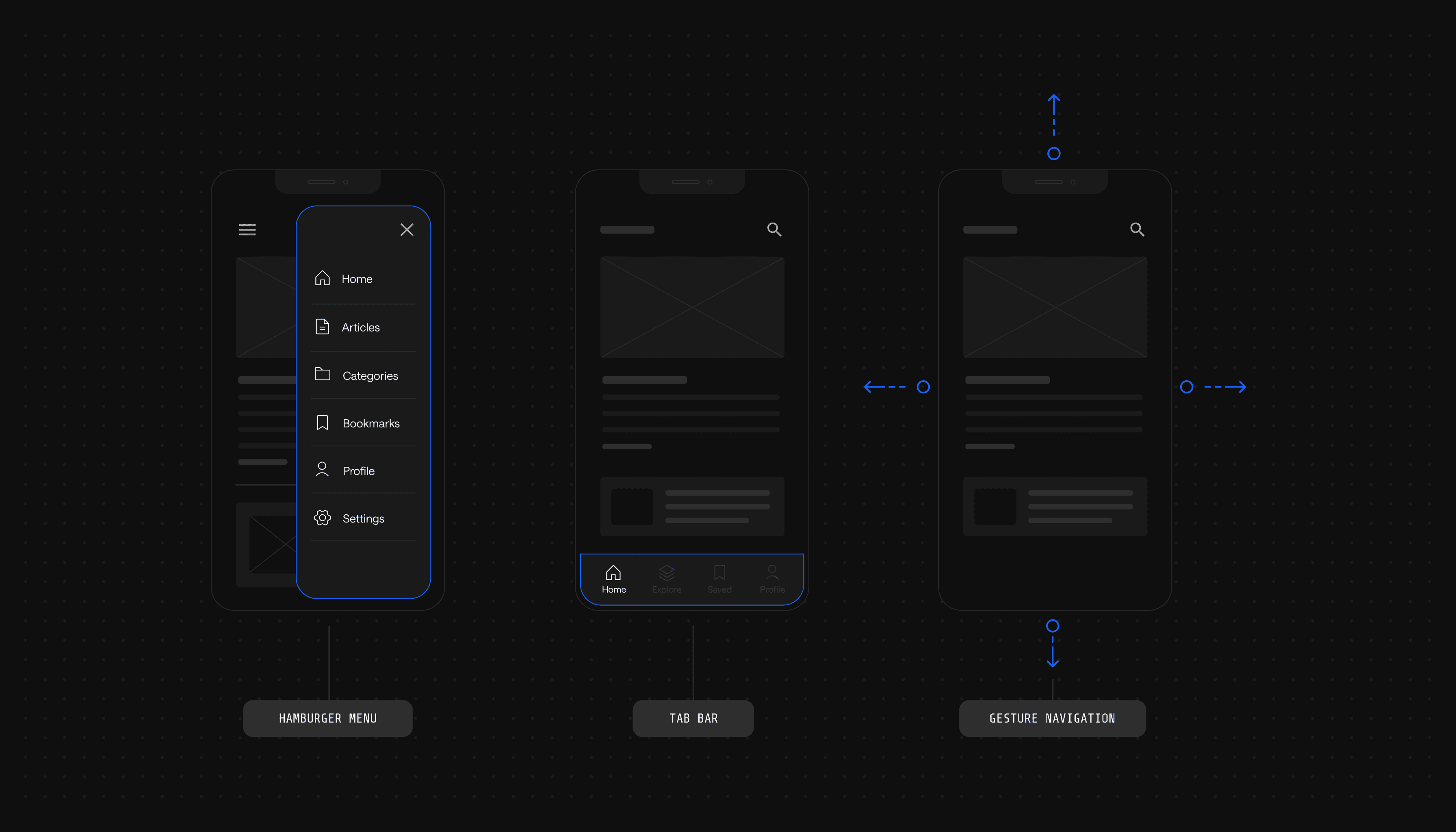
Design Intuitive Navigation and Interactions
Create an intuitive mobile navigation menu that works well on small screens:
- Design touch targets at least 44x44 pixels in size
- Maintain adequate spacing between interactive elements to prevent accidental taps
- Implement a fixed header menu that remains accessible
- Consider using a hamburger menu for complex navigation structures
- Limit main navigation items to 4-8 key sections
For multi-level navigation, implement a vertically oriented dropdown system that's easy to tap and scroll through on mobile devices. For more insights on crafting intuitive mobile navigation, visit our guide on mobile UX design best practices.
Optimize Content and Typography
Optimize your content for mobile consumption while maintaining readability:
- Set body text to a minimum of 16px
- Implement a 1.5x line height for comfortable reading
- Use web-safe fonts or reliable web font services
- Create a consistent typographic scale
- Limit your color palette to 2-5 primary colors with proper contrast ratios
These typography guidelines aren't arbitrary—they're based on extensive usability research and ensure your content remains accessible across different screen sizes and lighting conditions.
Design Touch-Friendly Interfaces
Design your interface with touch interactions in mind:
- Place key interactive elements within thumb's reach
- Provide visual feedback for touch interactions
- Implement common touch gestures like pinch-to-zoom where appropriate
- Provide sufficient spacing between clickable elements
- Use clear visual indicators for interactive elements
Designing effective touch-friendly interfaces is crucial for enhancing user interactions on mobile devices.
For forms, which are often challenging on mobile:
- Minimize the number of required fields
- Use appropriate input types (e.g., number pad for phone numbers)
- Implement autofill functionality
- Provide real-time validation feedback
Simplifying form fields and utilizing autofill features can significantly enhance user satisfaction and reduce cart abandonment on mobile devices.
Achieve Cross-Device Compatibility
Make sure your mobile website functions consistently across different platforms:
- Test thoroughly on multiple mobile browsers (Safari, Chrome, Firefox)
- Implement a mobile-first, flexbox approach for layouts
- Use relative units (%, vw) for fluid scaling
- Combine media queries with fluid rules for truly responsive designs
To maintain consistency, use flexbox properties strategically:
- Use flex-direction for content flow control
- Apply justify-content and align-items for proper alignment
- Implement flex containers to manage spacing and layout
For strategies on ensuring your site remains effective across different devices in the future, read our guide on how to future-proof your website. Remember that 68% of companies saw increased sales after developing mobile-first websites, making cross-device compatibility a critical investment in your digital presence.
Implementing these best practices will help you create mobile experiences that meet user expectations and drive better engagement and conversion rates. The key is to maintain a balance between performance, usability, and visual appeal while keeping your mobile website accessible and functional across all devices.
See what’s working for industry-leading websites and find inspiration to improve yours.

Technical Implementation Guidelines
Start with the necessary viewport meta tag to enable proper scaling on mobile devices:
<meta name="viewport" content="width=device-width, initial-scale=1.0">
Implementing a mobile-first flexbox approach provides flexible, adaptable designs that work across all screen sizes:
.container {
display: flex;
flex-direction: column;
padding: 16px;
}
/* Adjust layout for larger screens */
@media (min-width: 768px) {
.container {
flex-direction: row;
}
}
Follow these critical technical specifications:
- Set touch targets to minimum 44x44 pixels for optimal interaction
- Use base font size of 16px for body text
- Maintain 1.5x line height for readability
- Implement consistent spacing with a 4-point grid system
Don't forget that good mobile design also impacts your site's technical SEO, influencing search engine visibility and rankings.
Test your implementation using these key tools:
- Google's Mobile-Friendly Test to verify responsive design
- PageSpeed Insights for performance metrics, noting that load times under one second correlate with 3x higher conversion rates
- Cross-browser testing on both iOS and Android devices
Remember to use media queries for breakpoint-specific styling:
/* Mobile-first base styles */
.element {
width: 100%;
}
/* Tablet breakpoint */
@media (min-width: 768px) {
.element {
width: 50%;
}
}
/* Desktop breakpoint */
@media (min-width: 1024px) {
.element {
width: 33.33%;
}
}
Testing and Optimization
Regular testing and optimization are key to maintaining an effective mobile website. You'll need to implement a comprehensive testing strategy across multiple devices and platforms to achieve consistent performance.
Start by using Google's Mobile-Friendly Test to evaluate your site's basic mobile compatibility. This tool provides insights into potential issues that could affect mobile users. For more thorough testing, use BrowserStack to test your site across different devices and operating systems, as device-specific issues might not be apparent on a single platform.
Key testing checkpoints should include:
- Page load times (aim for under three seconds)
- Touch target accessibility (minimum 44x44 pixels)
- Cross-device layout consistency
- Core Web Vitals metrics
- Form functionality on mobile keyboards
- Navigation usability
Beyond initial testing, implement continuous optimization through mobile analytics. Monitor user behavior patterns and identify potential friction points in the mobile experience. Tools like heatmaps can reveal how users interact with your mobile interface, highlighting areas that need improvement.
Regular performance audits should evaluate:
- Mobile conversion rates
- Page speed metrics
- User engagement statistics
- Bounce rates on mobile devices
- Mobile-specific error rates
Remember that mobile optimization is an ongoing process. As new devices and technologies emerge, your testing and optimization strategy should evolve to maintain optimal performance across all mobile platforms.
Our Take on Mobile Website Design Best Practices
Mastering mobile website design is not just about keeping up with trends, but about staying ahead to meet evolving user expectations. The shift towards mobile-first experiences demands a strategic approach that blends design finesse with technical acumen. By focusing on responsive layouts, performance optimization, and intuitive user interfaces, businesses can create compelling mobile experiences that drive engagement and conversions. We have seen firsthand how investing in mobile optimization can transform customer interactions and contribute significantly to business growth.
See what’s working for industry-leading websites and find inspiration to improve yours.
Mobile Optimization: Your Path Forward
Creating a mobile-friendly website goes beyond following a checklist; it involves embracing the reality that over 60% of web traffic comes from mobile devices. The impact is clear: 74% of users are more likely to return to mobile-friendly websites, making mobile optimization imperative for sustained success.
Focus your efforts on responsive design, performance optimization, simplified navigation, and touch-friendly interactions. Start with Google's Mobile-Friendly Test to assess your current status, then systematically implement improvements. Regular testing across different devices and continuous monitoring of mobile analytics will help you stay ahead of evolving user expectations and technological advances.
Remember that mobile optimization is an ongoing process. As devices evolve and user behaviors change, your mobile strategy should adapt accordingly. Make mobile optimization an integral part of your website maintenance routine, not a one-time project.
Ready to optimize your SaaS website structure for growth? See the Webstacks difference: Schedule a brief discovery call today. Let us help you create a website that drives results.

I create SEO-driven content for B2B SaaS companies, from blog posts to case studies. I focus on research-backed writing that ranks on the first page and drives meaningful organic traffic.