Let’s face it - we’ve all seen some uninspiring websites in SaaS. Oftentimes, their design falls victim to the same bad habits, appearing flat, bland, and failing to pique genuine excitement in visitors.
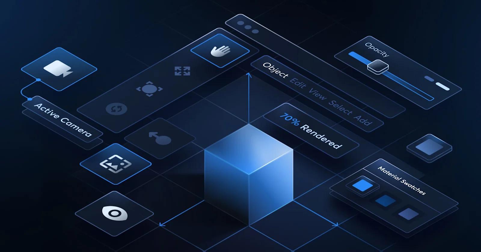
When you stay within the same one dimension, it can be much more difficult to immerse your users and create a memorable experience. This is where 3D design comes in.
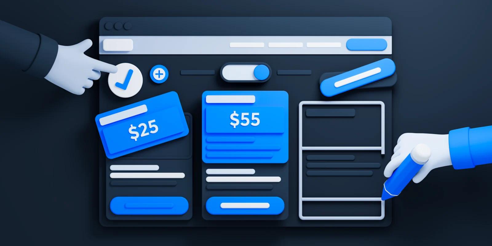
3D web design has the power to drastically transform the look and feel of your website, and there are plenty of techniques and applications of 3D that a website can utilize.
Read on to find out why 3D design is trending amongst SaaS websites, and see some of our favorites examples out there today.
Why 3D Web Design?
SaaS websites should be engaging and create a lasting first impression. Here are a few reasons 3D web design can be an effective strategy for enhancing the user experience.
😯 Captivate Web Visitors
When visitors land on your website, their first impression is crucial. 3D design instantly grabs attention and offers a unique, immersive experience. As we will cover shortly, there are a number of ways to incorporate dimensionality and foster an engaging environment that entices users to explore further. This captivating allure ensures that your website stands out amidst the sea of competitors, making a memorable impression that lingers in the minds of visitors.
👉 Encourage User Engagement
User engagement is the heartbeat of any successful SaaS marketing strategy. Through interactive 3D models and animations, you can pique intrigue potential customers. This hands-on approach not only educates users but also fosters a sense of connection, increasing the likelihood of conversions. Moreover, interactive 3D elements invite users to spend more time on your website, decreasing bounce rates and improving overall user satisfaction.
👀 Enhance Product Visualization
For SaaS companies, showcasing intangible digital products or services can be challenging. 3D design solves this problem by providing a platform for immersive product visualization. Complex software solutions can be represented visually, simplifying intricate concepts for the audience.
Through 3D animations and simulations, you can illustrate how your SaaS products work in real-life scenarios, making abstract ideas intuitive and relatable. This enhanced visualization not only clarifies your offerings but also instills confidence in potential clients, leading to increased trust and higher conversion rates.
👤 Build Brand Identity
Establishing a strong brand identity is paramount, and much of that starts with the website. 3D web design allows you to create a unique and memorable brand presence. Tailored 3D elements, such as custom animations and branded environments, can reflect your brand’s personality and values.
Consistent use of these elements across your website fosters brand recognition and reinforces your company’s identity in the minds of visitors. By integrating your brand seamlessly into the 3D design, you communicate professionalism and innovation, positioning your SaaS company as a leader in the industry.
How To Incorporate 3D Web Design
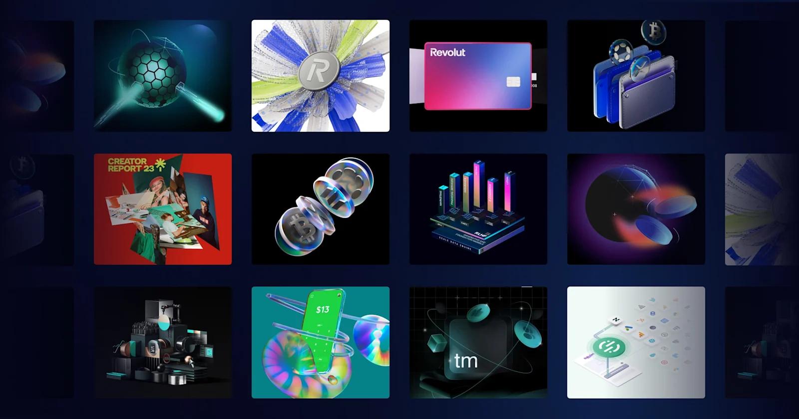
Shadows - By strategically placing shadows based on light sources, objects appear grounded, creating the illusion of height, depth, and spatial relationships. Shadows help define the position and orientation of elements, making them visually pop against backgrounds.
Lighting - Lighting simulates real-world illumination, emphasizing textures, depth, and spatial relationships. By manipulating light direction, intensity, and color, designers create realistic shading, shadows, and highlights on 3D objects, enhancing visual depth and providing a lifelike quality to digital scenes.
Gradients and Texture Mapping - Gradients in 3D web design provide smooth transitions of colors across surfaces, creating depth and enhancing visual realism. Texture mapping involves applying 2D images onto 3D models, simulating intricate surface details and materials, making objects appear more lifelike and visually appealing in the digital space.
Layering - Layering involves organizing elements in different planes, with some closer and others farther from the viewer. This technique creates depth perception, as objects in the foreground appear larger and move faster than objects in the background. Utilizing the parallax effect, where foreground and background layers move at different speeds during scrolling, enhances the sense of depth and immerses users in a dynamic, multidimensional visual experience on the website.
Animations - 3D animations enhance websites by adding dynamic and immersive visual elements that captivate visitors' attention. They bring static content to life, making information more engaging and memorable. These animations can illustrate complex ideas, products, or services, enhancing user understanding and creating a more interactive and enjoyable browsing experience.
Best 3D SaaS Websites
Now, let’s go over some examples that make use of 3D web design in a variety of ways.
Scale

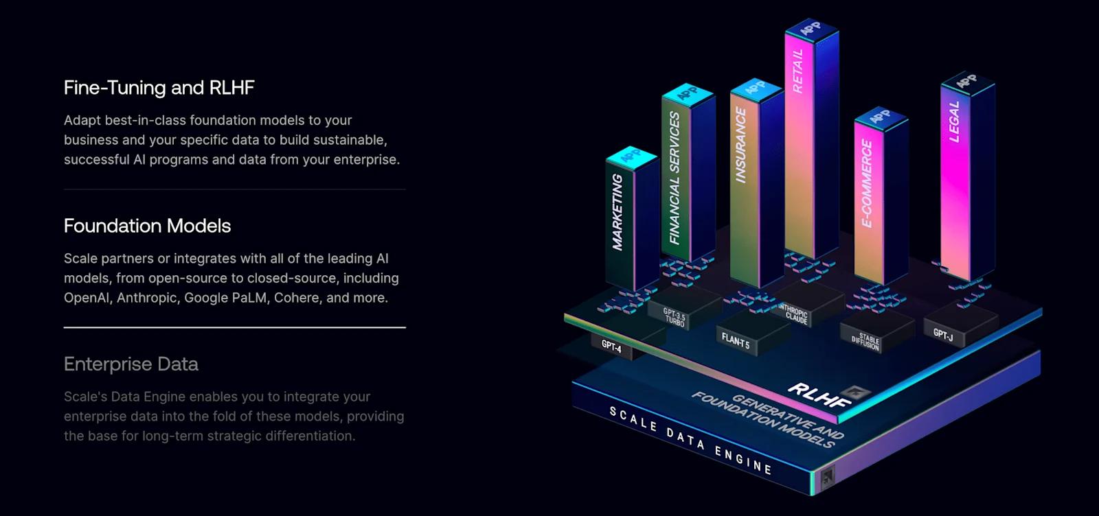
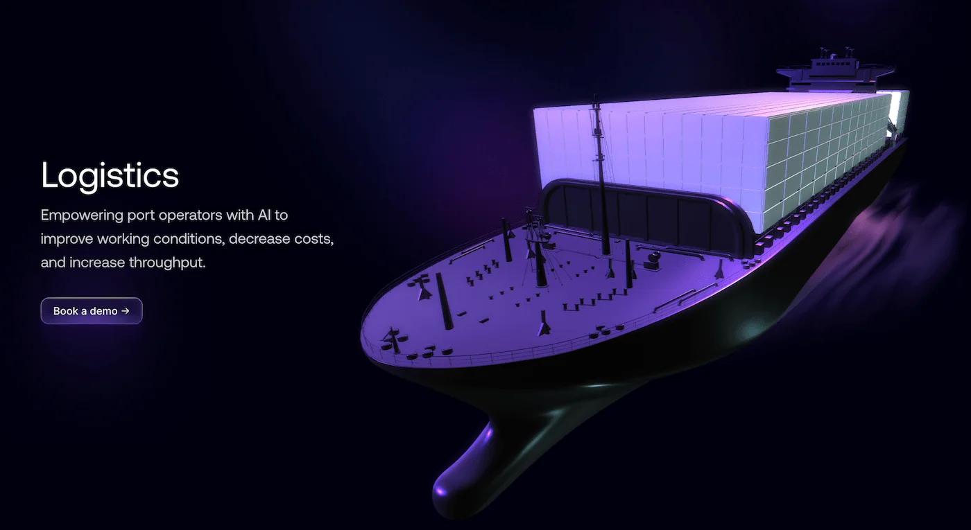
Highlights from Scale’s 3D Design
Revolut
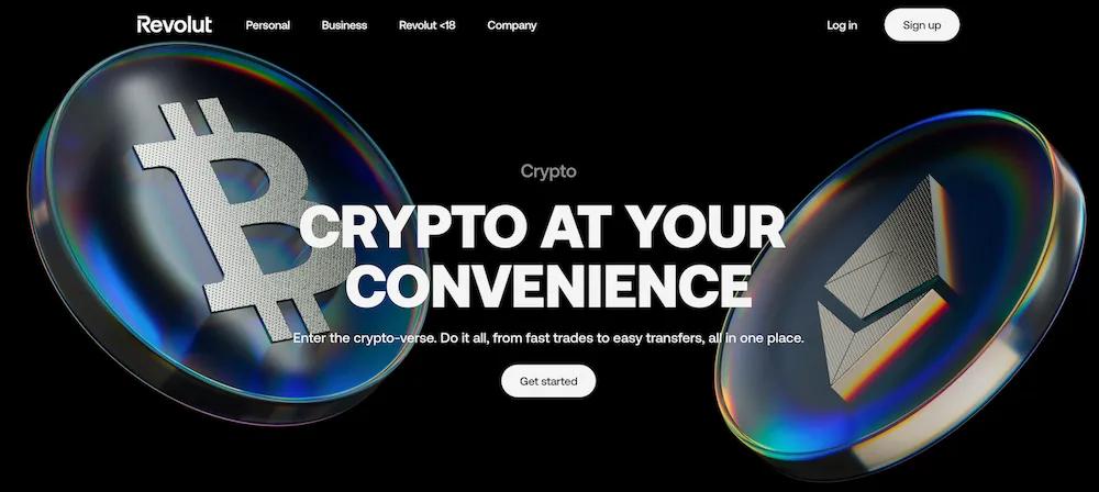
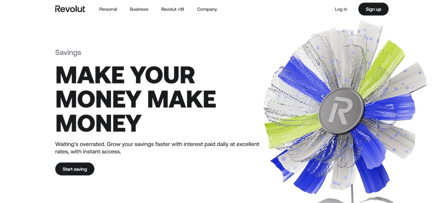
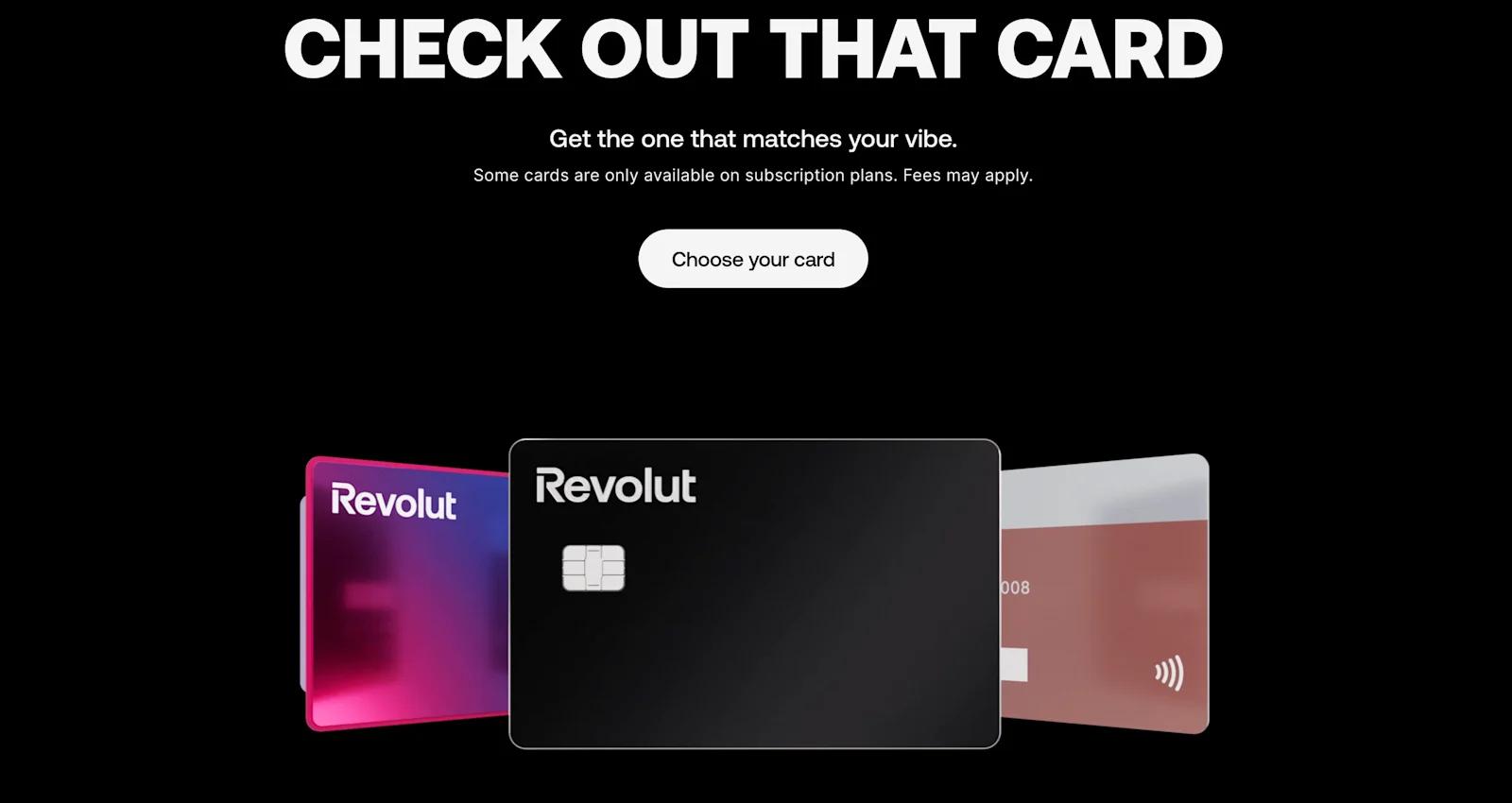
Highlights from Revolut’s 3D Design
Trust Machines
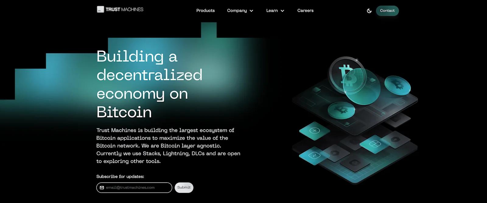
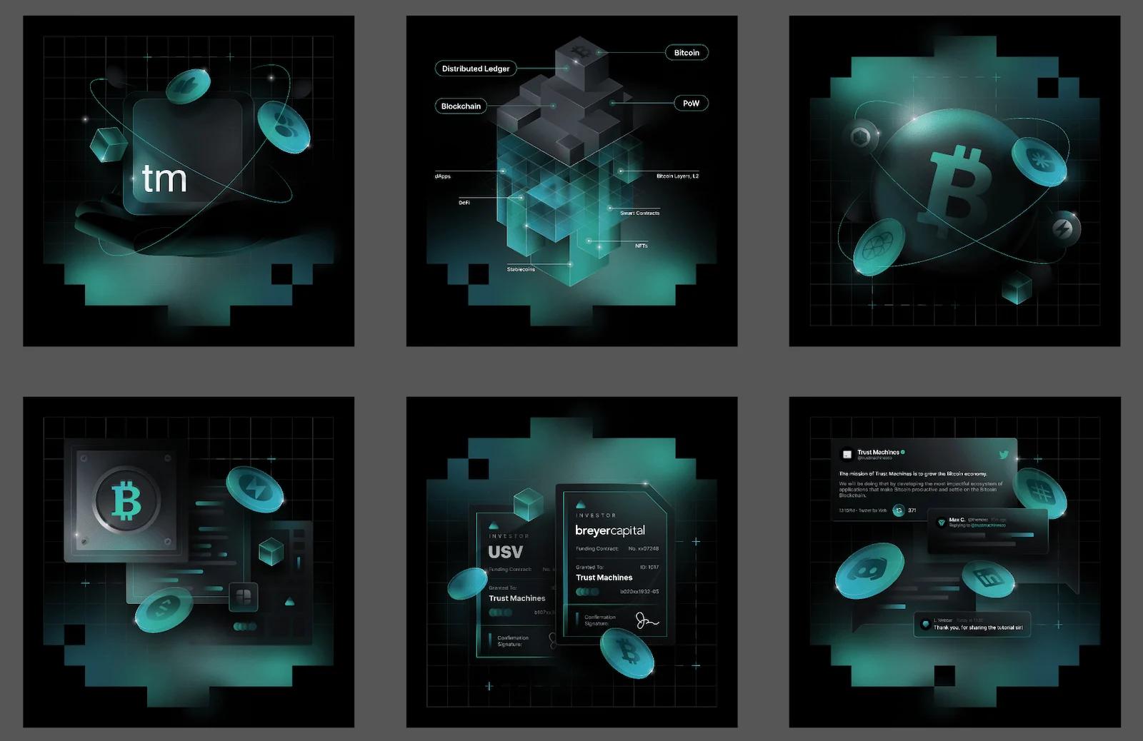
Highlights from Trust Machines’ 3D Design
Cash App

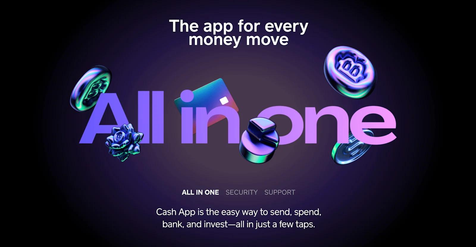
Highlights from Cash App’s 3D Design
Segment
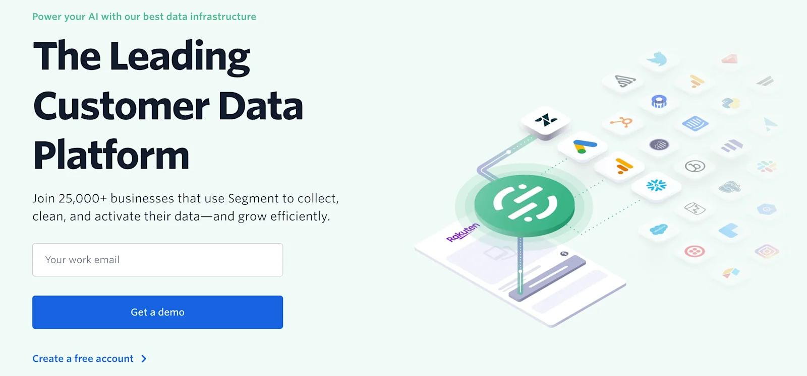
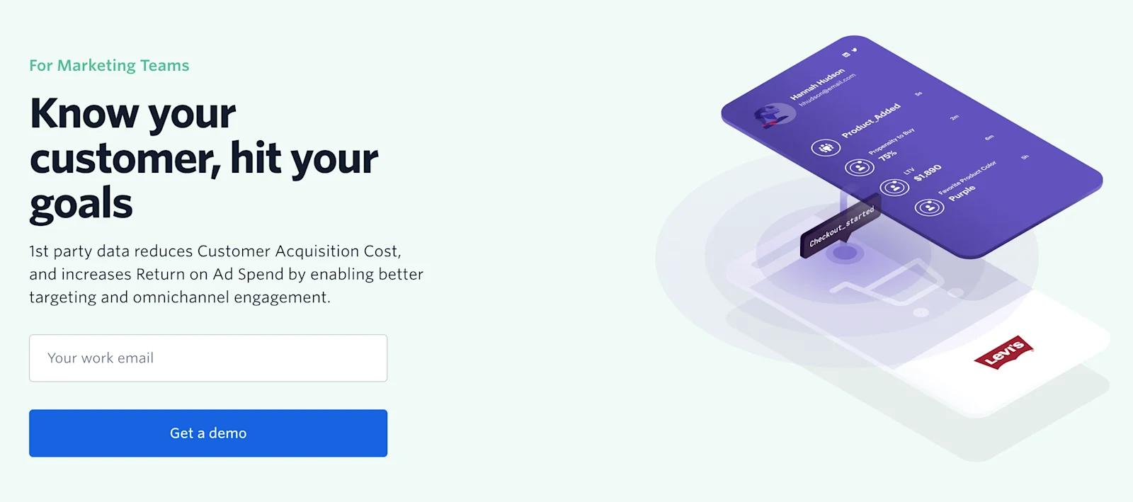
Highlights from Segment’s 3D Design
Cosmos

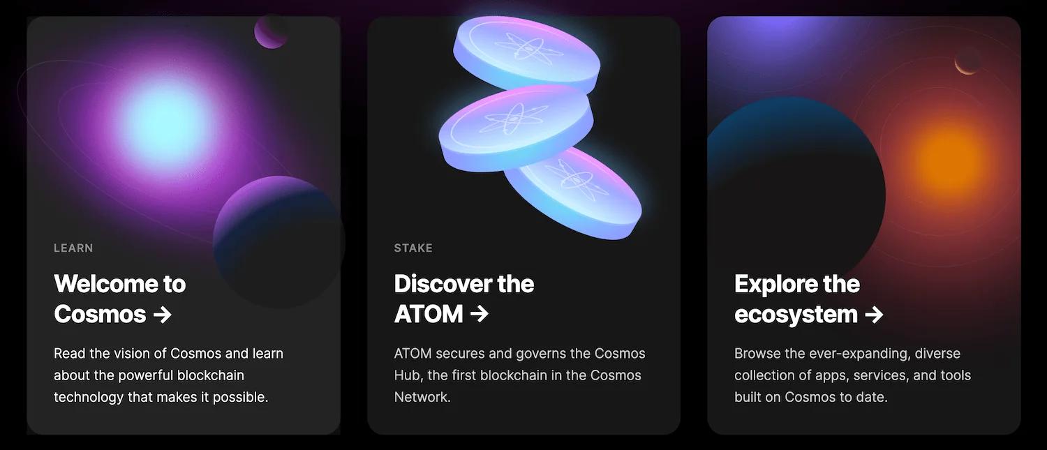
Highlights from Cosmos’ 3D Design
Calendly
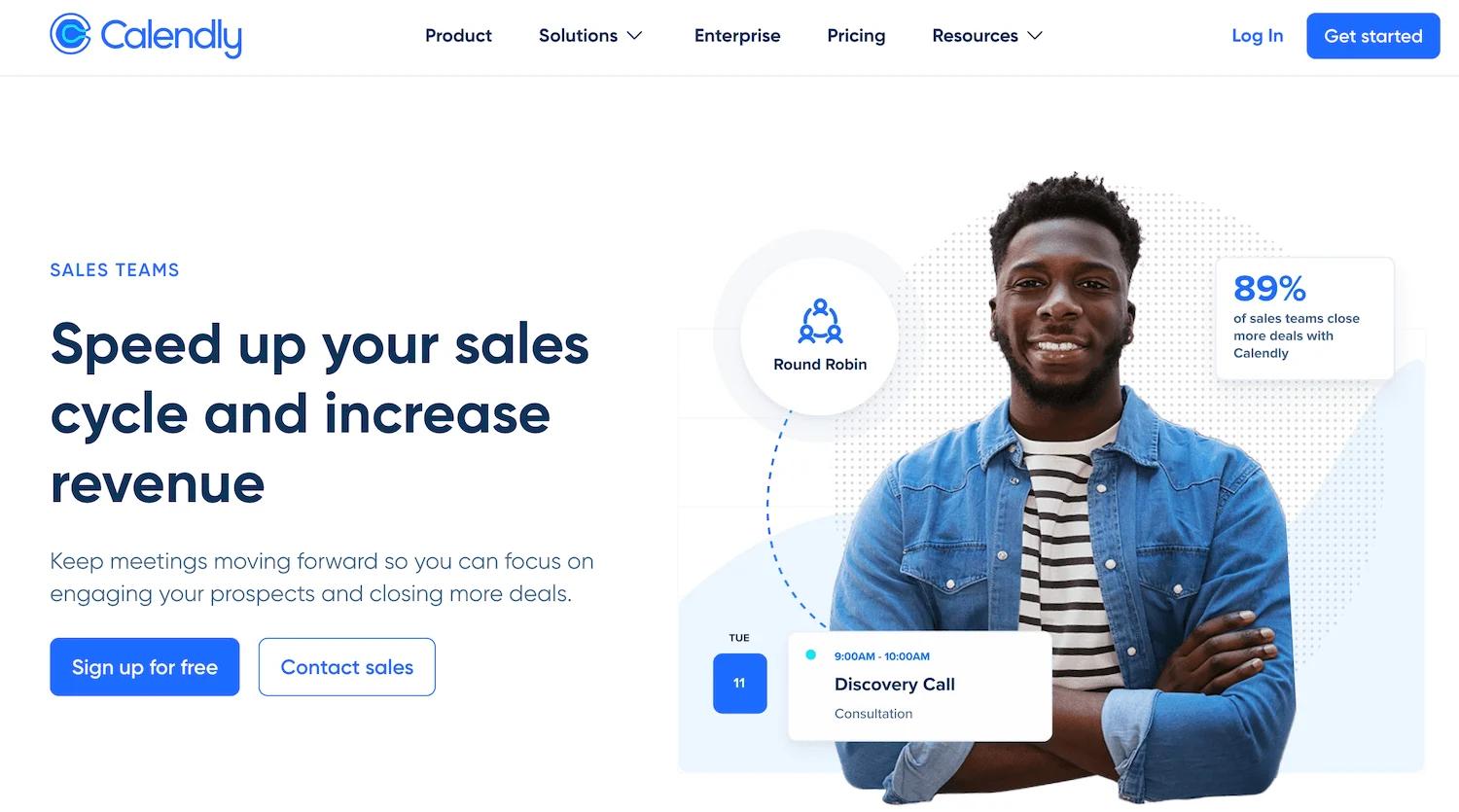

Highlights from Calendly’s 3D Design
Learn more about Calendly's 3D design and illustration system!
Linktree
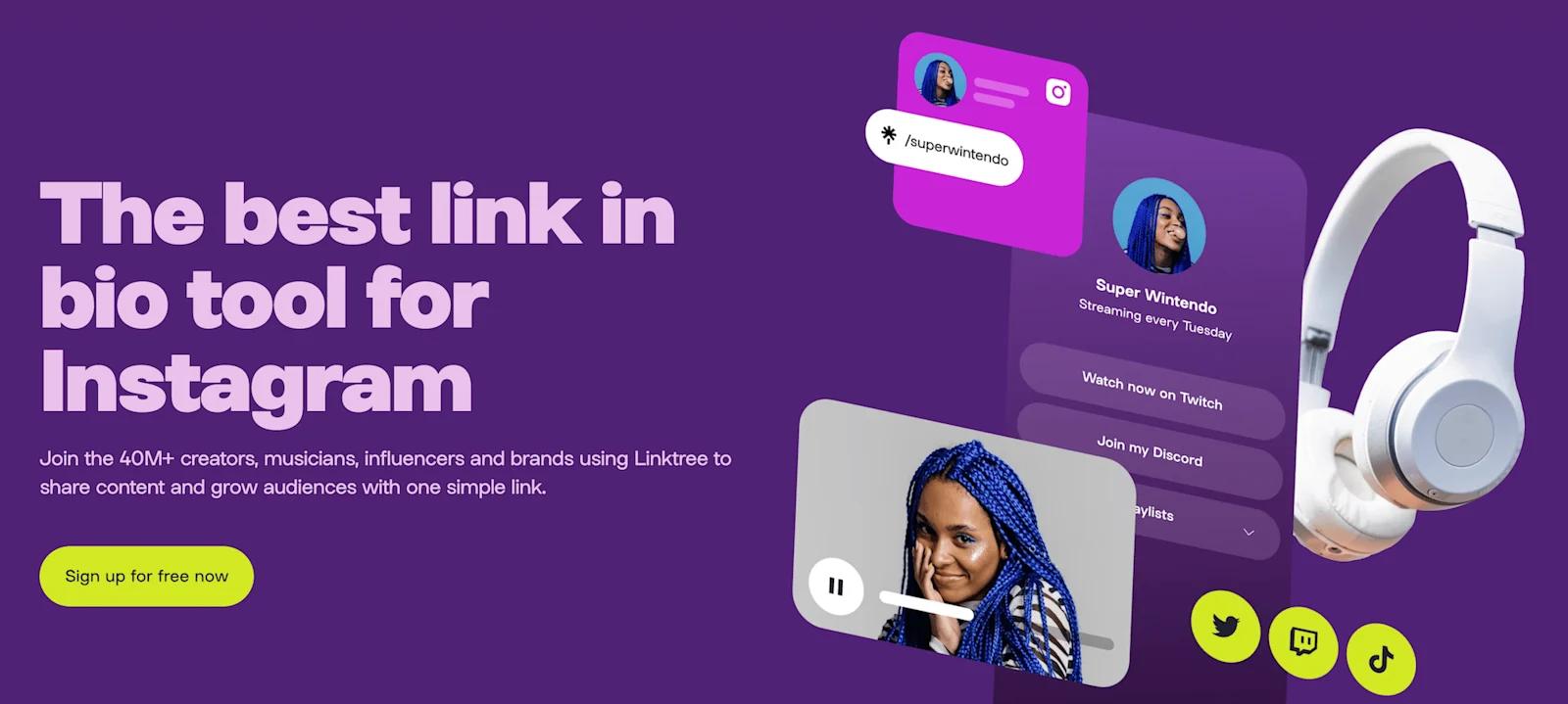
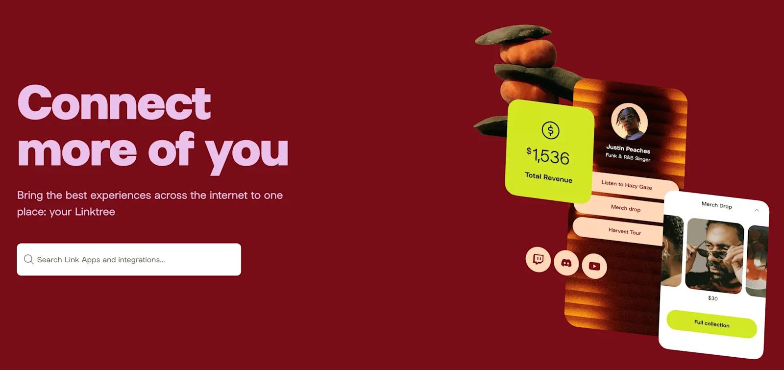
Highlights from Linktree’s 3D Design
Uplinq
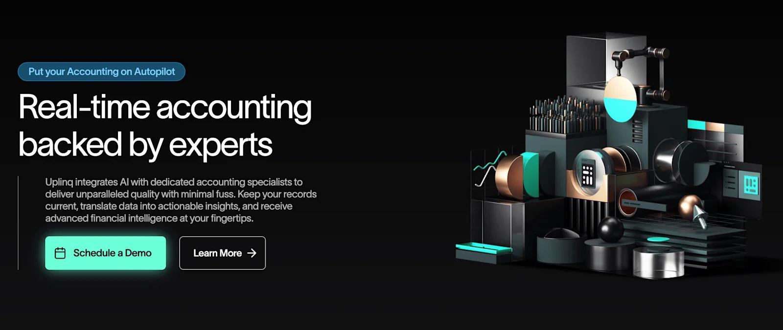
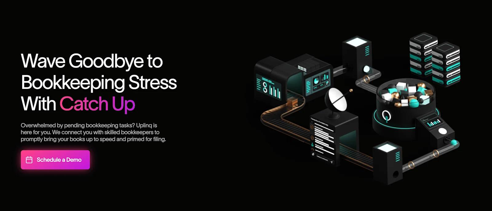
Highlights from Uplinq’s 3D Design
Miro

Highlights from Miro’s 3D Design
In Closing
In such a competitive and saturated landscape, organizations are feeling the pressure to differentiate and build brand equity. Oftentimes, this starts with building a modern web presence (and more specifically, a modern website).
The best modern tech websites embrace innovative design trends, like 3D, to set their website apart for the rest. As we saw with our examples, there are plenty of ways to add depth to your site. So, choose designs that align with your brand, and can enhance the presentation of your products.
And if you need help adding subtle 3D designs to your existing website or planning an entire website redesign, feel free to reach out to us here at Webstacks!

