Do your SaaS solutions pages effectively showcase the capabilities of your products? Do they utilize an intuitive design and serve as valuable sources of leads? If you’re looking to improve the way your organization promotes its solutions on the marketing website, you’ve come to the right place.
What is a Solutions Page?
In B2B SaaS, potential buyers come to your website with one main concern:
“How does this product solve my problems?”
A solutions page describes a product’s business outcomes, of which create measurable value. There are many different ways to construct and categorize these pages (as we’ll dive deeper into shortly). Through consumer research and understanding your products’ audiences and use cases, you can identify the most advantageous structure for your SaaS solutions content.
Needless to say, a high-quality solutions page can be the determining factor in whether a prospect considers your products in their purchase decision. So let's discuss what makes solutions unique, and how we can best construct them for your SaaS company.
Product Page vs Solution Page: What’s the Difference?
Oftentimes, a solutions page can get confused with a product page. While both pages provide similar information about an organization, their purposes are very distinct. Let’s clear the air, shall we?
Product pages describe the specific offerings of an organization. They answer the question “what does your product do?” by showcasing in-depth product features, product demos, or trials.
As we mentioned before, solution pages are outcome-focused, and exhibit the benefits from using your products. Often, they provide details on the specific applications of your solution based on industry, team, or function. A SaaS solutions page can also highlight client stories or case studies that demonstrate successful results you have produced.
Why Should You Have Solutions Pages?
Now that we’ve discussed the goals of a solutions page, let’s dive into the hidden treasures of having effective solution pages.
Establish Expertise in Your Industry
In today’s highly competitive market, it’s important to stand out as an industry leader who understands your customers' challenges and demands. A solutions page allows you to establish credibility and build trust with potential customers by showcasing industry-specific benefits, case studies, and success stories.
Address Customer Challenges and Pain Points
Without a solid solutions page, potential customers won’t have a clear understanding of how your product alleviates their pain points. Solution pages are your opportunity to illustrate the advantages of your SaaS product(s) — whether it's increased efficiency, cost reduction, revenue generation, etc. Ultimately, a well-designed solutions page UI makes your product’s applications clear and relatable, increasing the likelihood of a site visitor converting.
Support Product Pages
Solutions pages enhance a SaaS website’s product pages in several ways. For instance, a solutions page aligns the product with specific customer needs, helping potential buyers understand the value of your product for their use case. They strengthen trust in your product (and organization) by offering a deeper understanding of its features and business outcomes, complementing the efforts of your product pages.
Rank for High-Value Organic Keywords
In some instances, you may be able to design solutions pages around keywords that potential customers are actively searching.
A great example of this is Miro’s “Mind Map” solutions page.

By implementing the best SEO practices, Miro ranks in Google for queries that are highly relevant to their use cases, like mind mapping. Ahrefs estimates that this single page ranks for over 4,000 keywords, which translates into roughly 130,000 monthly organic visits!
It’s important to highlight that these keywords signal a high search intent. In other words, people searching “mind map” are already in the consideration stage of the buyer’s journey.
With excellent solutions page design like Miro, you can quickly turn website visitors into paying customers.
How Should SaaS Solutions Pages Be Structured?
The structure of solutions pages can dramatically impact a few key factors such as user experience and SEO. So, how do you effectively organize your solution pages and feature them within your website? Let’s get into it.
Categorization
Typically, you’ll find SaaS solution pages classified by roles, departments, industries, or use cases. For example, Upkeep organizes their solutions by three different roles: maintenance, operations, and reliability.

Each solutions page addresses unique challenges and provides tailored information to users in those fields. Categorizing your solutions pages by discipline allows potential customers to quickly locate the most relevant content.
Site Architecture
Common questions about featuring solutions on SaaS websites involve where they should be located in your navigation menu. Should your solutions have their own top-level tab or exist in a sub navigation tab? Should you have a parent page for all solutions?
Studies show that well-designed navigation bars can increase conversion rates by 18.5%. Therefore, it’s crucial to feature your solutions in the nav bar effectively. However, you may be constrained by your current navigation's design.
Let’s take a look at Freshworks' and Calendly's menus, which take two different approaches.

Freshworks’ solutions are located in a mega menu, which showcases all of their different softwares and solutions at a glance. Having them all in a mega menu allows Freshworks to maintain their minimal, organized navigation bar design while allowing users to easily explore all the content.

On the other hand, Calendly features their solutions on its own top-level tab with a dropdown menu, as well as a parent page. Calendly’s multiple categories, such as role and industry, make a dropdown menu ideal for an intuitive browsing experience where users can easily locate relevant solutions.
Calendly’s parent page allows users to browse all their solutions for various roles and industries. It serves as a central hub, and features customer testimonials, as well as CTAs. A parent page similar to Calendly’s approach is beneficial for offering a comprehensive perspective of an organization’s expertise, and how your solutions apply to different target audiences.
What Makes a Good SaaS Solutions Page?
Wondering what makes a well-designed SaaS solutions page? Well, there are a number of factors that can make or break SaaS websites- especially high value pages like these.
Here’s a rundown of effective design elements to keep in mind:
✍️ Bold headings
Bold headings establish visual hierarchy, which allows website visitors to seamlessly scan the page.
🖌️ Captivating images and illustrations
Eye-catching illustrations not only keep website visitors more engaged with your solutions page, but they can help visualize products and solutions in practice.
🤝 Social proof and testimonials
Buyers are more likely to invest in a product that’s evidently trusted and reliable. Providing case studies, testimonials, and other trust signals enhances the credibility of your SaaS solutions page.
🎨 Colors and branding
A well-designed SaaS solutions page should maintain consistency with your branding—like colors and tone of voice—to create a cohesive and impactful first impression.
📐 A Well-structured Layout
Website visitors won’t waste their time on cluttered, ambiguous, or confusing solutions pages. Utilize intuitive design and copywriting that encourage interest and engagement. Ultimately, you want to seamlessly drive these users towards the next step in the funnel (checking out products, reading a client story, booking a demo or starting a free trial).
💡 Reiterating the Problem/Stating the Solution
Potential customers should immediately recognize what your solution is and what problems it solves. That’s why it’s important to include clear, compelling copy that describes your solution to website visitors. For example, Truework’s mortgage page reiterates how their platform eliminates the hassle from VOI/E, as well as maximizes verification coverage and cost-savings.
👍 Describing the Benefits
Without clearly explaining the benefits and business outcomes of your SaaS solution, potential customers won’t be compelled to learn more about your offerings. A great way to describe your benefits is organizing them in a concise, neat card deck like Truework’s solutions page.
🗺 Demonstrating How You Get the Solution
Potential buyers seek detailed information about your solution’s applications to make informed purchasing decisions. Some intuitive ways to present how your solution works are motion animations or product demos that allow buyers to visualize how you solve the problem. Truework utilizes an amazing animation to illustrate how their platform provides integrations that give teams access to a robust VOI/E platform.
👉 Showcasing examples
Sometimes, buyers need to see it to believe it. That’s why it’s essential to include real-life examples of how your solution delivers positive results to clients. Providing case studies or client stories that reflect your solution’s success is crucial in persuading your target audience of its value.
🔎 Designing for Organic Search (SEO)
Depending on your solution, there may be a substantial amount of search terms that your page could rank organically for. Before you start creating your page copy, be sure to research and identify target keywords with an SEO tool like Ahrefs or SEMrush. Here you can find valuable queries, along with their monthly search volume and ranking difficulty.
Next, you will want to optimize several components of the page for those keywords, such as the page title, url slug, headings, and meta description.
💲 Optimizing for Lead Generation (CRO)
After potential buyers have familiarized themselves with your solution, they should have the opportunity to learn more. This involves providing relevant resources like product pages, pricing pages, blogs, case studies, and downloadable assets. There should also be CTAs to other high-intent landing pages like demos and sign ups.

SaaS Solutions Page Examples
Now that we’ve broken down what makes for a successful SaaS solutions page, let’s jump into some inspiring designs Webstacks has crafted for a handful of today’s leading SaaS brands!
Calendly

First up we have Calendly, a popular appointment scheduling platform used to book meetings and events for individuals and organizations.
Here’s what we love about Calendly’s solutions UI:
- Bold, purposeful headings
- Evident success stories and testimonials
- Sleek layout that’s consistent with Calendly’s branding
- Interactive table of Calendly’s features
Osano

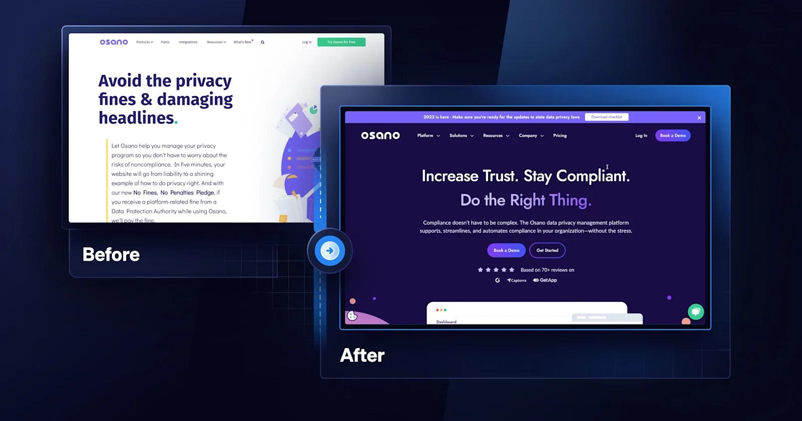
Osano is a data privacy platform that helps businesses build, manage, and scale their privacy programs.
Some key aspects of Osano’s solutions pages:
- Attention-grabbing illustrations of each solution
- Engaging, straightforward headings
- Prominent CTA’s inviting users to learn more
- Consistent use of Osano’s vibrant branding
Justworks

Justworks is a well-known payroll and human resource software that manages all HR-related tasks like employee benefits and compliance.
Notable elements of Justworks’ solutions pages:
- Compelling copywriting
- Eye-catching icons
- Social proof through trust bars
- Interactive list of the solutions’ benefits
Routable

Routable is a financial technology company that simplifies B2B payments, cash flow management, and financial operations for businesses.
Features we admire about Routable’s solutions pages UX:
- Captivating illustrations
- Concise, compelling copy
- Dynamic animations depicting solutions’ functionality
- Polished icons that organize solutions’ advantages
ServiceTitan

As one of today’s premier enterprise software platforms, ServiceTitan offers service management solutions to the thriving home and services industry.
Here’s our favorite aspects of ServiceTitan’s solution pages:
- Categorization by commercial & residential solutions
- Dynamic motion graphics
- Strategically placed CTAs, social proof, and demo
- Related content section
Deepgram

Deepgram is a leading Speech-to-Text API that harnesses AI to transcribe real-time or pre-recorded audio and video into text.
A few highlights from Deepgram’s solutions pages:
- Balance of white text and vibrant gradients on a dark background
- Colorful, eye-catching illustrations
- Additional related resources
- Social proof such as testimonials and case studies
Credly

Next we have one of the largest digital credentialing networks and global Open Badge platform: Credly
We can’t help but rave about these elements from Credly’s solutions pages:
- Clear, concise copywriting
- Simple yet sleek layout
- Statistics supporting the power of credentials
- Trust bar and customer testimonials
FieldRoutes

Up next is FieldRoutes, a cloud-based pest control and lawn care scheduling and management tool.
Major features of FieldRoutes solutions pages:
- Arrangement by company size and business type
- Interactive benefits table
- FAQ section for curious users
- Blog articles to entice users to continue learning
Workera

Geared towards enterprise customers, Workera is an up-skilling platform for machine learning, data science, and AI.
Some standout aspects of Workera’s solutions pages:
- Categorization by use case
- Bold, solution-focused copy
- Customer testimonials and trust bars
- Stunning illustrations and vibrant colors
Truework

Now let’s talk about Truework, a one-stop income and employment verification platform.
Noteworthy points of Truework’s solutions pages:
- Sorting by industry and teams
- Consistent use of Truework’s brand colors
- Eye-catching motion illustrations for “How it Works” sections
- Credibility from client stories and trust bars
Workgrid

Next is Workgrid, an intelligent workplace platform that streamlines digital workplace experiences.
Key points of Workgrid’s solutions pages:
- Classification by department and challenges
- High-quality hero images
- Sleek, well-structured layout
- Motion graphics depicting how Workgrid helps
UpKeep

UpKeep is a computerized maintenance management system (CMMS) that manages and streamlines maintenance processes for organizations.
We love the following aspects of Upkeep’s solutions pages:
- Bold, persuasive copywriting
- Card components and icons for better organization
- Trending resources to keep users engaged
- Dynamic trust bar and scrollable testimonials
Shopmonkey

As a comprehensive shop management software, Shopmonkey helps auto repair businesses optimize their workflows and grow their operations.
Shopmonkey’s solutions pages exceed in a few areas:
- Colorful icons that sort solutions in dropdown menu
- Intentional placement of CTAs to drive engagement
- Use of Shopmonkey’s bright branding on a light UI
- Testimonials and CTAs towards case studies
Blocknative

Blocknative, a blockchain management solution, offers cutting-edge real-time monitoring solutions designed for public blockchain networks.
Here’s what we admire about Blocknative’s solutions pages:
- Web3 design elements
- Organized layout with card components
- Extensive FAQ section with drop-downs
- Inviting resource section
Freshworks

Last but not least, Freshworks is an intelligent customer engagement software that offers cloud-based solutions for businesses.
Defining elements of Freshworks’ solutions pages:
- Bold, concise headings
- Quality images of software’s UI
- Neat card components for resources
- Social proof like animated trust bars & client stories
Sell More With Effective Solutions Pages
As we’ve discussed, the significance of a well-crafted SaaS solutions page cannot be overstated. With these key design elements and top-notch solutions page examples under your belt, you’re more than ready to design compelling solutions pages that showcase the competitive edge of your SaaS products!
If you’re hungry for more tech website inspiration, check out 50+ of the best B2B SaaS websites of 2024 — handpicked by Webstacks.
Looking to elevate the design of your SaaS website? Here at Webstacks, we’ve designed beautiful, scalable, and modular websites for high-growth B2B companies such as ServiceTitan and Calendly.
If you have a website design project in mind, don’t hesitate to get in touch with our team of website experts!


