In the ever-evolving landscape of digital marketing, where visual appeal often speaks louder than words, maintaining a consistent brand identity across diverse platforms is both a challenge and a necessity. Without the proper resources, marketing teams can struggle to balance creativity with uniformity.
This can be especially true for illustrations - an important component of a brand’s visual identity.
Think of all the places your marketing team uses illustrations: websites, product interfaces, social media, email campaigns, paid ads, lead gen assets, reports. Each medium demands its own set of designs, yet your brand message must remain coherent and undoubtedly recognizable.
In our work with Illustration design at Webstacks, we’ve been able to help both B2B and B2C brands implement illustration systems - a standardized and scalable approach to visual storytelling.
No longer do brands have to waste time piecing together visuals for different mediums and worry about inconsistencies. Now, it's easier than ever for your organization to design, modify, and distribute illustrations.
In this article, we explain how modular design empowers illustration systems, and allows for iteration, consistency, and adaptability for all of your brand’s creative needs.
What is an Illustration System?
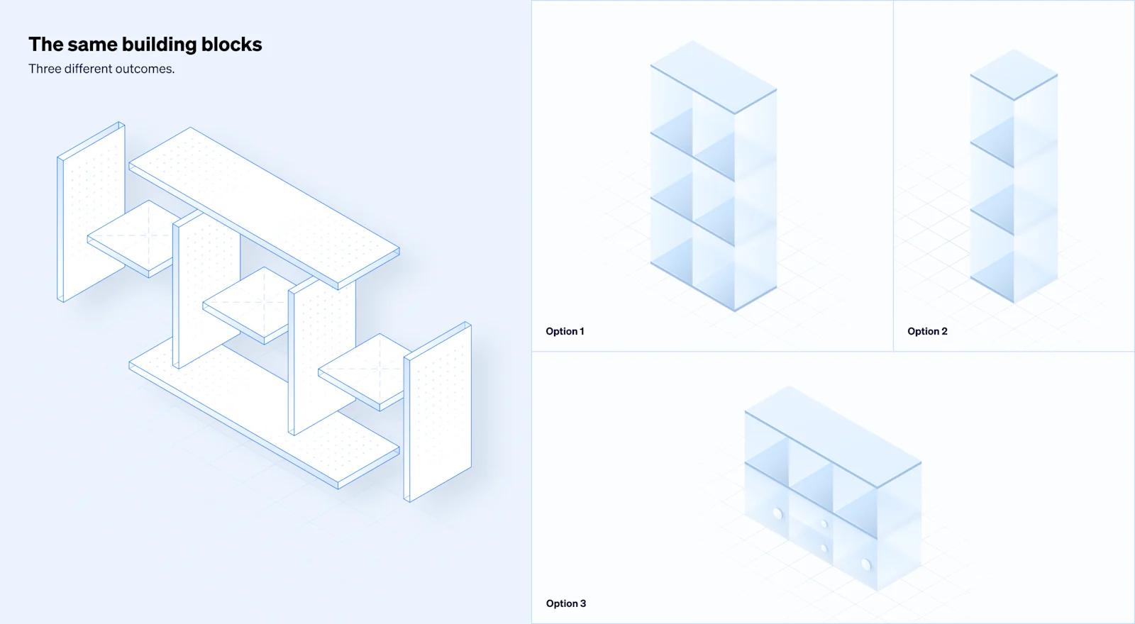
An illustration system is a strategic design framework that systematically organizes visual elements to enhance brand identity. This methodical approach follows the principles of modularity, which allows for seamless reusability and iteration.
This is possible because at its core, an illustration system prioritizes consistency. Every element – be it shapes, colors, or typography – adheres to predefined rules, establishing a cohesive visual identity. With these guidelines, designers (and marketers) can seamlessly alter illustrations without having the worry about breaking consistencies.
You can also think of an illustration system as a library of templates. Within the library is a set of dynamic tools that can be adapted and scaled to fit various contexts, without losing their core identity. This also enables creators of illustrations to streamline their workflow, saving valuable time and ensuring a consistent visual language across diverse outputs.
3 Key Benefits of Illustration Systems
1. Scalability
With an arsenal of pre-built templates, new illustrations can be assembled in a matter of seconds. Inputting new copy, logos, icons, interfaces, or images within an illustration template is remarkably simple. Subsequently, it's possible to generate tens or even hundreds of variations near instantaneously. This is a massive advantage when it comes to publishing new content or performing A/B tests on web pages.
2. Consistency
An illustration system serves as the single source of truth when it comes to a brand’s illustration design. This is important for brands that distribute content across a disparate set of platforms (website, email, social media, traditional marketing, etc). By defining specific guidelines for illustration design, these systems create a unified visual language that ensures illustrations positively contribute to the building of a brand's image.
This consistency not only enhances professionalism but also minimizes the risk of misrepresentation. Trustworthy, valuable brands account for attention to detail, which includes consistency of visual elements (like illustrations) across every channel. Whether a customer comes across your website, visits your LinkedIn page, or opens an email from you, their perception of your brand from a visual perspective should all be the same.
3. Speed to Market
Similar to the points discussed for scalability, the standardization of an illustration system will remove many of the constraints and dependencies that arise with design. In turn, marketing teams are now empowered to seamlessly create and publish new illustrations from templates on their own - drastically increasing speed to market.
How Do You Build An Illustration System?
Establish a Set of Modular Components

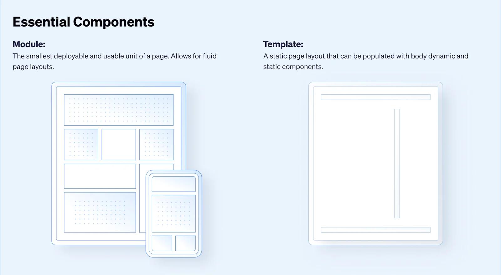
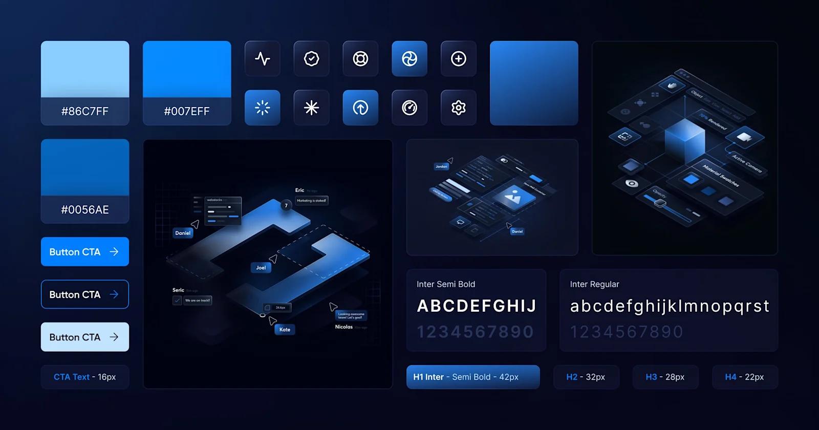
Illustrations from illustration systems can be broken down into basic, reusable elements. Many of these elements should be directly taken from other existing aspects of your branding, such as colors, typographies, shapes, logos, icons, and shadows.
This concept of modular design aligns perfectly with illustration systems. Breaking down a system into manageable modules allows for easier maintenance, updates, and modifications. Moreover, it ensures consistency, as each component built is pulling from the exact same set of elements laid out in the system.
When building a new illustration system, you want to define each of these modular elements first. Then you will be able to combine them and construct templates for your illustrations.
Want to learn more about modular design and how it can apply to your brand’s entire website? Check out our Modular Web Design Guide!
Design Reusable Templates

The next step is to combine your elements and start creating templates for your illustrations. You should have a comprehensive list of potential use cases to help your designer build out your illustration system.
We consulted with our design team here at Webstacks, and came up with a list of the most popular use cases for how and where we’ve helped our clients use illustration systems:
Types of Illustration Templates:
- Doodles and Artwork
- Variations of Logos
- Product UI Illustrations
- Client Testimonials and Customer Reviews
- Data Visualization
- Partner and Integration Logos
- Leadership and Team Headshots
Where to Use Illustrations:
- Website
- Application Interfaces
- Instagram and LinkedIn Posts
- Display Ads
- Email Marketing Creative
- Event Marketing Creative
- Report and Ebook Creative
Illustration System Example: Calendly

Here we’ll highlight an illustration system that Webstacks designed for Calendly - the virtual appointment scheduling platform!
When a SaaS company like Calendly looks to scale marketing efforts, it needs the proper resources to publish lots of high-quality, well-designed content. A major component of that is having a backlog of graphics and illustrations ready to deploy. Why? Because at every touchpoint, brands should strive to provide visuals that captivate and allure prospects.
Moreover, visuals should be constant reminders of your brand. By working with the same stylistic components, you can create a cohesive arsenal of elements that are subtle reminders that tie back to your brand identity.
That is exactly what we achieved with Calendly.
Our team of Webstacks designers built out an extensive library of illustration templates that Calendly could use in a variety of ways. By repurposing many of the elements from Calendly’s existing design system (such as colors, fonts, and shapes), we were quickly able to upgrade their existing illustration system.
Through Figma, we designed over 140 illustrations, including device screens, product UIs, people-centric images, diagrams, charts, logos, and so much more!
Here are some examples of our favorite Calendly illustrations!
Hero Images

Devices and Screens

Solutions Pages

Integrations, Partners, and Awards

One of our key focuses with these illustrations was enablement for Calendly’s marketing team. As with all illustration systems, these 140+ illustrations can easily be manipulated to produce multiple variants. Swapping logos, UIs, customer portraits, or copywriting. Now, marketers at Calendly are able to seamlessly access illustrations and create new ones from templates all on their own.
Closing Thoughts
In conclusion, the strategic implementation of illustration systems is nothing short of transformative for businesses aiming to establish a strong, distinct, and valuable brand identity. By simplifying the complex world of visual communication, these systems provide clarity, consistency, and efficiency.
Brands that harness the power of illustration systems not only simplify the creation of diverse visual assets but also scale their impact across numerous platforms seamlessly. In an age where first impressions matter, these systems serve as the linchpin, ensuring that every illustration, icon, and graphic element resonates with the audience cohesively. Therefore, it's key to simplify design complexities, amplify your visual identity, and ensure your brand's story is heard clearly and consistently in a cluttered digital landscape.


